What makes a great ‘we are reopening’ email? Here are some things to aim for, as illustrated by examples including the Natural History Museum.
Email has been more important than ever for marketers during the pandemic. Consumers have had lots of questions and marketers have been desperate to assist them in adopting new behaviour, as well as to generate much-needed revenue.
These motivations explain why email send volumes have increased significantly (up 44% Q2 on Q1 according to Hubspot), open rates are up, too (by 32%), but response rates have fallen (down 25-30%).
In short, there’s a big appetite for email at this time but a lot of the appetite is for information, rather than sales.
So, with the prospect of many businesses in the travel and leisure sector reopening over the coming months, designing a “we are reopening” email should be an easy win in many respects. Time to let all your contacts know they can start to live a little.
However, communicating simple messages to customers can be tricky. It’s very difficult to KISS (keep it simple, stupid), especially when brands are so fond of talking about themselves. Anyone remember those emails of rambling reassurance from brand CEOs at the start of lockdown?
In this article I’m going to look at an example of a ‘reopening’ email I loved (from the Natural History Museum) and compare it to some other examples which could have been better.
An enticing subject line
There’s great AI tech out there to devise and then subsequently optimise email subject lines to improve opens and clicks. But for one-off announcements, you can’t beat some clever brand-focused headline writing.

NHM’s subject line, “Whale hellooo again”, jumps out immediately for its intriguing cheer. Only when I opened the email to see an image of Hope, the blue whale skeleton that hangs in the Hintze Hall at NHM, did the subject line make sense.
This is a good tactic, writing a subject line that’s a bit less mundane than simply saying “we’re reopening the museum”. Although truly avid visitors will no doubt click anyway, you want to ensure that those who haven’t visited for a while are tempted, too. I know there are some people out there who hate cheesy puns, but we can’t mitigate for the hard-hearted.
Simplicity – what do customers really need to know?
What constitutes simplicity?
Save the speech
For those places reopening, this is a big moment and one filled with relief and pride but also lots of perspective and a bit of fear of the unknown. There’s lots of really interesting things to discuss. In the case of the NHM, a recent press release included the thoughts of Director, Sir Michael Dixon:
“We’re delighted to be able to safely share our wonderful buildings, spacious galleries and gardens once again. The nation has reconnected with the natural world during lockdown and there is no better place to discover all it has to offer than our Museum.”
The press release also waxed lyrical about what visitors can enjoy upon reopening – “From visiting our world-leading dinosaur gallery to seeing our awe-inspiring blue whale Hope plunging from the ceiling in Hintze Hall, we look forward to offering a uniquely relaxed visit. Visitors will be able to explore our magnificent halls and galleries without the crowds – something only our staff usually experience outside opening hours.”
But, none of this great stuff made it into the reopening email, because quite frankly it isn’t necessary.
What matters most is that the museum is open and that there are some new protocols to bear in mind. That’s why the main part of the email looks like this…
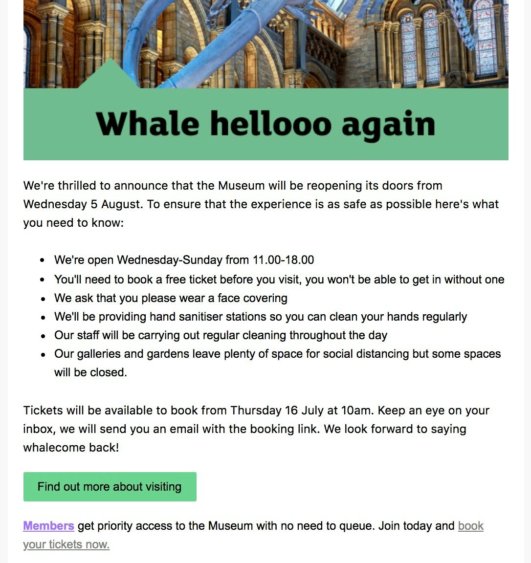
Bullet points are a copywriter’s best friend
Compare the NHM’s effort to the following reopening email I got from Center Parcs (below). The best thing I can say about it is that it’s accessible and the subject line at least conveys the most important point.
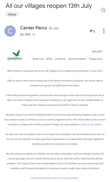
Don’t miss your selling points if you’re not quite as well known as NHM
On the other end of the spectrum, I received a content-rich email from Another Place, a fancy hotel in the Lake District. It was a really good email, packed with information and imagery, including a GIF at the top which cycled through stunning imagery of Ullswater and a feature at the bottom about a one-off ‘full moon swim’ event in the lake (see below). It really made me want to get out and travel and experience something different again.
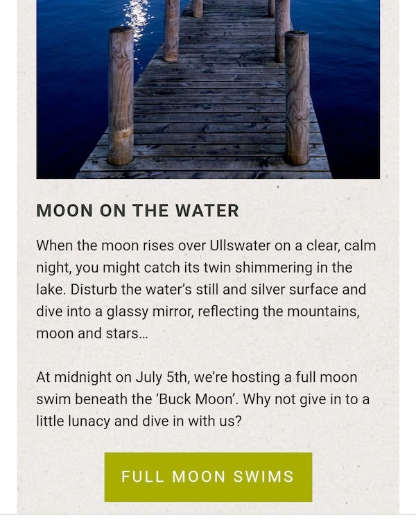
But Another Place’s reopening email also contains a fairly long message (below) from the CEO Ben Harper that was well-written and brimming with emotion and pride, but also contains brilliant selling points that could be easily missed by the reader, and deserve to be noticed. For example, Harper mentions “our new picnic menu” and “bookable slots for Swim Club”. Both of these could have had more of an impact if some humble bullet points were employed and the CEO’s message abridged.
Forgive me for sounding so dogmatic on the topic of bullet points. But they really are a quick win.
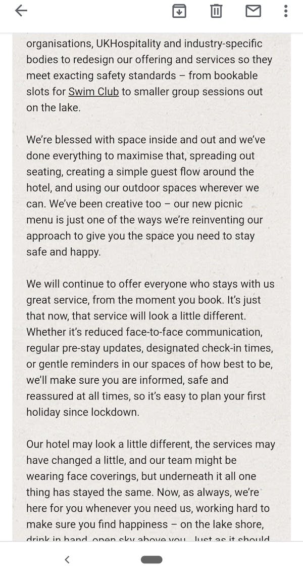
A message from Another Place’s CEO. Very nicely written but hiding some great selling points.
Long overdue excitement
At the beginning of the pandemic, in an article on dos and don’ts of coronavirus emails, Econsultancy deputy editor Rebecca Sentence wrote, “It probably goes without saying, but now is not the best time for irreverent jokes or edgy humour, no matter how on-brand it might be. That doesn’t mean that your update needs to be dreary or in dry legalese, but read the room, so to speak.”
That advice still stands, with the caveat that what the room wants now is something to look forward to. I certainly appreciated the exclamation mark at the end of the headline in the NHM’s email body.

A bit of excitement is long overdue. Treat yourself to an exclamation mark – it’s not irresponsible.
Multichannel consistency
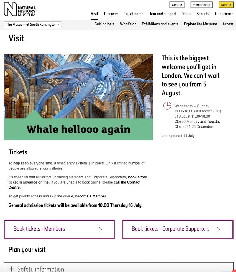
If you click through from the NHM email and its call to action – ‘find out more about visiting’ – you’ll land on the page shown below.
It’s nice that the email mirrors the website with the same imagery, colours and upbeat tone (“this is the biggest welcome you’ll get in London. We can’t wait to see you…”). Everything is kept simple again, with key information and calls to action plain to see.
Reassurance
NHM’s copy, which we’ve looked at already, serves to reassure visitors by focusing on safety, such as cleaning routines, restricted visitor numbers, hand sanitiser provision and so on.
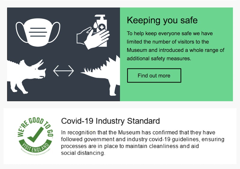
But to go the extra mile and make customers feel safe about booking a ticket, the email also includes two additional content blocks, pictured below. One highlights the museum’s achievement of Visit Britain’s ‘We’re Good To Go’ industry standard. This standard shows NHM has demonstrated adherence to the respective Government and public health guidance and the implementation of new safety measures. There’s also a content block which concerned customers can click on to be taken to NHM’s website and more detail on safety measures.
Marketers must do their best to reassure customers at this difficult time.
Something for everyone
For years, galleries, libraries, archives and museums have been trying to come to terms with how to serve people who are unable to visit a physical space. That may be exacerbated by a pandemic, so it’s more important than ever to offer subscribers some form of digital engagement. NHM rightly devotes a large chunk at the foot of the email to do just this, promoting a virtual tour, the Wildlife Photographer of the Year catalogue, and live interactive talks (in fact, there are a full 13 ways to visit from home).
In conclusion
It’s amazing that there aren’t more emails as clear as this one from NHM. But all credit to them for communicating so well.
In one of Marketing Week’s recent Lowdown webinars, marketing professor Mark Ritson recently created his own monster, an embodiment of the qualities of a great marketer. The monster included, amongst other things, empathy, curiosity, big picture, making time, and making it look simple and certain. I think you can get a whiff of these qualities in the marketers at the NHM.

