Product pages remain one of the most important parts of any ecommerce website.
It’s usually on the product page that the customer makes the decision to buy something (or not), so it is vital that the page conveys as much information as possible, in a way that is clear, easy to understand, and visually pleasing.
According to Econsultancy’s Ecommerce Best Practice Guide, an effective product page should include the following:
- A product overview, including name or brand, the price, and a short description of features.
- Product photos, i.e images to allow consumers to better see the details of products.
- Similar product suggestions, which enables up-selling or cross-selling of related or complementary products.
- Suggestions for help or guidance, so that the user knows how to speak to customer service.
- Social proof, such as ratings and reviews to instil trust.
- A clear call to action so that the user knows what to do next.
Here’s a roundup of effective product pages that have recently caught my eye.
1. Graham & Green
Furniture is a difficult thing to buy online, which is why homeware brand Graham & Green attempts to cover all bases on its product pages. From comprehensive imagery to video content about upholstering, there are many elements designed to inform and instil confidence in customers.

One of the best features is the size guide, which helps customers to easily visualise how big the piece of furniture is. It sounds simple, but this information can often be difficult to find or conveyed in a confusing way.
Here, Graham & Green ensures customers know exactly what they’re getting; the page also includes a further section dedicated to information on delivery and returns.

2. Converse
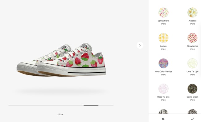
Product visualisation technology can be a great way to increase customer satisfaction and reduce return rates, helping customers to visualise how items look in real life.
These tools can also give customers greater control over the item itself, enabling them to customise it to suit their own needs or desires. Converse is a good example of this; many of its product pages include an ‘edit design’ option to allow the user to customise their own shoe.

This tool is particularly impressive for how it totally immerses the user in the process. It’s also quite addictive. I have to admit that I spent a good 15 minutes designing my own shoe when researching this article (even though I didn’t actually buy it).

3. Glossier
I’ve previously written about Glossier and its effective use of social proof, but the brand is certainly worth mentioning again here.
Its product pages are filled with subtle but effective features that nudge customers to buy, including copy that highlights an item’s unique selling point, and indicating whether an item is ‘top rated’.

Its product pages are also centred around ratings and reviews, which other customers can ‘upvote’ to indicate how helpful they’ve been. The reviews section also includes a filter to help customers during the decision-making process. Overall, it’s one of the most effective and well-designed product pages in this list.

4. Allbirds
Footwear brands often focus on style over substance, but Allbirds is all about how its shoes are both stylish and environmentally friendly.
As a result, its product pages are entirely value-driven, highlighting the benefits of the shoe (in terms of both its wearability and sustainable materials). Informal and conversational copy – including ‘feels soft and cosy’ and ‘your 98% of the time sneaker’ – helps to make the brand feel attainable, and not preachy.

The page design, which encourages users to simply scroll down to see all images and video (rather than click through a gallery) is also effective, encouraging users to take in all the information provided.

5. Brewdog
Brewdog is known for its creative (and sometimes shock) marketing tactics, but in recent times, the brand has shifted its focus back onto the beer itself.
Its own ecommerce site is a reflection of this, with product pages that aim to clearly convey the ingredients and taste of the beer – even to novices. Concise and descriptive copy cleverly complements a visual chart to inform customers of the beer’s main flavours.

Further down the page, the ‘brew sheet’ offers even more in-depth information about how the beer has been brewed. Also worth mentioning is the copy at the top of each product page, which highlights USP’s such as ‘free delivery on every full box’.

6. Bellroy
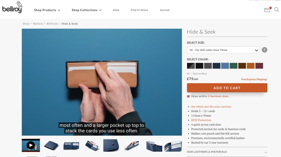
Ecommerce image galleries are typically used to help customers gain a better understanding of how a product looks in real life. Bellroy uses autoplay video to do this instead, which serves to immediately immerse and engage users in the item they are browsing.

Further down Bellroy’s product pages there are effective visual representations of the item, designed to give users a comprehensive idea of its size and what it can hold. Handy.

7. Hugo Boss
Hugo Boss product pages include many best practice elements, such as high quality imagery and effective calls to action (like ‘shop online, decide at home’ to highlight free returns).
Another stand-out feature is the ‘complete your look’ section, which offers suggestions based around the main item.

As well as offering inspiration, this simplifies the shopping experience for the customer, making it quick and easy to buy an entire outfit. Of course, it also enables the brand to cross-sell and increase the average order size.

8. Bliss
Ratings and reviews are a big focus on the product pages of skincare brand, Bliss. One particularly effective element – a feature I’ve not come across anywhere else – is the ‘why I chose this’ section, which helps to give the user an immediate sense of the item’s biggest benefits, without trawling through a list of long reviews.

Elsewhere, there are lots of nice visual cues, such as the ‘blissfully free from’ section which indicates harmful ingredients that you won’t find in Bliss products. The link to a store locator is also super helpful for customers that want to find the product in their local Target or CVS.

9. Bloom & Wild
When browsing for flowers online, customers are more likely to want to quickly view and compare multiple bouquets rather than delve into each one in lots of detail. Bloom & Wild cleverly accommodates this kind of browsing behaviour by using quickview product pages, which enables the user to quickly click out and back to the category page to continue looking.

As well as allowing for a smooth browsing experience, the product pages themselves focus on imagery to give an immediate sense of the flowers – effectively conveying how they will look ‘from bud to bloom’ – as well as extensive customer reviews to offer social proof.

10. Fabletics
Fabletics’ USP is that the brand offers high quality workout gear at a more affordable price than luxury competitors. As such, the brand’s product pages focus on this, drawing attention to its VIP membership prices.
Elsewhere, there’s lots to appreciate, such as integrated social content (of real-life customers wearing the product), and comprehensive reviews.

There’s some additional features that make the review section even more effective too, such as indicating whether or not a customer is an ‘elite VIP’, which instils the sense that they have more experience shopping with the brand and therefore are more trustworthy. The percentage indicating how many customers recommend the item is a helpful touch, too.

For more ecommerce best practice, visit Econsultancy’s ecommerce hub.


