“Contact Us” forms enable visitors to request information, ask questions, and submit concerns. The forms are important for customer acquisition and retention. Yet most contact forms fail usability tests.
In “How to Get More Form Submissions, Even on Checkout Pages,” I addressed key points, such as requesting only what you need and explaining why. But what’s included in contact forms depends on your audience.
There’s a myth that short and simple forms convert better. While forms asking only for the name, email, and comment sometimes convert well, they tend to create more back-and-forth messaging. Any form that creates more work for the consumer needs to be optimized.
Essential Form Features
- Responsive across all devices. The form’s design and functionality play a key role in conversion. It should be responsive across all devices — mobile, tablet, and desktop.
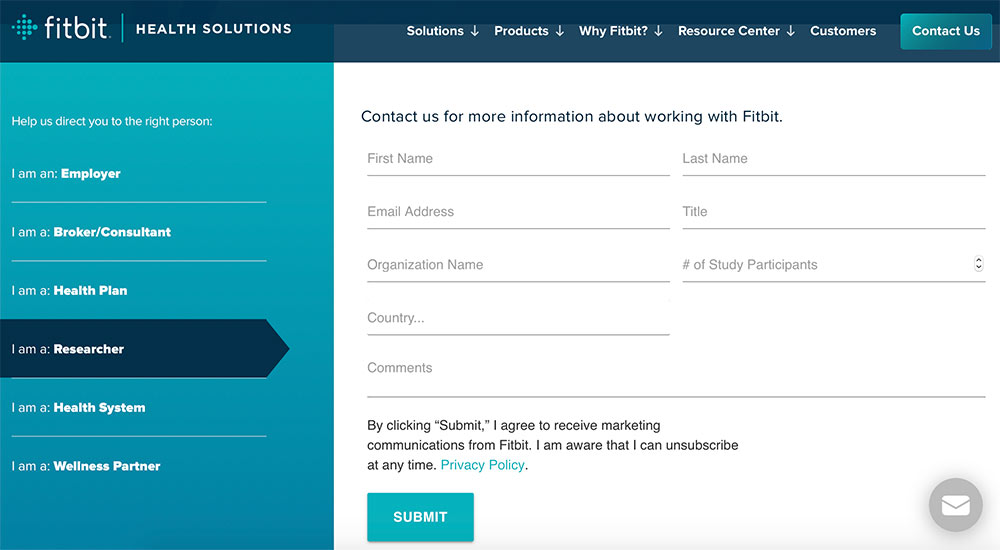
- Dynamic forms that change based on user input are helpful for multiple types of requests. For example, Fitbit Health Solutions displays the appropriate form fields after visitors provide their industry.

Fitbit uses first-person descriptors to load the right form. Click image to enlarge.
—
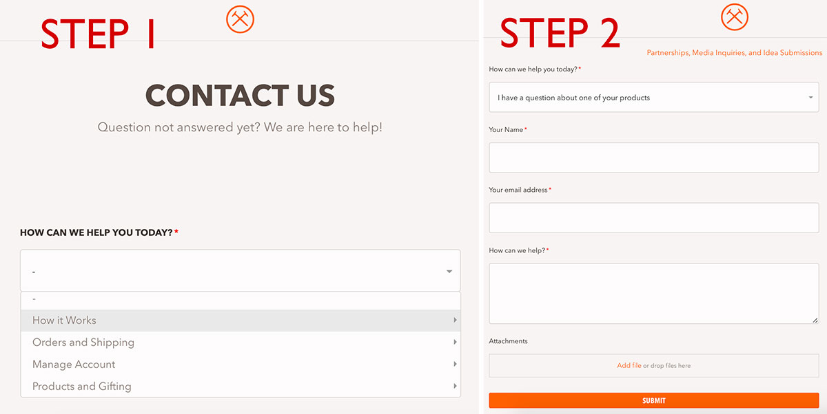
Dollar Shave Club’s dynamic contact form has two steps. Users first select a topic, and then the appropriate form appears. During the process, users can opt to use help articles.

Dollar Shave Club’s dynamic contact form has two steps. Displaying fields dynamically reduces clutter. Click image to enlarge.
No matter its style, the form should also include:
- Properly labeled fields, such as “First Name,” “Last Name,” and “Email Address.” These should appear above the corresponding input fields.
- Instructions for complicated fields. If you sell custom made dresses and need a customer’s measurements, include details about how to measure.
- Why you request a phone number. This field is often a stopping point, so ditching it can increase submissions.
- Why you request sensitive info. A fitness equipment company, for example, may ask for one’s age, weight, activity level, and goals to help guide the shopper to the best solutions.
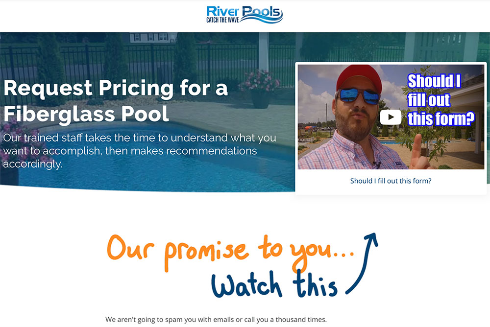
- What you do with the info. One reason people avoid forms is that they don’t want to be added to a mailing list and receive sales pitches. River Pools affirms its promise not to harass potential customers by posting a homemade video, shown below.

Put visitors at ease by stating what you’ll do with their information. Source: River Pools.
—
—
- Easy-to-understand input errors. Be sure typos or omissions are bolded and highlighted.
- An enticing call-to-action. Labeling the button “Submit” is common. But “Submit” has a lower conversion rate than “Go” or “Send.” Consider your audience and the primary purpose of the contact form to determine a more viable term. Also, color the button, so it stands out. Typically a complementary color to the overall site works well.
- What happens next. Once the action is complete, display a thank you message with details about follow-up times and practices.
Mistakes to Avoid
- Complicated spam detection. Features such as captcha and equations (e.g., “Enter the sum of 9+3.”) kill conversion rates. There are better tools to prevent spam, such as reCaptcha with a simple checkbox
- Blocking device-controlled autofill and autocomplete. Mobile users rely heavily on shortcuts to reducing typing.
- Requiring a specific format. If you ask for a visitor’s birthday, for example, use dropdown fields. They are easier and less confusing, such entering 6-15-89 versus 06/15/1989.
- Not coding numbers fields. It’s much easier to use the numbers-only keyboard on a smartphone. So make sure fields use the best input type.
- Requiring data that doesn’t apply to everyone. Do you need everyone’s physical address or just those inquiring about a lost order?
- No catch-all reason. Sometimes the reason for reaching out might not be in a menu, which can force people to fill out a plethora of fields to ask a simple question. Be sure to include an “Other” option. Then note the nature of those requests. You may need to add more menu selections.


