One of the most underutilized tools of online stores is the post-purchase thank-you page.
The thank-you page (also known as the invoice page) often contains only order details. That’s a mistake. Merchants should use this all-important page for brand recognition and sales.
Here are 10 useful elements to include on a thank-you page, and three to avoid.
Post-purchase Thank-you Page
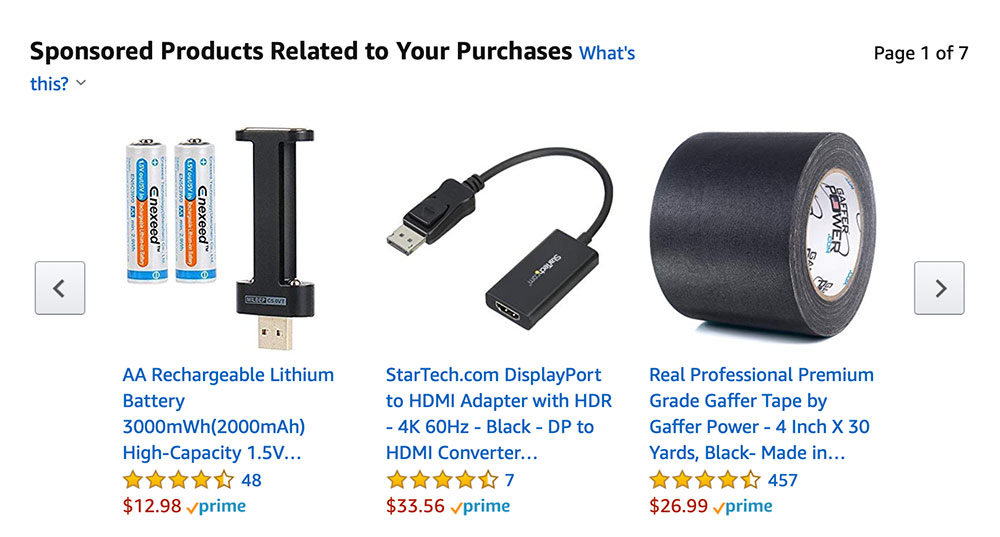
Related items. Amazon is good at this, reminding customers of accessories or related products. The example below shows items related to the purchase of batteries.

Display relevant items as reminders of other things customers might need. Source: Amazon.
Items relevant to upcoming life events. Sites that sell gifts or decorations could display content related to wish lists, upcoming events, or themes. For example, a wedding supply store may offer ideas about party favors or table decorations — the more personalized the suggestions, the better.
Sharing tools. Consumers tell friends about purchases. Make this convenient with a one-click process. Include Facebook, Instagram, and Twitter share buttons to promote word-of-mouth.
As a bonus, incorporate a contest where sharing counts as an entry. Many rebate and coupon sites do this successfully. Include the ability to share via email to help customers personalize recommendations.

Encourage shares via email and social media.
Social follow buttons. Customers are more apt to follow your brand on social networks. Be sure to include these vital links.
Customer feedback. The thank-you page can harvest valuable feedback, such as the checkout experience or usability of the site overall. Including a one-question survey can provide you with vital info.
Email sign-up. The thank-you page is a good place to encourage newsletter sign-ups.
One-click account creation. Inviting customers to create an account after the order reinforces that you seek permission (rather than doing it automatically) and helps build trust.
How-to videos. Including how-to videos for the goods purchased can minimize support requests and boost customer loyalty. Sell hair care products? Include a video of your best tips!
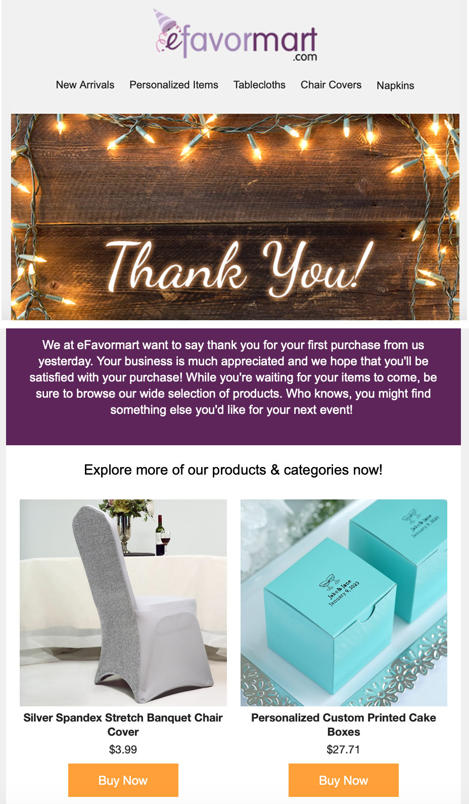
Engaging information. Find ways to keep customers engaged with your brand. The content in the email below from Efavormart, a wholesaler of party supplies, would have made for a compelling thank-you page. It includes three essential aspects: a sincere “thank-you,” basic navigation, and meaningful suggestions.

Efavormart’s post-purchase email thanks the customer and includes links to relevant content.
Contact options. Make it a breeze for customers to change order details, such as quantities or the shipping address.
What Not to Include
Merchants sometimes include the wrong info on thank-you pages. Here are examples.
Order return instructions alert customers of a potential problem. Reserve this information for the bottom of the order confirmation email.
Discount on a future purchase. Offering a discount on a future purchase can increase sales. But it can also backfire. Coupons can prompt shoppers to cancel their just-completed order and replace it at a discount. Reserve next-order deals for follow-up emails.
Words that cause alarm. Don’t ask customers if there is a problem with the order. Instead, include generic options, such as “Make changes to my order.” Avoid using “damaged,” “defective,” “we hope” and, yes, “concern.”


