A lot of design and presentation websites out there are claiming to know the 2023 color trends. But we are just 5 days into the new year, so we aren’t comfortable using the word “trend.” At least not yet. However, we do want to look at the color forecasts designers are making. So we’ve explored what designers across the fields of fashion, home décor, product design, and graphic design are saying to look for in 2023. These are colors and tones that are on the cusp of making a statement. And before long, we’ll be seeing them everywhere.
Here are the 3 things we see designers forecasting across the board: a return to red tones, a comeback for browns, and a new day for lavender. We’ll share some reasons experts are loving these colors as well as some tips for how to use them in presentation design.
A Return to Red Tones
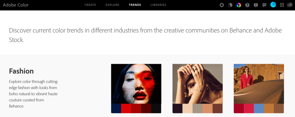
Of all the forecasted trends, a return to red seems to be the biggest one. Check out the presence of red tones on the front page of Adobe’s Color Trends library.
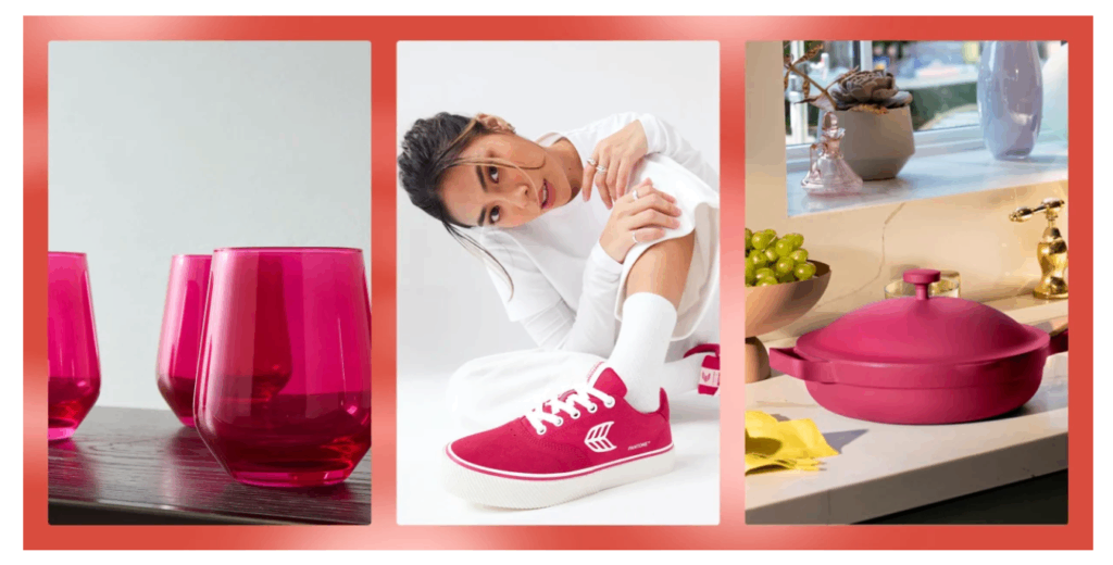
 “Vibrant orangery-reds” came in at number one on House Beautiful’s list of 9 big color trends for 2023. And Pantone’s color of the year is Viva Magenta.
 This bold reddish pink color is already starting to pop up everywhere. So it probably won’t be long until it’s making it’s way into PowerPoint presentations and Google slide decks. A word of caution, though. If you choose to use red in your presentation design, you’ll want to keep audience members who have color vision deficiency (more commonly known as color blindness) in mind. Aside from green, red is one of the most difficult colors for people with color vision deficiency (CVD) see. To see how your color palette looks to someone with CVD, use Adobe’s color accessibility tools.
A Comeback for Browns
According to experts, gray has had its day. But now it’s time for browns to make a comeback. Director of Color Marketing at Sherwin-Williams, Sue Wadden, says, “Brown is an earth tone, meaning it makes us feel grounded and more connected to nature.” She says that brown tones can bring both warmth and energy to a design. Admittedly brown tones might be picked up more quickly in home and fashion design. But they can work in graphic design too. Check out the prominence of brown in the UI/UX gallery section of Behance.
 When designing your presentation media, think about subbing black and gray for brown tones. For example, see how a rich brown text can bring depth to your slide deck. Or use shades of brown for a trendy, monochromatic color scheme.
A New Day for Lavendar
Our final color forecast is lavender. One trend forecaster even picked this as the color of the year. (You might have figured out by now that there’s really no such thing as just one color of the year. Each organization picks its own. That’s why we pay attention to the patterns we see repeated across the board as we forecast.) Color experts Coloro + WGSN specifically named Digital Lavendar as a color to watch in 2023 because it promotes feelings of wellbeing. Why? Kelsey Mulvey explained the research done to come up with this particular shade. She says, “Not only did research suggest that purple has a shorter wavelength—which often promotes a sense of calmness and balance—but this specific pastel shade has been on the rise since the Spring/Summer fashion collections.”
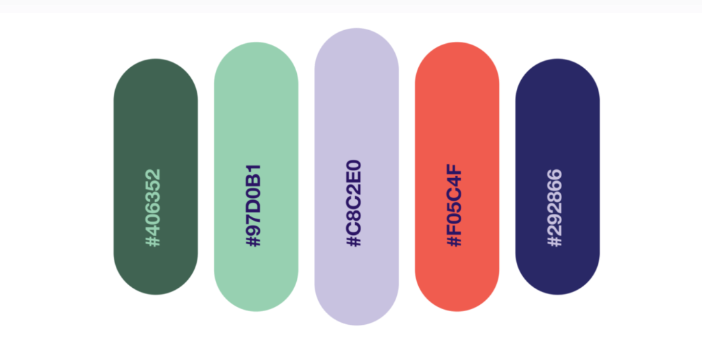
In November, one of our own presentation experts shared the 7 best color combinations for your next presentation. The color scheme he named as best (shown below) featured lavender as the most prominent color.
 Lavendar can work well in both the foreground and background of slide design. The key is to make sure you contrast it appropriately with other colors.
Experimenting With New Colors
Color choice can make all the difference in your presentation design. Not just with how your slides look, but also in the feelings they promote for your audience. Remember, colors are communicating. Check out what Ethos3 CEO Scott Schwertly has to say about color theory basics.
Then, take time experimenting with these hot reds, browns, and lavender tones on your next presentation (though we don’t recommend using all these colors in the same slide deck). If it feels too overwhelming to start from scratch, pick one of your older slide decks and simply change the colors to reflect one of these new forecasted trends. A quick color palette change is an easy way to make your presentation media look modern and fresh.
If presentation design isn’t something you have time for, or if it falls outside of your skillset, it might be time to collaborate with the experts. We’d love the chance to talk with you about how our expert design team can take your presentation to the next level. Get in touch with us now.
The post 3 Presentation Design Colors Forecasted to Be Hot in 2023 appeared first on Ethos3 – A Presentation Training and Design Agency.
Looking For Powerpoint Design Agency?
Call Pursho @ 0731-6725516
Telegram Group One Must Follow :
For Startups: https://t.me/daily_business_reads
#Presentation #Design #Colors #Forecasted #Hot


