Many of us tailor our home office spaces carefully to help us work comfortably and efficiently—I know I spent hours choosing my desk surface, rug, and other accoutrement. In this process, we often forget to take the same care of our computers. Your Mac is just as much of an “office space” as your physical office: it’s the portal via which you accomplish all of your work, so you should take the effort to configure and optimize it for productivity.
Just so you know what you’re getting yourself into, here’s what my desktop looks like:

I know: boring. But bear with me—you might thank me later.
8 tips, tricks, and tools to simplify your Mac experience
As a professional musician, I learned not to practice while looking in the mirror too often because it takes up too much “brain juice”—our brains spend a lot of energy processing visual information. Watching myself play takes away from what actually matters: my ability to evaluate the sound I’m creating on my instrument.
Similarly, computers often present us with superfluous visuals. As knowledge workers, we don’t need as much visual feedback, which means we can reduce distracting interface elements and on-screen clutter.
Here, I’ll suggest a few apps to fill gaps in macOS’s native functionality, plus a few unconventional minimalist tweaks to supercharge your workflow.
1. Use the Focus feature
macOS Mojave introduced Focus, a way to filter your notifications. I set up a work Focus that only allows emergency contacts and Zapier colleagues to contact me during my working hours. I also have additional Focuses (Foci?) set up for practicing music, sleeping, and exercising.
For those of us with an iPhone, Focuses set on your Mac will be mirrored automatically on mobile, keeping your phone notifications in check. I mention this native feature first because it’s had a profound positive impact on my concentration. It’s great to see Apple giving care to our attention spans.
2. Create separate users
Consider creating separate user accounts for personal and work computing. You can, for instance, only sign into Slack with your work user and only sign into Messages with your personal user to keep things compartmentalized. In System Preferences > Touch ID, be sure to set up a different fingerprint for each user for fast switching.
3. Use keyboard shortcuts
Mice and trackpads aren’t terribly efficient input devices if only for the fact that the repeated maneuver of relocating your hand from your keyboard to your mouse and back causes a small but measurable time-loss. This adds up!
As a Customer Champion at Zapier, I use Zendesk shortcuts all day to keep my fingers on the home row so I can focus on our customers, not my computer. There are keyboard shortcuts for Zoom, Gmail, and probably every other app you use. You can even create your own shortcuts, or take it to the next level with a tool like Keyboard Maestro.
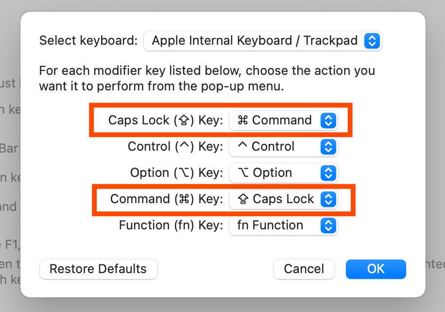
If your pinky starts to get tired hitting command so much, you can actually swap the caps lock and command keys on your Mac’s keyboard under System Preferences > Keyboard > Modifier Keys.
4. Clean up your desktop
Consider not using your desktop—ever. Desktop environments are an imperfect solution to an age-old multitasking problem (more on this later). That’s why I recommend forgoing folders and icons on your desktop altogether. Here’s why:
-
Not having icons on your desktop means less visual clutter overall.
-
Not having icons on your desktop means you’ll need to make proper use of your home folder and sort files actively.
-
Not having icons on your desktop means applications don’t have to compete with other things for screen real estate.
If you need to drag and drop files, say, into an email or from a web page to save, you can always use a Finder window instead.
While you’re at it, try out a plain/colored background instead of a desktop wallpaper. For starters, it’s not visually distracting. But it also reminds me, when I’m in front of my computer and presented with a blank slate: I’m here to create, not to consume. Pretty pics and videos can wait for after hours.
5. Don’t use Dock
If you don’t use Alfred, consider this a shameless plug. I use it for snippets, to retrieve passwords, and a million other things. An obvious but often overlooked function of Alfred is the ability to start apps quickly by invoking your keyboard shortcut and typing the app’s name. If that sounds like a lot of work, give it a try, and keep in mind how much screen real estate the macOS Dock uses, how much time it takes to appear when hidden, and how much time you spend hunting for apps using your mouse.
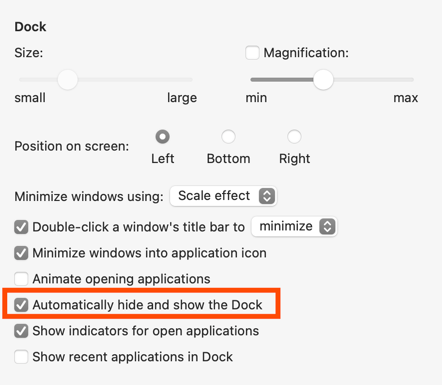
Honestly, just hide your Dock: System Preferences > Dock & Menu Bar > Automatically hide and show the Dock.
TinkerTool is another great free app that allows you to disable some superfluous visual elements in macOS. In particular, consider disabling automations for the Dock and Launchpad. Once these are turned off, you’ll be surprised how much more responsive these elements are should you need to access them quickly.
6. Remove menu bar and toolbar icons
Many macOS native apps have toolbars with icons that you can customize. In Apple Mail and Finder in particular, these icons can take up a lot of space. Consider disabling them altogether (dragging all icons out of the toolbar) or at least switching from icons to clickable text instead. This not only reduces visual clutter, but will also encourage the use of keyboard shortcuts.
I use Bartender to better manage the icons in my menu bar. I especially like the Show for Updates feature, which allows you to show menu bar icons only under certain conditions. Here are a few conditions I’ve set:
-
Show the battery icon only when battery charge is less than 40%.
-
Show the Wi–Fi icon only when not connected to a Wi-Fi network.
-
Show the VPN icon only when not connected to the VPN.
In general, aim to show as little as possible in your Mac’s menu bar—only what’s necessary to see all the time. You can always click into Bartender if you need to dive deeper.
7. Manage your windows
With multiple monitors and ultrawides being all the rage, it’s easy to get lost in a sea of open apps and overlapping windows. Understanding how bad humans are at multitasking has led me to reevaluate my approach to screen real estate while working.
Perhaps the most radical change I’ll suggest here has to do with window management. At Zapier, many of us use tools like Magnet or BetterSnapTool to snap/split windows quickly. These are both great, but they rely on the user to decide how windows are arranged on the monitor. If you’re like me and prefer to work with a maximum of two or three apps at a time, try out a tiling window manager instead. On the Mac, I use Amethyst. Here’s what it does:
-
When an app is launched, its window is automatically maximized on my desktop for full screen use. Note: This is not the same as a Mac app in “full screen” mode, which moves the app off of your desktop.
-
When another app is launched, a vertical split is introduced, and your apps are automatically resized, so each will take up half of your screen left to right. This works particularly well on an ultrawide monitor with a 21:9 aspect ratio, as splitting the monitor vertically produces two 4:3 aspect ratio spaces—a very comfy size for working with web apps.
-
When a third app is launched, the right side of the screen is split horizontally. The third app now takes up the bottom half of the right side of my screen.
-
If any app is closed, remaining apps are automatically resized to fill the space and splits are adjusted accordingly.
With this approach, you’ll never need to use Mission Control again to find overlapping windows. Amethyst even allows you to set exceptions, so apps that require only a small window can still float as needed—like if you need to quickly launch System Preferences to make a change.
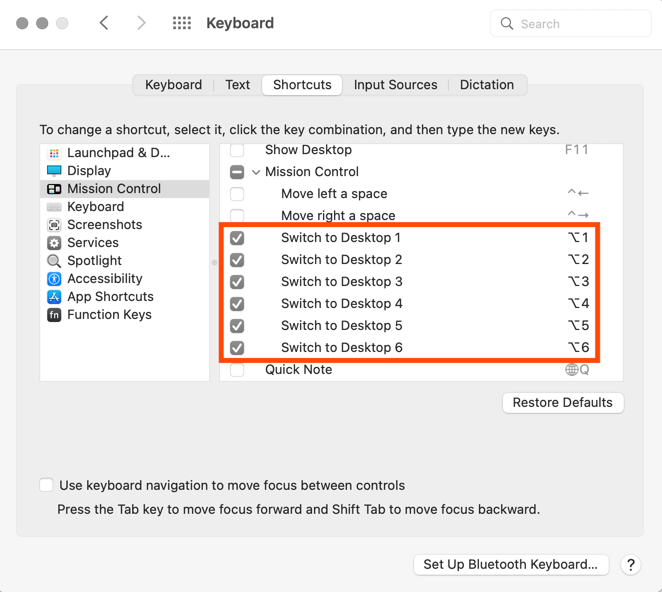
There’s more to my window management flow, though. In Mission Control, I add six static desktops and set the appropriate keybindings in System Preferences > Keyboard > Shortcuts > Mission Control so I can switch between them quickly:
-
option+1: Switch to desktop 1 -
option+2: Switch to desktop 2 -
option+3: Switch to desktop 3 (and so on)
(Tip: In Google Chrome, you can use command + <tab number> to quickly move between tabs. This, combined with the keybindings above, provides a super fast way to navigate both browser tabs and desktops on your Mac without ever touching your mouse.)
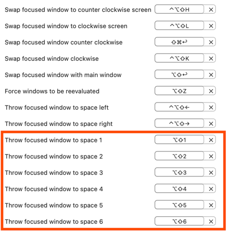
Amethyst’s preferences include bindings, so focused apps can be quickly moved between desktops. I personally use shift + option + <desktop number>.
I also use a handy app called SpaceId, which shows me, in my menu bar, which desktop I’m currently working in.

Using Amethyst for window management in this way has completely changed the way I use my computer and saved me countless mouse clicks. As an added bonus, I no longer see any reduction in productivity when I’m without my ultrawide monitor. It makes working on my 13″ MacBook Pro screen no less comfortable since I always have additional desktops available to quickly switch to.
On a typical workday, my desktops might be arranged as follows:
-
Desktop 1: Chrome: two windows split when I’m using my ultrawide monitor
-
Desktop 2: For a second Chrome window when helping customers
-
Desktop 3: Slack
-
Desktop 4: Apple Music
-
Desktop 5: Emacs (note-taking / to-dos / development learning)
-
Desktop 6: Firefox / Messages (personal apps)
8. Clean up your browser
I use Chrome for all work-related activities and Firefox for my personal browsing. It’s great to be able to compartmentalize my browsing since I don’t want my history, bookmarks, or logged-in accounts conflicting. Choosy is a great app that allows you to choose which browser opens under certain conditions. Under System Preferences > General, with my default browser set to Choosy (as opposed to Chrome or Firefox), here are some of the conditions I have set:
-
When clicking a link in Slack, always open it in Chrome.
-
When clicking a link in Messages, always open it in Firefox.
-
When opening a URL from Alfred, ask me which browser to open.
(And before you ask, yep, Choosy also works with Chrome profiles.)
I’d also suggest removing search suggestions in Chrome. If you’re like me, you keep a ton of bookmarks filed. Even so, sometimes it’s a chore to find the right bookmark when typing in the URL bar. You might consider disabling the “Autocomplete searches and URLs” option in Chrome so that when you type “dashboard,” for instance, Chrome only suggests URLs related to your bookmarks rather than pictures of car dashboards: Chrome > Settings > Sync and Google services > Autocomplete searches and URLs.

Investing in some of the small optimizations I’ve suggested here will pay big dividends down the road. Don’t lose the opportunity to front-load more optimizations that suit your personal working style. Most importantly, don’t be afraid to simplify—after all, you’re a Mac power user!
[adsanity_group align=’alignnone’ num_ads=1 num_columns=1 group_ids=’15192′]
Need Any Technology Assistance? Call Pursho @ 0731-6725516

