Collecting data often requires tools that can’t be found in Excel spreadsheets, form builders, and survey apps, especially for those working in the field. Depending on the use case, data collectors may need to capture images, video, and GPS coordinates, then complete a questionnaire, all before signing off on the form and sending it in. Data collection apps allow you to do much more than just record responses, whether you’re in the field or working from an office.
Here, we’ll look at how these relatively easy-to-use apps can help your team maximize productivity, reduce errors, and increase the speed of your data collection. We tested the most popular data collection apps and selected the five best, each with features that make them stand out from the rest.
The 5 best data collection tools
What makes a great data collection tool?
How we evaluate and test apps
All of our best apps roundups are written by humans who’ve spent much of their careers using, testing, and writing about software. We spend dozens of hours researching and testing apps, using each app as it’s intended to be used and evaluating it against the criteria we set for the category. We’re never paid for placement in our articles from any app or for links to any site—we value the trust readers put in us to offer authentic evaluations of the categories and apps we review. For more details on our process, read the full rundown of how we select apps to feature on the Zapier blog.
All of the apps we review here allow you to work offline—no cell or Wi-Fi connection needed—which means you can work from any location no matter how remote. This is an essential requirement for collecting data in the field.
For evaluating all of the apps we researched and tested, we looked at these criteria:
-
Unique feature(s) or something that makes the app stand out.
-
Relative affordability. Some of the plans include multiple users, so we looked at how those costs broke out when maximized on a per-user basis. We also compared limits on form submissions and storage.
-
Integration options with third-party apps, or a way to connect apps with an API or service like Zapier.
Now, on to the first selection.
Best data collection app for pre-filling form data
Device Magic (Web, iOS, Android)
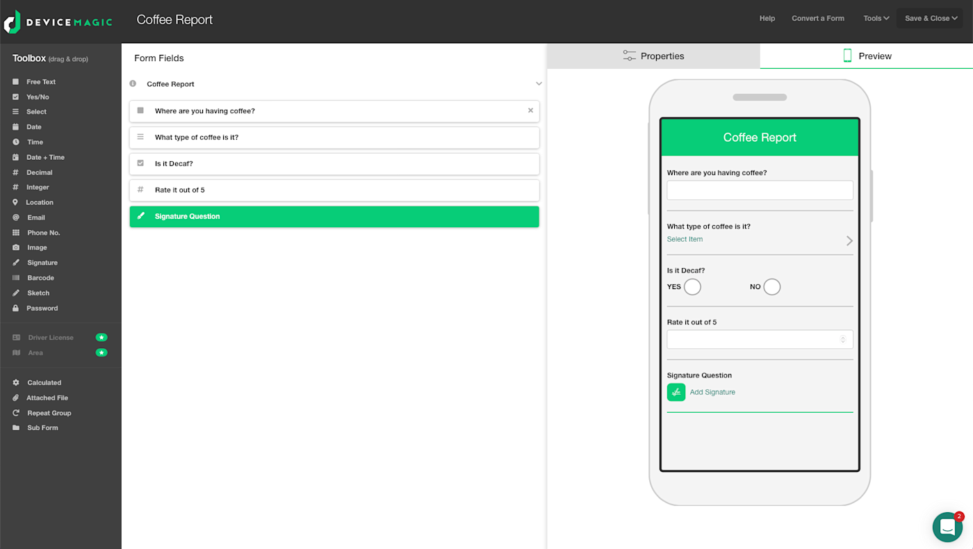
Whether your team is conducting a survey or running a job site, project needs can change—and sometimes on a dime. Device Magic lets you instantly send pre-populated forms to field users to help automate the data process and keep everyone on the same page. The feature is called Dispatches. Here’s how it works.
Let’s say you’re running a construction project on a new commercial building. One of the forms you create might be a daily job report with data fields for tracking each aspect of the project. To create this, go to the Forms tab, click the New form button, and then name the form at the top left. Then, on the left side, you can drag and drop fields such as free text, date, location, and so on to the middle of the screen. On the right side, add a field name, and pick any applicable advanced features. These are things like making the field required with conditions (e.g., include an image if the project is labeled new). As you add fields, click on Preview to see what the mobile form looks like. Click Save, and you’re ready to add a Dispatch to your daily job report.
After clicking the Dispatches tab, click the New Dispatch button. From the two dropdowns, select your form and a user. Users are those who have downloaded the phone app and have been verified by the admin (you). They are the recipient(s) of the Dispatch. Now the daily job report form will load on the screen, and you get to pre-populate any of the fields. Here are some examples for the daily job report:
-
Fill in the date, location, contract number
-
Add a new contractor’s name
-
Add new materials, equipment, and labor for the day’s activities
What you choose to add can do two things: (1) It may just be info that saves your field workers time from having to type in the data. (2) It may be new info your team needs to know for that day’s work, like a last-minute addition of material and labor to finish a job ahead of schedule. As the admin, you can also add comments to the form to explain the Dispatch: Iggy, I’m sending over Vlad so he can finish the basement today and close this contract early. Will explain more in the meeting. Then you send the Dispatch immediately or schedule it to send on a particular day and time using the options at the bottom.
Once sent, it will pop up in the Dispatches tab in the user’s mobile app (when I sent mine, it appeared within a few seconds). Clicking on this will bring up a list of outstanding Dispatches, starting with the newest. They remain here until they’re submitted. The Dispatch will look just like your regular form, except that it will have your pre-populated info and comments. If you need to add anything to the populated fields, just tap Add Item. Any other fields, such as signature, image, and barcode, can also be added from here. Once you’ve completed the form, tap the green checkmark at the bottom. This will email a PDF to the admin and show as a submission in the dashboard.
As an added benefit, Device Magic integrates with Zapier, so you can do things like automatically send a Slack message to your team when you receive a new form submission, or add new Google Sheets rows based on form data.
Device Magic Pricing: Free 14-day trial of all features; the free plan includes unlimited forms and submissions for one device. The Professional plan is $25 per device with a minimum of three devices. The Dispatch feature and Zapier integrations are only available with the Enterprise plan (get a custom quote).
Best data collection app for geolocation and custom maps
Fulcrum (Web, iOS, Android)
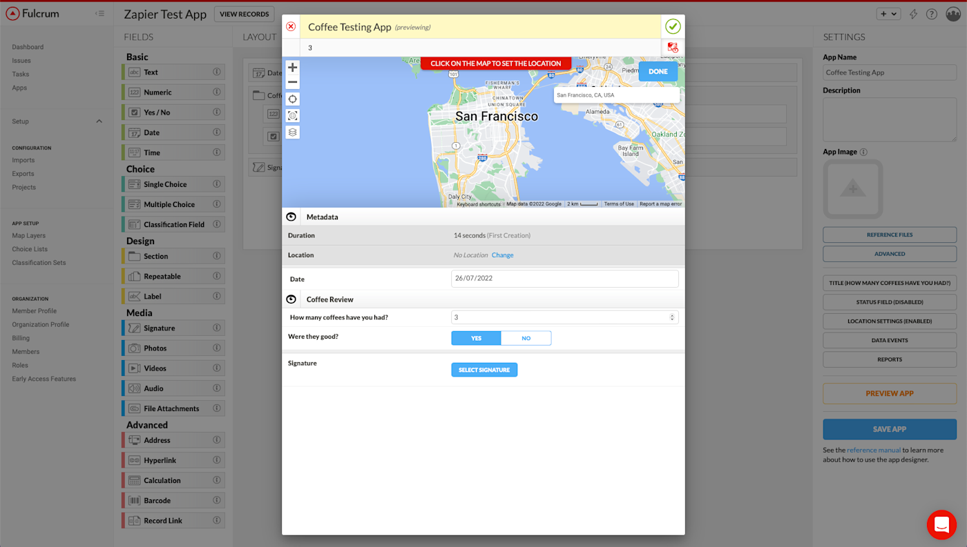
Fulcrum is an inspection-focused data collection app with advanced geolocation features. It’s built on Google Maps, which lets you use street, satellite, hybrid, and terrain basemaps, and supports custom map layers from OpenStreetMap, Mapbox, Esri, and others. The app also automatically geo-tags photos, video, and audio even without cell or Wi-Fi coverage.
Some of Fulcrum’s targeted industries include oil and gas, environmental, and utilities because of their need for gathering real-time geospatial and safety data. Normally data collectors in these fields would simply receive a text-based list of GPS locations, which is difficult to analyze and understand. With Fulcrum, they can overlay those GPS locations onto a variety of different maps to better understand and visualize patterns from their data.
After you sign up for Fulcrum, you’ll choose whether to build your form from scratch with a drag-and-drop editor or select an app template from the library (note that Fulcrum refers to forms as “Apps” throughout the UI). You can collect almost any type of data, including audio clips, signatures, videos, or barcodes.
Once you’ve created the form on the web, you’ll need to access it from your mobile device to collect responses. Log in to the iOS or Android app, and you’ll see all your forms displayed on the first screen.
As you start receiving form submissions, you can begin to overlay the submission locations onto different basemaps and map packages. In the Android version of the Fulcrum app, click Locate at the bottom. By default, you’ll see dropped pins on the street view of Google Maps. If you click the layers icon on the right-hand side, you can change the basemap view to aerial/satellite, hybrid, or terrain. You could, for example, plot form data about new homes being built onto a Google Street View map to see how your building plan will impact the entire neighborhood.
You’ll also see three dots at the top-right of the screen. Clicking this Layers tab will allow you to access custom layers that you have either uploaded directly to your device or added to Fulcrum through the web app.
If you need to share your form data, Fulcrum allows you to export it in ten different formats from the web app, including Excel, CSV, and Shapefile. You can also create PDF reports from your iOS or Android app and share them via email, SMS, Dropbox, or any other supported app on your device.
And because Fulcrum integrates with Zapier, you can more easily act on form data using your favorite apps, like creating a task when a new Fulcrum record is created or adding a new email subscriber based on form submissions.
Fulcrum Pricing: From $22/user/month for the Essentials plan that includes 20 GB storage.
Best data collection app for interactive voice data collection
Magpi (Web, iOS, Android)
In some situations, collecting data in person may be difficult and expensive. Remote areas and places affected by natural disasters can be unsafe for field staff. And even under ideal circumstances, sending data collectors into the field is expensive and time-consuming.
Magpi helps solve these issues with their interactive voice response (IVR) forms. This feature allows you to deploy your forms as interactive voice phone calls, where respondents answer questions by pressing their phone’s (mobile and landline) numeric keypad. Think: “Press 1 for sales or 2 for service.” Simple, scalable, and fast.
Note: During my test, Magpi was in transition between their legacy app and their new version, which will see quite a few design and feature updates. Though I tested both, only the legacy product had the IVR feature available, so that’s where I spent most of my time. The new app will have IVR and a new internet-based chat feature that will increase functionality and lower costs over the current SMS feature.
I was expecting first-time set-up and implementation of an IVR to be a challenge, but it was surprisingly easy. If you can create a form, you can create an IVR form. As you think about the content of your form, keep a few things in mind. The questions will be asked by an AI voice, so try to use simple, easy-to-understand words in short sentences. You’ll make it easier for the respondent and increase the odds of a completed response. Also, you’ll want to ask either multiple-choice (radio button) or numeric range questions (no photos and signatures).
Here’s a quick example of a retail store customer survey and how to design and deploy it:
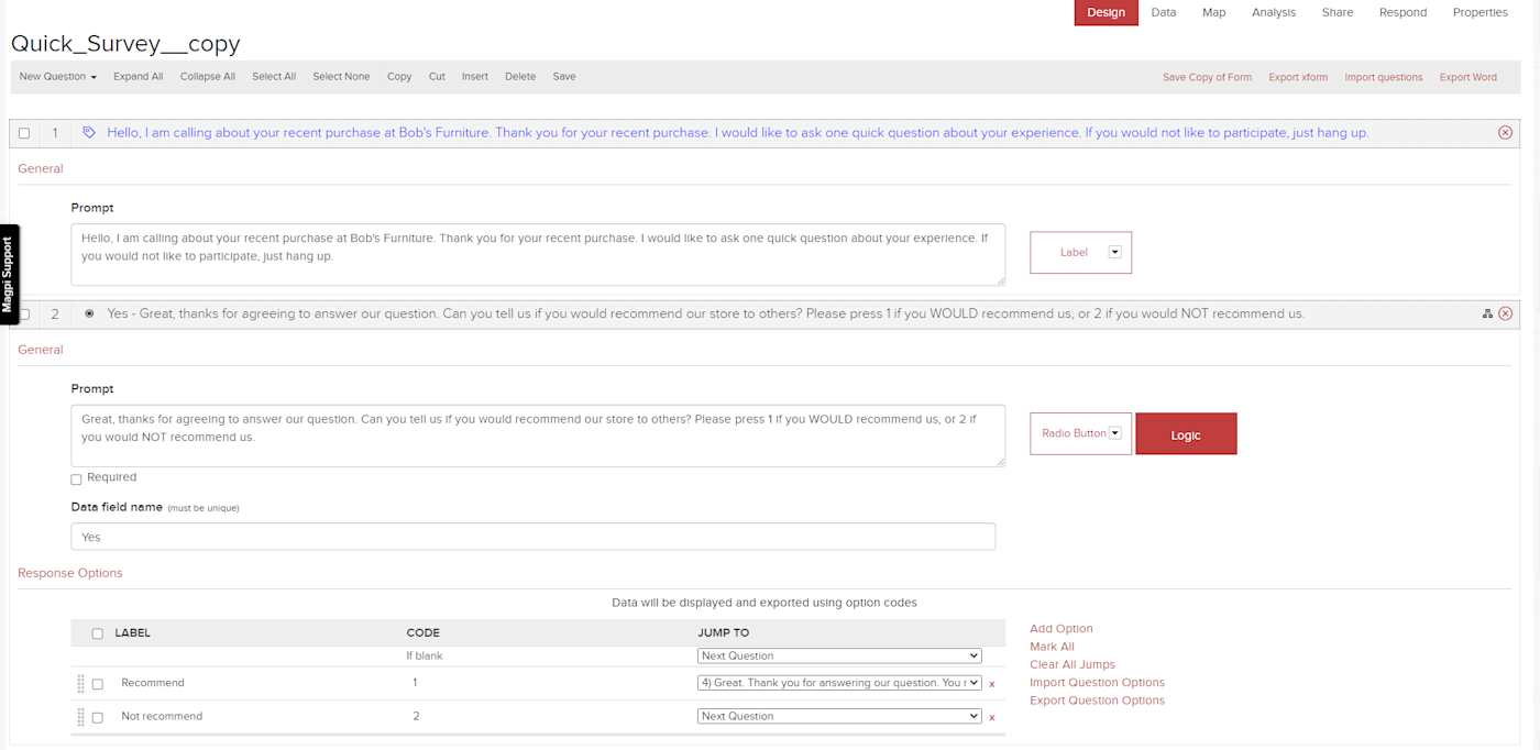
Click New from the list of forms on the home screen, and label it at the top-left. From the New Question dropdown, click Label. Labels are for info only. In the Prompt box, type in: Hello, I am calling about your recent purchase at Bob’s Furniture. Thank you for your recent purchase. I would like to ask one quick question about your experience. If you would not like to participate, just hang up. This is your call’s introduction. Now you want to create a multiple-choice option where the respondent is asked several questions.
From the same question dropdown, click Radio Button, and in the Prompt box, type: Great, thanks for agreeing to answer our question. Can you tell us if you would recommend our store to others? Please press 1 if you WOULD recommend us, or 2 if you would NOT recommend us. Then give the data field a name, and below that, label the two response options with “recommend” and “not recommend,” followed by the telephone response codes of 1 and 2.
In this section, if the user pressed 1, you would use skip logic, moving the call to the last prompt, where you would wrap up the call by creating another label similar to the first one: Great. Thank you for answering our question. You may hang up now. Then, in the response options box above for “recommend,” click the Jump To dropdown and select 4, the prompt you just created. This links and “jumps” the call to this final message.
But if they selected 2, you would create another prompt: I’m sorry to hear that you would not recommend our store! A store manager may call you to find out more and to find out how we can improve.
When you’re finished and ready to deploy your IVR form, click Save and then Share toward the top-right. Then click the Interactive Voice Responses sub-tab. Enter the recipient phone numbers, select the language from a list of 17 options with various accents, specify the timing, and click the Initiate IVR Sharing button. I tested it a handful of times, and each call survey came in within 30 seconds of initiating. Now click the Analysis tab (next to Share) to see the results of your survey, which show up immediately.
You can also extend Magpi’s capabilities with Magpi’s Zapier integrations, allowing you to more easily connect form data to other apps, like Google Sheets or Excel.
Magpi Pricing: $250/month for up to 15 data collectors; $500/month for the Pro plan, which includes SMS and IVR data collection; $1,500/month for the Enterprise plan for access to Magpi’s Zapier integrations.
Best data collection app for overall ease of use
FastField (Web, iOS, Android)
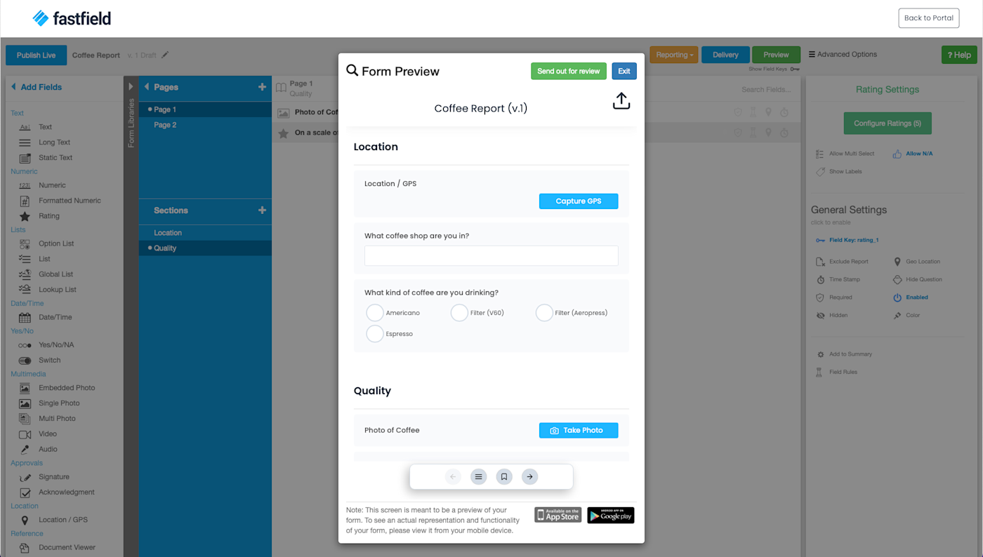
FastField makes the entire data collection process easier, from designing and validating a form to the many options for creating and sending your data. And this isn’t to say it’s a simplistic app—FastField is filled with advanced features. We’ll get to those in a minute. First, we’ll look at how to create and send a form.
When you first sign in to your FastForm account, you’ll get a tutorial on creating a form. This visual with instructions gives you a good idea of what to expect when you create your first form. From the portal, click New Form and Form from the dropdown, which brings you to the form designer. On the left side column are your fields, and to the left of each field name is a little hidden question mark. Hover over the field name and then the question mark to see an explanation for that field with an example.
To move a field into the middle white space, just click it. No drag and drop needed. If you need to rearrange the order of the fields on the form, then you can drag and drop them. For each field you add, a settings section appears on the right. Here, you can turn on things like timestamps, geolocation, and field rules. Hover over any of these options to get a brief explanation of the setting, and then just click on one to set it for that field. Each setting will then appear on that field as either a grayed-out icon (not set) or highlighted in blue (set).
When your form is complete, click Save Draft and then Preview. Here’s where some of the magic happens. Not only will you see what the form looks like, but you’ll also get to test each field (e.g., upload an image), validate it for errors, and then make a copy (PDF, Word, HTML, etc.) to see what the completed form looks like. When you’re satisfied, click Delivery to set how—email, Dropbox, Google Drive, and others—you want a completed report delivered and in what format (PDF, Word, etc.).
Here, you can also connect other apps using Zapier and a FastField-provided API key, which I received from their tech support. I connected FastField with my Slack account to get notified in my #general channel any time a report was completed. To test, I then completed my form in the phone app, submitted it, and confirmed that all deliveries were made: email, Slack, and Google Drive. Here are a couple other ways you can connect FastField to the other apps in your stack.
FastField Pricing: Free 14-day trial; $20/user/month for unlimited forms.
Best data collection app for form-building options
JotForm (Web, iOS, Android)
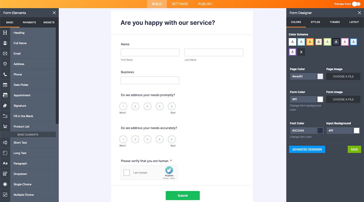
Imagine creating a form with GPS directions, a BMI calculator, and Chuck Norris jokes (seriously). Then link a Stripe account to accept payments through that form. This may be a mythical combination, but it’s all possible with JotForm. The app’s hundreds of widgets and 10,000+ free, customizable templates make almost anything possible when it comes to forms. Let’s take a look under the hood.
First, sign up for a free account so you can test drive it. You’ll get access to all of the key features, templates, and widgets. In your portal, click Create Form. Your options are creating a form from scratch, using a template, or importing an existing form. Let’s pick a form template from the library. Here you can narrow your search by type, industry, language (several dozen), and popularity. Many of the templates have presumably been submitted by organizations from around the world, so may contain their branding and copy. This is very easy to change or delete using the form designer, which lets you completely customize your form’s appearance. You can also use their CSS designer with codes provided by JotForm.
Once you have the design finished, you can start adding from elements (fields) with a click or drag and drop onto the template in the middle of the screen. These include basic fields such as name and image, plus things like input tables for rating products or services using multiple criteria on a scale you design. If you need to modify or delete any field, click on that section within the form and click either the settings wheel or the remove button.
The next column of options under elements is the payments section. Here, you can set up payment gateways (e.g., PayPal, Stripe, Square) to your form to collect payments, donations, fees, or purchases. This lets you add email order confirmations, coupons, and will calculate shipping and taxes, among other options.
The final column is for adding widgets. These are pre-built but customizable calculators, maps, scanners, graders, gadgets (dice roll), and embedding options for videos and social media. Just click to add and then customize as needed.
Once you’re done, get a view of your masterpiece by sliding the Preview Form button to the right. Not only can you see how it looks on a desktop, tablet, and phone, but you can also test all of your fields. Or to avoid this, click Form Fill to let the app do the work for you. From here, adjust the form’s settings, such as sending emails after submissions and selecting conditions for each field. If you need to integrate a third-party app, you also do that here. Finally, the Publish tab provides options for embedding the form on your site, assigning it to someone else using a link, or creating a fillable PDF to send out.
My only complaint with JotForm is that each of their plans up to Gold ($79/month) is limited to a single user. The only way to have multiple users on one plan is to purchase the Enterprise plan, which has tiered by-user pricing starting at $79/month with a minimum of five users (schools and nonprofits get a 30% discount). So if you had a team of data collectors, Enterprise is the only option for users to share and collaborate on forms. See more details here.
Once you start getting form submissions, you can automate data entry into other apps with JotForm’s Zapier integrations.
JotForm Pricing: Free for five forms, 100 monthly form submissions, and 10 payment submissions; $24/month for the Bronze plan, which includes 25 forms, 1,000 monthly form submissions, and unlimited storage.
Whether you’re surveying a site or compiling compliance reports, these apps will help you gather the information you need from the right people, stress-free. You no longer have to worry about duplicating data, keeping track of paper forms, or finding an internet connection—all your data will live in one place that your whole team can access at any time.
Originally written by Matthew Guay, this post has also had contributions from Emily Esposito.
[adsanity_group align=’alignnone’ num_ads=1 num_columns=1 group_ids=’15192′]
Need Any Technology Assistance? Call Pursho @ 0731-6725516


