Unlike many digital marketing tactics (think: social media, ads, blog posts), emails offer the opportunity to personalize communication to your customers. You don’t have to broaden your message to thousands of users nor compete with other brands for real estate. With apps like ConvertKit or Mailchimp, your emails can land directly in users’ inboxes, creating one-to-one conversations.
Whether you have 20 customers or 20,000, companies of all sizes need a reliable, scalable email marketing app. But, not just any email tool can do the job. You need a solution that offers personalization, automation, and robust reporting features to help you send the right message to the right person.
In this post, we’ll look at ConvertKit versus Mailchimp, two of the most popular email newsletter apps for small businesses. These apps go above and beyond simple email marketing, allowing you to create complex automated email campaigns, forms to generate leads, and landing pages.
Here’s how they stack up.
Important features of an email marketing tool
ConvertKit and Mailchimp provide the basic features you need to run an email marketing program: list management, email creation, automated emails, and reporting. They also offer landing pages and forms, allowing you to generate leads.
But the two apps differ in terms of sophistication of the email editor, A/B testing, and automated emails. ConvertKit and Mailchimp also offer different pricing models. For this article, we’ll be primarily comparing Mailchimp’s free plan to ConvertKit’s features for customers with fewer than 5,000 subscribers.
Mailchimp’s free plan doesn’t include all the advanced features of its paid plans but does include a wide range of powerful features to send emails, build forms, and publish landing pages. And, for companies with larger subscriber bases that also want advanced features (like segmentation or custom templates), the paid plans are very affordable — the Standard plan that Mailchimp recommends is just $14.99 per month.
ConvertKit doesn’t offer any free plans, but you can try the service at no cost for 14 days. After the free trial period, the paid plans start at $29 per month for up to 1,000 subscribers.
Ultimately, the best app for you will depend on the complexity of your email program and your marketing goals. Here are seven features we’ll compare to help you make your choice. Click on the section that matters most to you or go directly to the comparison table.
User interface
ConvertKit and Mailchimp have areas of confusion, but Mailchimp’s email editor stands out.
ConvertKit’s interface fluctuates between confusing and intuitive. Some experiences, like setting up workflows, are effortless thanks to bold buttons guiding you along the way. Other features, like segments or reporting, seem to be hidden away. Segments live on the lower half of the Subscribers page, tucked away in a small right-hand column. Reporting doesn’t appear on the navigation, and instead, you have to go into Broadcasts to see any email metrics.

ConvertKit also has its own vocabulary, making it harder for a new user to understand. “Sequences” refer to automated emails, but “Automations” are customizable workflows. ConvertKit also uses “Broadcasts” instead of “emails.”
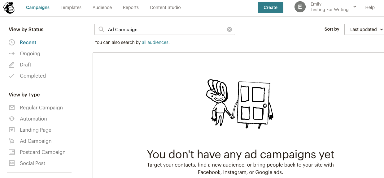
Mailchimp’s interface follows a similar structure, with a top navigation listing out the various functions. Mailchimp’s word choices are easier to understand thanks to familiar words like campaigns, templates, and audience. Many of the editing experiences are drag-and-drop, which is a step up from ConvertKit.
However, Mailchimp’s expansion from only offering email marketing to now offering landing pages; Facebook, Instagram, and Google remarketing ads; forms; printed postcards; and social posts, has cluttered the overall user interface. For example, the Campaigns tab is where all these types of marketing assets live, but the Templates tab only houses email templates. Navigation is also confusing — you can build a landing page in the Campaign or Audience tabs, neither of which is an intuitive place to look for a landing page builder.
Email creation
ConvertKit offers basic email creation in a WYSIWYG editor; Mailchimp’s drag-and-drop editor is more robust
ConvertKit’s email creation experience remains at the most basic level. All formatting and content are inserted via a WYSIWYG editor, which feels like a blast from the past. The customization options are limited, allowing you to change the font size, color, and alignment, or add images and files.
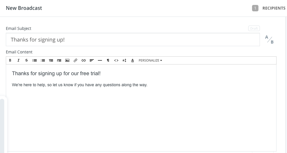
If you want to do any further customization or advanced formatting, you would likely have to go into the email’s HTML and edit the code yourself. If you’re not familiar enough with HTML, ConvertKit offers three basic templates to help you with layout.
To its credit, ConvertKit is working on a new editor (currently in the beta stage). The interface is much improved thanks to a totally clean text editor. As you type, a + icon appears, and when you click it, formatting options appear, including customization options (like allowing you to insert a button, HTML block, or divider).
On the other hand, Mailchimp offers more flexibility and visual aesthetic when creating an email. You can choose from 14 layout templates that have pre-placed text, image, and headline blocks so you can quickly add content and customize colors, photos, and fonts. If you need more design help, you can pick from more than 80 themes, super-charged templates that come completely designed with colors, fonts, and background images — you only need to add your own copy.
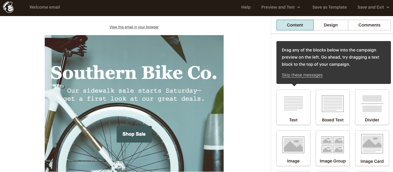
Whether you choose a template or build your own email from scratch, you can leverage Mailchimp’s drag-and-drop editor. The editor is based on blocks, with dedicated blocks for things like an image, an image group, text, an image and a caption, and more. This makes it easy for non-designers to make changes to the layout or quickly customize the overall look.
As an added bonus, Mailchimp helps you easily solicit and gather feedback on your emails as you’re building them. You can send a test email to your colleagues, and when they reply with feedback, all their comments will automatically be displayed in the _Comments _section of the email editor.
A/B testing
ConvertKit allows you to test subject lines; Mailchimp adds tests for sender name, content, and send time.
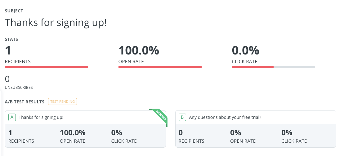
ConvertKit offers simple, no-frills A/B testing for subject lines. When you’re creating your email, you’ll see A/B to the right of your first subject line field. If you click it, it will expand and add another field for your second subject line variable. You only have to type in your subject lines, and ConvertKit does the rest. Each variation is sent to 15% of recipients (so the two variations are sent to a random 30%) and after four hours, the winning version will be sent to 70% of recipients. You can’t control the percentages or the testing time.

Once you send the email, you can track metrics and results from the A/B test by clicking into that specific email to view the report.
Surprisingly, A/B testing is not available with Mailchimp’s free plan. If you have any of the paid monthly plans, you can A/B test one of four variables: subject line, “from” name, content, and send time. What is particularly interesting is the “content” variable — you can test different email templates or blocks of content, all in Mailchimp’s drag-and-drop editor.

You can only choose one variable type and create up to three variations (i.e., test up to three subject lines). Mailchimp generates the different email campaigns and sends them to distinct sets of subscribers. To choose the winning email, you can track open rate, click-through rate, or total revenue (if you have an eCommerce store connected to your account).
Segmentation
ConvertKit’s segmentation features are intuitive and robust. You can choose from 10 filters, like subscription date, first name, or distance from a city, or create a custom field. You can mix and match these filters using the Boolean operators “and,” “or,” and “not.” For example, you could create a segment of everyone who subscribed after a certain date and does not live in the United States.
ConvertKit’s segmentation also leverages tags to make your lists smarter. You can create a tag to track almost any type of subscriber action. For example, you can tag everyone who clicked a certain link or who downloaded a certain eBook. You can then use the segment builder to combine tags into a list or to communicate only to a certain subset of tagged subscribers (i.e., all subscribers who clicked a certain link but are not in your newsletter list).
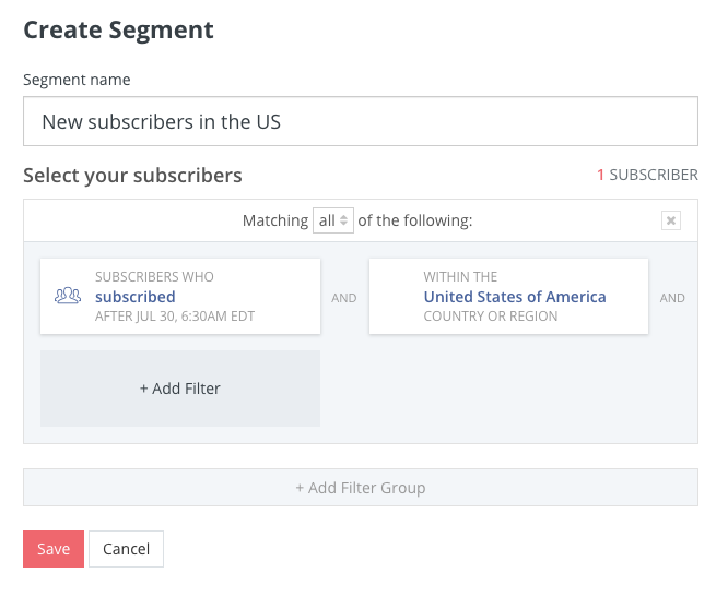
Mailchimp follows a similar approach to segmentation. You select conditions from a dropdown menu to filter contacts based on the data you have about your audience. Each segment can include up to five conditions (ConvertKit, on the other hand, does not appear to limit the number of filters you can have in a segment).
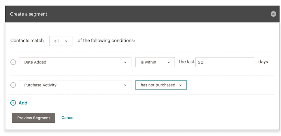
There are many options for segmentation, but again, it depends on how much data you store in Mailchimp (if you have connected an eCommerce store in Mailchimp, for example, you’ll have purchase information for all customers).
Mailchimp also offers advanced tools to increase the segmenting options. You can use Social Profiles to segment contacts based on the sites they visit and the social networks they use. Or, Mailchimp Pro helps you organize large audiences with its Advanced Segmentation tool, allowing you to create segments that combine “any” and “all” logic in a single segment. Both of these tools cost extra, above and beyond any of the paid monthly plans, so they’re not for everyone.
Automation
ConvertKit offers automated emails and workflows, but the overall experience is confusing. Mailchimp offers a more intuitive experience, but you need to upgrade to the paid plans to link multiple automated emails.
With ConvertKit, you can set up automated emails (called “Sequences”), but the process is a bit complicated. If you navigate to the “Sequences” tab, you’ll see a dedicated editor to create a series of emails, with the ability to customize when you send each message (for example, you can configure an email to send X days after the last email). You can add as many emails as you want to this sequence.
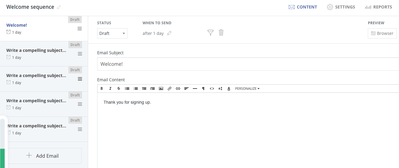
There’s also a filter icon that displays the same segmentation interface mentioned earlier, allowing you to add filters and build a list of recipients. In theory, this is all you need to do to automate emails in ConvertKit. But, there’s another tab called Automation where you can trigger marketing activity based on subscriber behavior.
The automation feature is more robust than just email — it actually allows you to automate workflows. You can automate and trigger activities after subscribers make a purchase, fill out a form, or are added to a tag (for example, automating webinar registration emails once someone signs up).
The confusing part is that you can add an email sequence to this automation workflow. For example, to set up an automation, you would first select the trigger (like filling out a form). You then choose what happens once that form is filled out, with one of the options being to add those people to an email sequence (the same sequence you created in the Sequence tab). It’s not clear why there are two places to configure automated emails (Sequences and Automation tabs) nor is it clear when you would create a standalone Sequence and when you would add it to an automation.
Creating automated emails in Mailchimp is simple and more straightforward thanks to many pre-built automation types. If you want to create your own automated emails, Mailchimp walks you through the steps in an easy-to-follow workflow editor.
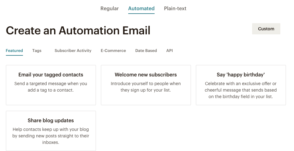
In the email creation workflow, you simply toggle to the Automated tab where Mailchimp presents different automation types based on tags, subscriber activity, eCommerce activity, or APIs. For example, you could set up automated emails to welcome new subscribers or say happy birthday to your customers.
You can also set up your own automated email type, adding triggers like previous email not opened or purchased a product. You can then specify on what day and what time the email should be sent. If you have a standard or premium paid plan, you can create your own automation series, linking together multiple automated emails based on different triggers.
Forms and landing pages
ConvertKit offers a quick, simple process to create forms and landing pages. On the other hand, Mailchimp offers fewer landing page templates, and its forms are confusing.
ConvertKit gives you a variety of ways to create forms and landing pages: you can host landing pages in ConvertKit or your own domain with WordPress, and you can embed forms on your website, or on a landing page you host yourself.
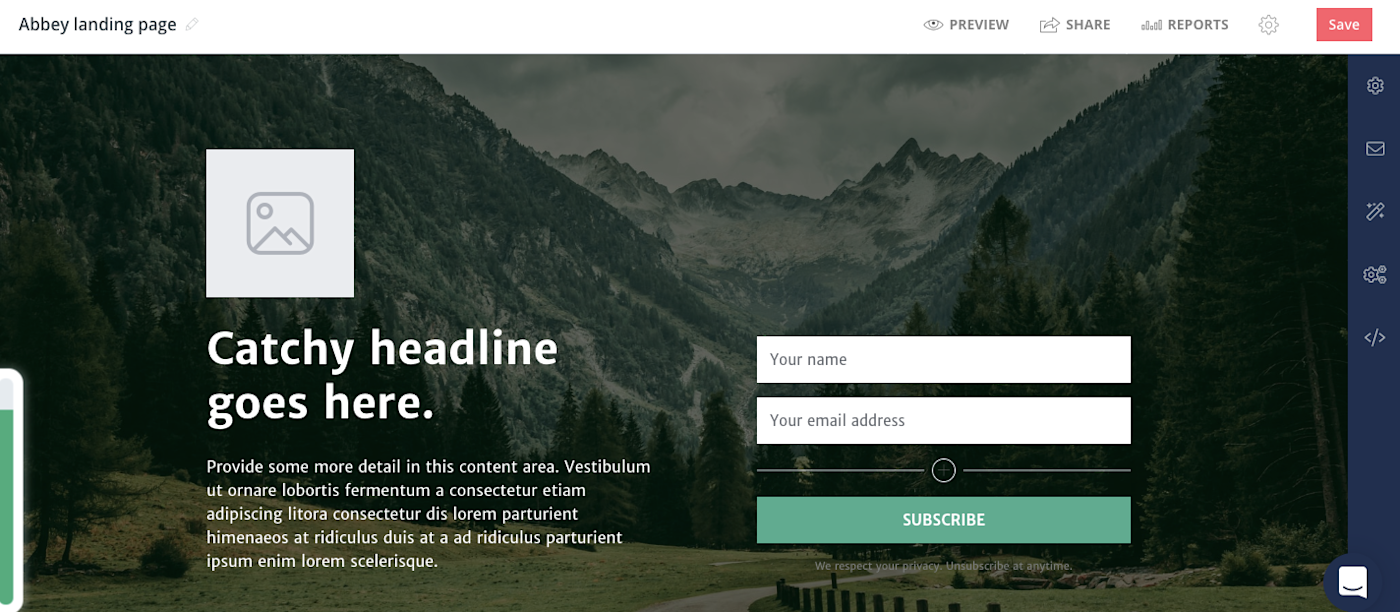
Creating a form is simple. You choose the display format (inline, modal, or slide-in), select a template, and customize the copy, font, colors, fields, success message, and button. You can then copy the embed code in Javascript or HTML, get a shareable link, or embed using WordPress or Unbounce.
To place a ConvertKit form on a landing page, you would follow similar steps to create a landing page (all landing pages come pre-made with a form). You can choose from 24 pre-built templates, with the ability to customize the imagery, copy, form field font, colors, and more. ConvertKit automatically hosts the page for you, giving you a shareable link. You also have the option to host the landing page on your site using ConvertKit’s WordPress plugin.
Compared to ConvertKit, Mailchimp’s form creation process is clunky. For example, if you want to create an embedded form, you click Embedded forms in the form creation process which takes you to a page with the code to paste it on your site. However, to edit this embeddable form, you need to go to the form builder, which is on another page.
Pop-up forms, on the other hand, have yet another separate editing interface where you can customize the design and form fields and generate the code. All these separate form editing screens make the experience very confusing.
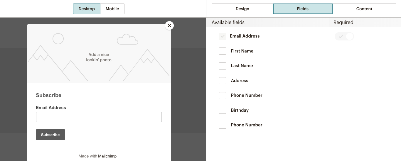
The landing page process is less complicated. You can choose from eight landing page templates and then further customize the page in the drag-and-drop editor (which looks exactly like the email drag-and-drop editor). If you choose a layout template that comes with a form, you can edit the form and form fields directly in the landing page editor.
Reporting
-
ConvertKit’s reporting is spread out between each type of marketing asset (email, landing page, etc.), whereas Mailchimp offers a dedicated tab to house all data.*
With ConvertKit, it’s not immediately clear where to go to view campaign metrics. The Subscribers tab shows you a graph over time based on net-new subscribers or total subscribers, with a row underneath that aggregates lifetime totals of subscribers, average open rate, average click-through rate, and emails sent.
To dig deeper into specific metrics for email or landing pages, you have to navigate to the corresponding tabs. For example, to see email metrics, you’d click the Broadcasts tab and either see an overview of each email’s metrics or click into each email to display the in-depth metrics (like A/B test results). To analyze reports for automated emails, you need to go into the Sequences tab.
Similarly, to see landing page or form metrics, you need to navigate to yet another tab where you’ll see another graph for form and landing page sign-ups over time, with an overview of individual landing page results underneath.
Mailchimp’s reporting is more streamlined, with four distinct reports all living in the Reports tab. At the campaign-level, you can see basic metrics like open rate, subscribers with the most opens, click-through rate, top links clicked, bounces, and unsubscribes. You can also see how your metrics compare to industry averages, which provides helpful benchmarking data. If you connect an eCommerce store to Mailchimp, your report will also show the number of orders, average order revenue, and total revenue generated from the email.
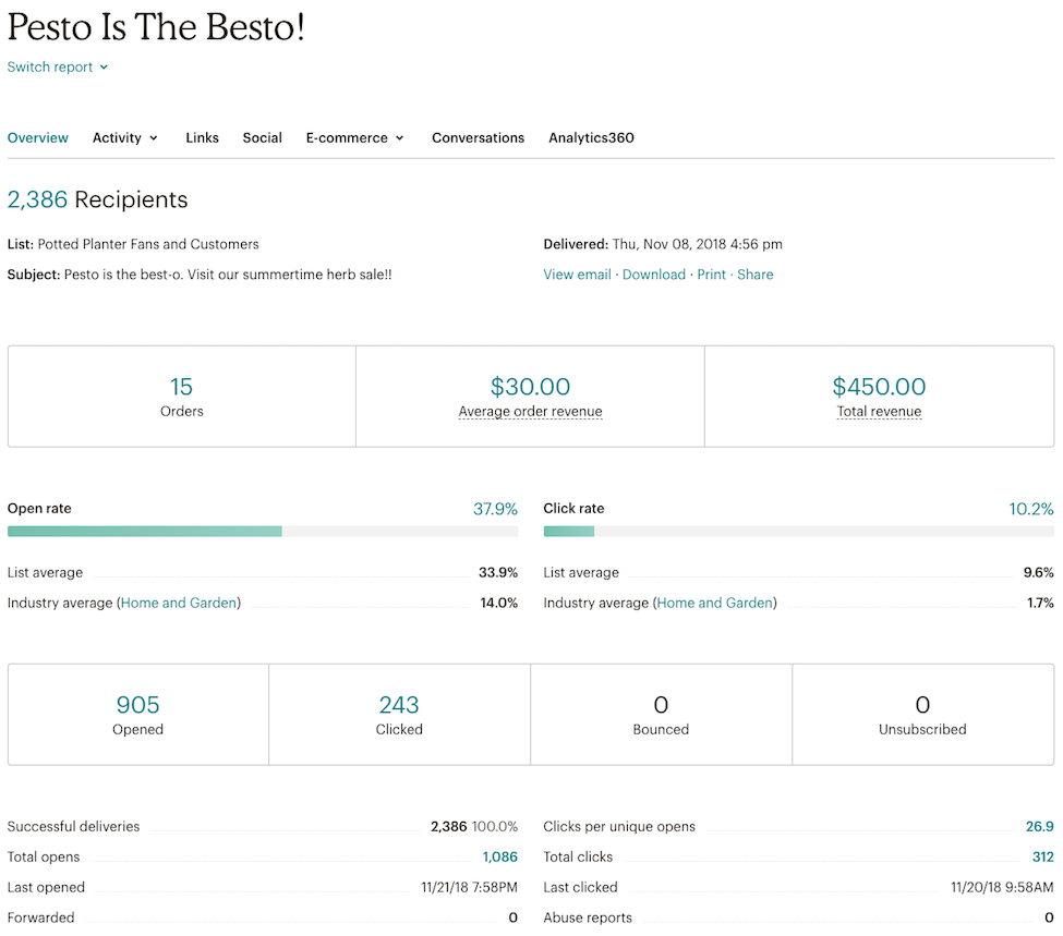
If you have a premium account, you can access comparative reports which let you compile data from different emails into a single, shareable report. This lets you identify patterns in subscriber engagement, and improve and target your campaign content.
When you create landing pages in Mailchimp, there’s another dedicated report that shows views, clicks, sign-ups, orders, conversion rate, and revenue.
ConvertKit vs Mailchimp: Which App Should You Use?
ConvertKit and Mailchimp both offer powerful email marketing features, especially for small businesses.
If you want a simple way to create, send, and automate emails at no cost, Mailchimp is the clear winner. Mailchimp’s free plan lets you store up to 2,000 contacts and access one-click automations and basic templates.
If you need to store more contacts and choose to go with one of Mailchimp’s paid plans, Mailchimp would still come out on top in terms of pure email marketing features (it’s hard to beat the drag-and-drop editor).
ConvertKit does not offer a free plan, and its paid plans are more expensive than Mailchimp’s. However, ConvertKit’s landing page and form features are superior. So, if you’re really focused on lead generation and want to customize your own landing pages with the added benefit of email, ConvertKit would be a solid choice.
Finally, here’s an at-a-glance feature comparison:
|
|
ConvertKit |
Mailchimp |
|---|---|---|
|
Pricing |
$29/mo for up to 1,000 subscribers. Pricing increases with number of subscribers. |
Free version with limits. Standard version, recommended for small businesses, starts at $14.99/mo. |
|
User interface |
Confusing interface with a unique vocabulary that adds to a steeper learning curve. |
Confusing navigation across marketing channels, but drag-and-drop editor is superior. |
|
Email creation |
Basic email creation in WYSIWYG editor. |
Robust drag-and-drop editor. |
|
A/B testing |
Can only test subject lines. |
Not available in free plan, but with paid plans, can test subject line, “from” name, content, and send time. |
|
Segmentation |
Out-of-the-box segmentation is intuitive and powerful. |
Extra, paid features boost standard offerings. |
|
Automation |
Offers automated emails and workflows, but confusing experience. |
More intuitive experience, but you need to upgrade to a paid plan to link multiple automated emails. |
|
Forms and landing pages |
Quick, simple process with many templates. |
Fewer landing page templates and forms are not intuitive. |
|
Reporting |
Reports spread across each type of marketing asset. |
Dedicated tab to house all data. |
Automate ConvertKit and Mailchimp with Zapier
Whichever email marketing solution you choose, you can save yourself hours each week automating the process. Zapier’s workflow automations, called Zaps, can add subscribers to ConvertKit or Mailchimp from the other apps you use.
Here are some examples to get you started:
Don’t see the workflow you’re looking for? Browse more Mailchimp and ConvertKit integrations, or create your own workflow with the Zap editor.
[adsanity_group align=’alignnone’ num_ads=1 num_columns=1 group_ids=’15192′]
Need Any Technology Assistance? Call Pursho @ 0731-6725516


