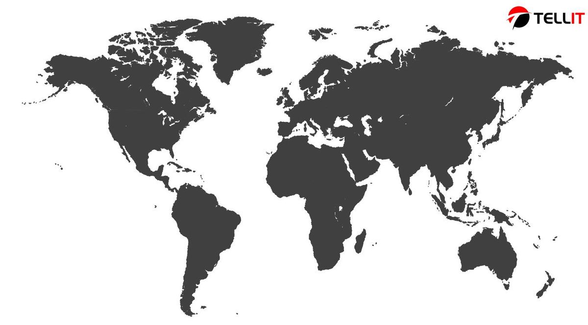
When you are presenting data in a PowerPoint presentation, you should do that in a visually appealing manner as much as possible. This is where you will encounter problems with presenting data in the presentation. One of the most convenient methods available for you to represent data would be to use map infographics.
What exactly are map infographics

You will be able to use maps in PowerPoint presentations to showcase geolocation related information in the form of a map. Map infographics are quite popular among history teachers and geography teachers. On the other hand, you can even use them during business and international presentations, especially when you are discussing about expansion plans and different countries. If you want to define the size of a market, this will become helpful as well.
How can you add a map into your PowerPoint presentation?
There are numerous map templates available for you to find out there on the internet or just use our free map template. You should go through them and locate the best map template out of them. Then you can copy the map to the PowerPoint presentation that you are creating.
As you look around for PowerPoint templates that contain maps, you will notice that there are multiple options to consider. This is where you should carefully look for a template that matches with your preferences and start using it.
Modify the map

After adding the map into your PowerPoint presentation, you will be able to modify the colors of it. For example, you can modify the colors of the presentation according to the way you want. It is better if you can pick few colors and use them. Then you can ensure harmony of the presentation conveniently.
You can click on the section of the map that you need to modify and proceed with making the modifications according to your preferences. Each map comes along with a style of its own. Therefore, it is better if you can have a solid understanding about that style before you proceed with making modifications. Then you can stick to the style and deliver the modifications. For example, you may click on the Shape Fill option, which will help you to configure the look and feel of the presentation according to your preferences.
Insert text and modify the map
You will still come across the need to insert some text and modify the map. However, you should be careful while you are doing this. The main objective of using a map is to highlight the graphical content. Hence, you should not be using too much of text in the map. Still, you cannot completely forget text and images. You will need to insert text and images based on your preferences and make your presentation informative.
To insert text, you should go to the slide where you wish to modify, and the n click on the Insert tab, which you can see on the toolbar. Then you will need to click on the option called “Text Box”. You can then pick the area where you are going to add the text and then draw accordingly. You can easily size that according to your preferences as well. After you do that, you will be able to add the text that you want based on your preferences. You will be able to change the color, size, alignment, and font as per your wish as well. You can do the same when you are inserting an image as well. Instead of adding a textbox, you should add an image into the slide via the menu.
Looking For Powerpoint Design Agency?
Call Pursho @ 0731-6725516
Telegram Group One Must Follow :
For Startups: https://t.me/daily_business_reads
#Creating #maps #formatting #PowerPoint #Tellit


