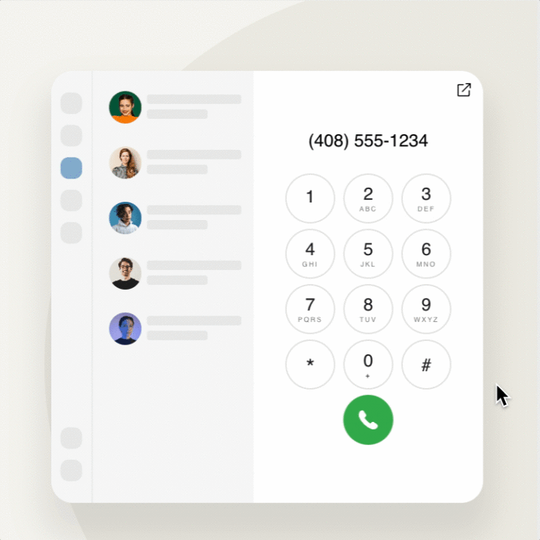
With more than 7+ billion calls clocked on RingCentral each year, our app has become a cornerstone for businesses to communicate with customers, partners, and employees alike. Today, guided by user research and customer feedback, we’re updating the desktop app experience to be more compact and intuitive than ever, reducing distractions and empowering seamless “multi-app” experiences – so you can do your best work.
A new compact design to take up less screen space
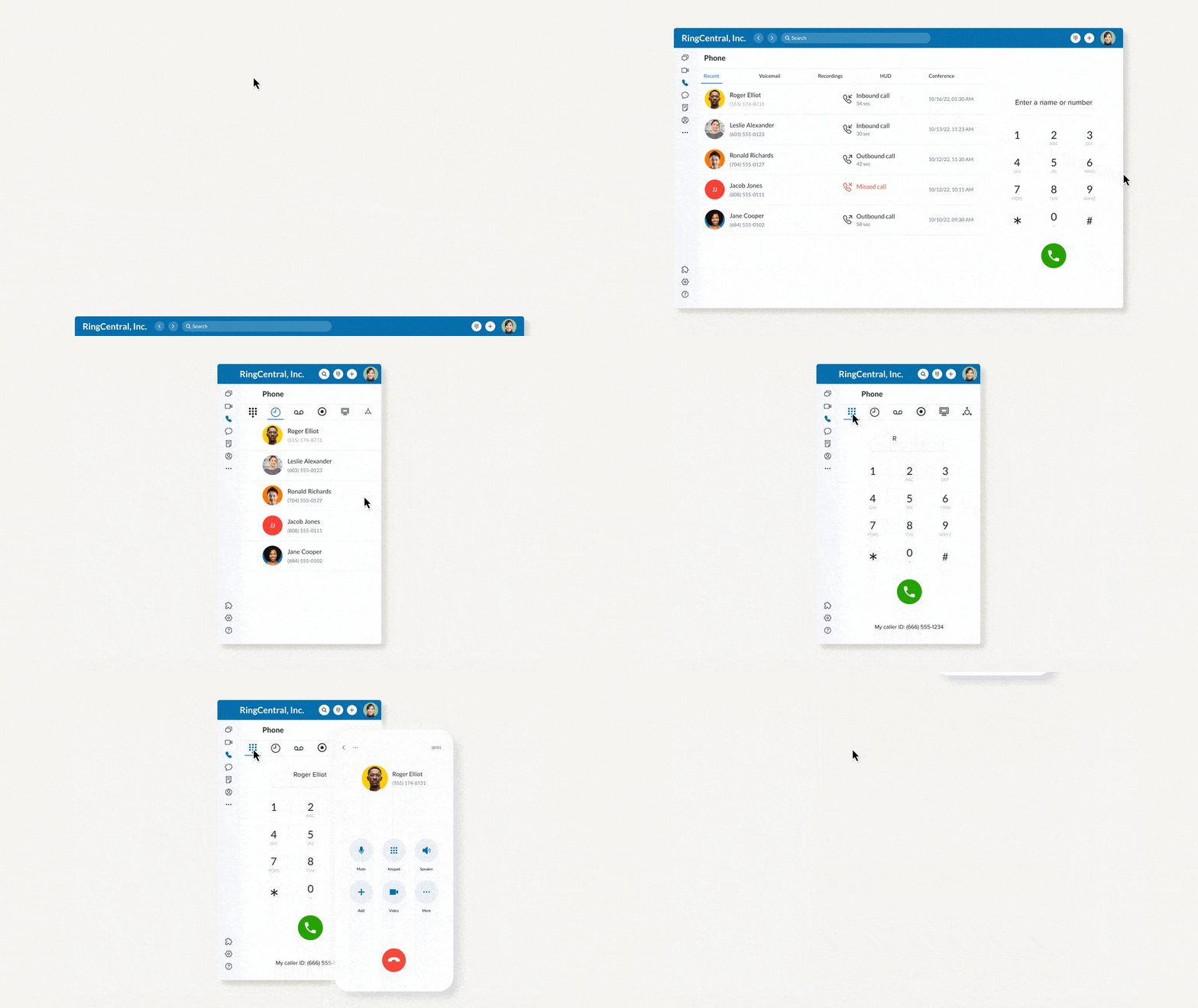
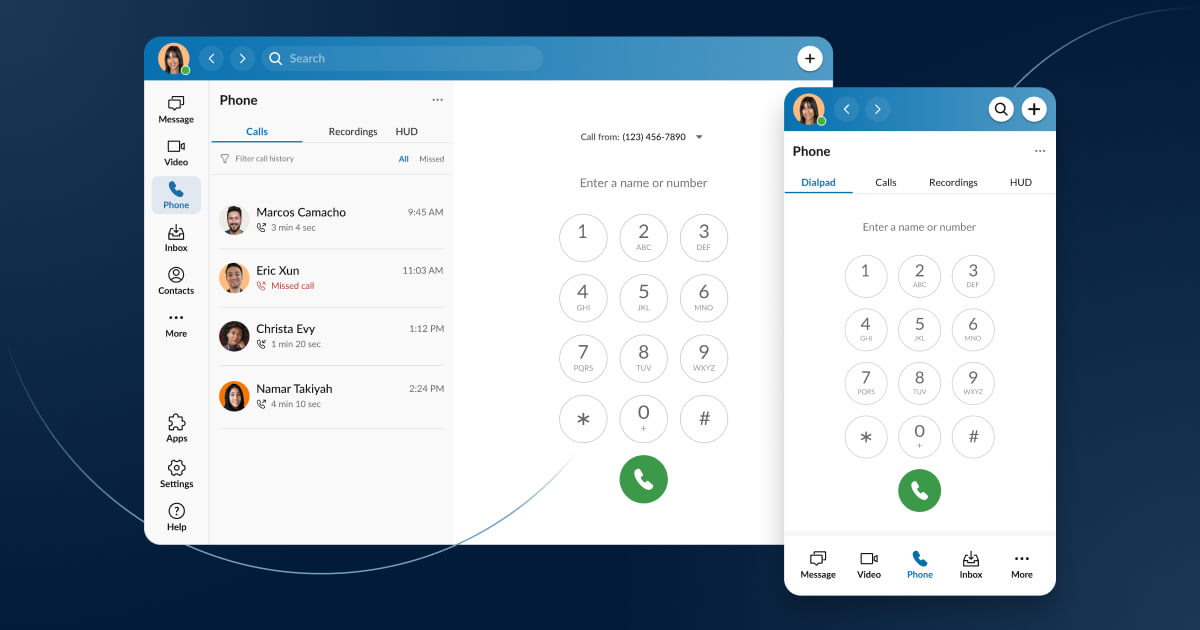
We know your desktop screen space is valuable real estate, so we’ve optimized our app for a smaller footprint without sacrificing functionality. With our new Compact Mode, easily shrink or expand RingCentral to multitask in other apps, while keeping your favorite phone features close. The new Narrow Navigation lets you save on-screen real estate without losing access to our navigation icons, and the app has been redesigned to be perfectly responsive, so you can enjoy a smart, resizable app where the content resizes and flows intuitively.
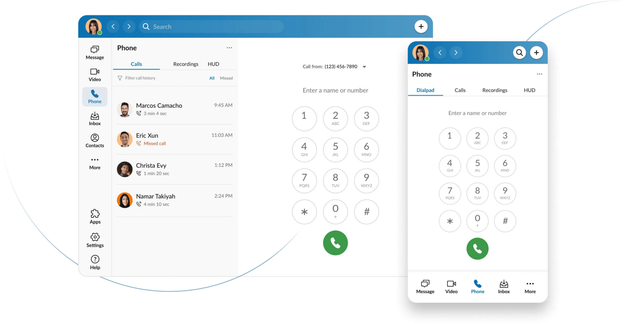
Less space, more impact: See all the updates to the RingCentral app
Quicker access to your dialpad
We’ve made it even easier to access the dialpad, with a dedicated tab on the sidebar (that can be broken out into its own window if needed). If you use features like On-Demand Call Recordings, Heads-Up Display (HUD), and Voicemail frequently, you can now upgrade them to main navigation for even quicker access.
Voicemails, texts, and faxes unified in one inbox
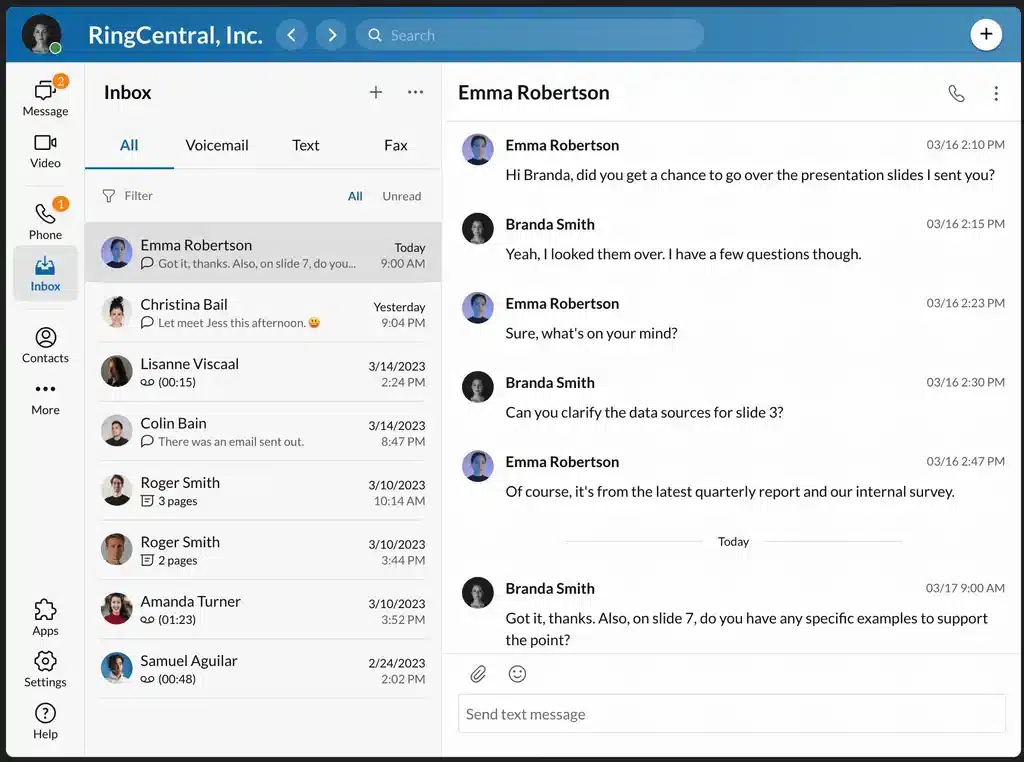
We’re excited to announce the return of the telephony Inbox, back by popular demand. The inbox boosts convenience and message management with a central location for all telephony messages, including SMS MMS, voicemail recordings / transcriptions and faxes. Easily manage and prioritize messages without having to jump around various tabs. You’ll have full control, with the ability to delete, archive, forward or mark messages as read or unread.
Customize your app experience
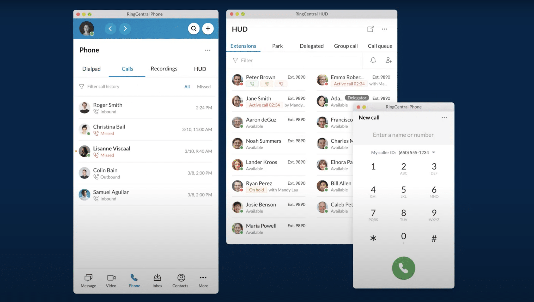
With the new Customizable Menu, you can slice, dice, unify or break apart your menu to create a layout that’s right for you. Modular Pop-Outs have also been designed to make your RingCentral experience more efficient for multi-tasking and “multi-apping”. Pop out your most frequently used RingCentral tools, like the dial pad or Heads-Up Display (HUD), and arrange them on your desktop for easy access.
For power users who want to keep the dialpad of HUD front and center, you can “pin on top” to ensure the tools you need are always in view, regardless of other open tools. Plus, by detaching these features from the larger desktop app,, you free up more screen space and reduce visual clutter. We understand that customization and convenience are key to delightful app experiences, and these enhancements are just some ways we’re delivering on this.
Optimized for iPad
With our new iPad optimized phone, you can switch between your desktop and iPad seamlessly while staying connected with teams and customers. You’ll have access to all of the same features as the desktop app, including the new Modular Pop-Outs and the telephony Inbox, all within a responsive and intuitive interface designed specifically for iPad. Whether you’re in the office or on-the-go, our iPad interface ensures that you can stay productive and connected, no matter where you are.
Stay focused and save battery life with “Launch in background”
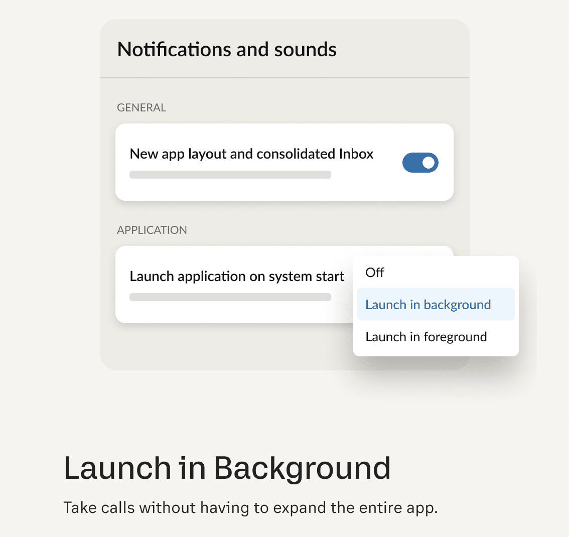
Stay focused while your softphone loads in the background. By selecting this option, users can launch the app without interrupting their current task. This also enhances multi-tasking as users can continue to work in other apps while RingCentral loads in the background. Lastly, this feature helps when you are looking to preserve battery life – When an app is launched in the foreground, it typically consumes more battery and thus if you are on the go without your battery pack, we’ve got you covered.
Enhance asynchronous communications
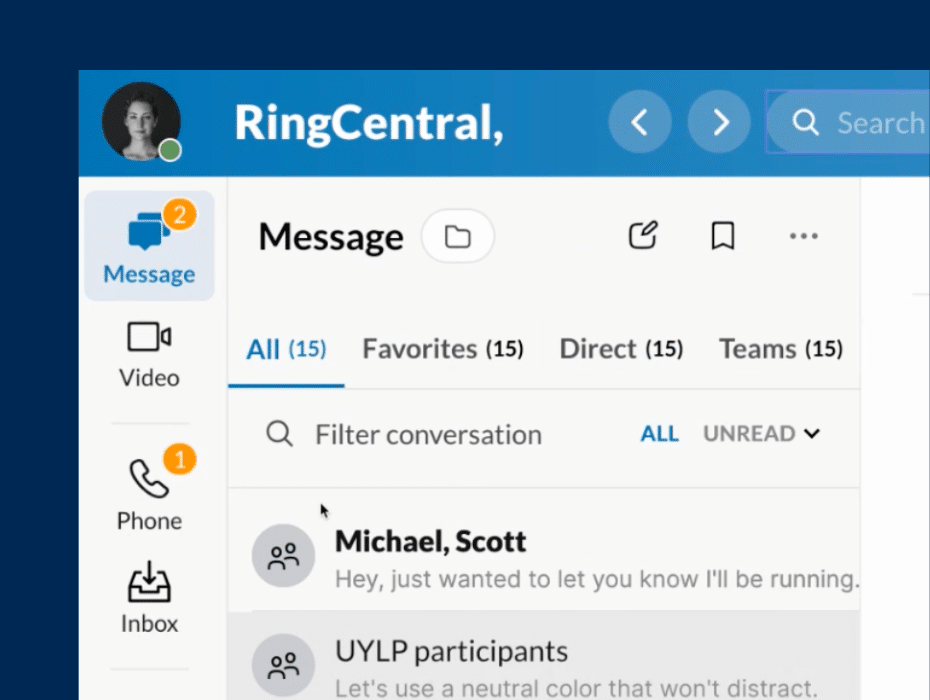
Starting in June 2023, switch even more seamlessly between voice and messaging, allowing you to communicate even if you’re not available at the same time. We’re making it easier to send team messages by moving the compose button to the top of the Team Messaging menu, where users have told us they naturally look for it. Additionally, you can now choose how you want to review your team messages – either by most recent messages received or folder view. In elevating our asynchronous tools, we help users connect in any way that suits the task at hand.
 “Millions of people around the world use RingCentral. “Millions of people around the world use RingCentral.
These changes are about being good stewards of their time, making work life just a little more intuitive, pleasant and productive.”
Steven Zachok, VP Phone Product Management, RingCentral |
Want to try the new experience?
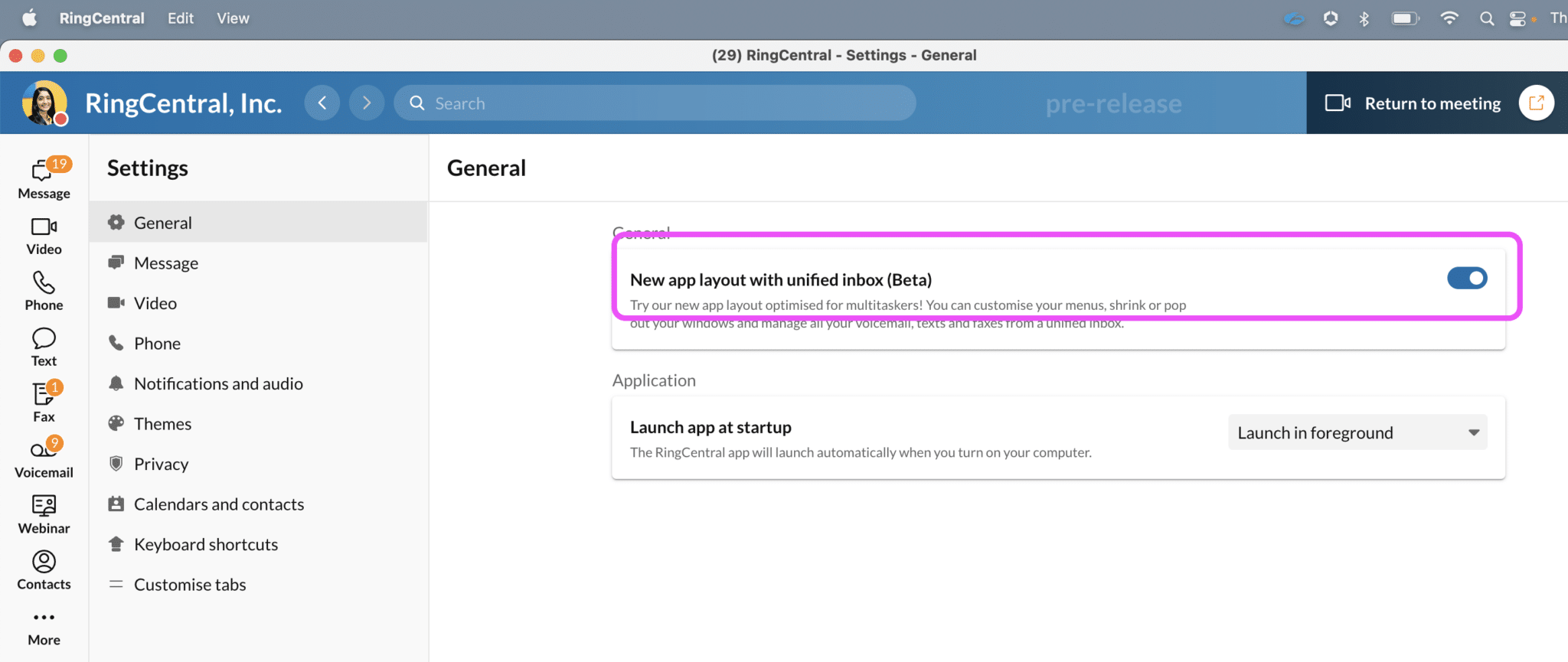
If you are ready to take your phone to the next level, open up your desktop app and follow the simple instructions below:
- In the bottom right corner of the desktop app, click Settings.
- Then click General at the top of the next menu.
- You will see a toggle to opt into the new app layout and consolidate inbox (beta) .
- Turn the toggle on
Submit feedback and build with us

We’re always looking for new ways to innovate and improve, and we’d love to hear from you. If you have any feedback for how we can make RingCentral even better, please don’t hesitate to share them with us in the app in the Help section, and then by clicking “Report an Issue” in the top right corner.
Our team has worked hard to deliver an interface that’s optimized for your needs, so you can focus on what matters most. Try it out for yourself and let us know what you think!
Originally published May 05, 2023
Looking For Startup Consultants ?
Call Pursho @ 0731-6725516
Telegram Group One Must Follow :
For Startups: https://t.me/daily_business_reads

