Presentation design comes with lots of choices. Font choice. Template choice. And of course, color choice. But these choices don’t have to overwhelm you. Today we’ll show you how to build a custom color palette starting with your brand colors. With the right tools and a solid foundational color, it’s easier than ever to get started on your presentation design.
Getting Started
To follow this process, you’ll need a few things. First, you’ll need a web browser so you can access the Adobe Color tools we’ll be using. Second, you’ll need an online version of the logo or brand image from which you want to pull your main color. And third, you’ll need access to the presentation design program you prefer. Once you have those, the process is simple.
Building A Custom Color Palette
- Go to color.adobe.com.
- From there, click on create.
- In a second tab, pull up the logo or brand marketing image from which you want to build your palette.
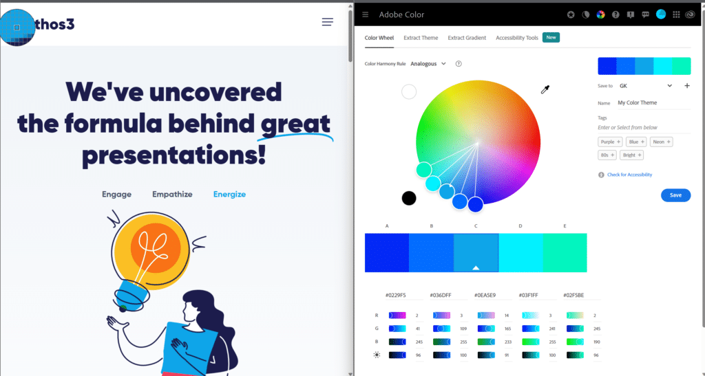
- Create a split screen (as shown below) so that you have both the Adobe Color page and your logo in front of you.
 On the Adobe page, you’ll notice an eyedropper tool to the upper right of the color wheel. Click on the eyedropper.
- Drag the gridded circle over the brand color you want to copy.
- Click to copy that color.
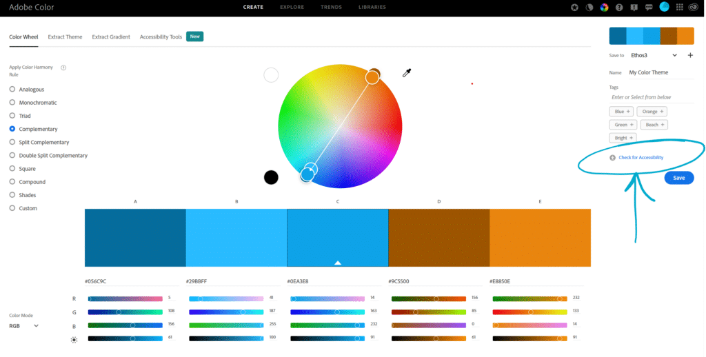
You can see that Adobe has created a color palette with your selected brand color at the center. It gives you 10 color palette options building from this one color: analogous, monochromatic, triad, complementary, split complementary, double split complementary, square, compound, shades, and custom.
Choosing and Checking Your Color Palette
Say I really like the look of the complimentary color palette that Adobe built. I’ll start by naming and saving the color palette on the right side of the screen. Before I import it into my presentation design though, I want to check it for accessibility to make sure it is “color safe.” I also want to confirm that it has enough contrast to make it easily visible for my viewers.
To do that, I’ll simply click on Check for Accessibility on the right side of the screen.

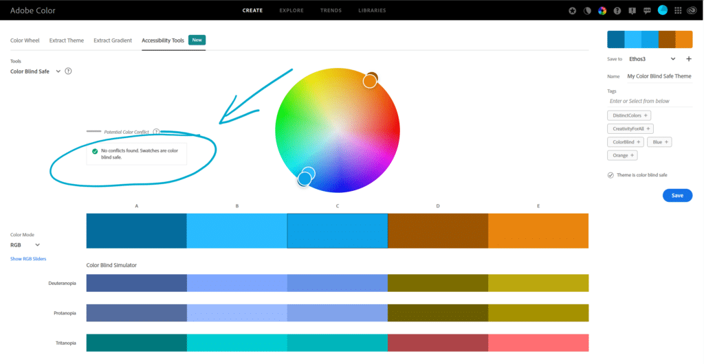
This will show me what this color palette will look like for viewers with color blindness. If the color palette is “color safe,” you’ll see a green check mark with the note that no color conflicts have been found, as shown below.

Next, click on the drop-down menu under tools in the upper left corner and select the Contrast Checker. Here I’ll be able to see how much contrast there is between the colors of my palette. Check out our blog on why contrast ratios matter in presentation design here.
You can copy and paste the colors of your palette into the Contrast Checker by simply toggling between the Color Wheel and Accessibility Tools tabs in the top black menu bar. Input different combinations from your color palette based on which colors you want to use for text and which you want to use for background colors. You’ll see that this color palette doesn’t offer much contrast, which is a problem. Luckily, Adobe offers recommendations for revised colors on the right side of the screen. You can click to apply the ones you like and then add those to your color palette.
Importing Your Color Palette
There are many ways to import your color palette into your presentation design program. Here’s the one I have found to be quickest.
- From Adobe Color, click on libraries on the top tab menu.
- Find your saved color palette and click on it to download it as a jpeg.
- Pull up a blank presentation in your presentation design program of choice.
- Insert the jpeg of your color palette onto a blank slide.
- Use the eyedropper tool or the custom color tool to import the palette colors as backgrounds, texts, icons, and shapes.
- Delete the slide with your color palette once you’ve imported all the colors you need.
As long as you have brand colors to work from, you’ll now be able to create color palettes for your presentation design in no time. If you still feel overwhelmed when it comes to presentation design, maybe it’s time for you to consider collaborating with a presentation design agency like Ethos3.
Find out how we can help take your presentation design to the next level.
Looking For Powerpoint Design Agency?
Call Pursho @ 0731-6725516
Telegram Group One Must Follow :
For Startups: https://t.me/daily_business_reads
#Create #Color #Palettes #Brand #Colors


