There used to be a time of simplicity – an era of no notifications, vibrating phones, or social media pings- when things were done one at a time.
Today is the age of hyper tasking. Something is trying to take our attention every step of the way- during waking, sleeping, driving, and working hours. The implication- take it as a given that people will lose focus. Translating this into what it means for presenters- People will have no patience for presentations that don’t hit the sweet spot. Boring, long, roundabout, data-heavy presentations will turn off your audience to the presentation and you as a presenter.
On the other hand, people can be persuaded to pay attention and buy your ideas via effective visual presentations. While there are no set rules for giving PowerPoint presentations that will win the day in every situation, there are Powerpoint design ideas that apply universally.
Role of Presentation Design
Presentation design is like the secret sauce of an excellent presentation. It’s the visual representation of ideas and concepts that sets the tone and mood for the audience. It makes the presentation go from bland to bold, from forgettable to memorable.
A well-designed presentation can:
- Grab the audience’s attention
- Convey the message in a clear and concise manner
- Leave a lasting impression
- Evoke emotions and memories, and transport the audience to a different place and time.
- Establish a strong visual identity that is recognizable and memorable.
A well-designed presentation can distinguish between a forgettable and a memorable experience. It’s not just about making a presentation look pretty; it’s about using slides design ideas, and elements to enhance the message and make it more impactful. A presentation can evoke excitement, calmness, professionalism, and creativity by choosing the right color palette, font choices, and visual elements.
Understanding the Basics of Presentation Design
Presentation design is like a map for the audience, guiding them through the presentation and highlighting the most important points. It makes a presentation go from dull to dazzling, from forgettable to unforgettable.
Understanding the basics of PowerPoint slide design ideas is crucial for creating presentations that engage and inform the audience. The basics of presentation design include:
- Color theory: It is the study of color and how it affects human emotion and perception. In PPT design ideas, color can evoke emotions, set the tone, and grab the audience’s attention. For example, blue can evoke a sense of calmness, while red can evoke a sense of excitement. It’s essential to choose a color palette that aligns with the message and brand of the presentation.
- Typography: It is the art of arranging type to make written language legible, readable, and appealing. In presentation design, typography can convey information, establish a visual hierarchy, and enhance the overall design. It’s essential to choose a font that is easy to read, legible, and fits the brand and message of the presentation.
- Visual hierarchy: It is the arrangement of visual elements in order of importance. In Power Point layout ideas, visual hierarchy guides the audience through the presentation and highlights the most critical points. For example, using larger text for headings and smaller text for subheadings creates a visual hierarchy that makes the information easily understandable.
- Use of images and graphics: It can break up text-heavy slides and add visual interest to the presentation. In presentation design, images and PowerPoint graphics help explain complex information, provide context, and enhance the overall design. It’s important to choose images and graphics that align with the presentation’s message and brand and ensure they are high-quality and clear.
Try Our Free PowerPoint Templates
To Build An Engaging Presentation
9 Failsafe Powerpoint Design Ideas To Engage Your Audience Till the End
Are you tired of using old, boring templates for your Powerpoint presentations? Look no further!
This section will provide you with innovative Powerpoint design ideas to elevate your presentations and make them stand out.
Consider Using A Minimalistic Presentation Theme
A presentation strategy that effectively conveys your point to your audience is being minimalist. Using a simple presentation theme, you draw the audience’s attention to the bare minimum they need to focus on. There won’t be any obtrusive photos, design in PowerPoint presentations, or graphics because you’re keeping things barebones.
Your readers won’t have to browse through a lot of “unnecessary” information to find what they are looking for.
Forget the 3-point rule (which says that each slide should make no more than 3 points); the guiding rule here is ONE point per slide and no more.
Make Your Presentation Simple To View
Moving ahead in our list of Powerpoint design ideas. You can exercise your creative muscle in many places within a presentation. Typography is one of them. However, the moment your text becomes hard to read either because of its size, background contrast, font family, or for any other reason, you have started to lose your way.
Know that there can be a variety of demographics in your audience – folks with color blindness, those with reading difficulties, people who will see your presentation on a small screen- the list goes on. People will lose interest in your presentation if they cannot read what is written on the slide.
Large fonts, with clear contrast, intelligent use of bolding (lose the italics unless you are writing Latin in your presentation- there is rarely a good reason to italicize your fonts). Always pick a suitable font family, such as Arial and Helvetica, that has legible typefaces to help your audience can read from a distance on any screen size. Learn more which are the best fonts for presentations.
Statistics Support It More
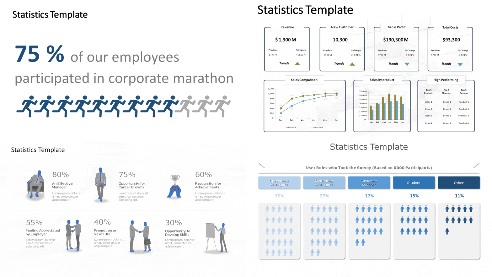
Using data is a powerful way to strengthen your argument while outlining an issue or explaining an ongoing scenario. Many presentations include statistics and data, yet we must remember to ask the so what question or, worse, not focus on the numbers that matter.
Make statistics simple to understand when distributing them. Use the correct table, number, PowerPoint infographic, or chart for the proper purpose. For example, Tables are ideal for comparing a small number of statistics, but a bar chart or combo chart can make it easy to work with complex information.
SlideUpLift.com has several examples and templates of the right formats and tools to use when presenting data.

Pose Inquiries
Questions and a highly interactive dialog is the hallmark of an excellent presentation. Innovative presenters prompt their audience with question and answer slides and encourage a two-way discussion while maintaining focus on their core presentation content.
There are, of course, many ways to do this: formal, informal, batched to the end versus sprinkled throughout. The method you pick may depend on the context and your style. The important part is to ensure that the audience actively engages and participates in your session. You demonstrate receptivity to it and encourage them to do so.

Use Color Without Fear
One of the most useful Powerpoint slide design ideas is to be bold and use color. You should consider employing colors if you’re wondering how to make your PowerPoint presentation appealing. It would not be an overstatement to say that colors can change how you and your presentation are perceived.
Although colors can make your slides more visually appealing, they can also turn viewers away if they need to be correctly blended or are too vivid. Please ensure the colors are pleasing to the eye; neither should they be very bright nor overly muted. Know more about the best colors for presentations.
Include Videos That Are Relevant to the Speech
Even if not everyone in your audience prefers videos to still images, some of them will. Videos give your debate life and can become incredibly interesting if they are relevant to the subject. Animations occasionally function perfectly. Look at some animated PowerPoint template examples.

Send Printed Materials As Pre-reads
When you send pre-reads, you are communicating your respect to your audience. People value pre-reads for various reasons- some adore having the ability to be in the know and avoid surprises, and some like taking printouts and having their questions ready. At the same time, you present your slides, and some just like the respect endowed to them to send the material in advance and appreciate your readiness and punctuality.
So send the pre-reads. If you want certain parts to remain in suspense until the time of the presentation, send background material- anything that helps your audience prepare well for your presentation. You can read the blog to learn how to print handouts in powerpoint.
Keep Your Speech to No More Than 20 Minutes
People have a lot to do- we already talked about that. They may not be willing to give you a big slice as much as you might want to indulge. Ensure that you only talk about the pertinent issues and omit everything that does not support your position.
Even if your presentation is mighty entertaining, after 25 minutes, your audience will begin to lose interest. Give a brief, enthralling, focused presentation in under 20 minutes. If your audience wants more after your presentation, you will know you were successful. Learn about storytelling in presentations by reading our blog.
Finalize Your Points With a Summary
Use the chance to reiterate the key topics you covered in your presentation toward the conclusion. Reminding your audience of what you have been talking about throughout should be the goal of your summary. Focus on the residual messages – what they must retain after forgetting everything else. Learn how to end a presentation to make a lasting impression.

How to Get Design Ideas on PowerPoint Using The In-built Design Ideas Feature
Design Ideas, also known as PowerPoint Designer, is your secret weapon for making your slides visually stunning. Simply add your text and images, activate the tool, and let it generate ideas for you.
The beauty of this tool is that each design suggestion is unique, so there’s a low chance that you’ll come across the same idea twice. This means that your presentations will always be original, even if you’re presenting on a common topic.
At present, only Office 365 subscribers have access to the Design Ideas feature within the desktop application.
Conclusion
No presenting concepts are known to work miracles. A presentation that engages the audience successfully conveys the essential points and accomplishes the overall goal is the finest presentation.
Yet, designing professional presentations is a cumbersome job. At SlideUpLift, we work hard to help you make it easier to incorporate these concepts and make them work for you. SlideUpLift provides an extensive array of free presentation templates that can make your work easy. Select one according to your required designs and create engaging PowerPoint presentations.
Looking For Powerpoint Design Agency?
Call Pursho @ 0731-6725516
Telegram Group One Must Follow :
For Startups: https://t.me/daily_business_reads
#PowerPoint #Design #Ideas #Presentations #Standout


