Do you need help communicating data effectively in your presentations?
Data visualization is an essential tool in today’s world as it helps represent complex data sets in a simple and easily understandable manner. With the abundance of data we encounter daily, conveying information effectively through graphs has become a vital skill.
In this guide, you will learn how to create a graph in PowerPoint, making it easier to communicate your data.
Benefits Of Using A Graph In A Presentation
Using graphs in presentations is an excellent way to convey complicated information comprehensibly. Graphs can help to simplify complex statistics and ideas, make information visually pleasing, and engage the audience better.
They also add interest to dry data, making information communication fun. Additionally, charts in PowerPoint can assist analysts in extracting more meaningful information from data.
The following are some of the benefits of using a graph in a presentation:
- Display a frequency distribution for each data category.
- Show the relative numbers or percentages of specific categories.
- Visually summarize a vast data collection.
- Better than tables at illustrating trends.
- Quickly estimate crucial values.
- Allow for visual verification of calculation correctness and reasonableness.
- Allow for easy visibility of relationships.
- Consolidate detailed information to reduce the need for complicated and repeating statements.
- Serve as a synopsis of extensive information.
- Act as a refreshing break from the endless pages of text.
Types Of Graphs In PowerPoint
There are several types of graphs that you can create in PowerPoint, each of which is better suited to different types of data.
- Line graph: A line graph is best suited to showing changes in data over time.
- Bar graph: A bar graph is best suited to comparing different categories of data.
- Pie chart: A pie chart is best suited to showing the proportions of data.
- Column graph: A column graph is similar to a bar graph, but the columns are vertical.
- Scatter plot: A scatter plot best shows the relationship between two data sets.
- Area graph: An area graph is similar to a line graph, but the area below the line is filled in.
And many more!
Try Our Charts For PowerPoint
To Visualize Large Sets Of Data
How To Make Graphs In PowerPoint?
In this section, we will dive into how to make a chart in PowerPoint. Whether you’re new to the software or an experienced user, this guide will provide you with the knowledge and skills to create visually appealing and informative graphs that effectively communicate your message.
Step 1: Open your PowerPoint presentation.
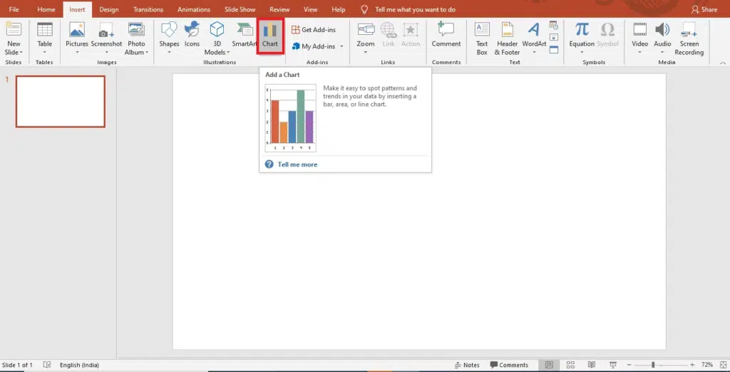
Step 2: Go to ‘Insert’ and then click on ‘Chart.’

Step 3: A new window listing different types of charts will appear.
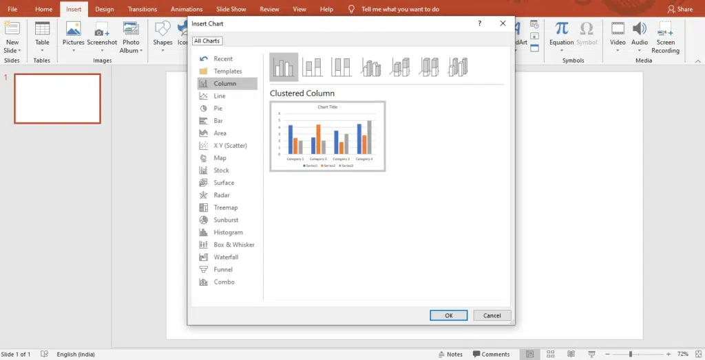
Step 4: Simply select any of these types and click ‘Ok.’
Step 5: A worksheet will appear on your screen.
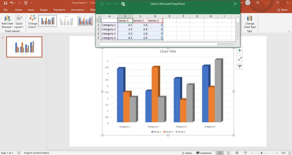
Step 6: Replace the placeholder data with your information.
Step 7: Once down, adjust the position and size of the graph.
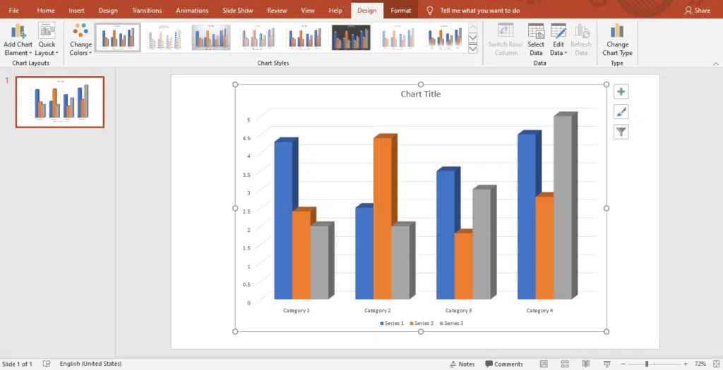
Step 8: You can add or change the elements of the chart, like title, legend, and axis title, using the ‘+’ option on the left side of the graph.
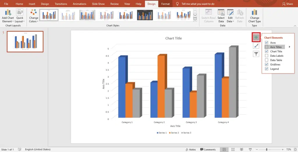
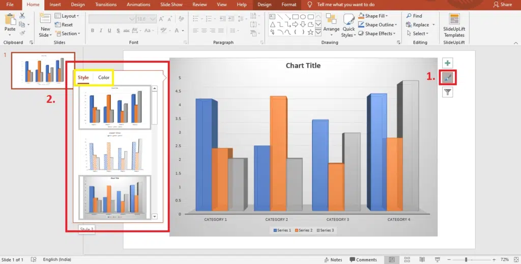
Step 9: Using the ‘Chart Styles’ option, you can set your graph’s style and color scheme.
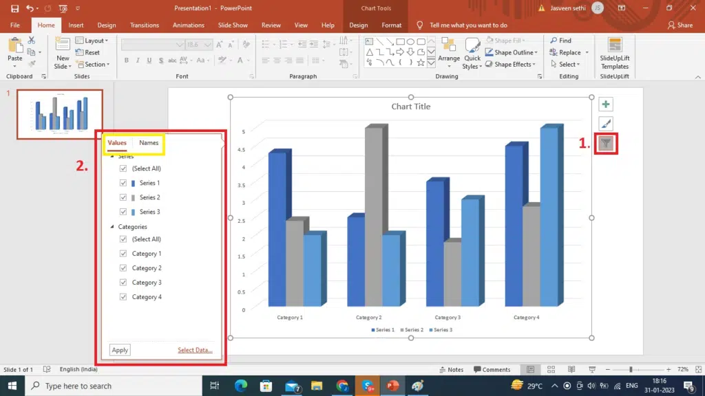
Step 10: Using the ‘Chart Filters’ option, you can choose which data points and names to display in your graph.
Voila, you’re done!
How To Insert The Data Chart From An Excel Worksheet Into PowerPoint?
PowerPoint also allows you to add data from an excel sheet to your PowerPoint chart. Here is how you can do it:
- Open the Excel document containing the chart you wish to add to PowerPoint.
- Right-click the chart you wish to use and select “Copy.”
- Return to PowerPoint, choose the slide you want to paste the chart, and then hit Ctrl + V.
Try Our Free PowerPoint Templates
To Create An Engaging Presentation
Wrapping It Up
In conclusion, making graphs in PowerPoint is a valuable skill that can help you effectively communicate data in presentations. With the step-by-step guide in this blog, you now have the knowledge and tools to create different charts in PowerPoint, customize them to meet your needs, and effectively communicate your message.
Looking For Powerpoint Design Agency?
Call Pursho @ 0731-6725516
Telegram Group One Must Follow :
For Startups: https://t.me/daily_business_reads
#Graph #PowerPoint

