We live in a three-dimensional universe. So, why should you limit yourself to a 2D visuals? The isometric design combines the best of both worlds, providing a 3D design without the converging perspective lines.
Observing graphic design around you might seem like watching Groundhog Day all over again. In the movie, Bill Murray’s character constantly relives the same day, always witnessing the same things and experiencing the same occurrences.
Tracking graphic design can be similar to seeing the same patterns over and over.
However, Bill Murray eventually realizes how to make minor alterations to influence the outcome of the day. You can do the same to completely alter the experience of your audience by making a different set of choices on the design elements- enter the world of visual presentation.
So pick up your 3D glasses, grab a bag of popcorn, and prepare to bob and weave as you learn the ins and outs of visual aids in presentation.
What is an Isometric Illustration?
Isometric illustrations are a kind of graphic design. The term refers to a distinct method of displaying visuals that involves sketching three-dimensional things in two-dimensional planes. The objects are produced by starting with a vertical line and two specified points. The angles between these points should be 30 degrees.
Simply put, isometric designs portray an item from one corner at a bird’s eye angle.
Customized drawings and isometric graphics are becoming more popular. As a result, many graphic designers use customized graphics in order to attract more customers.
Check out compelling ready to use isometric templates for compelling visuals
How Isometric designs are created
Isometric designs are distinct. Because of their use of curves and extra depth, this sort of design works well for branding and marketing. Shadows on isometric objects are cleverly used by professional graphic designers. These items exist in a two-dimensional world yet seem to be three-dimensional. This is due to the smart utilization of lines and angles.
The isometric grid is a key element of design style that is essentially a guideline for having the appropriate angles while designing from an isometric viewpoint, regardless of the type of design you want to bring to life.
Many graphic design software programs allow you to quickly change the angle of the isometric grid. You can also change the size of the grid, which is useful if you want to add something like a little balcony to your isometric housing.
Difference Between Flat and Isometric Illustrations
Prior to isometric design, there were flat designs, which are simpler techniques of presenting information via graphics. However, unlike isometric designs, flat designs lack depth.
In flat designs, there should be no superfluous features. Flat graphics are two-dimensional things with clear lines, forms, and edges. It also has an open space with no distracting factors in the surrounding area.
Isometric, on the other hand, denotes equal measure. This indicates that all of the object’s axes should intersect at a place with a 120-degree angle. This also implies that isometric objects have equal and precise dimensions.
In isometric objects, all horizontal lines must maintain a 30-degree angle. Furthermore, all vertical lines should remain in place.
Due to its authenticity and depth, the isometric design offers visual intrigue. This is why so many people appreciate this kind of design.
Benefits Of Using Isometric Illustrations In Visual Presentation
Isometric grids are a game changer for designers. This design style allows designers to create work with an exceptional 3D appeal that really stands out. If you work in design or any creative field using digital media, you must be familiar with this tool in order to utilize that ‘pop’ look and take your design game to the next level.
These represent unique and powerful ways to communicate ideas, especially in presentations.
These visual presentation ideas can help make your slides more visually appealing and help viewers better comprehend complex topics. In this section, we will discuss the five benefits of using presentation visual aids.
Increased Visual Impact
Using isometric illustrations in presentations is an incredibly effective way to increase visual impact and grab the attention of your audience.
Isometric illustrations use geometric shapes to create a sense of depth and perspective, making the visuals look more real-life and engaging. They can be used to explain complex processes, showcase products or services in a realistic way, or illustrate abstract concepts.
Furthermore, with isometric illustrations, you can customize the colors and objects to better suit your presentation’s style, adding an extra layer of visual interest.
Professional Look
Isometric illustrations are a great way to add a professional and modern look to your presentation. They allow you to present data in a visually appealing way, making it easier for your audience to understand your message.
Isometric illustrations can also be used to create an aura of sophistication and professionalism, which will help engage your audience and make them more likely to listen to what you have to say.
Additionally, they can be used to add a contemporary feel to your presentation – giving it that extra something special that sets it apart from the rest.
More Engaging
Isometric illustrations are a great way to make your PowerPoint presentation more engaging and interesting. By incorporating them into your slides, you can give your presentation movement and depth that will capture your audience’s attention.
Isometric illustrations can help you create an immersive experience for your viewers as they blend 3D shapes and design elements into one cohesive image.
Not only do these illustrations add visual interest to your presentation, but they also provide the opportunity to convey complex concepts in a simple, easy-to-understand format.
Save Time
Isometric illustrations are an invaluable asset when creating presentations. They can save you time since they are already finished and don’t require any customization. This means that you can quickly add them to your presentation without having to spend any extra time or effort customizing them.
Furthermore, as isometrics are vector graphics, they can be easily scaled up or down without losing quality, allowing you to use them in whatever size you need for your presentation. All in all, using visual aid for presentations can be a great way to save time and make your presentation look professional and appealing.
Versatility
Isometric illustrations can be used in a variety of formats, allowing for more flexibility and options when presenting. Whether you need to present your message online, on printed materials, or through video, isometric illustrations can help you make an impact.
With the ability to use bold colors, simple shapes in PowerPoint, and unique graphics, these illustrations can really draw attention to what you are trying to convey.
Furthermore, they are relatively easy to create, meaning that you won’t have to spend a lot of time and money creating them. Using isometric illustrations in presentations offer a great way to get your message across in a visually appealing manner.
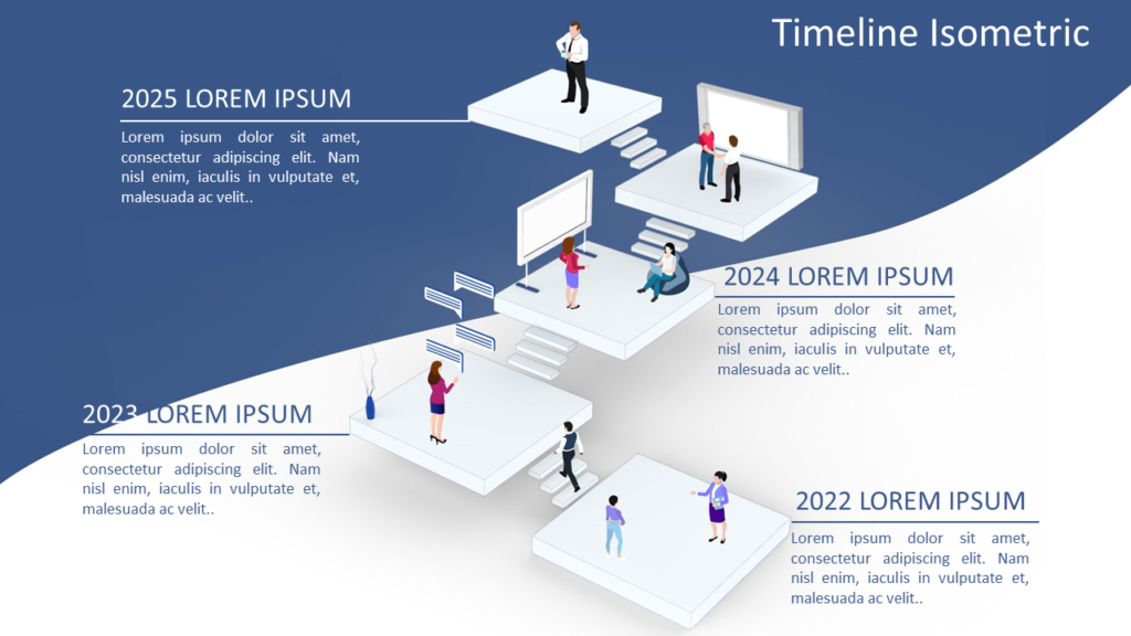
Isometric Illustration Examples To Make Compelling Visual Presentation

Explore Different Types of PowerPoint Graphics For Creating Stunning Visuals

Wrapping It Up
Isometric illustrations are a terrific way to bring a 2D flat design to life. The inherent benefit is that humans consider visuals created using isometric drawings to be crisper and more realistic than traditional ‘realistic’ 3D graphics.
Isometric graphics offer a world in which we can see things exactly as they are. They are an excellent complement to your presentation since they make it seem more attractive.
Looking For Powerpoint Design Agency?
Call Pursho @ 0731-6725516
Telegram Group One Must Follow :
For Startups: https://t.me/daily_business_reads
#Compelling #Visual #Presentation #Isometric #Designs


