Data visualization is a great way to demonstrate complex statistics in a simple and engaging format. The use of charts in presentations helps people grasp the concept clearly. You can create charts in Google Slides without the hassle and with less effort.
So, here’s a step-by-step tutorial to make different types of charts in Google Slides. Let’s start!
How to Create a Chart
Step 1: Choose the slide where you want to insert a chart.
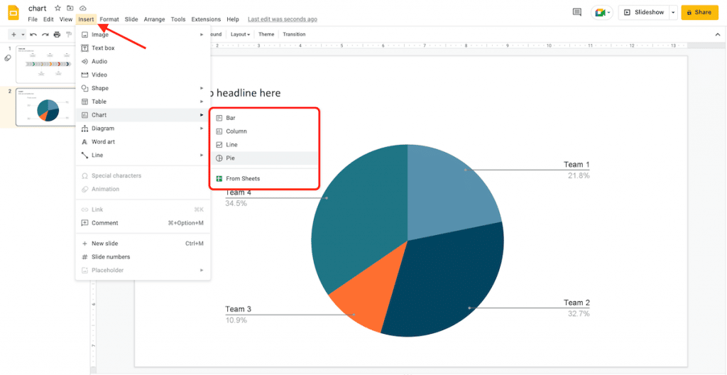
Step 2: Click Insert > Chart. In the drop-down menu, you will see various options, like column, line, pie, and bar. You will also find an option to add a chart from an existing Google Sheets document. Choose the one that fits your requirements.
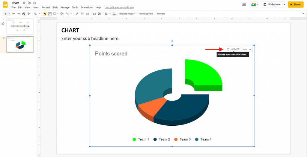
Step 3: The chart will be added as an image on your slide. Click on Edit in Sheets; a pop-up will appear in the bottom left corner.
Step 4: Click the Link options drop-down button and select Open source. A new Google Sheets document will appear.

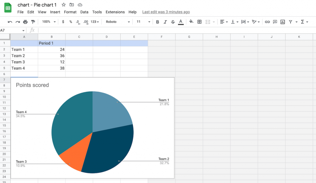
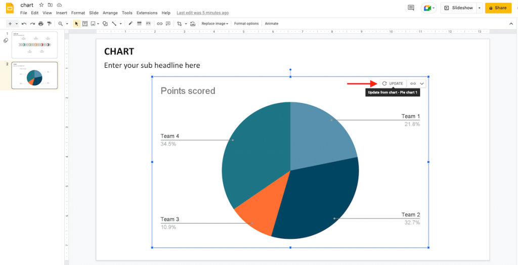
Step 5: You can modify the data and designs. Afterward, go back to Google Sheets and click the Update button to apply the changes.
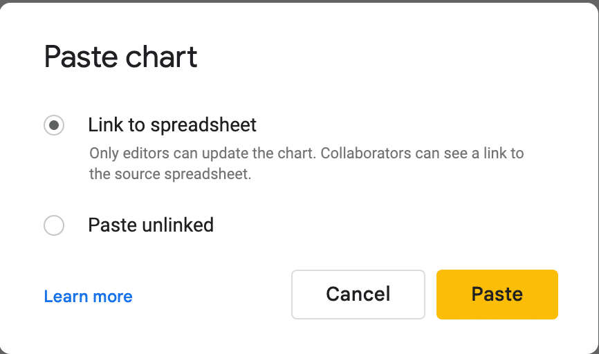
Step 6: You can also copy the chart by pressing Ctrl/Cmd + C and paste it into your presentation.
Step 7: You can link the chart to the source spreadsheet by selecting the Link to spreadsheet option that appears while pasting.
Editing a Chart
Step 1: Open the presentation and select the chart that you want to edit.
Step 2: The chart will be added as an image on your slide. Click on the Link options drop-down button and select Open source. A new Google Sheets document will appear.
Step 3: Change the data in the first cells that have been added by default.
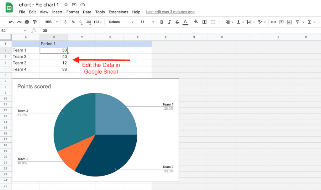
Step 4: You can edit the colors of the background or chart by selecting the desired element and choosing a color from the panel on the right. Or, you can simply click the three vertical dots in the top right corner and click on the Edit chart.
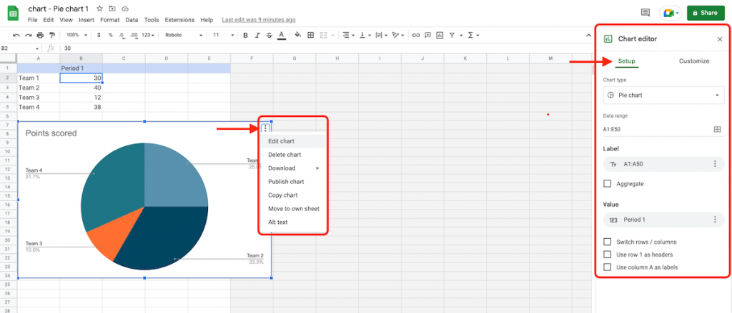
Step 5: The Setup tab in the Chart editor panel lets you select the data range, add operations, change the chart type, and allows you to choose the headers. You can also change how to display data on the chart by clicking on the Stacking drop-down arrow.
Step 6: Click on the Customize tab on the Chart editor panel to adjust different settings.
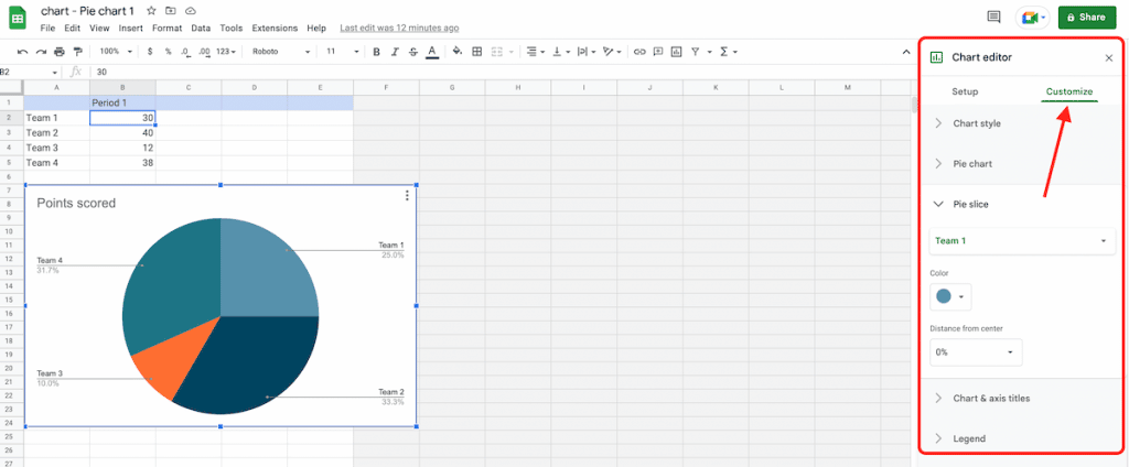
Step 7: Select the Chart & axis titles submenu. Now, enter the title text and change its format, size, color, and font to override the title settings from the Chart style submenu.
Step 8: You can change the background color, chart border color, and font from the Chart style submenu. It allows you to enable the Compare mode, maximize the chart, and turn it into 3D.
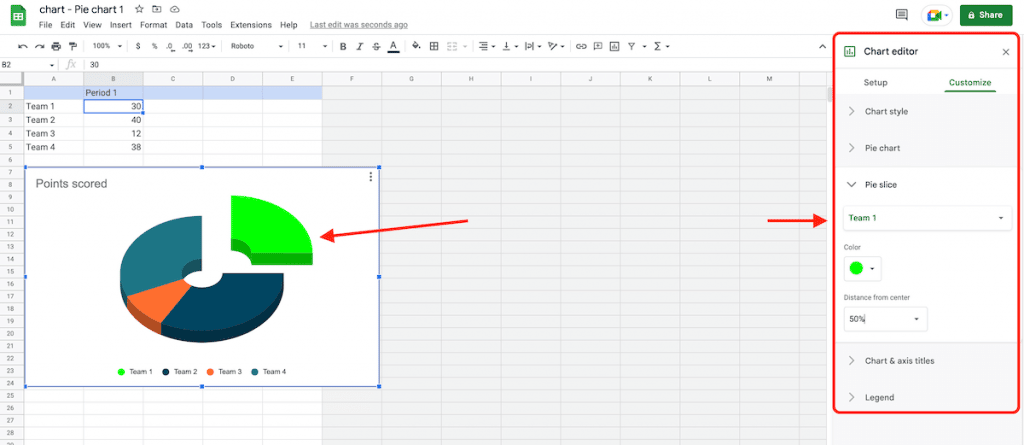
Step 9: Click on the Legend submenu to set the format and position of the legend.
Step 10: To edit the bar chart, click on the Series submenu to change the colors of the periods, enabling data labels and error bars.
Step 11: To edit a line or bar chart, click on the Vertical axis and Horizontal axis submenu to adjust the axes and format of the labels.
Step 12: Finally, click on the Gridlines submenu to enable the gridlines, their color, and numbers.
Step 13: Click the Update button to apply these changes in your Google Slides presentation. To copy the chart directly from your Google Sheets, press Ctrl/Cmd + C and paste it into your Google Slides presentation.
Isn’t it super easy to make charts in Google Slides? Stay tuned for more such handy tutorials!
Looking For Powerpoint Design Agency?
Call Pursho @ 0731-6725516
Telegram Group One Must Follow :
For Startups: https://t.me/daily_business_reads
#Edit #Charts #Google #Slides #Step #Step


