You’ve got a huge presentation coming up. You’ve worked for months researching and developing content. Now it’s time to start designing your presentation. Before you do, there’s something important you need to know. Your presentation screen size.
Today we’ll cover the two most common aspect ratios for presentations, how to set up your PowerPoint presentation to a specific size, and some other things you might want to consider.
The Two Most Common Presentation Screen Sizes
The two main sizes are 4:3 and 16:9. These numbers give you the aspect ratio of width by height. A 4:3 presentation format has a ratio of 10 inches wide by 7.5 inches high. A 16:9 presentation format has a ratio of 10 inches wide by 5.625 inches high. So the width of these two sizes is the same, but the height is different, giving the 16:9 size a longer, more narrow look as shown below in a graphic from PresentationPoint.
 Widescreen
It’s safe to assume that most of the screens you’ll use as a presenter will be a version of the 16:9 ratio called widescreen. This version maintains the 16:9 aspect ratio while making the slide size 13.333 inches wide by 7.5 inches high. PowerPoint’s creator, Microsoft, says, “widescreen provides more slide surface area for the content, so that is the best choice for presentations.” That’s why they have set the default of PowerPoint presentations to a 16:9 widescreen ratio by default since 2013. So unless you know you’ll be presenting on a squarer screen, you should format your presentations for widescreen. If you create a 4:3 PowerPoint and present it on a widescreen, you’ll end up with black bars on the left and right of your screen space, which looks unprofessional.
Setting Up Your Screen Size
So here’s how to set up your screen size. First, remember that PowerPoint 2013 and later defaults to a widescreen setting. But if you are trying to convert old 4:3 presentations to widescreen, you’ll need to walk through the following steps.
- Go into the Design menu.
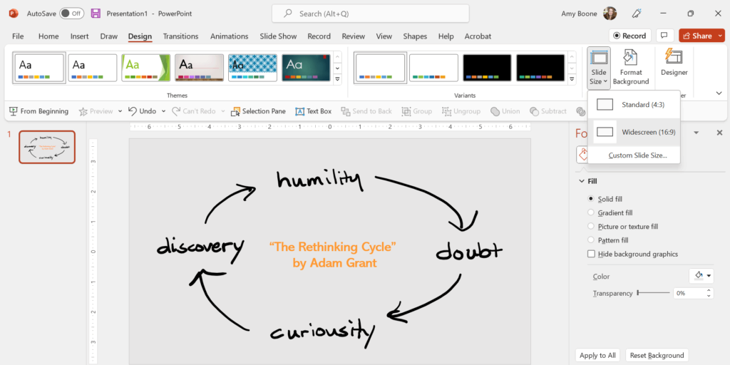
- From there, click on Slide Size. Here, you can see what your current settings are as shown below.
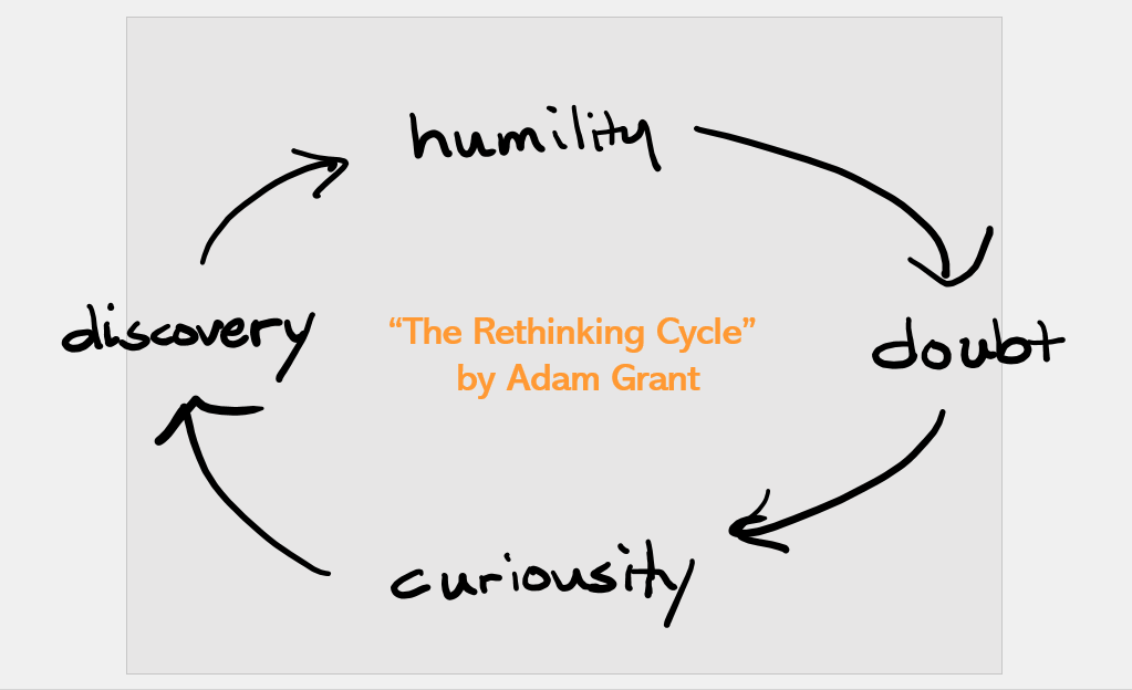
 Select the size you want to change to. If you are changing a 16:9 presentation to a 4:3 presentation size, you’ll have two choices: maximize or ensure fit. If you choose maximize, Microsoft warns, “Choosing this option could result in your content not fitting on the slide.” You can see that below. So this option is better if you are sizing up.

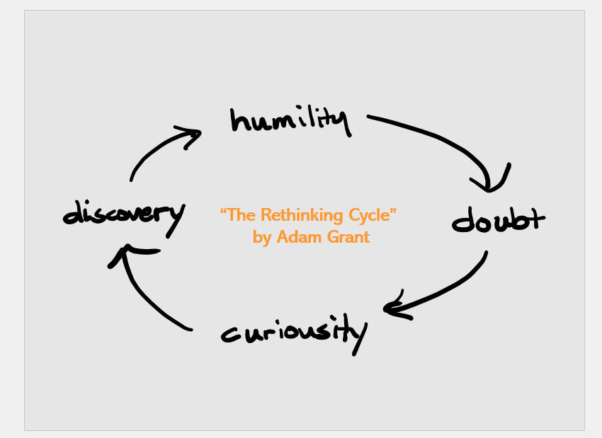
If you choose ensure fit, it’s the opposite. Microsoft says, “Select this option to decrease the size of your content when scaling to a smaller slide size. This could make your content appear smaller, but you’ll be able to see all content on your slide.” The problem with this is that it can compress graphic elements. See below how the handwritten elements are less clear once sized down? Look especially at how the word “discovery” looks. It is thicker and harder to read because of the size change.

Some elements of your slide made need to be revised if you are sizing up or sizing down. It’s always a good idea to look through your slide deck to see how the size change affected the elements in your presentation.
Other Things to Consider
As you think about sizing your presentation, here are some other things you might want to consider.
- Make two versions. Although the large majority of today’s screens are 16:9, if you are unsure of the size of the screen you’ll be presenting on, it’s not a bad idea to create both a 4:3 and a 16:9 widescreen presentation. Unless you have lots of distortion in your elements, it will probably only take you a few minutes to have two versions ready to go.
- Know the orientation of the screen. The vast majority of presentations will be created for landscape (horizontal) screens. However, sometimes hotels and malls use screens in portrait (vertical) layout, so make sure to ask about the orientation rather than assuming. It’s always better to be safe than sorry.
- Save your presentation in a couple of different versions. For example, the standard .pptx file is always a good version, but we’d suggest also saving it as a .pdf file. That is a more universal computer program “language.” So if the technology you are presenting on is outdated or has a different version of PowerPoint, that .pdf file can come in clutch.
We’re happy to see a more standardized widescreen approach to both screen and presentation size. It makes things easier for all presenters. But if you are someone who feels like presentation design is outside of your wheelhouse, that’s what we’re here for.
See how our presentation design agency can help.
The post Designing for Different Screen Sizes: 4:3 or 16:9? appeared first on Ethos3 – A Presentation Training and Design Agency.
Looking For Powerpoint Design Agency?
Call Pursho @ 0731-6725516
Telegram Group One Must Follow :
For Startups: https://t.me/daily_business_reads
#Designing #Screen #Sizes


