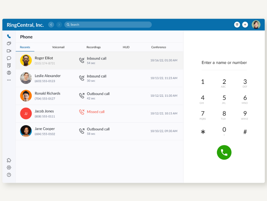
You asked, and we listened—here are five user-requested updates to the RingCentral desktop softphone experience.
We’re thrilled to share with you this update to our user interface, which brings together customer feedback in a seamless, intuitive experience. This is just one way RingCentral users are making our products better and directly impacting the future of what’s possible in cloud communications.
So let’s get into it! Here are the 5 big improvements we’ve made to our desktop softphone interface:
- Boost productivity with a compact pop-out window
- Make calls more quickly with our new dial pad experience
- Find voicemail transcriptions more easily with the updated voicemail tab
- Transfer calls like a pro with enhanced Heads-Up Display (HUD)
- Access what matters most with customizable navigation menu
5 new, user-led updates to RingCentral’s desktop softphone experience
1. Boost productivity with our super-compact pop-out window
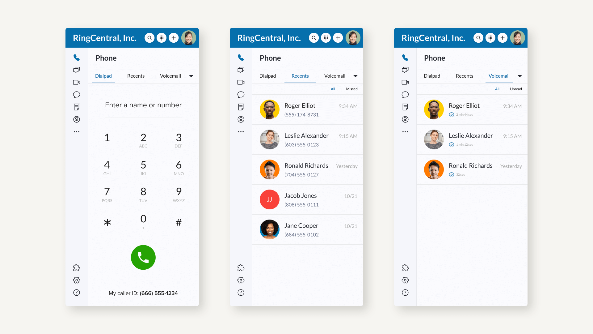
Previously, the RingCentral desktop softphone took up considerable space on the screen and could not shrink down to a compact mode. Our users told us they wanted it to shrink further, so that they could better multi-task in other apps.
The new RingCentral softphone can now be minimized from a previous 640 pixels to a mere 400 pixels. Easily tuck it away on the side and work in other windows/apps while still being able to access the softphone when you need it. Stay on the phone in a standalone window while completing tasks simultaneously. Do more with less.

2. Make calls more quickly with our new dial pad experience
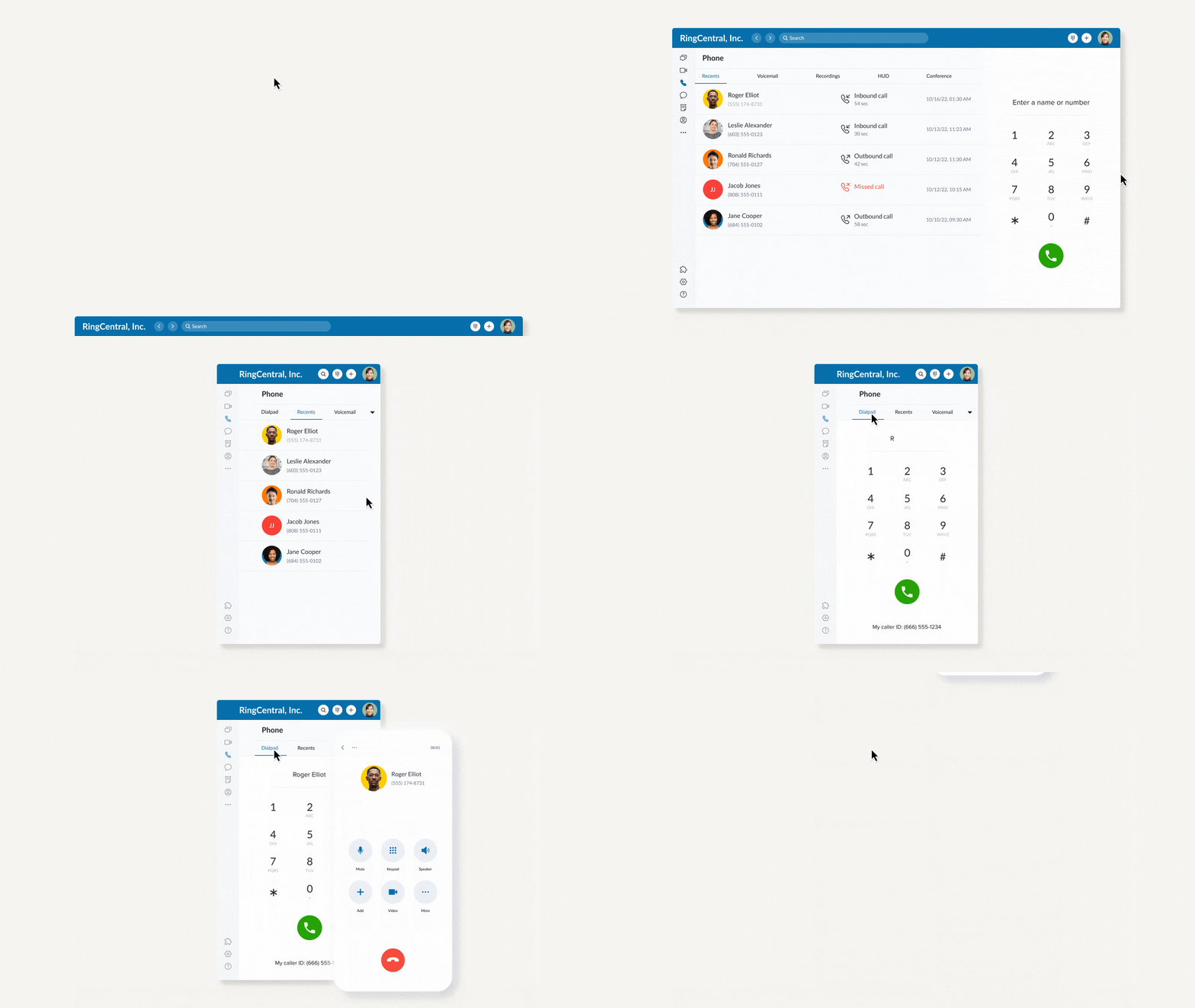
Making an outbound phone call is usually the first interaction users have with the RingCentral app. But first-time users had difficulty finding our old dial pad. That’s why we’ve removed the guesswork and built a larger, easier-to-find dial pad in the center of the softphone experience.
In this new design, you can access the dial pad effortlessly for quick calling, easily copy and paste phone numbers or directly type in your recipient’s name in the dialer.

3. Find voicemail transcriptions more easily with the updated voicemail tab

When we started introducing advanced softphone capabilities, we were concerned that people wouldn’t easily find out about them. At first, we reduced the footprint of classic phone features like voicemail and call history tabs, to add room for shiny new, but niche features.
But this focus on new innovations made the old favorites hard to find sometimes: voicemail, call history etc. That’s why we‘ve refreshed the voicemail tab experience for a simpler, easier-to-use interface.
Now, in the refreshed voicemail tab, you can see an auto-transcribed text of your voicemails appear instantly alongside the caller’s information. Enjoy a 360 view of the voicemail instantly.

4. Transfer calls like a pro with enhanced Heads-Up Display (HUD)
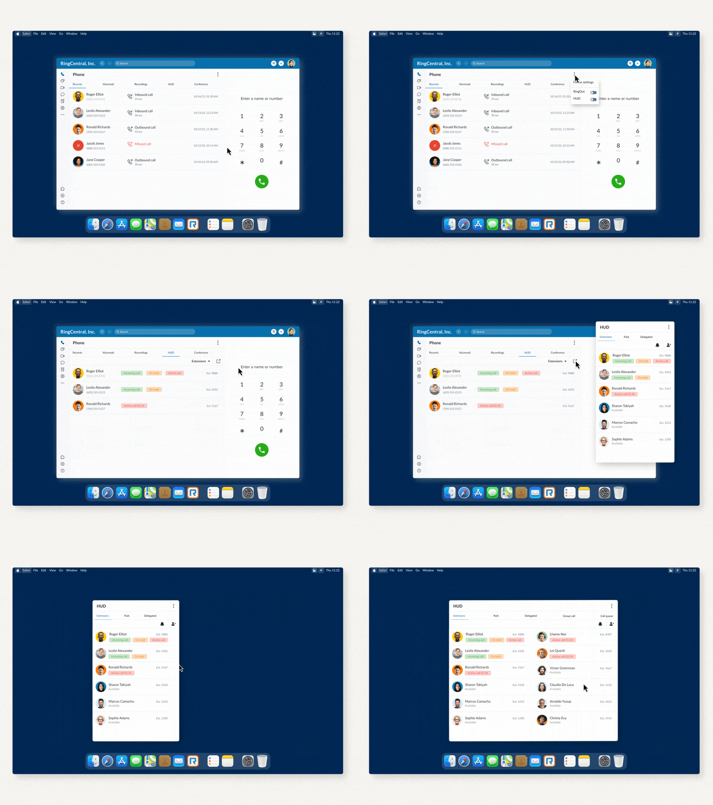
RingCentral was the first-to-market with mobile and desktop HUD (heads up display) functionality, making advanced phone capabilities for users, such as receptionists and admins, more mobile than ever before. We like to call these softphone pros “power users.” Typically only available on proprietary desk phones, customers can easily view colleagues’ real-time availability and manage multiple incoming calls with the capability to answer and transfer an incoming call, add users to a current call, chat with a colleague directly, or pick up a call on behalf of colleagues with permission – from a desktop or mobile device.
We wanted to enhance the desktop experience for power users, so we brought them into the design process. Their insights showed us where our first ideas weren’t quite right, and helped us refine our app for a more helpful experience. Thanks to these softphone superstars, our newly enhanced, co-designed desktop HUD is more adaptive, responsive, and flexible than ever. Here’s one example of a user-led idea we’ve made possible today:
In the previous UI, you had to click through your HUD tabs (extensions, park locations, group call pick up, etc.) to see what was going on. Now you can easily see colleagues’ real-time availability and manage multiple incoming calls in an unified view or choose if you only want to see certain HUD navigation tabs.The number of columns also change dynamically depending on how big or small you drag the app to be, giving different views as you need it. You can even undock the HUD window, so you can do work more efficiently in just a tiny window.

5. Quickly access what matters most with customizable navigation menu
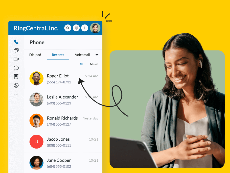
People use RingCentral at all kinds of organizations with varying roles and responsibilities, from CEOs to field technicians to small businesses and established banks. With that in mind, we have made the navigation menu customizable, so you could curate an order that best meets your needs and workflows.
Whether you’re an avid texter, responsible for sending sensitive documents over encrypted eFax, or a customer facing power caller, you can easily customize the desktop icon order according to what you use most.
Our customers help us get the details right

We believe that getting the details just right is a big part of making something truly excellent — sweating the small stuff as it relates to phone is one of our key competitive advantages.
At RingCentral, we take design changes seriously. With over 5 million paid users globally, people are highly engaged on our platform. We recognize that we need to be extra cautious when making even the slightest change to their learned workflows and apps.
Our new desktop softphone experience is truly about putting our users’ needs first, and we hope this update brings us meaningfully toward a simpler, more modern RingCentral workspace that sets the stage for more exciting innovations in 2023.
How to experience the new desktop softphone: The new softphone interface will soon be in open beta in December, and will be generally available January 2023 onwards to all global users. Soon, you’ll see a pop-up in the app to enable the new softphone experience. You can choose at any time to toggle that on or off – by default it will be off as we want the choice to be yours to opt in. When enabled, you’ll see a new interface appear in the phone tab, and all your current phone history will migrate over. Try it out and let us know what you think!
If you haven’t already, consider downloading the RingCentral app to try it out, or bookmark our dialing up innovation webpage to stay up to date with our latest and greatest.
Originally published Dec 05, 2022
Looking For Startup Consultants ?
Call Pursho @ 0731-6725516
Telegram Group One Must Follow :
For Startups: https://t.me/daily_business_reads

