Your LinkedIn page is basically your digital resume, portfolio, and cover letter all wrapped into one. When you’re filling out your profile with your many accolades, be sure you’re not skipping a valuable piece of real estate: your LinkedIn banner.
Now, to be clear, recruiters might not even see the banner. Bonnie Dilber, Recruiting Manager at Zapier, told me that recruiters won’t see your banner if they’re using LinkedIn Recruiter, for example. But Bonnie also said that sometimes she’ll click through—and when she sees the full profile, the banner can give her a sense of a person’s values and interests.
So not including a banner likely won’t deter recruiters from reaching out, but it’s still a great place to showcase some personality—and might just be the perfect conversation starter.
Unsure what image to upload as your LinkedIn banner? You’re not alone—while stalking profiles for this article, I noticed roughly half of the profiles I came across stuck with the default image featured below (sorry, Blake). So I’ve compiled a list of LinkedIn banner ideas that stuck out to me and recruiters at Zapier to help you stand out from the crowd.
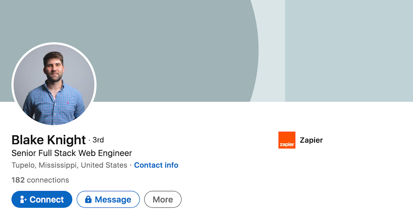
Table of contents:
1. City skyline
If your career is closely tied to the city you work in, slap the city skyline on your profile. For example, if you lead a tour guide company out of New York City, will people trust you more if your background is a random abstract image or an amazing shot of the Statue of Liberty?
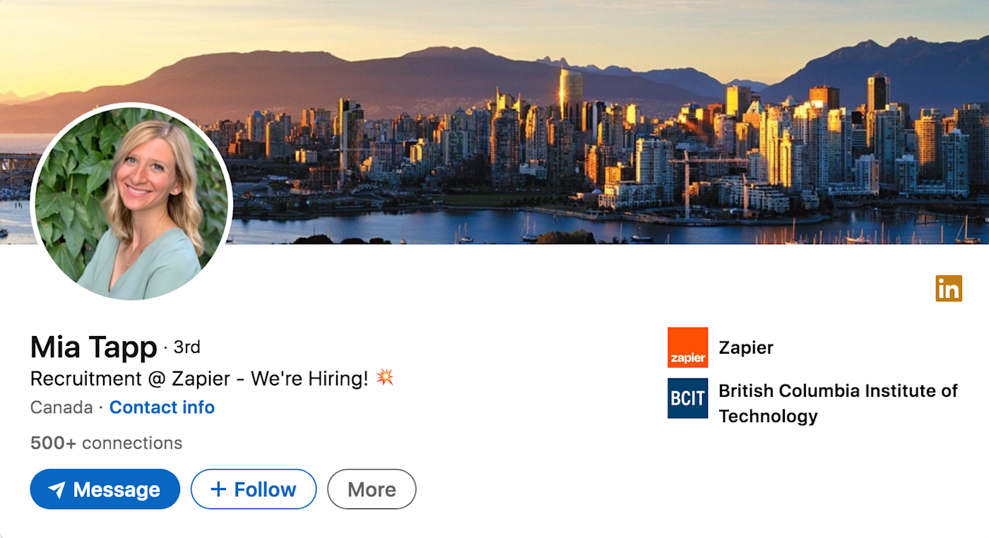
Even if your location isn’t relevant to your work, it can still show your connection to a specific place and help spark folks to reach out about local events. Here’s an example from Zapier recruiter, Mia, showing off the skyline of Vancouver.
2. City landmark or natural landscape
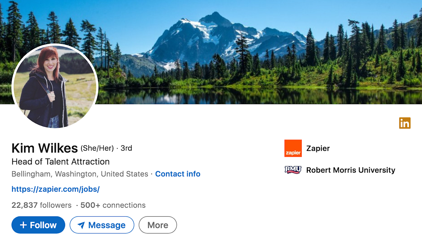
Just like the city skyline, a local landmark can help identify your location at a glance and serve as a fun way to get the conversation going. Zapier’s Head of Talent Attraction, Kim, highlights a local mountain as her LinkedIn banner. “Candidates often reach out to me asking where my photo is from, and it’s a nice way to open the conversation,” she says.
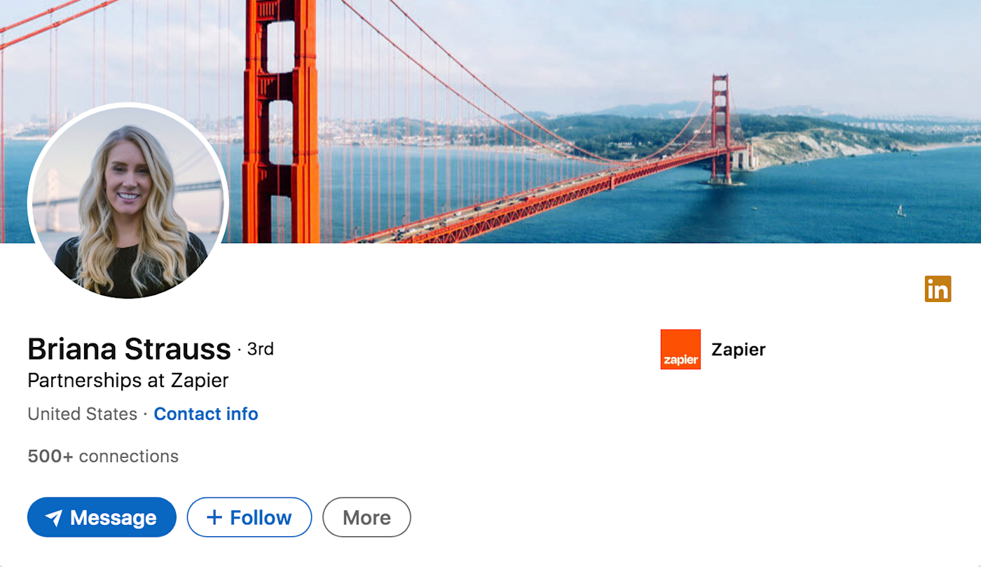
Here’s another example from Briana at Zapier. I’m guessing no one’s asking what it is, but it shows her love for San Francisco and can help break the ice.
3. Inspirational quote or motto
An inspirational quote (by you or someone you admire) or a personal motto can showcase your values and personality to future employers or clients.
My personal favorite quote is “There is no innovation and creativity without failure. Period.” from Brené Brown because it inspires me to take risks. Whatever quote you choose, be sure it encompasses who you are as an individual and in your career.
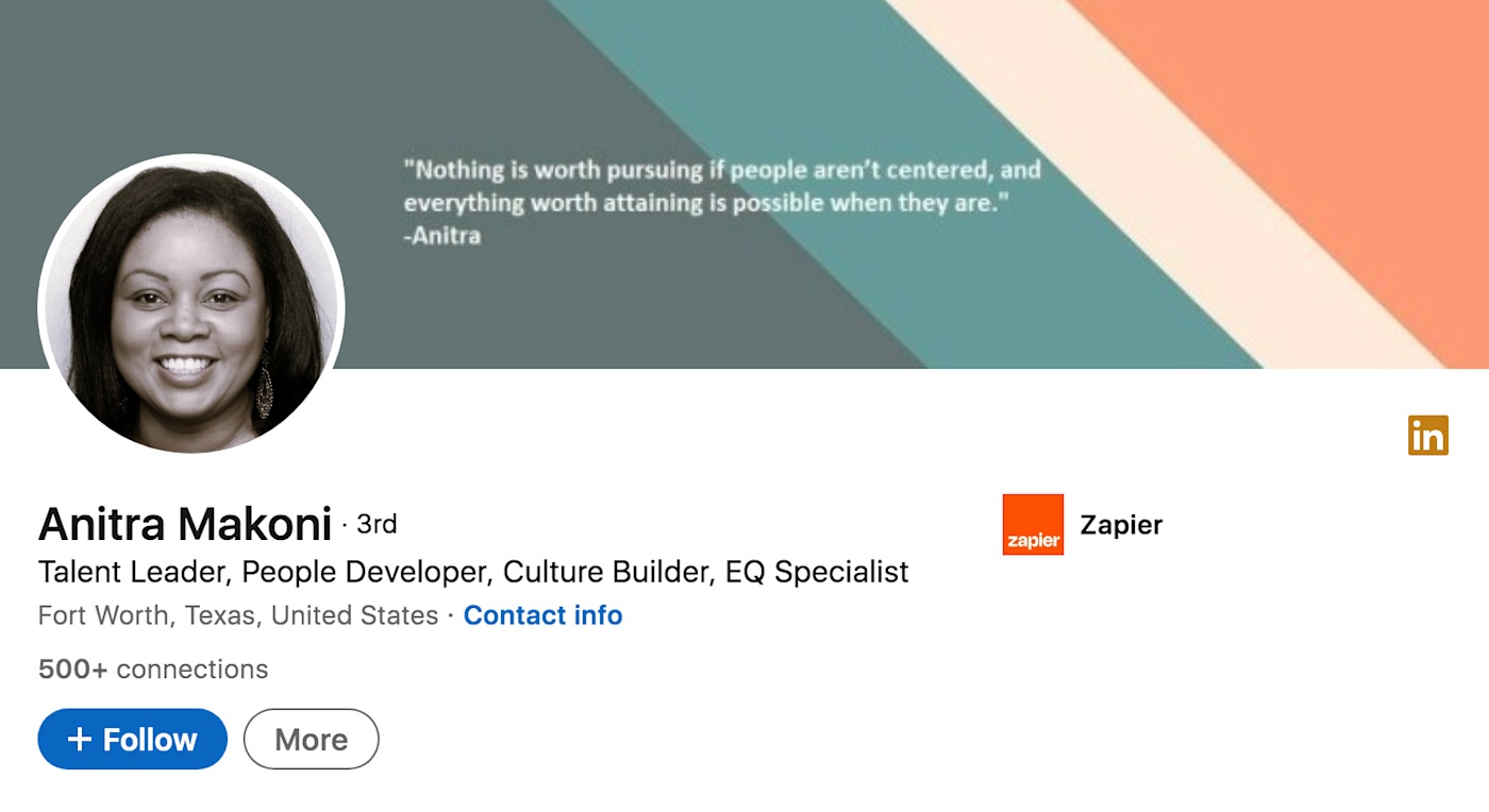
Anitra, a recruiter at Zapier, attributes a quote to herself in her banner. It gives you a good idea of what matters to her.
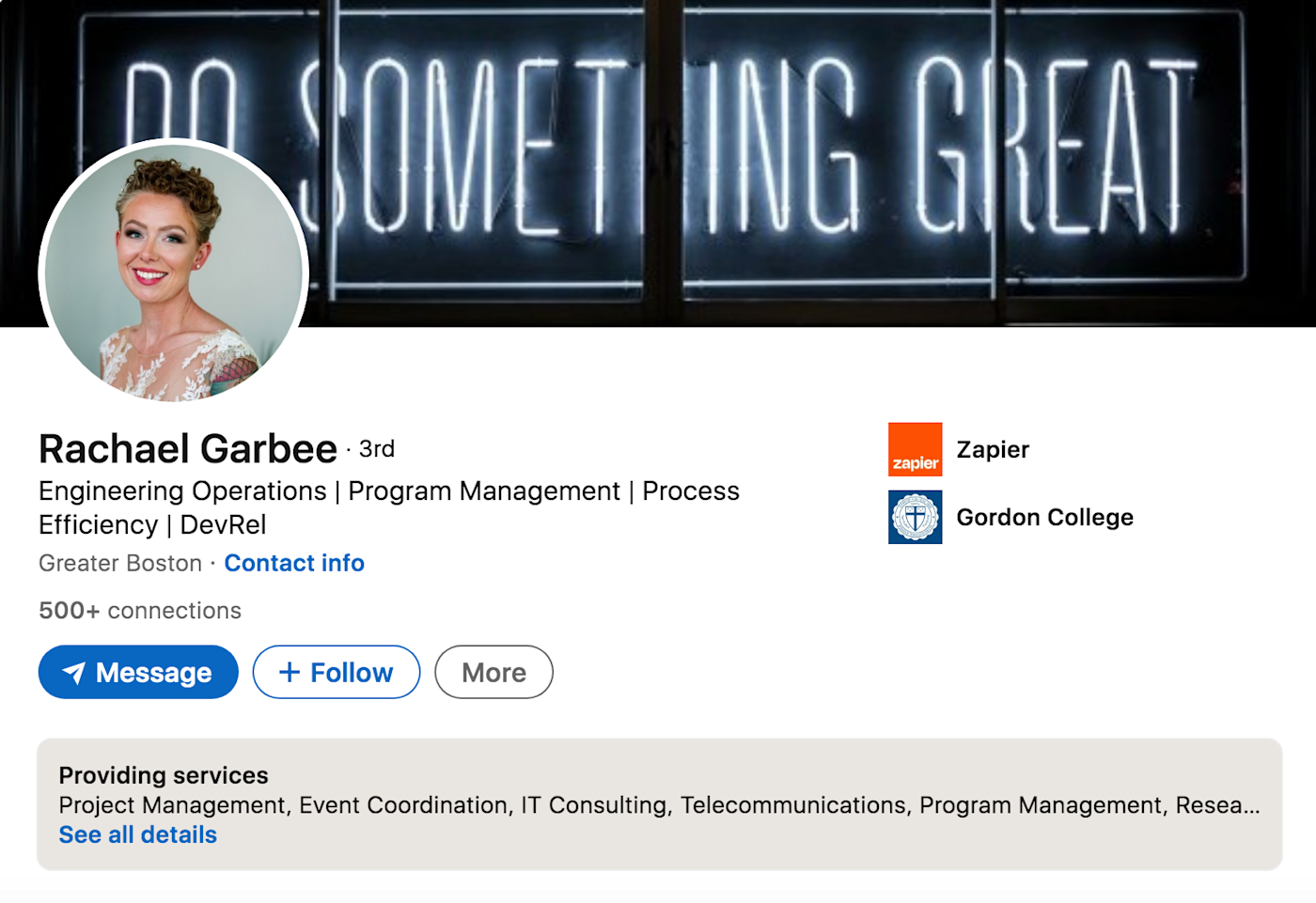
Rachael, a manager on the Technical Support Operations team at Zapier, sticks with something more anonymous—and spices it up by displaying it in lights.
4. Professional gear
Featuring the gear typically used in your profession can add some credibility to your profile and provide a visual representation of your career.
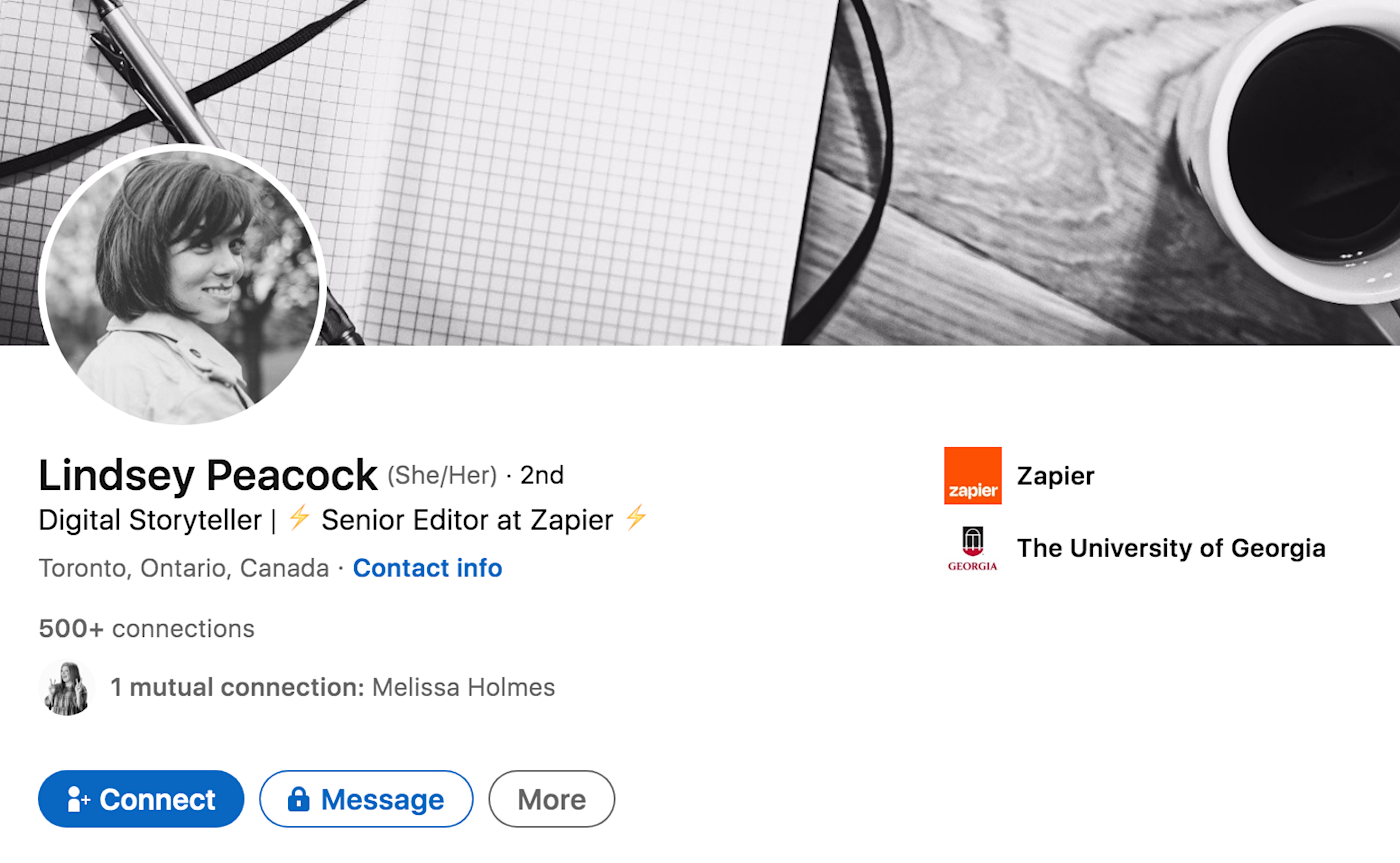
In the example below, Lindsey, an editor at Zapier, shows off her pen, paper, and (of course) coffee while maintaining a cohesive black and white aesthetic, which highlights her eye for design.
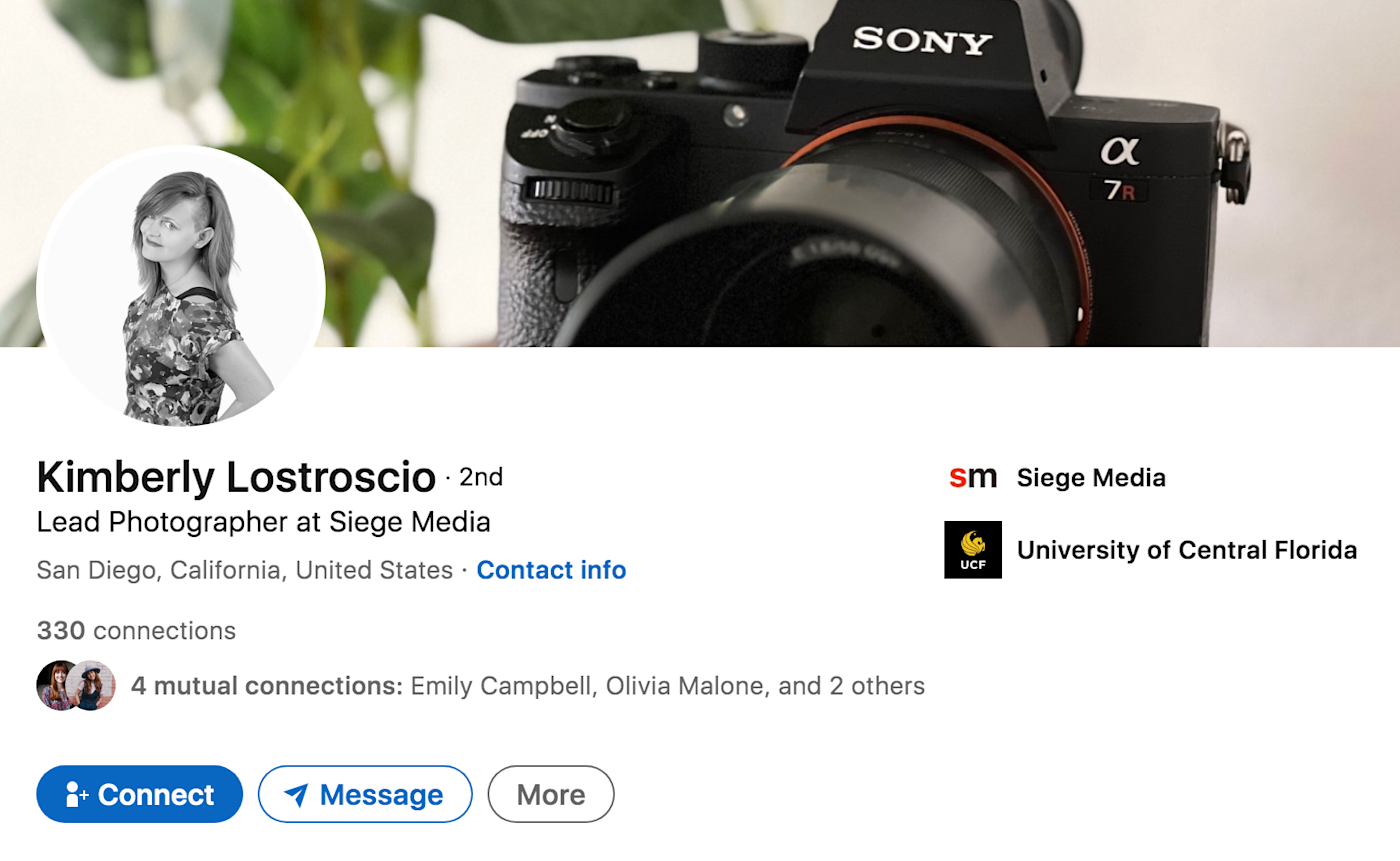
And you can tell that Kimberly from Siege Media is a photographer just by glancing at her LinkedIn banner, which displays a close-up picture of the camera she uses to work her magic.
5. Graph
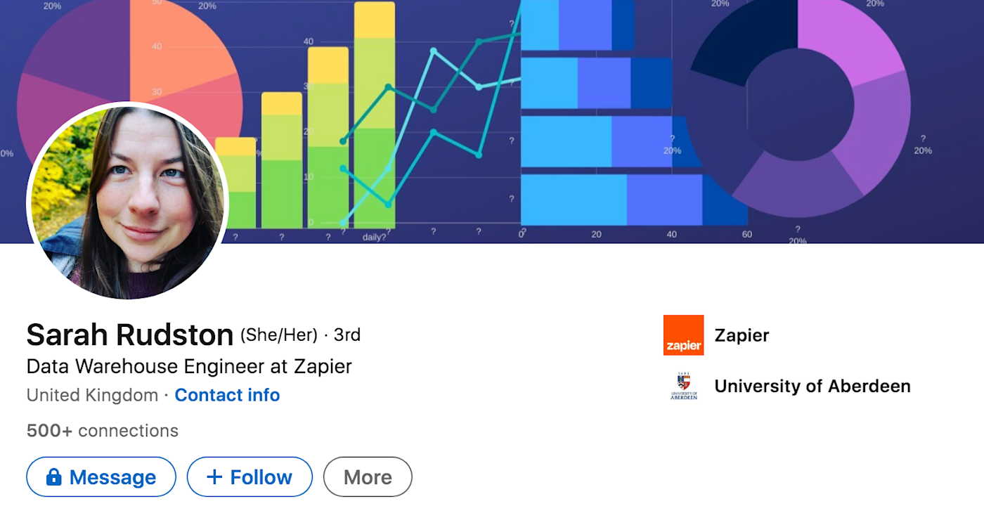
If you have a data- or results-driven career (think data engineer or sales manager), consider an image showing upward trend lines and other visualizations frequently used in your line of work. Don’t shy away from using bold colors that really grab attention to showcase your creativity.
Sarah, a data warehouse engineer at Zapier, grabs your attention with all the data. You can tell she loves what she does.
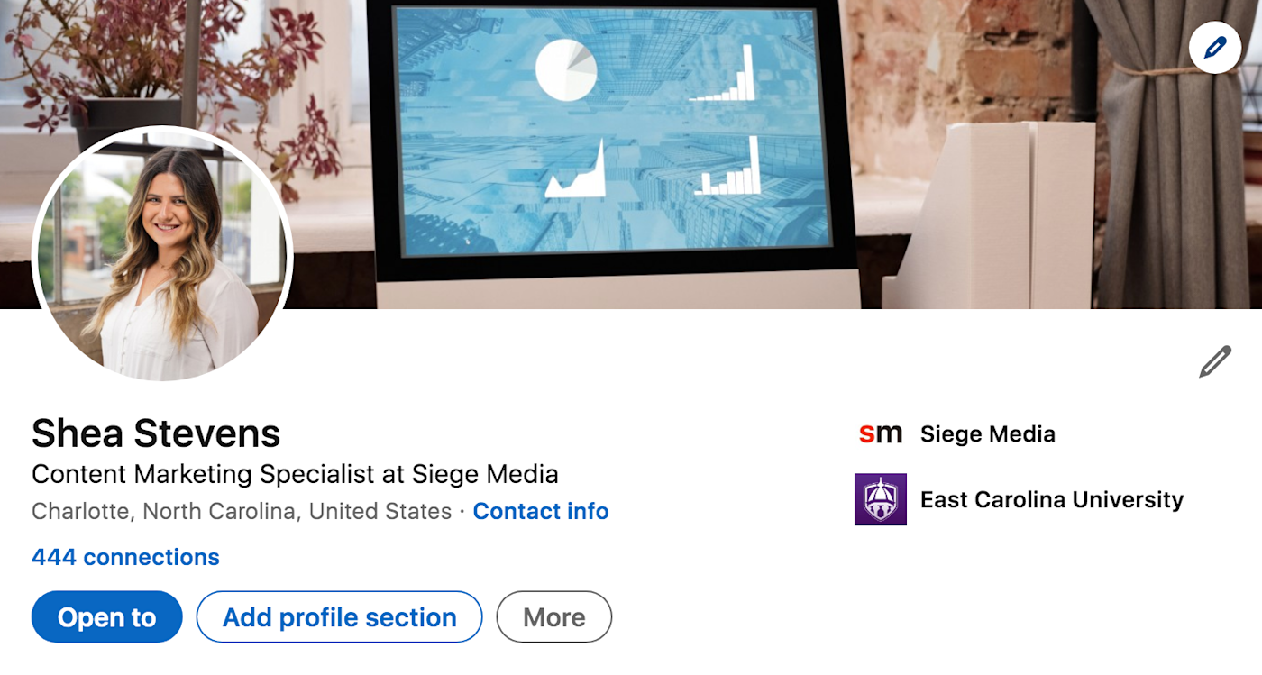
And here’s me! I help companies boost their traffic and rankings with SEO-focused content, and my banner alludes to that with some charts.
6. Your company, coworkers, or clients
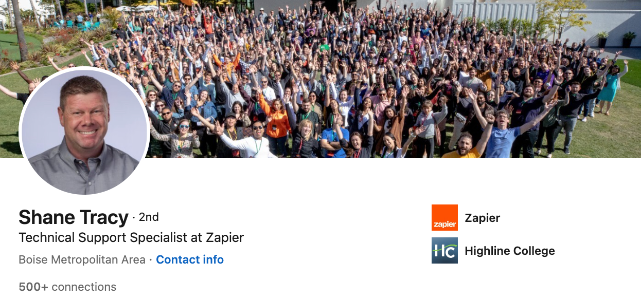
If your job involves working with people, like HR or customer success, add an image of the folks you work with. If you don’t have an in-person picture, you can also use an illustrated image to portray that you’re a people-oriented professional.
Here’s a picture of the entire Zapier team at an in-person retreat, care of Shane, a customer champion at Zapier.
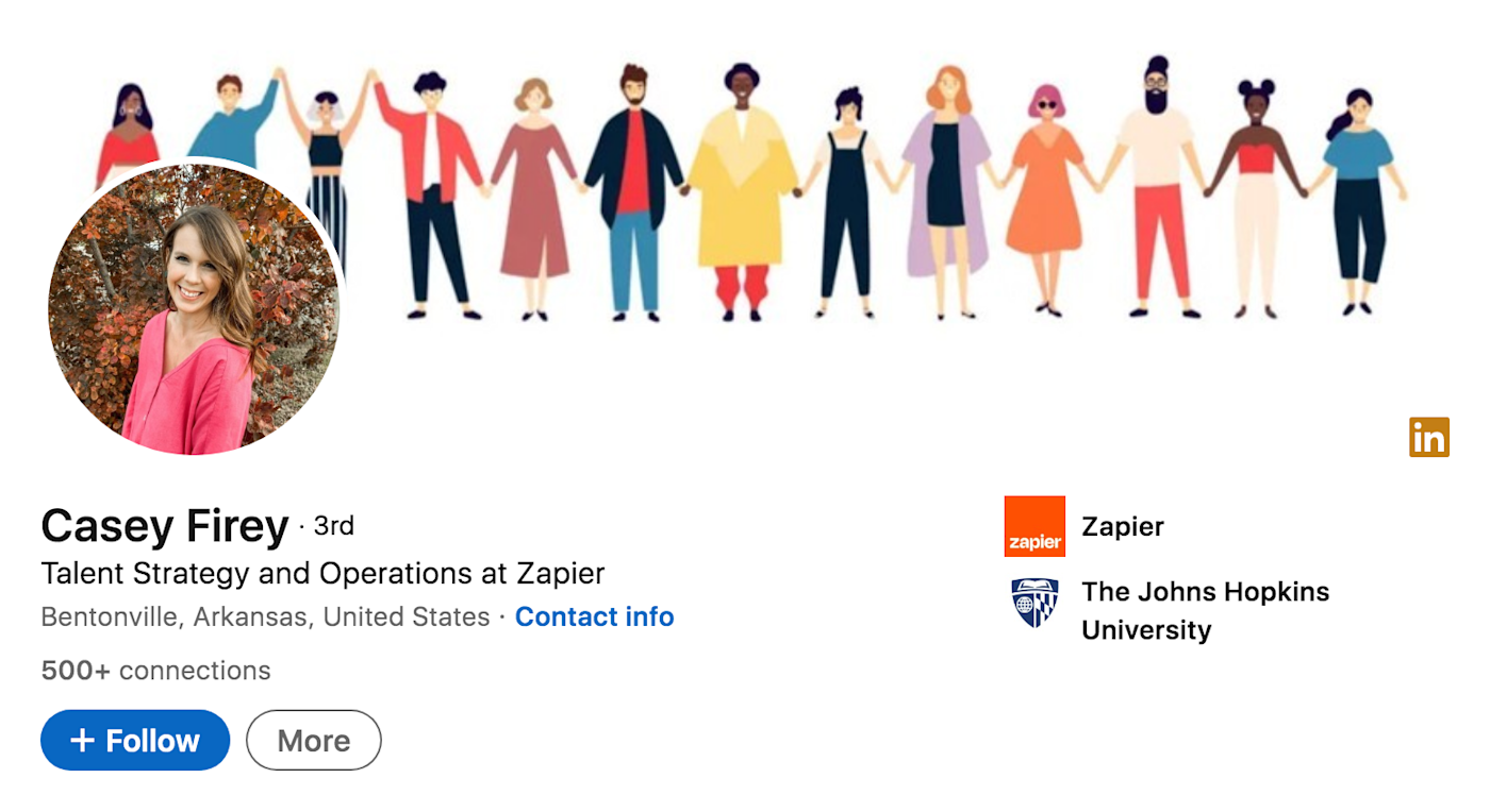
Casey, who works in talent strategy and operations at Zapier, takes a different route. She uses an illustrated graphic of a group of people holding hands, which exudes values of connection and diversity.
7. Personal hobby or interest
Your LinkedIn banner can be a great place to showcase what you like to do outside of work too. Recruiters are looking for a well-rounded person, and adding a personal hobby or interest shows that you’re a real person, not just a resume. Whether it’s a photo of you doing something you love or just an image of whatever you’re a die-hard fan of, including this on your profile can be a nice personal touch—and will absolutely get some conversations going.
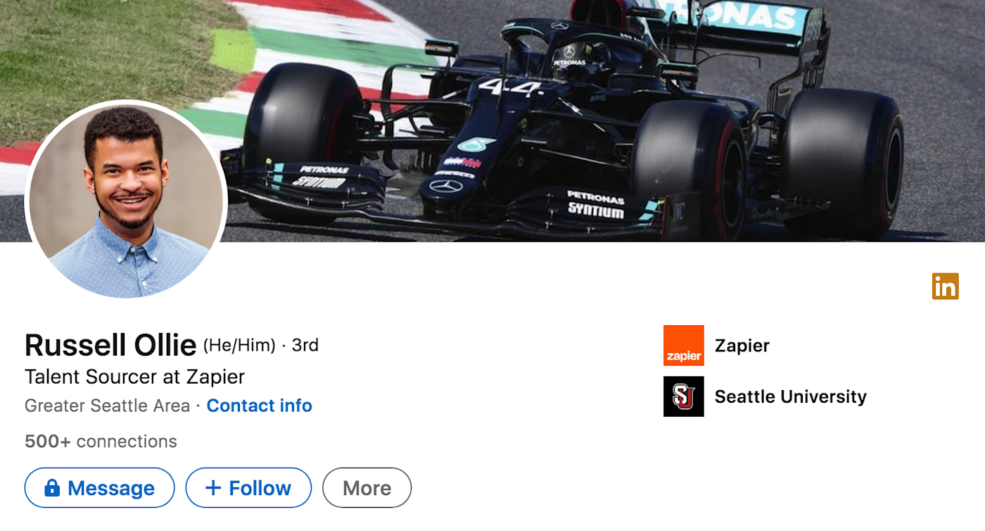
I’d be shocked to find out that Russell, a talent sourcer at Zapier, didn’t love car racing.
And Evan, a design lead at Zapier, shows off his love of the outdoors—a far cry from designing at a computer.

8. Workstation
A photo of your desk and work setup gives off a clean, professional vibe.
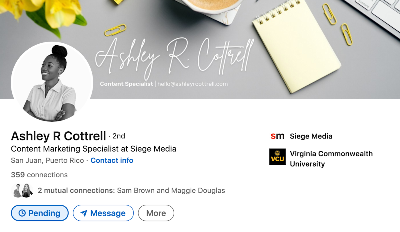
You can even use this image as a background to display your name, job title, or contact information, like Ashley, a content marketing specialist at Siege Media, does in the example below. Her cohesive color scheme creates a distinct personal brand, which is especially important for creative roles like content writers and graphic designers.
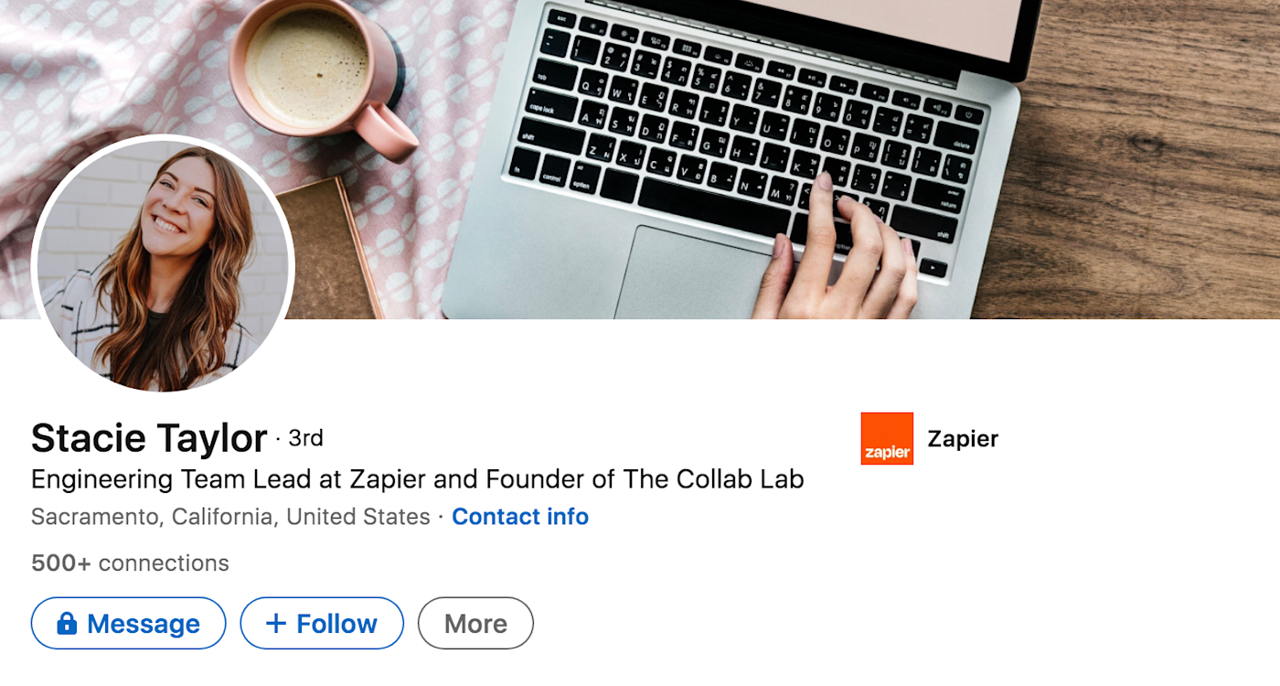
Stacie, an engineering team lead at Zapier, does something similar—making sure her profile image matches the vibe of the banner too.
9. Your product
A LinkedIn banner is the perfect place to promote your product, what it does, and its benefits. Whether you run a small eCommerce business or work at a large tech company, this can be a great place to showcase your offerings. If your product isn’t a physical object, you may need to get creative with this one.
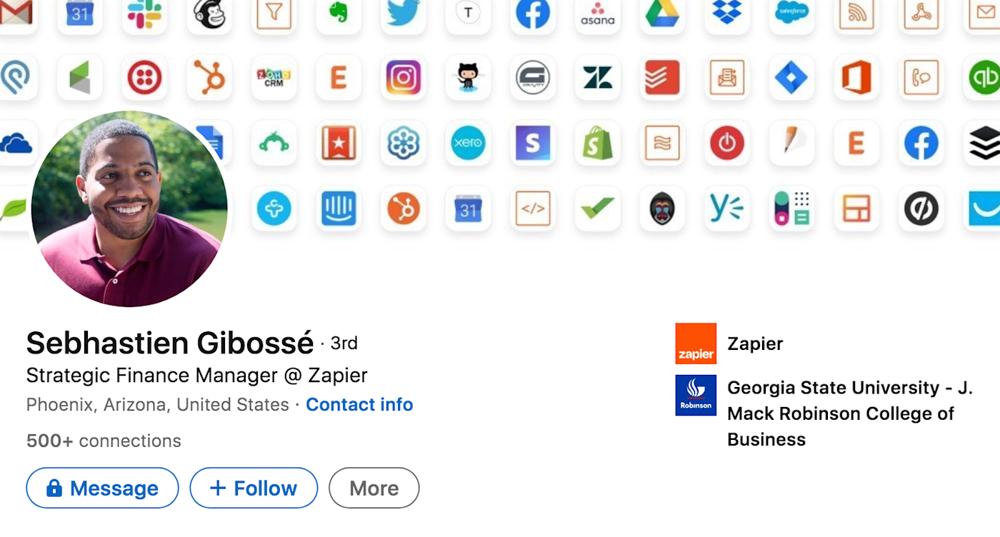
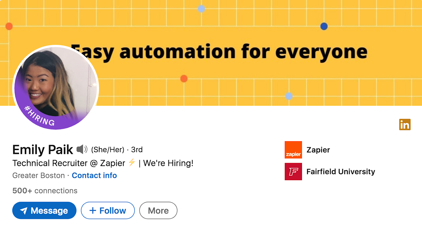
In the examples below, Sebhastien, a finance manager at Zapier, includes an image of some of the apps that Zapier integrates with, while Emily, a recruiter at Zapier, explains in simple terms what the product does.
Other ideas:
-
If you’re a freelance copywriter, consider featuring brands you’ve worked with.
-
If you’re a graphic designer, showcase your designs.
-
If you’re a photographer, use a photo you took.
10. Minimalist icons
Minimalist icons are a fun and creative way to convey what it is you do in your career. Think emojis if you work in social media or a magnifying glass if you work in executive search.
In the example below, Sean, a marketing ops specialist at Zapier, uses icons that clearly showcase email marketing, like an envelope, thought bubble, call to action button, and paper airplane.
Meanwhile, Jed, a designer at Siege Media, kills two birds with one stone by using his own design skills to create these fun and colorful icons.
11. You doing your work
Use your LinkedIn banner to showcase yourself in action.
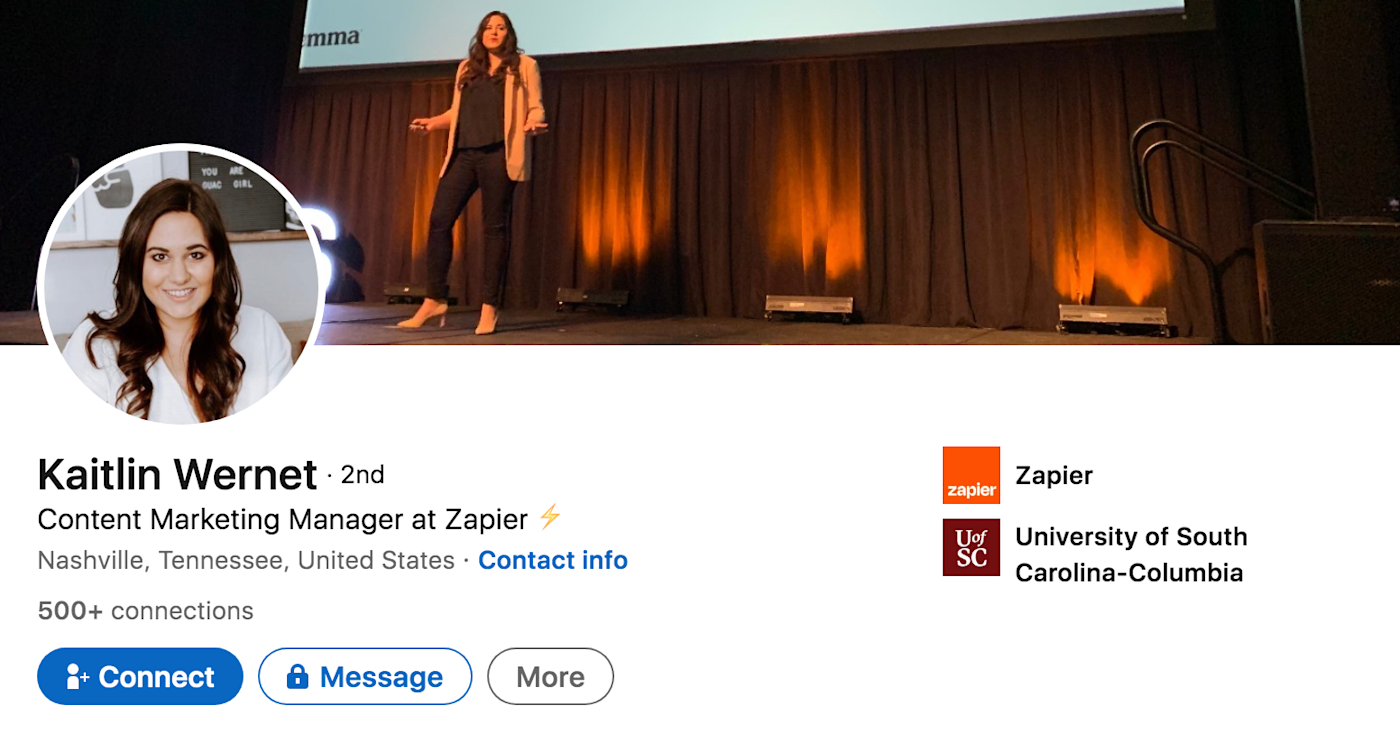
Kaitlin, a content marketing manager at Zapier, showcases herself speaking at a conference, which implies that she’s a thought leader in the industry.
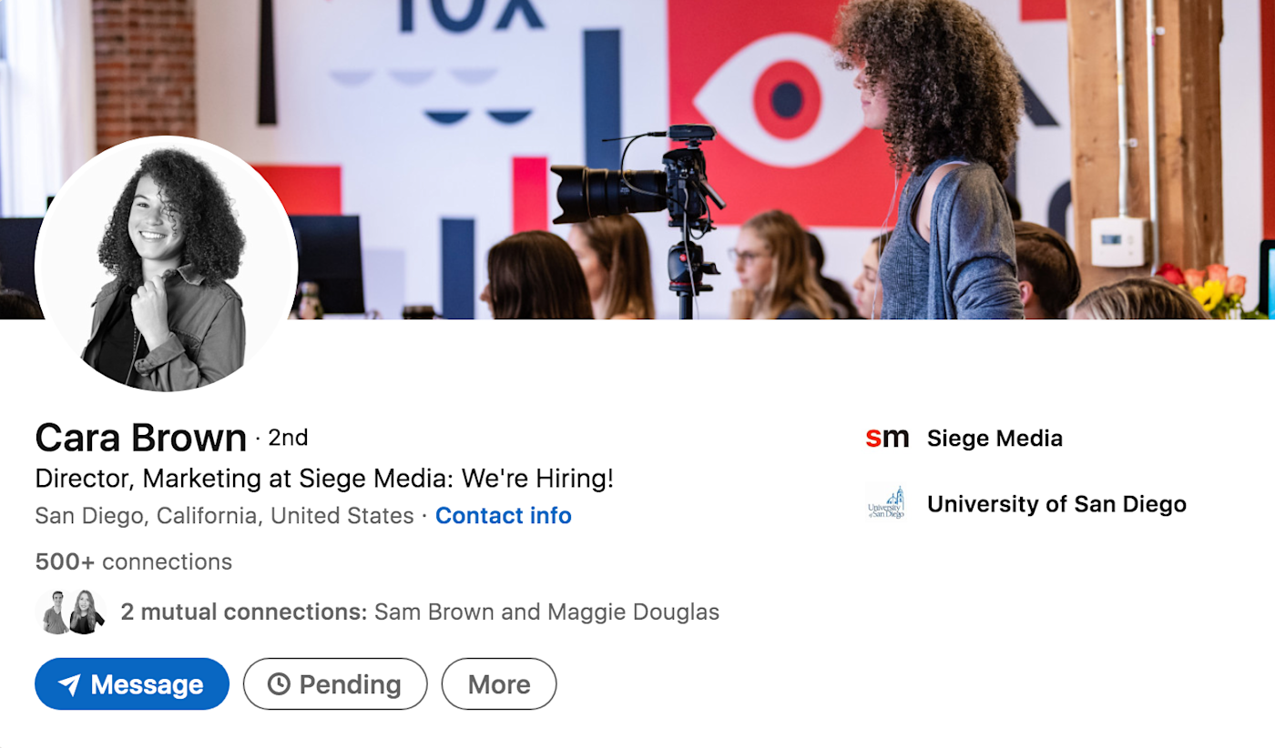
Cara, my marketing director, shows off her passion for photography by using a photo of her behind the camera.
12. Personal belief
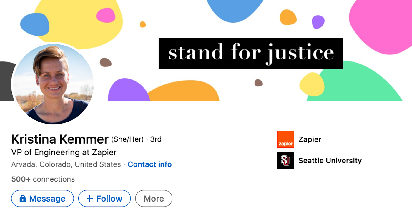
If there’s something you really believe in, don’t hesitate to display it on your profile. You won’t want to work for a company whose values don’t align with yours, so it’s actually a good way to prevent that possibility. LinkedIn even offers a few pre-made banners that support causes like Black Lives Matter and LGBTQ+ allyship.
Kristina, the VP of Engineering at Zapier, selected a banner that showcases her passion for equality and human rights.
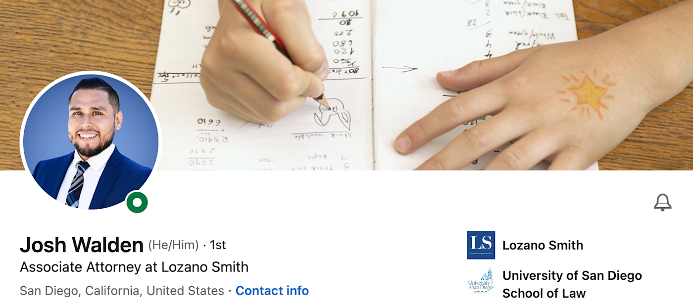
I reached out to Josh Walden, an associate attorney, about his LinkedIn banner, and he mentioned he only works with law firms that support public education. You can glean his passion for helping children by glancing at his LinkedIn banner.
13. Your company’s logo or mission
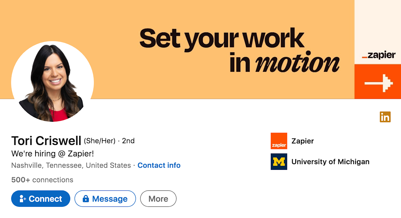
Last but not least, you could promote your company by featuring your logo, mission, or another company-branded tagline. That way, potential customers or clients know exactly what you’re about from the get-go without having to go digging around your profile.
If you’re a recruiter, it’s a great way for candidates to immediately know where you’re reaching out from. And that’s exactly what Tori, a recruiter at Zapier, does.
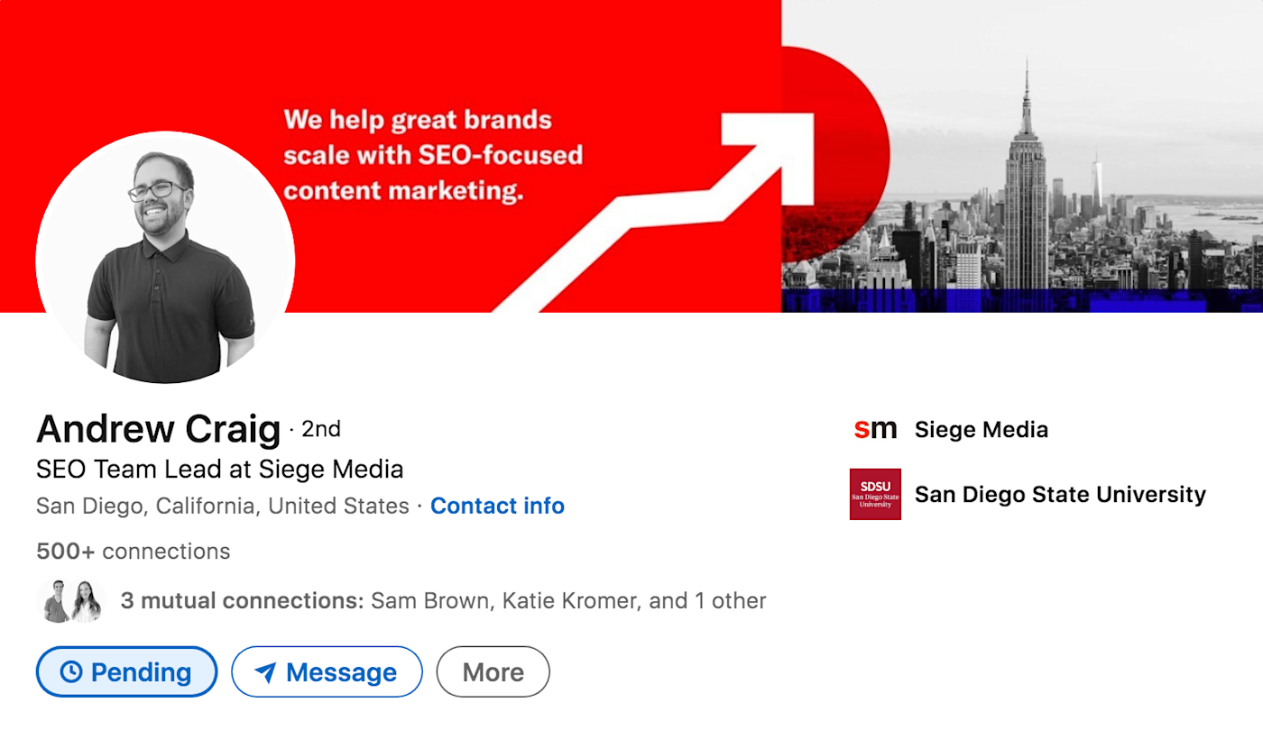
Andrew, an SEO team lead at Siege Media, lays it right out there for you—if you didn’t know what Siege Media did before, you do now. (And hey: bonus city skyline!)
Where to source images for your LinkedIn banner
Where should you go about finding these images? Here are a few options.
-
Your own photos. Using a photo you’ve taken is probably the easiest (and most personal) way to get something up on your profile—and you don’t need to be a photographer or graphic designer to do it. Just be sure it’s decent quality and doesn’t appear blurry when you upload it. If you’re using a photo taken from an iPhone, tap the icon that looks like a lowercase “i” in a circle to check the resolution and pixel size.
-
Stock images. If you go the stock image route, I’d recommend sourcing from free stock image websites to be sure you’re allowed to use the photo you choose. To avoid having the same image that a zillion other people have, use more specific, descriptive words when searching, such as “minimalistic green desk” or “black and white NYC skyline.”
-
Graphic design platform. If you’re looking to create a customized LinkedIn banner, many design tools have templates available, so all you need to do is edit the text with your own info.
LinkedIn banner dimensions
LinkedIn banner dimensions are 1584 x 396 pixels with a max file size of 8 MB. When uploading your chosen banner, be sure to check how it appears on the mobile app, since the profile picture overlaps with the banner and can sometimes cut off some words.
LinkedIn banner dos and don’ts
After scanning countless LinkedIn profiles, consulting hiring specialists, and sourcing best practices from designers, I compiled some general dos and don’ts to consider when selecting a banner.
Do:
-
Feature your contact info. Having your professional contact information and specialty front and center on your LinkedIn banner makes it quick and easy for a potential client or recruiter to reach out to you.
-
Complement your profile picture. Whether you stick with the color scheme or overall aesthetic, choose a banner that complements your profile picture while still exuding your personal style to create a cohesive design and show you’ve put in effort.
-
Frequently mix it up. You can quickly and easily change up your LinkedIn banner to promote new initiatives, announce new products, or even just change it with the seasons (Halloween theme, anyone?). If you keep it topical, it shows that you’re actively cultivating your profile—that’s especially valuable to promote your personal brand or business.
Don’t:
-
Use a blurry image. Using a blurry image could convey that you don’t pay attention to the details.
-
Stick with the default setting. Even just switching to a plain background can help your profile stand out.
-
Pick something off of a Google image search. You could run into copyright issues if you pull a random photo off Google.
LinkedIn banners are a great place to showcase who you are so you can connect with others. And isn’t that what LinkedIn is all about? As you get started, remember to keep your goals in mind and stay true to your values.
Related reading:
[adsanity_group align=’alignnone’ num_ads=1 num_columns=1 group_ids=’15192′]
Need Any Technology Assistance? Call Pursho @ 0731-6725516

