The foremost purpose of your presentation is to communicate your thinking to your audience effectively. To keep the audience engaged in your presentation, believe it or not, the Presentation fonts selection also plays a significant role. The fonts create the tone and atmosphere of the presentation. PowerPoint Fonts have the power to enhance or dampen your communication considerably. Fonts are like non-verbal expressions of written words. You can make your words look bold and confident or shaky just by the choice of your presentation fonts. You can produce deep and powerful impressions using presentation fonts.
In a nutshell, you don’t want your audience to be distracted from the topic just because of the font selection. Right? So what should you be taking care of in font selection while designing your next winning presentation? Let’s learn more about the best font for presentation for winning over your audience:
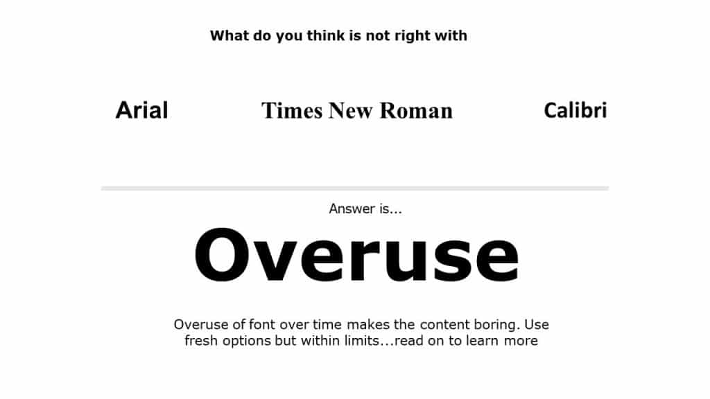 Overuse Of A Font: Initially created for The Times newspaper in 1929, Times New Roman became the new default font for many MS Office Apps, and it is overused since then. Just like Times New Roman, Arial has been a default font for Windows for many years; this reason is enough to justify why Arial is one of the most boring fonts. We are tired of seeing these PowerPoint fonts almost everywhere. You don’t only have to choose the font that fits your business and the presentation topic, but also need to make sure that you avoid all of the common options. Our attention span is decreasing very fast; we get bored very fast. If your content is not attention-grabbing, you can’t engage your audience. Move away from the defaults; use different PowerPoint fonts, there is so much more out there.
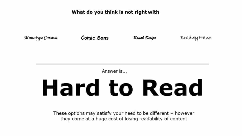
Cool Fancy Fonts: Although it might look fancy to look at the cool fonts, they considerably reduce the readability of your content. Handwriting-style fonts such as Mistral and Viner Hand can be fun to use; however, they can make your slides look unprofessional. Similarly, some fonts such as Comic Sans are more appropriate for content prepared for children rather than for corporate presentations. Your audience in the back row relies on the slides to help them understand what you’re talking about, that’s why you should avoid tiny PowerPoint fonts like Brush Script or Bradly Hand. Most of us should try to stick to the basics when it comes to font styles. Make sure you keep it simple and formal!
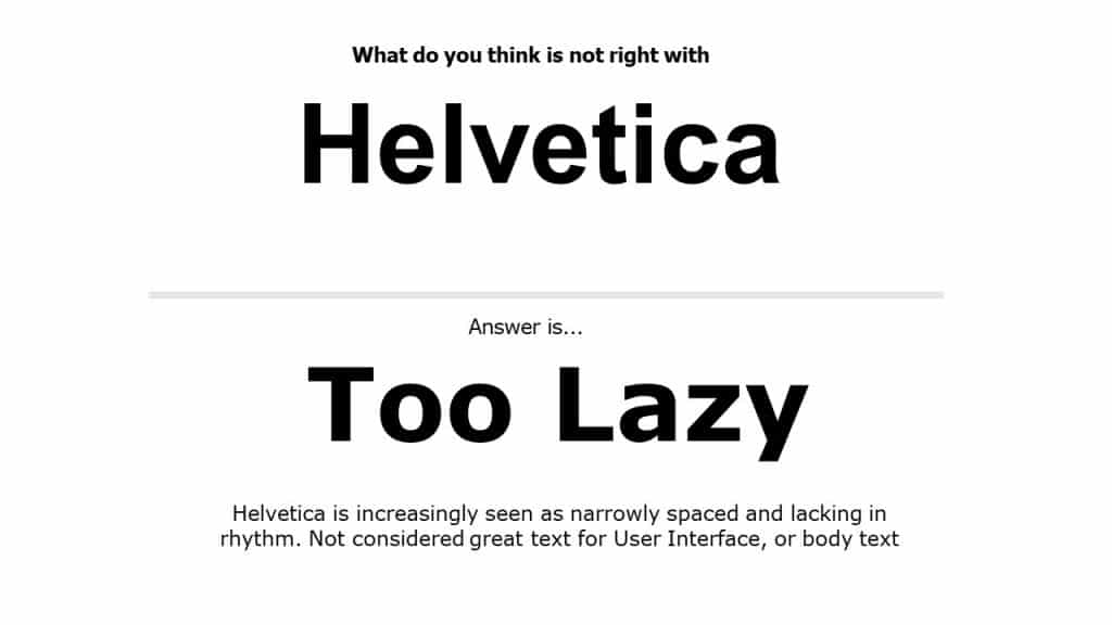
Too Obvious and Boring: Helvetica Neue typeface was proudly used by widely-known companies such as Apple, Nasa, and BMW because it worked for them. The problem is that Helvetica is a thin-weight font, and when shown in smaller point sizes, its curves break up. Kerning is the space between two letters based on their shape. Too little space makes the font unreadable because the letters are smushed together. Unfortunately, Helvetica uses kerning to distort words, making the text difficult to read by randomizing the spaces between characters. Using this font in your presentation won’t bring any extra value.
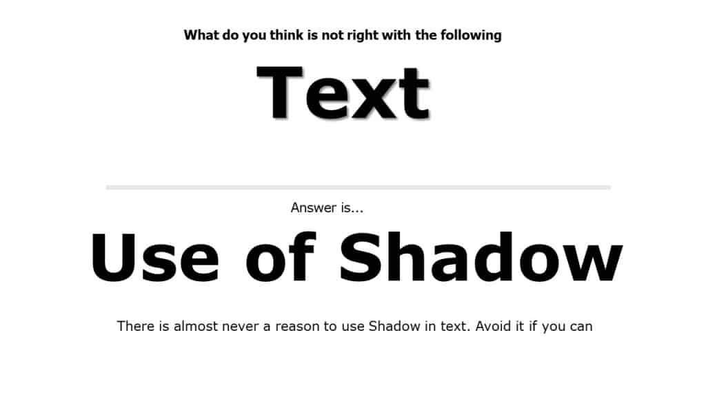
Use of Shadow or Misuse of Shadow: Many people use shadows on their text to make it stand out. However, when you use shadows, the text looks blurry and dirty. It’s always better to avoid shadow, especially for PowerPoint presentations. But if you are a fan of text-shadow and still want to use a drop shadow on text, only use it on the header and never in the body. Also, consider using a dark background with white bold text for better visuals.
So, what is the best font for presentations?
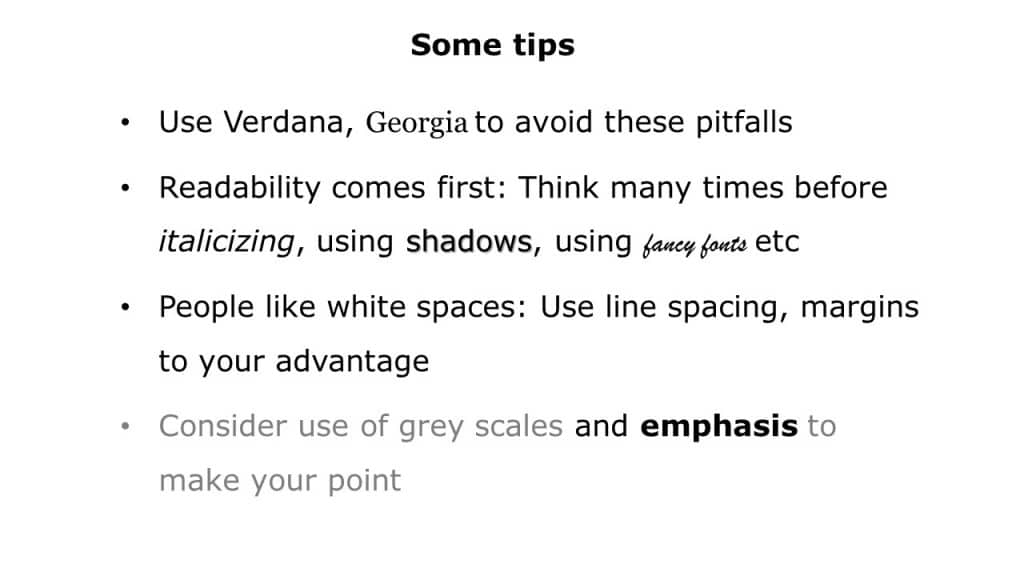
- Use Verdana and Georgia: Designers at Microsoft deliberately crafted Verdana for use on computer screens. The letters are widely spaced, and lowercase letters are tall, making this font extremely readable. Verdana makes it a very safe bet when you know that your presentation will appear on different devices. It is also not overused making it the best font for presentation to make the content look appealing and readable To effectively showcase numbers in the PowerPoint presentation, Georgia is a great serif option offering lowercase numbers, which are also a Windows standard font. Therefore this is the best font for presentation when showcasing numbers.
- Readability comes first: Creating your presentation using some cool text fonts will make your audience focus on the design rather than the message that you want to deliver. Also, it would reduce the readability of your content, as I mentioned above, that setting far from you rely on the slides for understanding.
- Don’t make your slide too busy: It would help if you effectively format your text on the slides so that the slide doesn’t look like they don’t feel too busy. The use of proper line spacing and margins can increase the readability of the content. Effective use of bullet points and indentation can make your slides look neat.
- Stick to grayscale: Studies have shown that different colors have different impacts on the mind and evoke mixed feelings in many people. It would be best if you keep that in mind while creating a presentation since you want to avoid colors that might negatively impact the message you are delivering.
Pro Tip: It is always safe to use grayscale in your presentation as they look professional.
We have a vast library of presentation templates & Google slides templates. You can use them to create influencing presentations. Here are a few examples to showcase the magic of the right presentation fonts to deliver effective presentations-
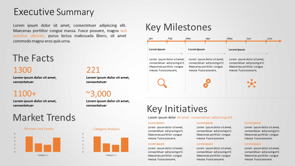
Executive Summary
Source: Executive Summary by SlideUpLift
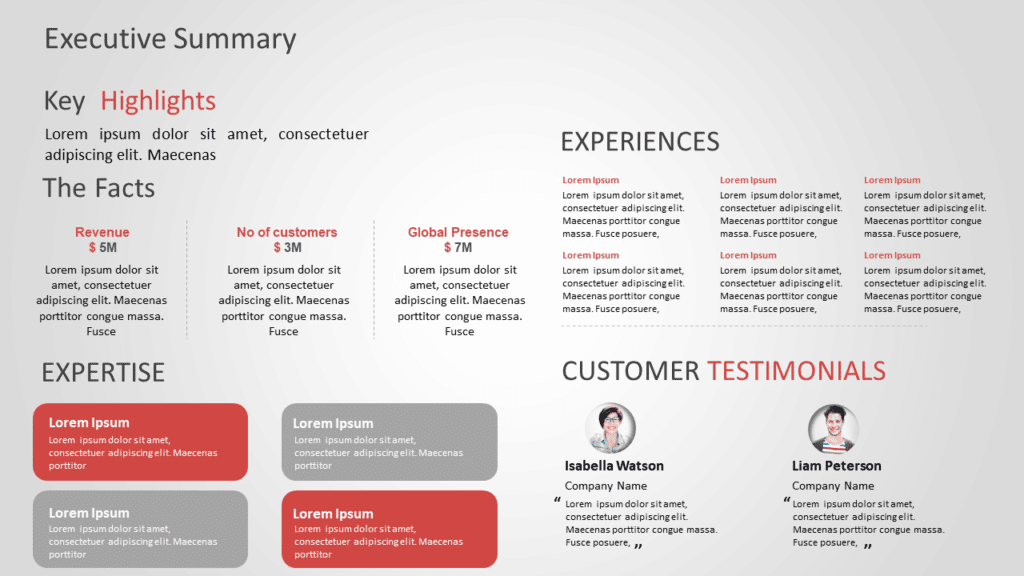
Executive Summary
Source: Executive Summary by SlideUpLift

Customer Journey
Source: Customer Journey by SlideUpLift
Now you don’t have to scour the web to find out the right templates. Download our PowerPoint Templates from within PowerPoint. See how?
Looking For Powerpoint Design Agency?
Call Pursho @ 0731-6725516
Telegram Group One Must Follow :
For Startups: https://t.me/daily_business_reads
#PowerPoint #Fonts #Matter #Influencing #Audience


