There are few names more ubiquitous in the business world than HubSpot (probably even fewer than the number of opportunities I get to use the word “ubiquitous”). That’s partly because HubSpot has, at last check, roughly one zillion software products.
One of their best-known offerings is their CRM platform, boasting some of the industry’s best solutions for managing customer relationships. It also comes with a premium price tag for packages above the lowest tier, which has made space for CRMs like Zoho to fill the gaps for small to mid-size enterprises.
But does the size of your business instantly make one of these options a better fit for you? I tested HubSpot and Zoho’s CRM platforms to see for myself. Here’s how they break down.
HubSpot vs. Zoho CRM at a glance
To test these two customer relationship management software solutions, I signed up to try Zoho Professional and HubSpot Sales Hub Professional.
Here’s the tl;dr:
-
HubSpot predictably has more features, more robust reporting, and a more user-friendly interface.
-
Zoho’s offering is a little more stripped-down, which (along with lower price tags) may make it preferable for smaller outfits with limited CRM needs.
Whichever HubSpot hub you choose, you get access to a lot of the same functionality, so I was able to test not only the essential CRM features, but also sales, marketing, and services tools. HubSpot’s CRM is a pretty all-inclusive solution with plenty of features for workflows, automation, ticketing, operations management, and even a strong CMS. Zoho’s base CRM is more of a pure CRM with chat, email, workflow management, and more limited marketing and automation features. Zoho offers a whole suite of tools as well—you just need to sign up for them separately.
|
HubSpot |
Zoho |
|
|---|---|---|
|
Features |
|
|
|
Price |
$50/month Starter $1,780/month Professional $5,000/month Enterprise |
$20/month Standard $35/month Professional $50/month Enterprise $65/month Ultimate |
|
User experience |
|
|
|
Onboarding |
|
|
|
Reporting tools |
|
|
|
Overall quality |
|
|
What’s not different between HubSpot and Zoho
If you’re looking for deal-breakers to decide between these two CRMs, look somewhere other than these common features:
-
Free trials: If you want to give the platform a test run before you commit, both have pretty generous free trials even across package tiers.
-
Basic range of utilities: Both HubSpot and Zoho allow you to build workflows, nurture leads, create reports, organize tasks, track customer interactions, and implement automation.
-
Ability to import lists, files, and leads: If you’re switching over from another CRM or integrating with an existing database, you’ll be able to automatically import it into the new platform.
HubSpot’s interface is vastly more user-friendly than Zoho’s
When trying both platforms, the difference that’s immediately apparent is the dashboard experience.
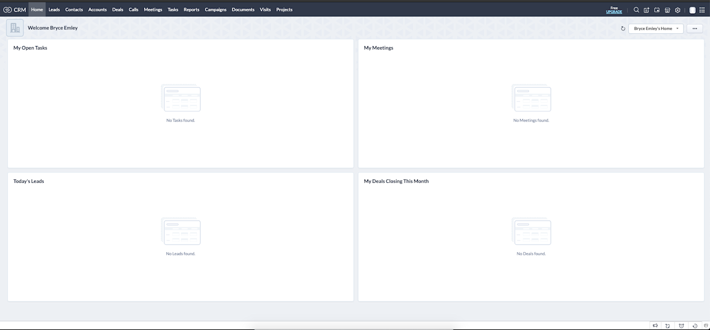
Zoho’s interface is user-friendly to the extent that it’s pretty clean and simple, but it’s not always clear what your options are or where you go to execute an action. This is problematic, given that the top nav has 13 tabs. To create an automated email notification, for example, there’s no obvious way to access it from the dashboard nav.
It took me a while to figure out that you have to navigate to the little home or settings icons at the top-right corner of the dashboard. Both contain the same menu navs (also a UX curiosity), which is where you’ll find the Automation tab. It took me even longer to find the email template creator, which is also housed in these menus under the vague Customization tab.
HubSpot‘s interface, on the other hand, is very visually oriented and intuitive. It’s more predictably organized, with its features separated into seven distinct categories in its top nav. Whatever action you want to take, it’s pretty obvious where to go to access it.
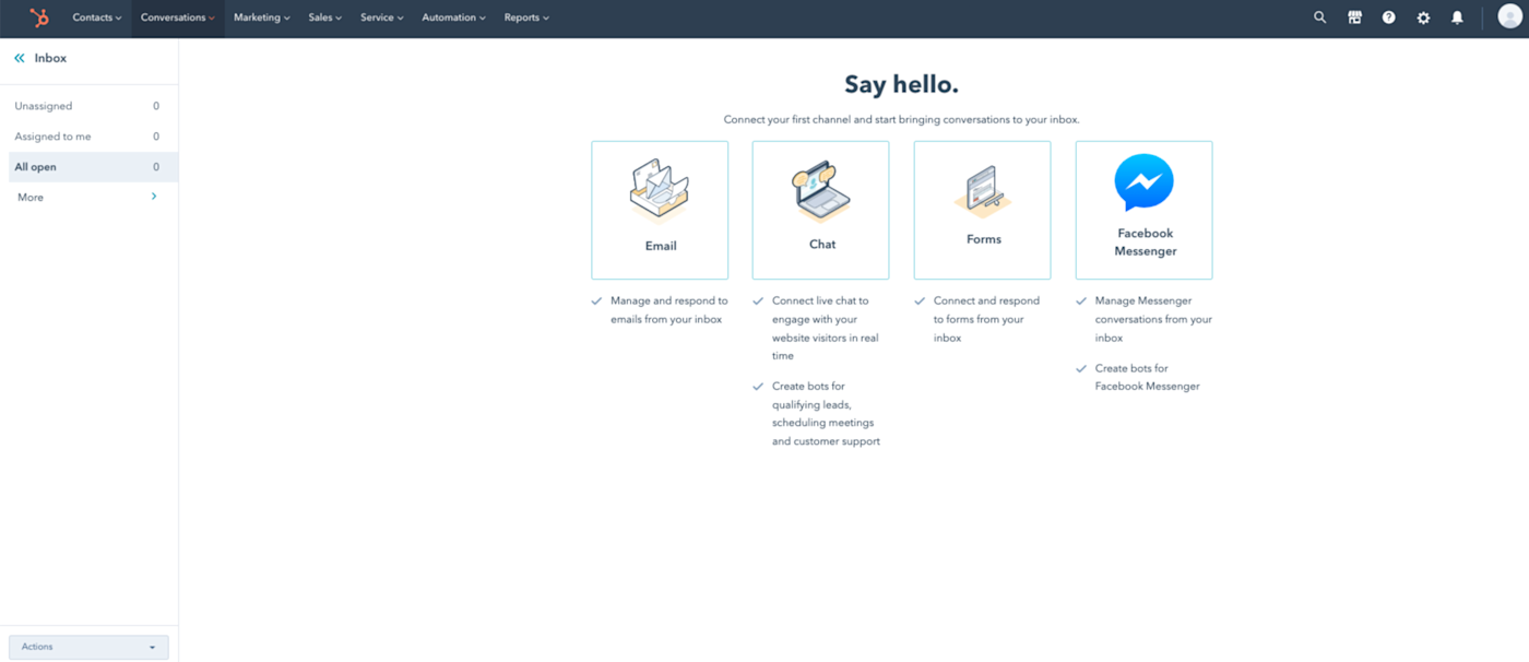
Want to create a landing page? Go to the Marketing tab and find the Landing Page option. Want to create an email template? Go to the Conversations tab and find the Templates option. Want to set up automation? Go to the Automation tab.
Ease of onboarding
Given Zoho’s relative simplicity, I was surprised at how much time I had to spend learning not just how to use it, but what its utilities were and where to go to access the features I wanted to use. Maybe it’s more obvious to people who’ve used similar platforms before, but it left me feeling a little adrift.
You always know where you are in HubSpot’s interface. Once I spent a few minutes exploring, I was fully ready to get to work. HubSpot feels similar to many other dashboards I’ve seen, so onboarding took much less time and frustration—even though it has more complex capabilities.
Zoho also has fewer learning resources. There’s a quick overview during your first login, some YouTube guides, and seminars you can sign up for. The seminars are probably very helpful, but let’s be honest, no one wants to sign up for software seminars—they just want to start using the software.
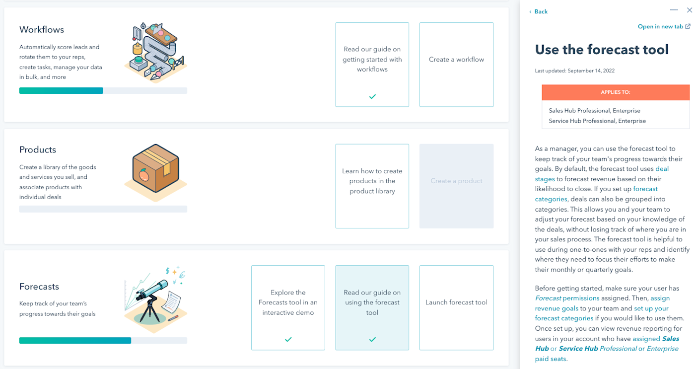
HubSpot has very robust onboarding guides—there’s even a dedicated onboarding hub with text guides in the sidebar, learning milestones, and real-time automated demos. And since HubSpot has so many users, there are also many more community forum posts, third-party guides, and Reddit threads you can refer to.
HubSpot feels much more polished than Zoho
Zoho’s dashboard is more lo-fi than HubSpot’s, which I found to be a pretty telling difference between the two offerings. Zoho’s interface is very text-oriented, with basic drop-boxes, a limited color palette, outdated-looking buttons, and a fairly barebones design. As a whole, Zoho just feels visually lacking as an interface in comparison.
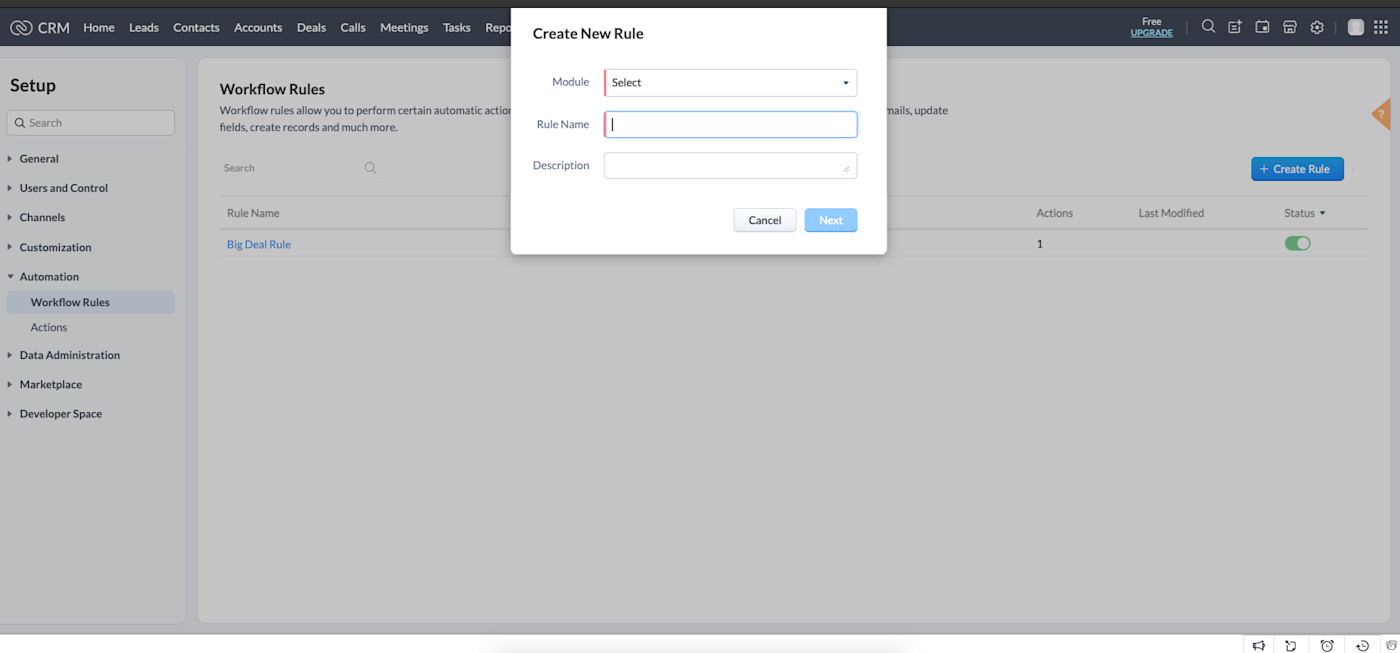
Simplicity doesn’t have to be a bad thing if it’s executed with intention and style. But there are some red flags that show it may be a symptom of bigger back-end issues. For example:
-
I hit a couple ends as I explored through the subnavs, requiring me to remember where I started and try again.
-
There are typos and misspellings throughout the platform.
-
Formatting looks off on some pages.
-
Multiple users on Reddit reported data went missing during importing and exporting.
-
You can’t use capital letters or spaces when naming projects.
It’s worth noting that some of Zoho’s more complex functionality requires a little finessing to integrate applications across their product suite, so it’s possible that syncing issues could lead to some of the problems users have reported. It also means integrating separate apps and products isn’t as streamlined for Zoho as it is for HubSpot.
As a product, HubSpot just feels better designed than Zoho. Attractive graphics, contrasting colors, automated demos, and dynamic buttons and dropdowns make HubSpot’s interface visually appealing, easy to navigate, and easy to use. I’d be shocked if I found any typos, formatting miscues, dead ends, or redundant pages on HubSpot.
Zoho seems more focused on project management, while HubSpot is a more complete platform
I’ll admit that some of my hangups learning Zoho stemmed from what I came to realize were misaligned expectations based on HubSpot’s capabilities.
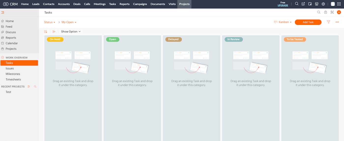
Zoho’s strength as a platform can be its simplicity—if you’re mostly looking for pure CRM capabilities like managing applicants, leads, customers, sales, tasks, reports, and projects. Its Project interface is its strongest, best-designed feature. I liked that Tasks can be viewed in the crowd-pleasing Kanban style, and the overall look is much more polished than any other part of the CRM platform.
Zoho does offer higher-level utilities like email automation, data administration, and even customer engagement integration—they’re just not as accessible or user-friendly as they are with HubSpot. Zoho’s basic CRM seems better suited for a project management platform, which may be what most prospective users are looking for.
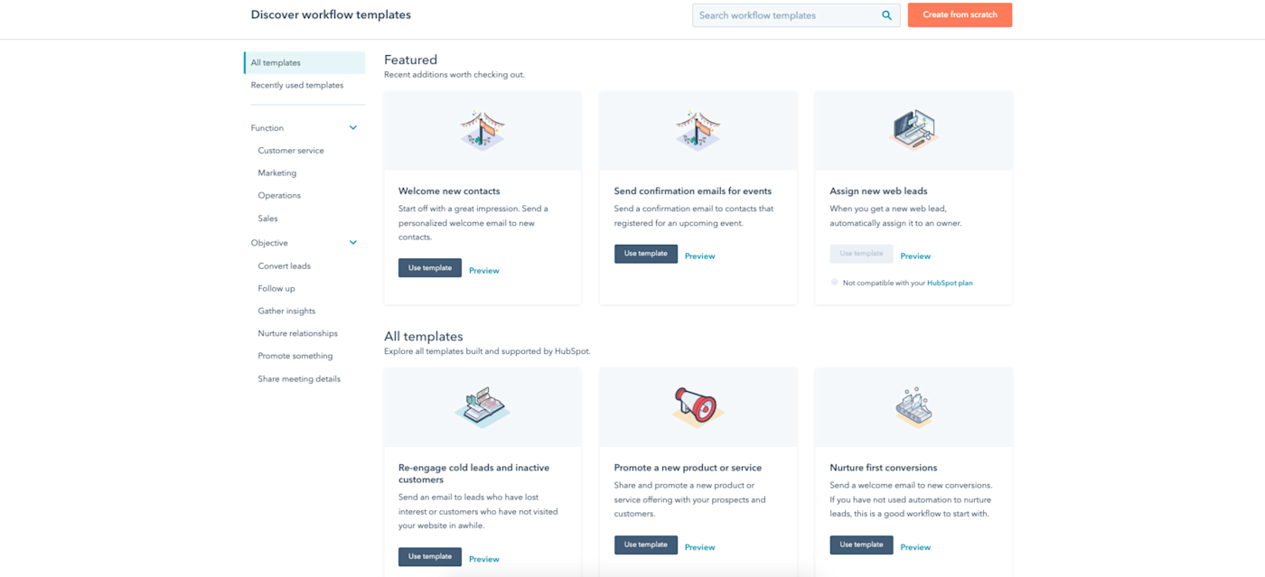
HubSpot is a more capable all-in-one platform, meaning it comes packed with more bells and whistles than some users need. Its tools for automation, content creation, and workflows are much more dynamic. It feels like there’s just about nothing it can’t do—and do very well.
Zoho’s pricing makes it more viable for small- to medium- sized businesses
Zoho’s biggest draw may be its pricing. For smaller teams looking for a capable, reasonably priced CRM to supplement other marketing and sales software, Zoho fits the bill. With a $20/month/user basic package and its tiers maxing out at $65/month/user, even Zoho’s premium functionality is pretty affordable.
The issue is, HubSpot’s free package also offers a pretty wide range of CRM capabilities like team email, scheduling, workflows, contact management, shared inboxes, and reporting dashboards, plus additional marketing, sales, and even CMS tools—granted, it’s all HubSpot branded and you have lower limits (e.g., 2,000 email sends/month vs. Zoho’s 6,000 on its free Campaigns plan). Its Starter package comes in at $50/month/user (which includes two users), so on a per-user basis, it’s on par with Zoho’s Standard package.
HubSpot’s comparative value diminishes pretty quickly after the Starter package, however. The Professional tier bumps up to a minimum spend of $500/month/user starting with five users—that breaks down to $100/month/user, if my math is correct—compared to Zoho’s Ultimate tier, which costs just $65/month/user with no minimum number of users.
HubSpot’s additional tools are more robust than Zoho’s
In general, you can use Zoho and HubSpot to perform many of the same common CRM and basic marketing and sales functions. But, for the most part, those functions are easier to perform on HubSpot. Here’s how a few popular tasks stack up.
Reporting
Zoho has an extensive library of preset reports you can use to monitor everything from sales to lead check-ins to invoices to meetings. You can also create custom reports, but this is a bit tricky—there’s a seven-step process via Zoho Desk, and the Standard plan caps the number of custom reports at 50.
HubSpot’s reporting feels more intuitive—it’s pretty easy to create entire custom reporting dashboards or base them on templates. Like Zoho, they’ve got an extensive report library with common suggestions like “Activity of recently created contacts” and “Blog posts by most total views,” but the custom reporting definitely shines. HubSpot’s report builder is built right into the platform and has a super simple point-and-click interface with a live preview that updates as you go.
Contact and lead management
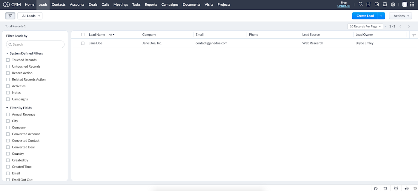
When it comes to contact and lead management, Zoho is more than capable. Simplicity is a strength here—you can readily add, import, and edit leads and contacts, and lead filtering capabilities are comprehensive. You can add new leads and contacts from scratch, import them from files or other CRMs, or instantly add them via automation. Once stored, you can email contacts directly from within the platform. They also integrate easily with Zoho’s preset reports and can be further synced with automated workflows.

HubSpot has many of the same contact and lead management capabilities and easily integrates custom CTA campaigns along with both native and third-party forms for capturing leads. Their contact management platform, predictably, also feels richer than Zoho’s. HubSpot has more sorting and grouping functionality and even has added data security, format fixing, and duplicate entry management.
Both HubSpot and Zoho made it onto our list of the best free email marketing services, so for $0, you can’t really go wrong.
To tap your contacts for basic email campaigns, Zoho’s CRM gets the job done. You can connect your own inbox directly with the software and link up with records logged within the CRM itself (note: you’ll need at least the Professional plan for this). After configuring basic formatting components, you can also (as aforementioned) send emails to your leads and contacts directly through the dashboard. You can also create templates and set up automatic notifications and workflow triggers.
The email platform in HubSpot feels a little closer to dedicated email software, like MailChimp and Constant Contact. New campaigns are easy to create, with easy-to-follow funnels that walk you through a one-off email, an automated sequence, and even blog/RSS messages for your published content. Like other common email software, you can use a drag-and-drop email builder or start with one of their many templates.
Automation
I found Zoho’s automation to be a bit challenging. Setting up automated email notifications using templates and stored contacts is pretty straightforward, but designing a custom workflow came with more of a learning curve. You can create workflows for every module within the CRM based on everything from opt-outs to closed tasks to initiated deals, but something about the dropdown structure for creating paths of conditions and actions was hard for me to visualize.
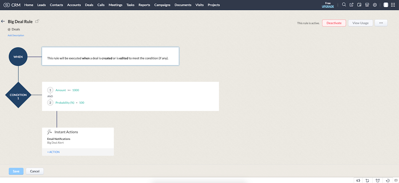
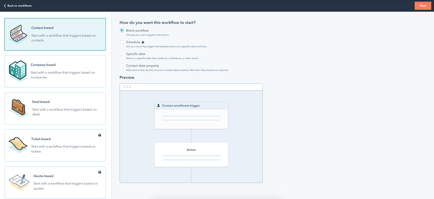
Other users might not have any issues creating workflows like this, but I found that HubSpot’s templates and workflow builder were (say it with me) more intuitive. You can base them similarly on parameters like contacts, deals, tickets, conversations, etc., but the condition suggestions, interactive pipeline, and general hand-holding made things much easier for me. There also just seem to be more available conditions and capabilities to choose from than Zoho.
HubSpot vs. Zoho: Which is best for you?
So on a feature-by-feature basis, HubSpot is the superior choice, which is reflected in its cost. But it can also become much more expensive at scale. It’s built to be an all-in-one solution, whereas Zoho can fit affordably into a suite of other tools.
For smaller, cost-sensitive businesses or more limited CRM needs, Zoho may give you everything you need at a fraction of the cost. For those looking for more complex solutions or for companies with the budget for it, HubSpot is the easy choice for CRM implementation.
Related reading:
[adsanity_group align=’alignnone’ num_ads=1 num_columns=1 group_ids=’15192′]
Need Any Technology Assistance? Call Pursho @ 0731-6725516

