I’m a writer, not a designer. But a few months ago, I tried my hand at creating Instagram graphics for Unwinnable, an independent media criticism site I do some marketing work for. I used Canva, a free design tool, and within minutes, I could tell that it was the accessible tool I needed to dip my toes into design.
Here, I’ll show you how to use Canva to make some basic brand assets, so you can build a consistent and effective brand even if you have zero background in design.
The basic elements of branding
Every company’s brand kit looks different. But you can organize brand elements into two categories:
-
Language: Brand guides often establish how to talk about a company and its products. They can have messaging guidelines that teach you how a brand should present itself through language. It might also include a brand voice section or lexicon for even more nuance.
-
Visuals: The visual aspects of a brand guide show you how to design websites, images, and print materials according to the brand’s aesthetic. Think: logos, fonts, and colors. Take a look at this breakdown of Zapier’s visual rebrand to understand how to think about branding visuals.
Since I’m talking about a design tool here, I’ll be focusing on the visual elements. But if you have any language brand elements available, they can come in handy when creating on-brand graphics.
Branding elements to get ready before you design
Before you create an image in Canva, establish what colors and fonts you’ll use in your brand images. By establishing these choices in advance, you’ll be sure to have a consistent brand look, and you’ll be ready to create graphics in Canva without having to fiddle with your options.
Color palette
In a cohesive brand, the brand colors affect all the most important visuals, including the logo and website design. Choose a color palette to represent your brand.
Streamline your business operations
You’ll see a bunch of resources saying to use color psychology to define your color palette, but there’s no surefire rule here. As Help Scout points out, the right colors will depend on context and your customer’s opinions. Think about the vibe you want your brand to give off, and ask your customers how they perceive your company and product.
Choose three to five colors that complement each other. Canva’s color palette gallery and Color Hunt are both great places to find colors that go well together.
Note your colors’ HEX codes, too. You can copy and paste these six-figure codes into a tool like Canva to get the exact color you want.

Fonts
Pick a few fonts to represent your brand. You’ll often see brand guides that define the font for website body copy. But you’ll be good to go for the purposes of this Canva guide if you just choose a header and subheader font.
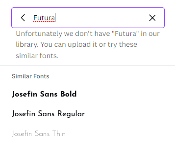
As you find fonts, keep in mind that Canva’s free plan has a list of fonts you can’t work outside of. Canva showcases 20 of its fonts here, or you can open a new Canva document and go to the fonts menu to see the full list. If Canva doesn’t have a font you enter in the search box, it’ll recommend a similar font.
How to make brand visuals in Canva
Now that you have your colors and fonts handy, it’s time to open Canva. I’ll make some brand visuals for a catsitting service as an example.
Logo
What goes into an effective logo? Adobe explains that logos should strike a balance of complex and simple design. They should also work well in a wide range of environments since you’ll be using it across multiple contexts.
Canva has tons of logo templates that follow these principles. You can add your brand’s visual signature to those templates’ layouts to make a logo all your own. Here’s how it works.
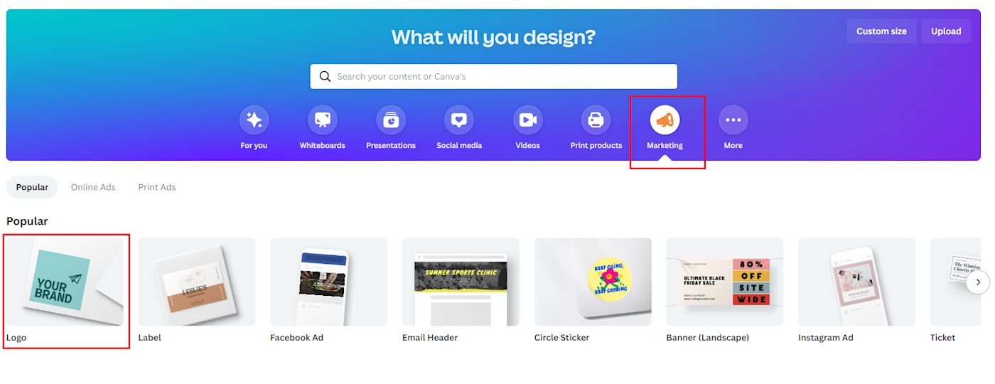
First, create a Canva account if you don’t have one. Then, go to the home page, and click the Logo template under the Marketing tab in the What will you design? section.
This action will open a blank, logo-sized document with all of Canva’s logo templates available in the left-hand menu.
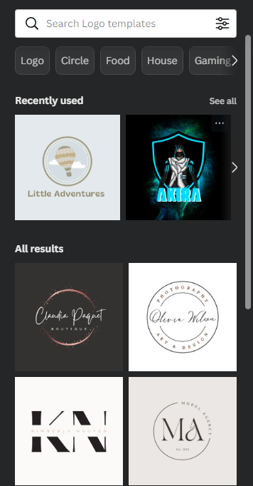
Find one with a layout you like, and remember: it doesn’t have to match your brand concept, colors, and fonts one-to-one. (Keep in mind the templates with a crown only work with paid plans.)
I chose this template:
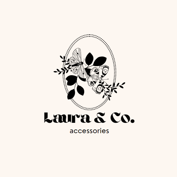
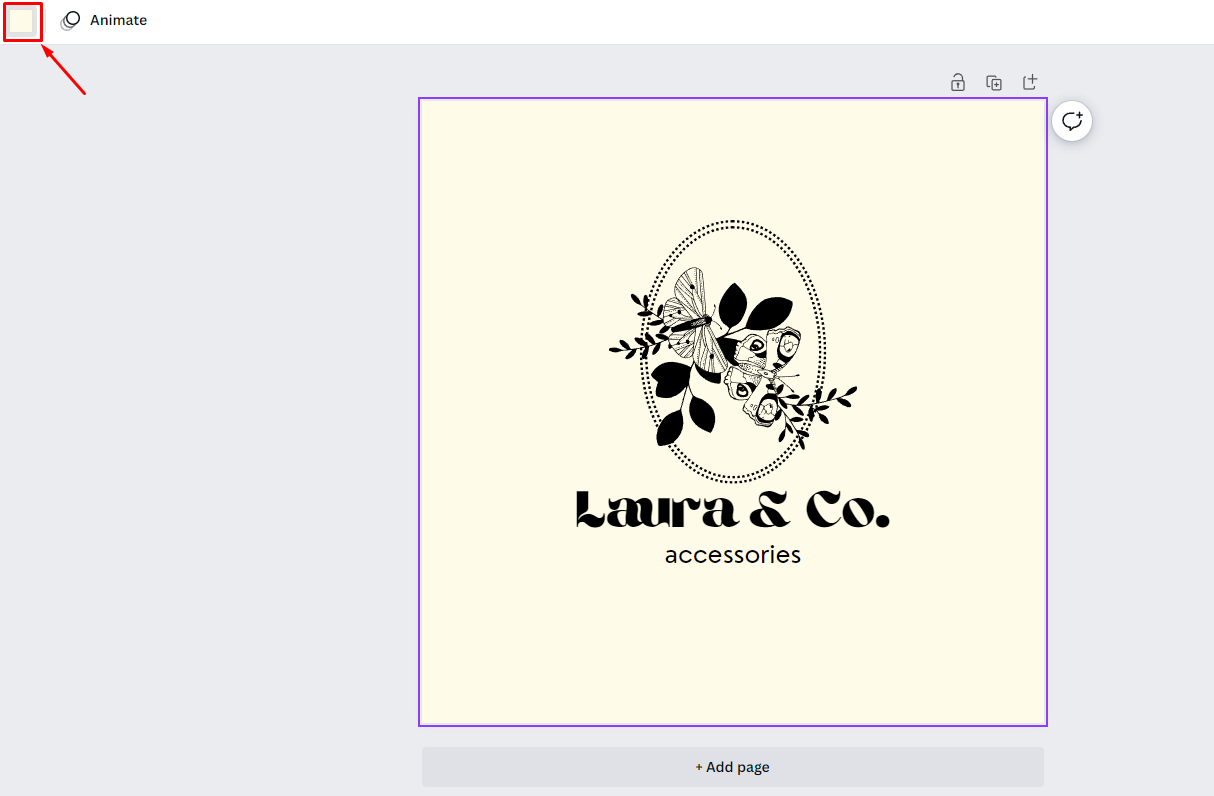
Click the image’s background color, then the color square in the white bar above your design to change your background color. Use your website background color or a color from your brand palette. I changed mine to the cream in this ColorHunt palette.
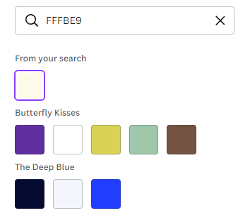
You can use your exact brand color by pasting its HEX code into the search box and clicking the From your search option.
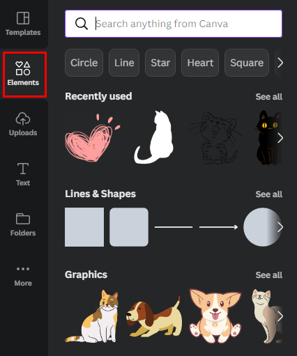
Now, let’s customize the visual elements. Go to the Elements tab in the left-hand menu to search for images to use in your design. You can change the color of some lines, shapes, or graphics using the same color square you did for your background color.
Tip: Resize any element in Canva by clicking and dragging on the dots that appear at its corners when you click on it.
I changed the color of the dotted ovals, deleted the butterflies, and replaced them with a cat and a heart in my palette colors:
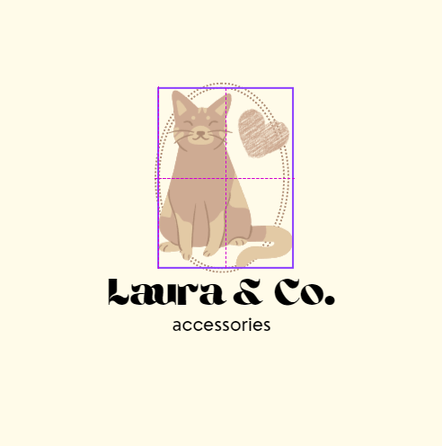
Tip: The purple dotted lines that appear when you move a Canva element show you when your element aligns with other elements.
On to the text! Click a text box, and use the white bar menu to change the font to your brand fonts and colors. If needed, you can click the Text tab in the left-hand menu to add more text boxes.
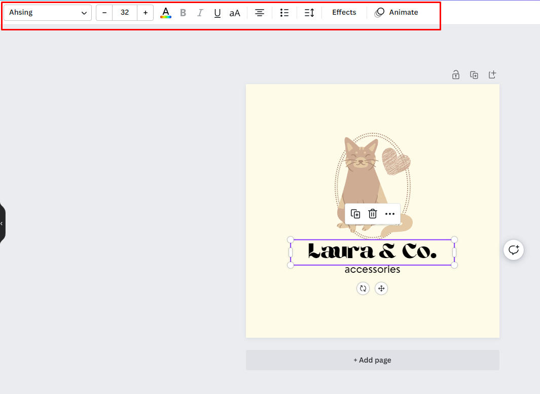
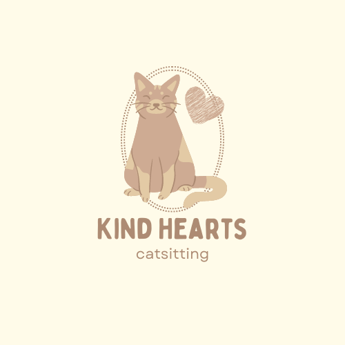
Here’s my finished logo:
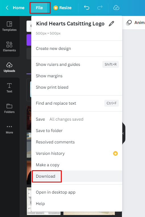
Save a copy to your computer by clicking File in the top-left corner, then Download.
I also suggest using the Save to folder option to save it to a dedicated “Brand Assets” folder in your Canva library. From there, you can click the Folders tab in your left-hand menu and then your assets folder to pin it to your menu as you work.
Website hero image
A lot of modern website designs have a hero image on the home page. You can use this graphic as part of your starter branding kit to stand out to website visitors.
Shopify has some best practices to recommend for creating a compelling hero image. It suggests combining a prominent image with convincing copy and a call to action. Keep in mind that Shopify’s blog is geared toward eCommerce professionals, so you might not need a call to action if you don’t have an online store.
Search “website banner” on Canva to find a variety of website image templates, including hero image templates. Compare each template’s dimensions with HubSpot’s recommended dimensions for your website. One of the hero image templates I found was 1366 pixels wide and 768 pixels tall, which doesn’t quite match. You could start with a blank, custom-size image if website optimization is a top priority.
Click the Custom size option at the top right of the What will you design? menu if you want to go that route. Since I want to keep my hero image fairly simple, I’m going to use that feature to create a blank document 1500 pixels wide and 650 pixels tall.

Let’s find a high-quality stock image to serve as the base for our hero image. This Unsplash picture will work well for my design. Keep an eye out for images that have “white space” for text, like the area above the cat in that picture.
Download it, and drag the file to Canva to add it to your hero image. From there, you can resize it and move it until it fits the canvas and looks good.
If you’d like to adjust your image in Canva, click on it, and try out your options in the white bar. The Edit image menu has plenty of ways to modify your picture’s sharpness, balance, and colors, including filters.
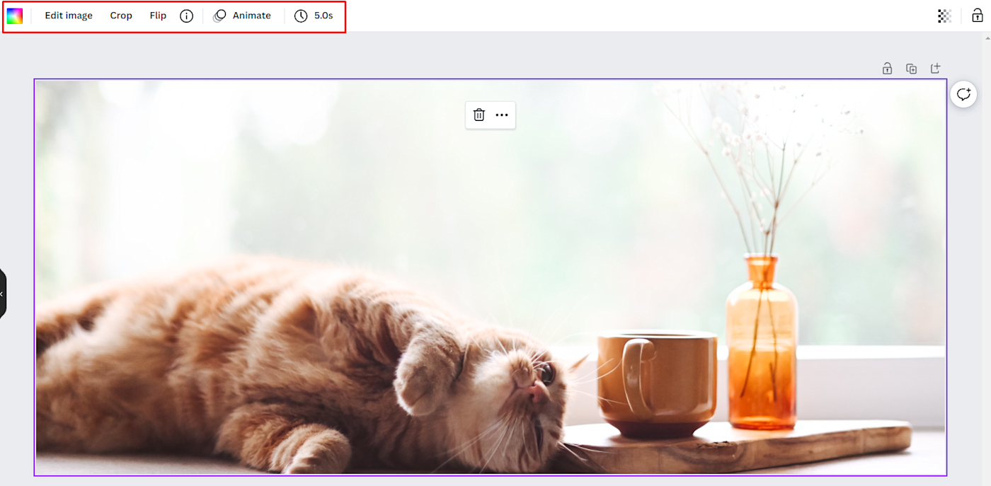
Play around with the options to make your stock image fit your brand’s website and mood. I made my image colors a little softer by scrolling down to the Photogenic filters menu, then choosing the Hazel filter. Click a filter again to choose how intense you want it to be—I lowered the filter to 0.5.

Add some text with the left-hand menu’s Text tab, and change it to one of your brand fonts in a brand palette color. If you plan on adding a button or link as you edit your website, leave room for it. I added an action-oriented line of copy that starts with a verb and left it at that.

Once you’re happy with your image and text combo, download it from Canva and upload it to your website!
Social media profile pictures and headers
Once you have your logo and hero image created, you can use elements from those images to create profile pictures and cover photos for your social media. Here are the recommended minimum sizes for each website:
A resized version of your logo is the most straightforward option for a profile picture. Canva’s free plan doesn’t let you resize an existing document, but you can use Pixlr instead. Open an image in Pixlr X, go to Layout and Template, and choose Resize page (scale).
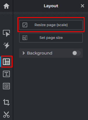
Tip: Don’t resize an image to a bigger size than its original dimensions. It’ll look blurry and grainy. Consider adding more white space around the image instead. For your reference, the Canva logo template is 500 x 500 pixels.
You can get more creative with your social media headers. Think about remixing the same picture from your hero image or choosing a new one that matches your brand’s aesthetic. Cover images don’t necessarily need text, so they give you the chance to let visuals shine.
I made a Twitter cover image as an example. After creating a blank 1500 x 500 document, I added this Pexels picture.

Then, I decided to have some fun with my brand colors. In the Edit image menu, I went to the Duotone filters and chose the Sepia option. Then, I clicked the option again to customize the colors through this menu:
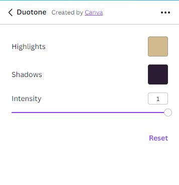
The Highlights option lets you pick a color to represent the light colors in your image, and the Shadows option does the same for the dark colors. I selected colors from my palette for both by clicking the + button and pasting HEX codes.
Here’s the final result:

More DIY brand design tips
Now that you have some staple brand assets to work with, here are more tips for designing day-to-day brand visuals like social media posts and email newsletters. Use your brand colors, fonts, and logo in these images to keep your visuals consistent—and then work on developing templates, so you don’t need to start from scratch every time.
[adsanity_group align=’alignnone’ num_ads=1 num_columns=1 group_ids=’15192′]
Need Any Technology Assistance? Call Pursho @ 0731-6725516

