I’ve been using Asana and ClickUp for a while to manage my freelance business and collaborate with a few different clients. Which is better? The answer, of course, is it depends. Asana is like ClickUp’s more responsible but less adventurous older sibling.
Connect your project management software to your other apps
In addition to the many hours I’ve spent in each of these apps for my own work, I took some time to thoroughly test each one and dig deep into the features, so I could do a more thorough apples-to-apples comparison.
The summary:
-
Asana is a super competent, traditional project management app.
-
ClickUp is more of an all-things-to-all-people collaboration app.
Keep reading for more details.
Asana vs. ClickUp: comparison table
|
Feature |
Asana |
ClickUp |
|---|---|---|
|
Ease of use |
|
|
|
Customization |
|
|
|
Integrations |
|
|
|
Customer support |
|
|
|
Automation |
|
|
|
Pricing |
|
|
ClickUp is more customizable but can be overwhelming
Asana is pretty solidly in the project management app category. ClickUp, on the other hand, has positioned itself as a customizable WorkOS.
But…what even is that? Basically, ClickUp wants to be “one app to replace them all”: a central workspace for collaboration and project management, so users don’t need to constantly bounce between apps and browser tabs. ClickUp is more like a project management tool, shared inbox, to-do list, internal knowledge base, whiteboard, chat app, and OKR tracker all in one. And then some.
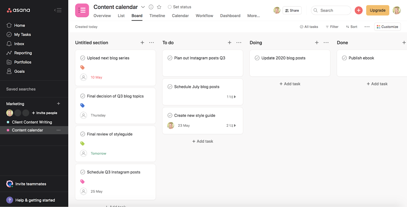
When it comes to standard project management, both Asana and ClickUp offer the typical views to display your projects: list, board, timeline (Gantt), and calendar views. Here’s what a board looks like in Asana.
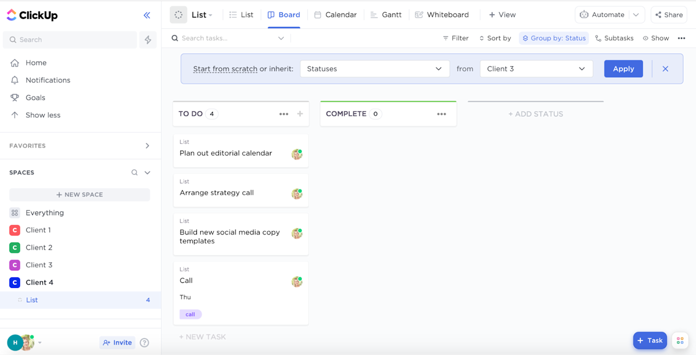
Other than the color scheme, ClickUp’s board view is pretty similar.
But ClickUp goes well beyond the standard options. In ClickUp, you can embed views from other apps like Airtable and Miro, and even make changes to them within ClickUp. (Note that some of these embedded views, like Google Calendar, only allow you to track changes and not make modifications within ClickUp.)
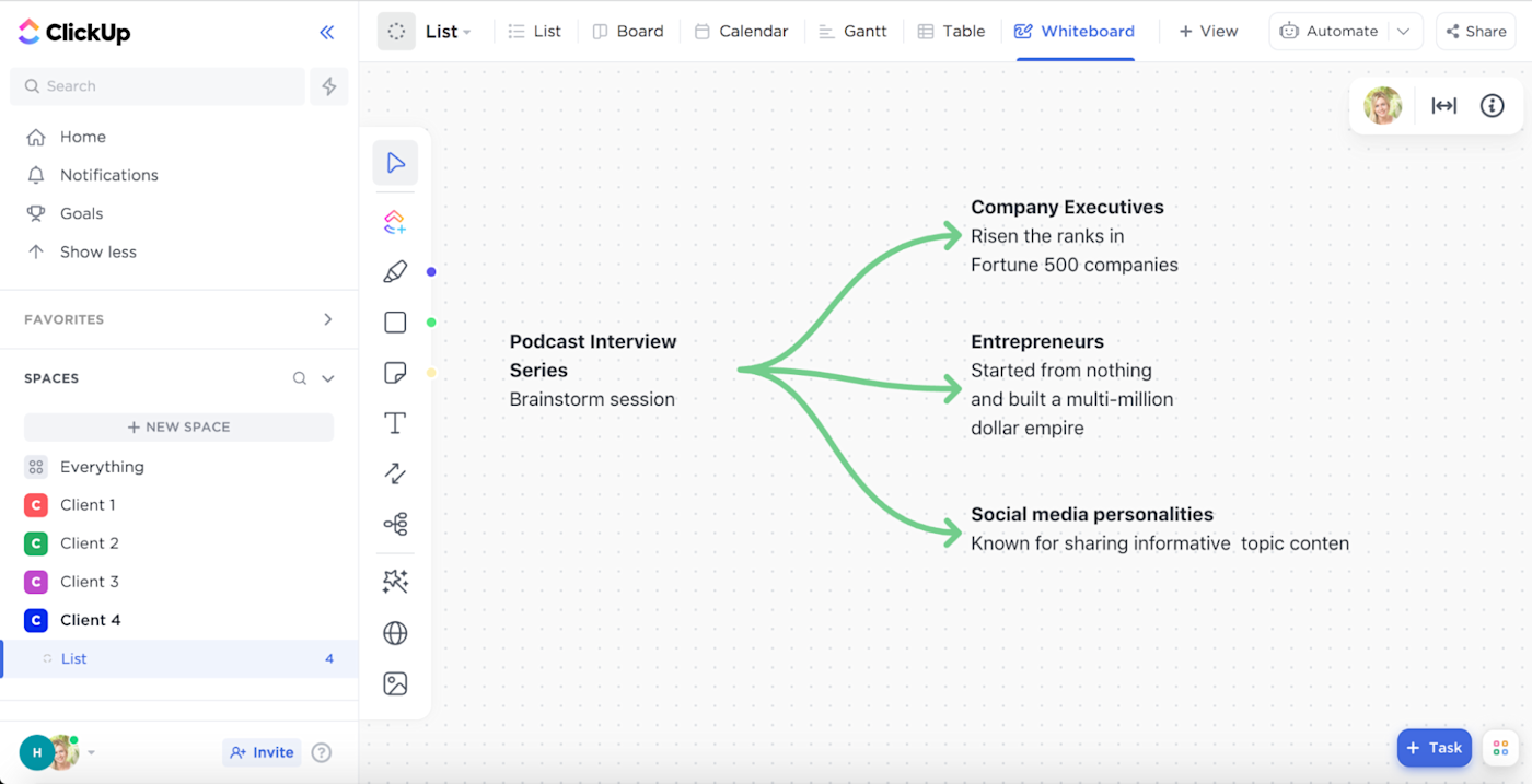
There are also other unique features, like a documentation area, mind maps, and a digital whiteboard. While these aren’t traditional “views”—they don’t convert your tasks into a mind map or anything—it’s really nice to have these options built in.
Of course, if you’re using a project management app for the first time, or you’re just looking for something more traditional and easier to navigate, ClickUp’s options could be overwhelming. Asana’s views are more than enough for true project management, even at a large organization, so it can be the better choice if you want to go the more traditional route.
Asana is easier to set up and more intuitive to use
The simplicity of Asana’s features is echoed in its usability: clear navigation and labels, along with a contrasting color palette, make it pretty easy to find your way around. ClickUp, on the other hand, uses some obscure labels (“LineUp” and “Trending,” for example), and all the options can make it hard to find what you’re looking for.
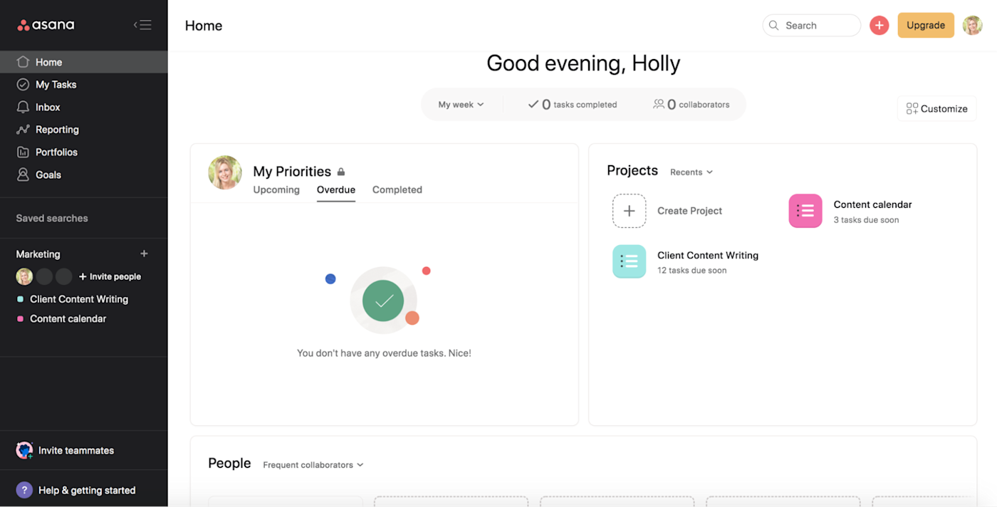
Asana’s side navigation menu is simple, with several icons and labels to take you to wherever you need to go, whether that’s your tasks, reporting, or anything else. And if you get lost, it’s easy to find your way back to the home screen, where you’ll find your priorities, recent projects, and collaborators. Asana’s HQ is set up pretty nicely.
Within a project, there’s a simple Add task button, or you can click into any section and add a task directly into it.
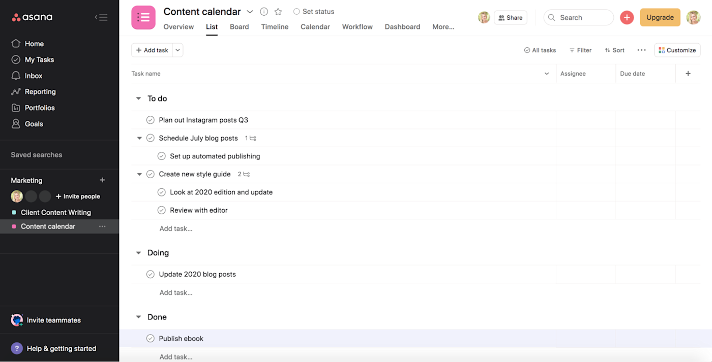
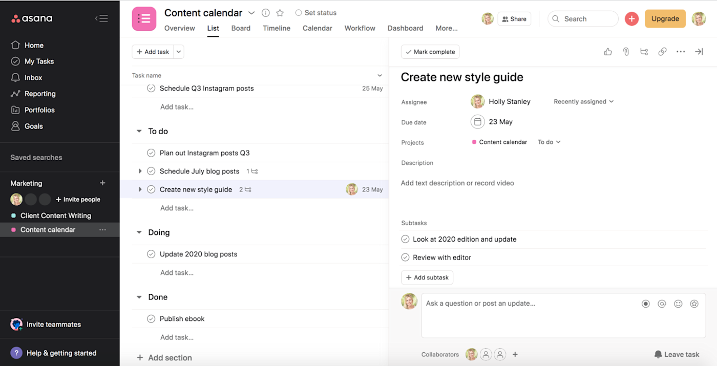
From there, it’s easy to drag and drop tasks so they’re in the right section and order. Once you’ve created a task, you can add subtasks, assignees, and a due date, each in a click.
It’s also easy to color-code your tasks or events in the calendar view so they stand out a bit more and are easier to parse.
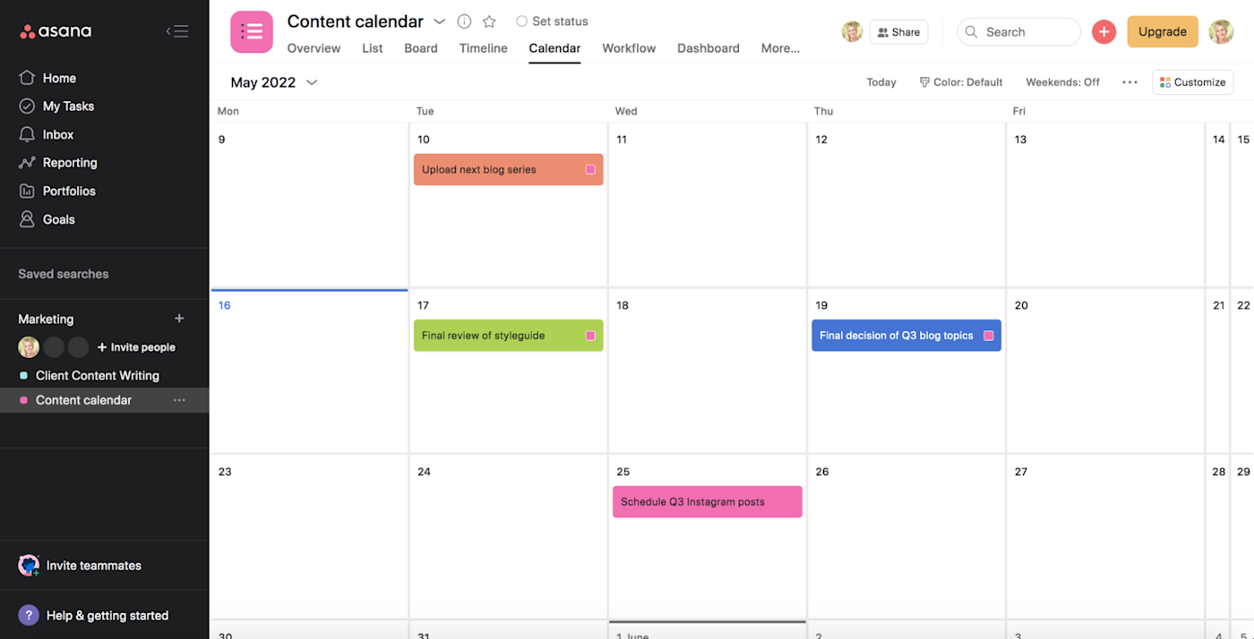
None of this is novel or surprising, but that’s the point: Asana does exactly what you expect it to, which makes it easy to navigate.
ClickUp’s interface, on the other hand, isn’t as intuitive. For starters, from a distance, ClickUp seems a little like a blank piece of paper. Everything kind of looks like it’s written in pencil, with fine fonts and a lot of light gray. And the home page isn’t nearly as helpful as Asana’s. (Do I really need to know which projects are “trending”?)
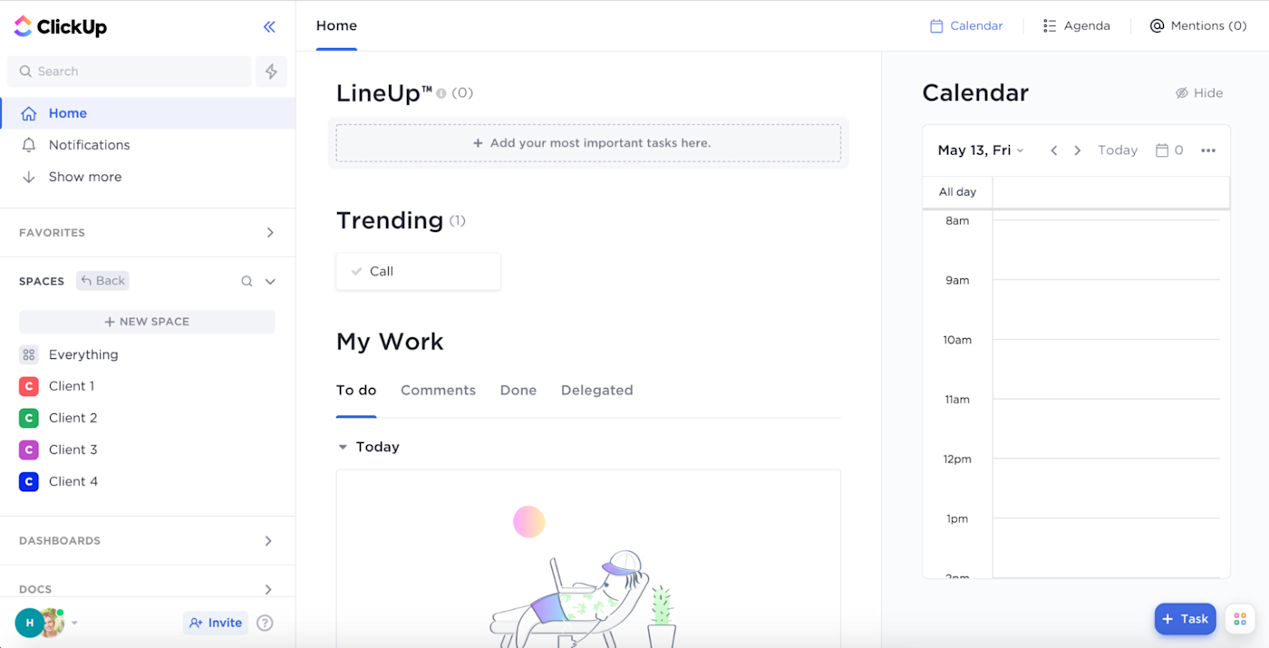
All the must-haves are there in ClickUp, but because of the design—and the overwhelming number of features—it’s a bit harder to find your way around.
ClickUp has highly-customizable automation options on the free plan, while Asana’s require a paid subscription
Both apps offer solid built-in automation, but with Asana, you can only access them on the top-tier business plan, which is $24.99/user/month. Depending on how many users you have, that can add up quickly. ClickUp, on the other hand, offers its customizable automations for free (you get 100 automations/month on the free plan, and it bumps up to 1,000 for only $5/user/month).
Even if you’ve never automated anything before, it’s simple to get started with ClickUp’s pre-built automation templates. Then, once you’ve got the hang of it, you can create your own custom automations based on whatever trigger and condition you want. Automatically change assignees, priorities, or task statuses based on any sort of custom logic.
Asana’s automations are called rules. You don’t get any on the free plan, and you get a few pre-set rules, custom templates, and forms with the Premium plan ($10.99/user/month). But to get unlimited custom and dynamic rules like you have in ClickUp, you’ll need to upgrade to that top-tier plan.
Both platforms streamline team communication; ClickUp also offers a (maybe unnecessary) chat feature
Both Asana and ClickUp share similar team communication features. It’s easy to collaborate with large or small teams as well as invited guests in each platform. In both tools, you can tag team members, assign tasks to members, and comment on tasks. All the standard stuff.
The inbox feature in Asana stores all of your recent conversations, so it’s easy to find recent comments or assignments.
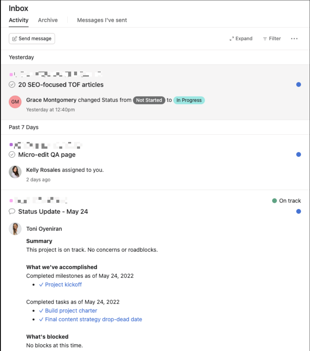
But Asana doesn’t have a true messaging feature. At best, you can set up tags to trigger an email notification. ClickUp, on the other hand, has a separate view for chats. You have to add the chat as a view, name it—let’s say “Product analytics”— and then decide whether you want to pin it for other team members to see. Then everyone involved in that part of the project can chat about it within this view.
I’m not gonna lie: it’s a little confusing (why not just have an inbox?), but it does give it a little more of the team chat app vibe within the tool. You can take a look at their marketing page for it to get an idea of how it feels.
ClickUp has a robust free plan, but it can be too complex for new users
ClickUp’s free plan is incredibly generous. You can set unlimited tasks and register as many users as you want (Asana’s free plan is limited to 15 users), so even if you have a large team, you can get a complete picture of how ClickUp works without spending a dime. And unlike Asana, ClickUp has a whole host of complex features included in the free plan, including sprints, mind maps, dependencies, and embedded spreadsheets. Not to mention the customizable automations I mentioned earlier.
But depending on your use case, you might not need or even want all that. The free plan on Asana is more than enough for a small team doing basic project management—and it’s easier to work with if that’s you.
Both Asana and ClickUp integrate with Zapier, but Asana has more native integrations
Any project management app becomes more powerful when you can connect it to the other apps in your tech stack. Both Asana and ClickUp offer native integrations in their free plans. Asana natively integrates with an impressive list of over 200 apps, while ClickUp connects with closer to 50.
But because both Asana and ClickUp integrate with Zapier, you’ll be able to connect them with thousands of other tools too, so you can automatically add tasks to your project management app or set off workflows whenever you mark a task as complete. Learn more about how to automate Asana and how to automate ClickUp, using Zapier as the glue.
ClickUp or Asana: Which should you use?
The right platform for you comes down to what you need and what will help you get your work done most efficiently.
Choose Asana if:
-
You’re new to project management apps
-
You want a traditional project management tool
-
You prefer simplicity and get frustrated by bloated apps
-
You’re a small team or don’t mind paying for more than 15 users
Choose ClickUp if:
ClickUp is one of the best Asana alternatives for people who want more from their project management software, but Asana is still the old reliable that many teams—including Zapier—use for their project management.
[adsanity_group align=’alignnone’ num_ads=1 num_columns=1 group_ids=’15192′]
Need Any Technology Assistance? Call Pursho @ 0731-6725516

