Creating a PowerPoint presentation might seem easy. Learning the nuances of sharing content through this medium can reinforce your message correctly. PowerPoint Presentations are a mode of communication where you can share information regarding your company, USPs, Mission, Vision, etc. You need to be careful with minute details, as even something like a wrong color scheme can make the whole thing can go south. A professional PowerPoint presentation can help you put your message across the table clearly and effectively. Check out six presentation secrets that will help place your audience’s trust in you. These small secrets go a long way!
1. Less Is Always More

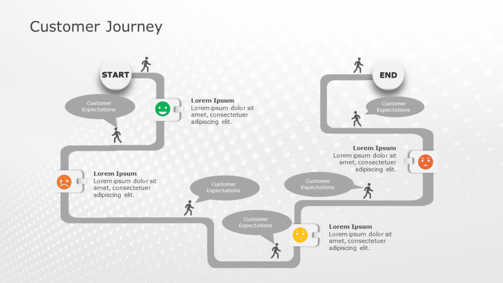
Customer Journey
Source: Customer Journey Template by SlideUpLift
A PowerPoint presentation is a mixture of text, images, and graphs. However, using too much text and highlighting the features through bullet points might fade the essence of the presentation. The textual content makes the audience lose interest and makes the presentation seem boring. On the other hand, graphs and images will help you communicate better and keep the focus on what you want to share. Remember, content is the key. If you do not highlight the right content in a presentation, you may be unable to anchor the audience’s focus, interest, and time.
2. Design Influence

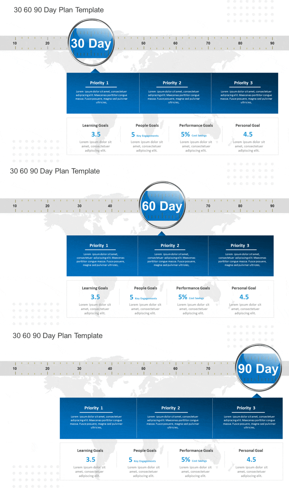
30 60 90 Day Template
Source: 30 60 90 Day Template by SlideUpLift
PowerPoint designs speak for themselves. Choose a font that is easily readable by your audience. When choosing a designer font, pick a classic one the audience can relate to. The PowerPoint will leave its mark only when the size of the slides is of appropriate length. Remember, you do not want your design to have content that looks too small or too big. For headers, you can use 20pt; for the body text, it should be around 18 pt. This content size is acceptable for phones, TVs, banners, and laptops. And classic fonts are fortunately available on every desktop and laptop. Also, the color contrast matters; if there is text on the picture, ensure to use either shadow or highlight it by putting it inside a border.
3. Creativity Is Everything

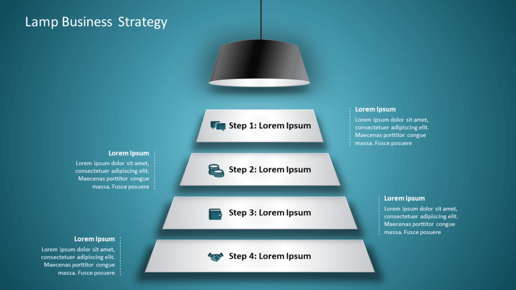
Lamp Business Strategy Template
Source: Business Strategy Template by SlideUpLift
Undoubtedly, creativity is the foundation of exceptional PowerPoint presentation design. No one likes boring presentations, especially with more content and fewer images to convey the message. A plethora of designers up their game of creativity by learning and trying something new each day. Color schemes can be a tricky thing in presentation. Therefore, look for presentations that are approved by others. Maybe the same layout and color palette will work for you. Also, you can use the Moodboard template mechanism at Slideuplift to create a draft of how your presentation will look after putting in all the relevant information.
4. Master The Basics

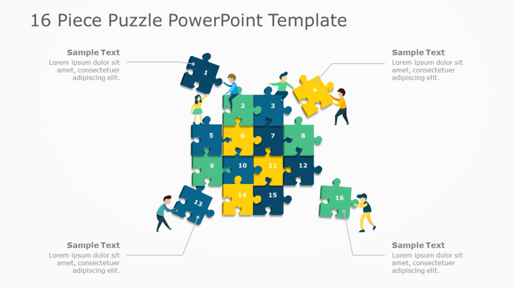
16 Piece Puzzle PowerPoint
Source: 16 Piece Puzzle PowerPoint by SlideUpLift
In the designing field, it is paramount to master the basics of creativity. Your PowerPoint templates will stand out once you conquer the nuances of designing. Remember, advanced designing only helps when the basics are cleared. Mastering alignment, adjustment, and arrangement can make or break your PowerPoint presentation. Another important aspect of paying attention to while preparing a presentation is the apt usage of negative space.
5. Explore The In-Built Features
The best part of PowerPoint Presentations is that you do not require any special software or buy new features to make your presentations look spectacular. PowerPoint is easily available in the market and is loaded with a plethora of game-changers features compared to any basic design software. Explore the shortcut tool so you do not have to go back and forth. However, it is the hardware you need to invest in. If you are working on a laptop, you need to buy a good quality external mouse as the detailing may not be easy to manage with the touchpad. So, if you wish to invest less time and create a presentation that speaks for itself, this is a must.
6. Visualize Your Presentation

Project Kickoff
Source: Project KickOff by SlideUpLift
Before investing time in creating a mind-blowing presentation, you need to visualize its look. From basic color combinations that appeal to the eyes to simplifying the tables and using the doughnut graphs appropriately, all are a part of the visualization. Just putting in content is not enough, and you need to know how and where to put it. Google Slides Templates can create presentations that communicate the message loud and clear. Also, Google Slides Templates are compatible with PowerPoint presentations, so you do not need a separate tool.
To sum it up
Creating a PowerPoint presentation masterpiece is all about knowing skills, practice, and patience. However, if you feel you are short on time and lack those skills, it’s best left to experts, Slideuplift has it all covered. We will add a creative tinge to your PPT presentations and help you deliver the right message in the right way.
Looking For Powerpoint Design Agency?
Call Pursho @ 0731-6725516
Telegram Group One Must Follow :
For Startups: https://t.me/daily_business_reads
#Tips #Impactful #PowerPoint #Presentations


