Have you ever had a nugget of an idea, then immediately grabbed a pencil and sketched it out on a scrap of paper before you could forget it? The design world has a word for this preliminary sketch: they call it a wireframe.
5 things you should automate today
Wireframes are the first idea—the minimalist outline—of things like mobile apps, landing pages, and websites. Designers use basic shapes like rectangles and lines to indicate what will later turn into complex elements like images, text blocks, and interactive buttons. Once the designers agree on the wireframe’s basic structure, it can be turned into a high-fidelity prototype that looks closer to the final product.
There are dozens of wireframing apps available to get the job done. After hours of research and testing, I narrowed it down to the six wireframing tools I’d recommend.
The 6 best wireframe tools
-
Sketch for detailed, vector-based design
-
Adobe XD for beginners
-
Figma for a free wireframe app
-
UXPin for handing off design documentation to developers
-
MockFlow for project organization
-
Justinmind for interactive wireframes
What makes a great wireframe tool?
How we evaluate and test apps
All of our best apps roundups are written by humans who’ve spent much of their careers using, testing, and writing about software. We spend dozens of hours researching and testing apps, using each app as it’s intended to be used and evaluating it against the criteria we set for the category. We’re never paid for placement in our articles from any app or for links to any site—we value the trust readers put in us to offer authentic evaluations of the categories and apps we review. For more details on our process, read the full rundown of how we select apps to feature on the Zapier blog.
Let’s start with an honest disclaimer: you don’t need a dedicated app to create an effective wireframe. Flowchart apps, for example, provide ample structure for a basic wireframe of a website design or sitemap structure. But they aren’t created with interface designers in mind, and they lack more advanced visual editing tools like object opacity and pre-sized canvases for responsive screen sizes.
Wireframe apps, on the other hand, assume that you’re going to want to refine and improve your design before it’s ready to be handed off for further development. That’s where apps that are specifically designed for wireframing really stand out.
Not only do they make space for you to create your rough sketch and UX flow, but they also include a few standout elements like:
-
An included UI kit or ability to upload one: In each of the following apps, you can either take advantage of a built-in UI component library or upload pre-designed kits from third parties.
-
Various levels of mockup fidelity: Whether you prefer to stick with basic, low-fidelity wireframes or move toward more high-fidelity mockups, the apps on this list represent a full range of capabilities.
-
Collaboration/feedback options: Remote work is a reality. The apps on our list all include at least one viable way to share the design virtually and collect feedback from teammates, design clients, or other stakeholders.
-
Export/hand-off options: While many developers are capable of working from a screenshot, the best wireframe apps include hand-off features that allow you to export individual elements of your design (like icons), whole screens into HTML, or simply inspect the design to nab the CSS code for quicker development implementation.
-
Multiple points of access: Team collaboration is easier (and more likely) if your team can edit and view the design from wherever they are. Whenever possible, it makes sense to choose a tool that you can use from your browser, a desktop app, or even a mobile app. While there are some apps on this list that are only available in a desktop app, they still allow for real-time collaboration—and they have other features that make them worthwhile to consider.
When reviewing these apps, I signed up for each one, designed a basic mobile app wireframe, tested the collaboration and export options, and made a note of how the app’s ease of use balanced with its more advanced features.
Need a primer on some of the design terms used in this article? Scroll to the bottom or click here for a quick glossary.
Best wireframe app for detailed, vector-based designs
Sketch (macOS)
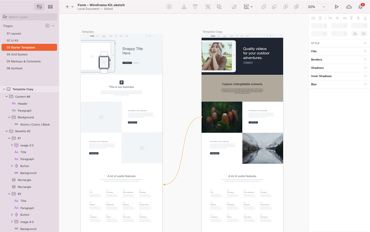
Since its release in 2010, Sketch has maintained a premier spot as a powerful yet lightweight vector design tool for Mac users. By itself, it can be used for anything from wireframes to modern UI and icon vector design (on a pixel-based canvas, no less) and some interaction design. Its interface is far simpler and more intuitive than vector design heavyweights Affinity Designer and Adobe Illustrator. Thanks to this simplicity, Sketch can be used to create wireframes quickly with a combination of artboards and vector design shapes.
When you download the Sketch app to your Mac, you’ll notice that there are no built-in UI components. While you could certainly design your own components to use as part of your wireframe process, there’s a vast online community of designers that have created and shared many free wireframe design kits. A single click to download, and you have a wealth of buttons, icons, and other design elements that can be used inside your Sketch file.
Sketch offers layout templates for Android and iOS app icons, and it also syncs with Unsplash to let you quickly search and use royalty-free photos for your designs without leaving the app. And if you don’t want to interrupt the flow of your design process (or you just like to roll the dice), you also have the option to choose a random photo as a placeholder.
Previously, Sketch’s limited availability as a desktop-only app put a ceiling on its collaboration features. But Sketch now lets users collaborate in real-time in shared workspaces directly from their desktop apps. Simply add your design to a shared workspace, invite your teammates, and everyone can begin working on the same design in real-time.
As I was testing, I appreciated that the app shows collaborators’ color-coded cursors and names as they work—a feature that lets you easily keep track of who’s doing what on the canvas. And Sketch also lets you use Follow mode if you simply want to observe the design process without participating yourself.
When it’s time for hand-off, you can use the Export option to save your full designs and/or individual elements. Or take advantage of the large variety of integrations to send your wireframe further down the design process.
Overall, Sketch feels like an Apple app. It looks nice and has a lot of features, but it can also have a bit of a learning curve. I found that the placement of tools and options wasn’t always intuitive. But once you get the hang of it, you’ll see that Sketch is a household name in the design work for a reason: it’s a powerful wireframing tool that lets you create detailed, vector-based designs in an aesthetically-pleasing interface.
Sketch price: $99/year for individual users (when the year is over, you can continue to use the tool, but you’ll no longer receive software updates), or $9/month for team members utilizing Sketch Cloud.
If you’re a Windows user, you might want to look into InVision Studio, which was created as a Sketch alternative for designers who prefer to stay within the InVision app suite.
Best wireframe app for beginners
Adobe XD (macOS, Windows)
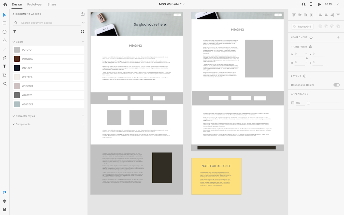
While Adobe products are known for being feature-heavy and complicated to learn, Adobe XD really stands out as an easy-to-use option for wireframing and interface design projects. Everything from wireframing to basic prototyping can happen within XD. And compared to other feature-rich Adobe tools, XD’s minimal interface is a breath of fresh air.
The moment you open the app, a set of interactive onboarding lightboxes helps you get oriented quickly with the design tools at your fingertips. The clean interface and quick onboarding are invaluable for beginners who want to use a professional wireframe design tool without spending too much time trying to learn the software.
Basic wireframe vector design tools are easily found in the left-hand navigation bar. UI elements aren’t included, but you can find a variety of free options with a quick Google search. XD is full of responsive design aids, whether you choose to create multiple artboards, overlay a Bootstrap 12-column grid, or use the responsive resize tool to create variations of each element.
As with Sketch, I appreciated that while Adobe XD is limited to desktop-only access, this limitation doesn’t restrict team collaboration. Since XD is part of the Adobe Creative Cloud, you’ll just need to save your design to the cloud and invite your team. Then, all of your collaborators can view and edit the same design simultaneously within their own desktop apps.
For many wireframing apps, the interface design files must be exported into a different tool before you can create an interactive prototype. Adobe XD makes it possible to create the wireframe, mockup, and prototype in the same design file, so you don’t have to integrate multiple tools or re-export dozens of times with each iteration. Then, you can use XD to publish your prototype—whether it’s a basic wireframe or a full interactive prototype—and share the link with others so they can view and make comments.
As a bonus, AdobeXD also keeps track of the basic CSS and HTML for your designs, so you can grab the code directly inside the interface when handing it all off to your programming team.
Adobe XD price: From $9.99/month for the Single App plan that includes unlimited prototypes and 100GB of storage.
Sketch, InVision Studio, and AdobeXD have a lot in common. You can’t miss the resemblance in their interfaces: design layers on the left, a toolbox on the right, with the drawing and publishing tools on a very minimal top bar. All three also allow you to create vector graphics and move them around on a canvas that’s measured in pixels. The vector elements can then be anchored to the page so that they resize (or not) as you scale your design up and down to mimic responsive screen sizes.
Best free wireframe tool
Figma (Web, macOS, Windows, Linux)
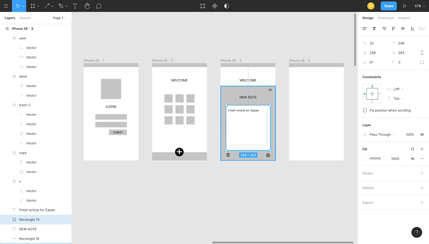
Figma stands out as a powerful cloud-based alternative to tools like Sketch and XD. And the best part: it doesn’t hold back for free users, offering a suite of features that work well whether you’re a standalone designer or part of a bigger team.
There are a number of free wireframe tools out there. But while I recommend Figma as a great choice for those on a limited budget, it’s also an excellent option if your team needs one easy tool for the whole design process. You can use FigJam, an online whiteboard that lives side-by-side with Figma, to brainstorm and map user flows. Then, jump smoothly into wireframing and prototyping without needing to export your ideas to another design app.
The actual process of wireframing with Figma is straightforward and quick. You’ll have to design your own UI components (or add them from a separate, pre-designed kit), but it’s easy to create your artboards, add shapes and text, and even add some prototyping so you can get a better feel of the flow. The left-hand panel helps you keep everything organized, from layers to artboards to separate pages within the same design doc. For responsive design, you can apply a column overlay (if you prefer the Bootstrap grid system), or you can use the Figma constraints, which tell each element how it should respond when the design is resized to mimic various screen sizes.
Another feature I appreciated when testing Figma is the vector-based pen. Many of the tools I tested offered vector-based drawing, but these pens usually operated from a single direction and wanted you to reconnect to the original starting point. With Figma’s vector networks tool, your drawing can branch off in multiple directions—meaning you can create complex shapes with just a few clicks.
Figma also stands out for its team collaboration opportunities. Because it’s a web-based wireframing app, multiple team members can log in and access the design file simultaneously, whether to tweak the design or add content. The most compelling feature is the ability for a team to carry on an entire conversation inside the design file, leaving sticky note-like comments that other teammates can then reply to or mark as complete.
When it comes time for your dev team to take over, developers can grab CSS code from inside the design file and export individual elements to use as needed.
Figma price: Free for up to three projects; from $12/user/month (billed annually) for the Professional plan that includes unlimited projects.
Best wireframe app for handing off design documentation to developers
UXPin (Web, macOS, Windows)
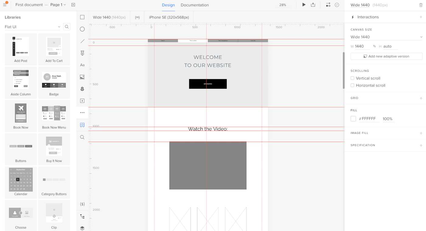
UXPin is a perennial favorite with interface designers, and it’s typically one of the first tools recommended for anyone who’s learning how to wireframe. While its rich feature set can be a bit challenging for a new designer to pick up, the effort spent learning UXPin definitely pays off.
With UXPin, you’re able to start your wireframes with a built-in library of UI elements that you can drag and drop directly onto your canvas. The benefit of this slightly higher-fidelity wireframe is that you can do more fine-tuning of the flow and functionality without spending a ton of time redesigning the screen’s components. And, since UXPin can read Sketch and Photoshop files, you can always use those tools to turn your basic wireframes into high-fidelity prototypes, before importing the polished design back into UXPin to take advantage of the tool’s other features: adding interactions, presenting to a team, and handing off the design specs to a developer.
Despite the great wireframe and interface design features, it’s the live presentation and documentation abilities that make UXPin stand out in a crowded field of wireframe > prototype tools. While many apps allow you to snag CSS, HTML, or even JSON from your design, UXPin makes it easy for you to present a working prototype of your design, collect feedback, and include specs/documentation all at once through the Preview mode. You can even choose how much you want invitees to see.
To use this feature, click the Preview button on the top toolbar, decide what kind of access you’d like to grant viewers (e.g., the ability to view comments, specs, documentation, etc.), then share the link provided. This all-in-one sharing option means that the final review, approvals, and design documentation hand-off can all be done in the same place, so no one is left in the dark when your design hits the home stretch.
UXPin prides itself in being a wireframing tool with “DesignOps in mind”—and the software lives up to that promise. When testing, I appreciated that the library of drag-and-drop elements comes with HTML, meaning that every wireframe you create is focused on design ops without your having to know code. If you’re looking for a design tool that creates a fluid transition from prototype to production, UXPin might be the choice for you.
UXPin price: Free for up to two prototypes at a time; From $19/user/month (billed annually) for the Basic UXPin Standard plan that includes unlimited prototypes and reviewers.
Best wireframe app for project organization
MockFlow (Web, macOS, Windows)
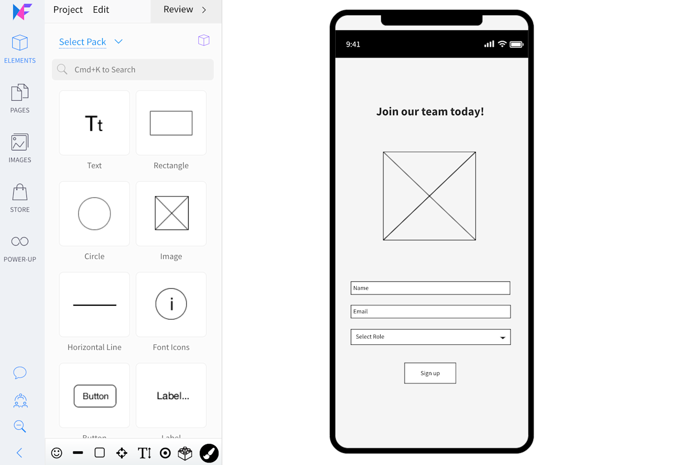
MockFlow is another popular online wireframe tool that prioritizes real-time, online collaboration. Even if you’re using the desktop version, you have the ability to design alongside your team in real-time (with the added bonus of native keyboard shortcuts and menus).
MockFlow impressed me with its extremely clean and intuitive interface. The tool makes it quick and easy to get started wireframing, offering tons of UI packages and features without being overwhelming to the user. The design interface is very clean; when testing, I appreciated that all of the controls in the edit screen are on the left, which maximizes space for the design itself.
The design elements in MockFlow are also diverse and organized in an intuitive way. If you’re new to wireframing, you’ll probably appreciate how easy it is to get started using MockFlow, not to mention how modern the UI looks.
One of my favorite aspects of MockFlow is its organizational functionality. From your dashboard, you can create separate design spaces for each project. Uncategorized wireframes are automatically sorted into a “default space,” where you can easily find and categorize them later. And the export options go beyond PNG and HTML; you can also share your designs with stakeholders in a Word doc or PowerPoint.
If you’re looking for a wireframing tool that lets you easily manage several projects at once—or just stay organized as you move through the design stage of a single project—MockFlow is a great option.
MockFlow price: From $14/user/month for the Wireframing plan that includes basic wireframing and integrations; from $19/user/month for the Product Design plan that includes advanced organization and planning tools like sitemaps, product research, design files, and style guides.
Best wireframe app for realistic, interactive wireframes
Justinmind (macOS, Windows)
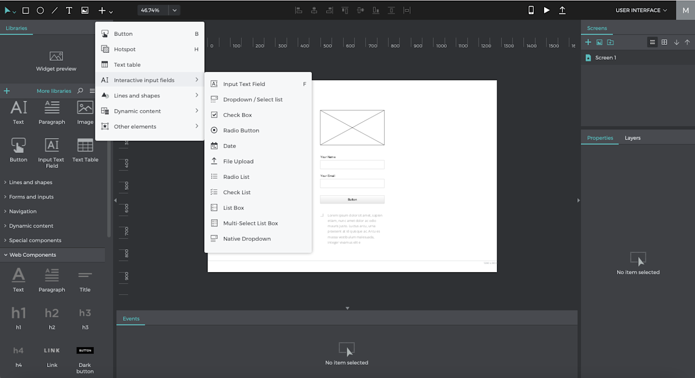
Justinmind is not only easy to learn and enjoyable to use; it also maintains a focus on empowering you to create a wireframe that can be tested as a working prototype from the start. It does this by including something that other apps just haven’t bothered to develop: interactive prototype elements (text inputs, radio buttons, dropdowns, and so on). Even at a basic wireframe level, a working dropdown would take three or more screens to set up in a tool like Sketch or Figma. Justinmind allows you to add it to your wireframe with a single click.
In fact, the ease with which you can create and share realistic wireframes can save you hours or days of work on any given project. This makes Justinmind a great wireframe maker for anyone who wants to get real, in-depth feedback on designs much earlier in the wireframe stage (with minimal effort).
Apart from the content of the elements themselves, the layout of Justinmind is very easy to figure out: all of your design elements are on the left-hand side; the organization elements (like folders, list of screens, etc.) are on the right. It all just feels very intuitive, which I loved as I was testing.
And much like Sketch or AdobeXD, Justinmind’s desktop-only access doesn’t stop you from collaborating with your team in real-time. You can designate your design as a Shared Prototype within Justinmind’s cloud server, which stores an updated copy and detailed version history for all users to see. However, keep in mind that Justinmind uses a check-in/check-out collaboration model, which means that users may not always have the ability to edit the same page or element at exactly the same time.
While Justinmind generally has a very low learning curve, its suite of advanced elements may be a little too detailed for you if you just need to sketch a quick and minimalist wireframe.
Justinmind price: Free for the desktop app with wireframe capabilities; from $19/month for the Professional plan, which includes real-time collaboration and advanced prototyping features.
Which wireframe app should I use?
While Sketch and Adobe are the biggest names, that doesn’t mean you’re limited to using those for your own wireframing software. Choose something that will fit in with the rest of your tech stack so that your design process can move forward easily.
When choosing the best wireframe software for you and your team, start by considering your design process and your goal for the wireframes themselves. Do you need to include responsive elements for mobile devices? Do you want robust collaboration features? Do you plan to turn your wireframe into full, high-fidelity interactive prototypes? Will you be presenting each of your wireframes to a board of directors, or will they be passed directly to the dev team for implementation?
Since each tool does have its own unique strength, it’s normal to create a tech stack with multiple of the best wireframing tools so that your entire design process can run smoothly. For example, since many of the desktop apps offer a more robust feature set, you might start your wireframe there, before moving to a cloud-based app that allows multiple designers to collaborate in real-time. It all depends on what you need to accomplish with your wireframe—and whatever happens afterward.
Glossary of terms
-
Vector graphic: A vector graphic is an image that is made up of points, lines, and curves that are based on mathematical points. Because of this, it can scale infinitely without becoming “fuzzy.” Most icon and logo graphics are initially created with vector graphic design tools.
-
Raster (pixel) graphic: Raster images are made up of bitmaps, or grids of individual, tiny square pixels. If a small raster image is magnified (or scaled to fit a large canvas), the quality of the image will decrease and cause it to look fuzzy. Photographs are a common form of raster image.
-
UI components: Commonly used user interface (UI) components are buttons, checkboxes, progress bars, navigation menus, and so on. When starting a design, you may prefer utilizing a kit of ready-made UI components to make the initial wireframe process go more quickly.
-
Artboard: Many design apps allow you to create one or more artboards in the same design file. Think of each artboard as an individual canvas or paper. They’re helpful when you need to create multiple separate designs but don’t want to switch files each time.
-
Mockup: Whereas a wireframe typically consists of basic text and shapes to serve as placeholders, a mockup is a fully designed interface that includes colors and images.
-
Prototype: A prototype is an interactive wireframe or mockup that allows users to click through and “use” the design even before it has been translated into code by developers. This is useful when your design requires UX testing data before it’s implemented.
-
Low-fidelity: Rough and simplified designs (like a wireframe) are considered low-fidelity.
-
High-fidelity: Fine-tuned and polished designs that appear similar or identical to the finished product are considered high-fidelity.
-
UI: UI stands for user interface and pertains to how an app or design appears to users (think: color and type scale).
-
UX: UX stands for user experience and pertains to how a user will interact with an app or design, such as optimal button placement or logical flow from one section to another.
This article was originally published in December 2018 and has since been updated with contributions from Nicole Replogle.
[adsanity_group align=’alignnone’ num_ads=1 num_columns=1 group_ids=’15192′]
Need Any Technology Assistance? Call Pursho @ 0731-6725516

