What do 100 oysters have to do with data visualization? In Storytelling with Data, Cole Nussbaumer Knaflic uses a metaphor of oysters and pearls to explain data visualization. As presenters, researchers, analysts, or educators we are used to gathering and shifting through data. We track numbers all the time in an effort to see patterns and make decisions. In Knaflic’s terms, it’s no big deal for us to open 100 oysters on the hunt for pearls.
But when it comes time to present our findings to our audience, clients, colleagues, or students, we drudge through the task again. We tell them about all the oysters we opened and bore them to tears. Data visualization is about shifting the focus from the oysters to the pearls. It’s not about what or how we gathered, it’s about what we found. And it’s about plucking the valuable stuff out and sharing it in a way that makes sense. So let’s see how data visualization can take your presentations to the next level.
So what is data visualization?
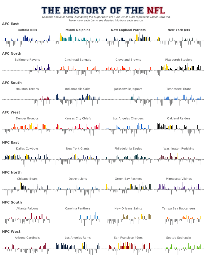
Data visualization (or data viz) is changing data like numbers, statistics, and raw research into graphics that your audience can easily understand. Here’s a great example from Matt Chambers who is a Tableau Zen Master (that just means he’s really, really good at data viz). His graphic below shows the history of the NFL. He has compressed pages and pages of data into a beautiful and clear story.

Check out Chambers’ fully interactive data viz here.
Why is data visualization important?
“Being able to tell stories with data is a skill that’s becoming ever more important in our world of increasing data and desire for data-driven decision making. An effective data visualization can mean the difference between success and failure when it comes to . . . presenting to the board or simply getting your point across to your audience.”
-Cole Nussbaumer Knaflic, Storytelling with Data
The easiest way to explain the importance of data visualization is to show you a really great example of how it can completely transform a presentation. Hans Rosling’s BBC video has received over 10 million views. Take just four minutes to watch it.
Can you imagine what this presentation would have been like if Rosling tried to cover the same information without any visuals? We might have caught just a small percentage of the information. And that’s only if we made it through 4 minutes of talking about lots of numbers.
Rosling’s example illustrates how data visualization allows us to:
- capture and maintain audience attention in a special way
- present incredible amounts of data without overwhelming the audience
- tell a “data story” in a way that is clear, concise, and beautiful
- honor and mimic the increasingly visual nature of communication, information design, and business analytics
So how can you use it in your presentations?
While you won’t be Tableau Zen Master or a Hans Rosling right out of the gate, you can still start using data viz in your presentations with these beginning steps:
- Be aware of the need for and the purpose of great data visualization in presentations. (Go ahead and check this one off. You’ve completed this step just by reading this post!)
- Pick a program and invest some time (and money, if needed) to learn this new skill. Challenge yourself to try one of the programs listed below.
- As you are building your data visualizations, remember to keep things simple and focus on the pearls (not the oysters)! That means you need to get rid of the Excel tables and lists of data.
- Place your graphics in your slide deck in a way that helps to tell an overall clear and compelling story. Remember, the data is there to help you make your overall point.
Data viz programs to start with:
- Tableau. This one is my top pick. Not only is it user friendly, but it offers incredible support for new users. Once you sign up, you can follow specific “Learning Paths” that allow you to gradually increase your data viz skills through a series of video and slide deck lessons and to earn badges as you go.
- Microsoft Power BI. This data visualization tool works with programs you already use, like Microsoft Excel. This allows you to take the data you already have in Excel to start building beautiful graphics. Plus, they offer incredible free tutorials.
- Infogram is another great choice. They offer a great library of designer templates as well as the option to build custom templates which incorporate your company’s unique brand colors, fonts and logos.
If you want to see more data viz software options, check out this longer list compiled by FounderJar.
If you are ready to dive into design principles that will help you create better data visualizations, check out our blog on that topic here. And if you want to find out how Ethos3 can help you create and deliver compelling presentations that are all about the pearls, get in touch with us now.
The post The Beginner’s Guide to Using Data Visualization in Your Presentations appeared first on Ethos3 – A Presentation Training and Design Agency.
Looking For Powerpoint Design Agency?
Call Pursho @ 0731-6725516
Telegram Group One Must Follow :
For Startups: https://t.me/daily_business_reads
#Beginners #Guide #Data #Visualization #Presentations


