If you asked the average person to name an email marketing platform, I’d bet almost all of them would say one of two things: “what’s an email marketing platform?” or “Mailchimp.”
In all the years that I’ve used Mailchimp, I’ve never once had to explain what it was—it’s practically a household name. So why exactly is this email marketing brand that’s named after a chimp so popular? Here’s my take.
-
It has a generous free plan
-
Its branding is relatable
-
It’s easy to get started with
-
Its automation features are simple
-
It’s an all-in-one tool
1. Mailchimp has a generous free plan, which attracts small businesses early in their journey
I have yet to see another marketing platform offer so much for so little—even other free email marketing tools. Here’s what you get on the free plan:
-
The ability to email one group of up to 2,000 contacts. That’s just fine for a small business or even a one-person brand who wants to communicate regularly with their audience. I actually worked at a medium-sized company that used the free plan just for their weekly internal newsletter.
-
Access to six starter email templates. There’s a range of aesthetics, such as Bold, Natural, or Minimal, and you can edit them with Mailchimp’s easy-to-use email editor.
-
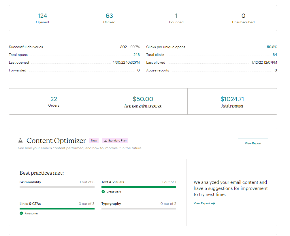
Comprehensive reporting. When it’s time to see how well your emails performed, Mailchimp delivers—with the number of opens, the number of links clicked, the revenue made from a specific email, and a bunch of other data points. The report also includes an evaluation of various elements, including the skimmability of your emails and your use of links and CTAs.
-
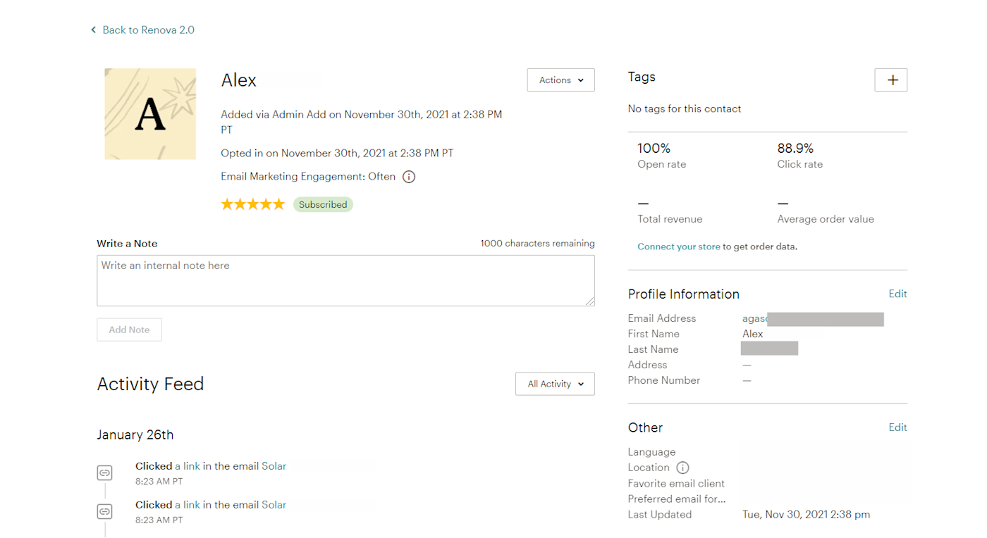
Analytics for individual subscribers. Mailchimp shows you how often a specific subscriber opens your emails or clicks on links. Based on these metrics, it assigns a star rating to each member of your audience (on a scale of 1 to 5).
At the end of the day, this generous free plan is as much a win for customers as it is a win for Mailchimp. It gives small businesses the chance to dip their toes into the world of email marketing, getting them in the door. As those brands scale and grow to love Mailchimp, they’ll want to stick with it and will upgrade to a paid plan. Everyone wins.
2. Mailchimp’s branding is fun and relatable
Remember the Mailchimp ads on Serial? Great. Remember any other ad for any other software on any other platform? Probably not.
The takeaway: Mailchimp is really good at branding.
Automate your email marketing
Mailchimp’s quirky branding can be found in every aspect of their business: their marketing website, their social media accounts, and even within their product. Their mascot, Freddie the chimp, who hangs out in their logo, even manages to wink at you without being creepy. It’s kind of amazing.
The sleek, advanced, and almost futuristic vibe that many tech brands give off with their branding may look good, but it doesn’t always feel relatable or human enough. Mailchimp, on the other hand, has always remained true to its original we-don’t-take-ourselves-too-seriously feel, regardless of any rebranding. Example: the animated sketches of funny-looking characters throughout their marketing pages and within the product.
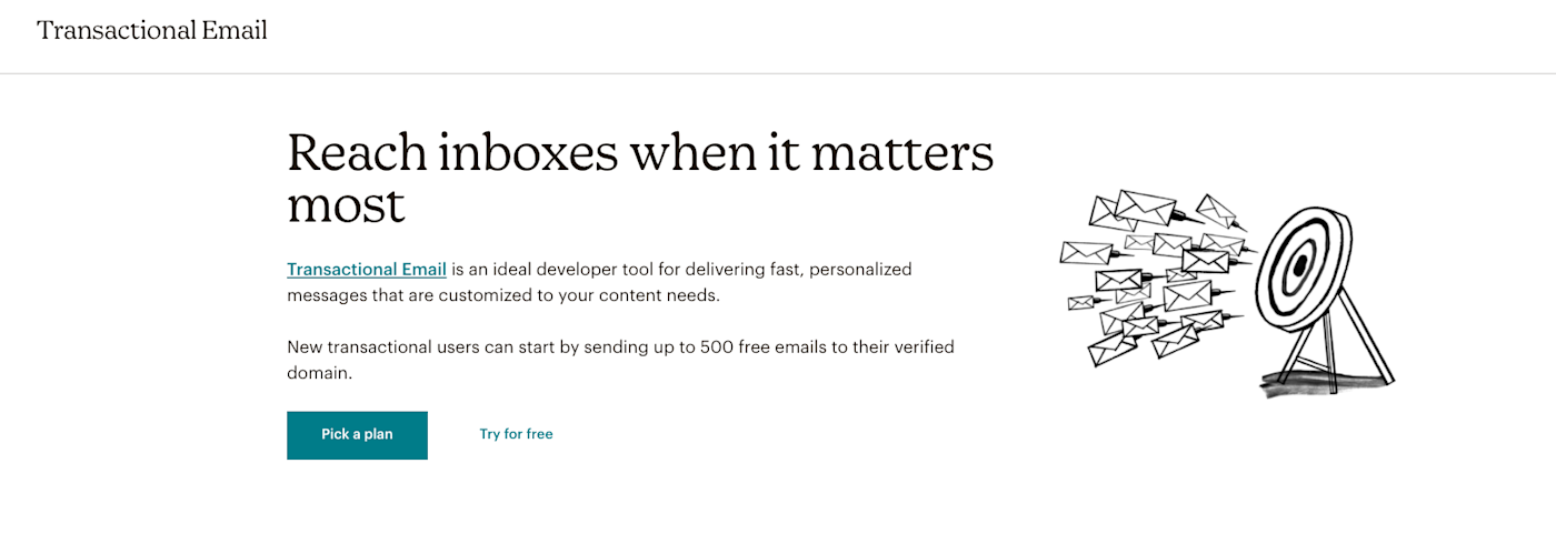
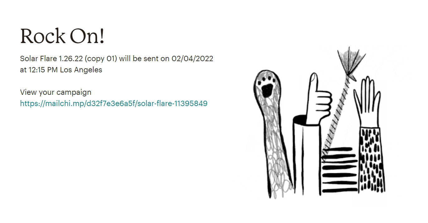
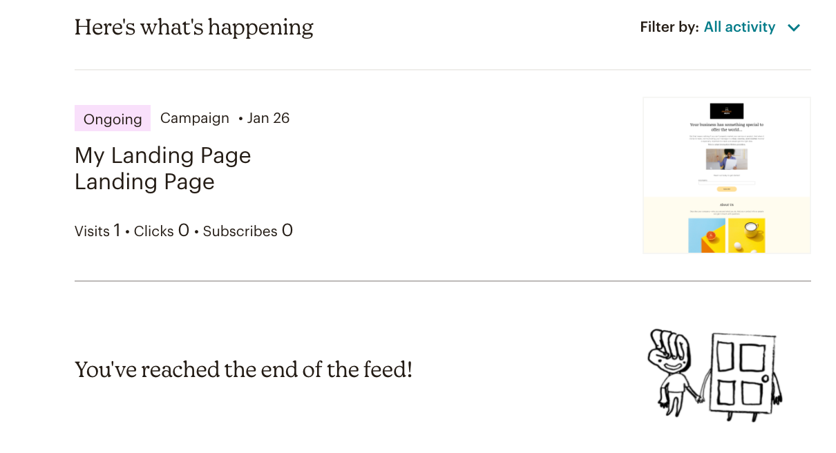
Despite the goofy drawings, the branding doesn’t come across as juvenile—it actually makes Mailchimp feel more down-to-earth and approachable. And its brand voice matches: it’s casual, friendly, and easy to understand. And the Mailchimp style guide is highly regarded in the marketing world (Zapier actually used it as an example to emulate in the early days).
3. Mailchimp makes email marketing easy
So Mailchimp’s branding is approachable—and the product lives up to the marketing. Mailchimp is a product that anyone, from marketing veterans to newbies, can use.
Mailchimp makes it super easy to get started with email design, especially if you’re completely new to the platform. Once you hit Create, Mailchimp will start you off with their Minimal template (see the image below), and customizing it is super straightforward.
Many email editors I’ve used employ the drag-and-drop method—that’s not necessarily bad, but it’s a little old-fashioned. Mailchimp has updated to a much more modern take. To add a new section to your template, you just click the blue + button above or below a section and pick whichever element you need. Deleting is quick too: select the section and click the red trash bin that pops up. You can also easily change text color and even the colors of your links once you select a section of text.
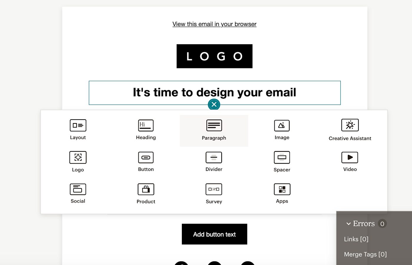
Mailchimp offers five templates on the free plan. Folks on a paid plan who are looking for a bit more inspiration can also take a look at Mailchimp’s Marketplace for access to dozens of other unique, premium templates (just keep in mind you’ll have to pay extra for those, in addition to your paid plan, with the priciest templates costing $14.99 each). And if none of the templates are doing it for you, you can also copy/paste or upload HTML into the code editor that’s built in to the tool.
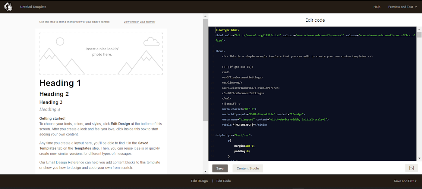
Sure: there are lots of email apps that deliver on an easy-to-use email editor. But Mailchimp is one of them—and because it’s so good at getting people into its product with its branding and free plan, delivering on the product means people stick around.
4. Mailchimp offers simple marketing automation features
Marketing automation can seem intimidating for anyone without experience using it. And while it can definitely get complicated depending on the complexity of your campaigns, Mailchimp keeps it simple, while still offering the must-have features.
With Mailchimp’s customer journey builder, you can control how your audience experiences your campaigns. You have the option to split your audience with if/else rules, send different emails to different audiences, use time delays, tag and group your audience members, or even make subscribers repeat a journey.
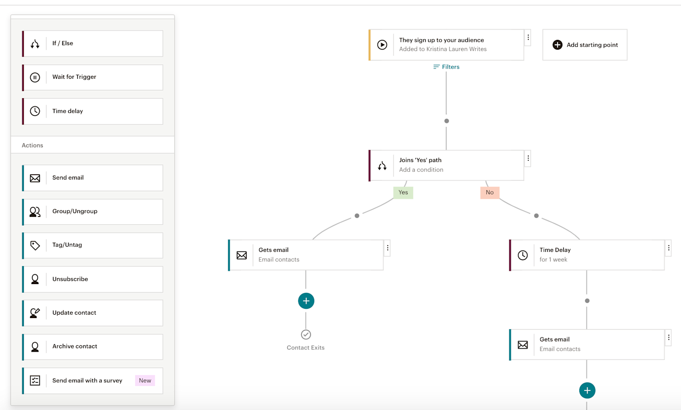
That might sound complex, but the process is incredibly intuitive. I didn’t need to watch any tutorials or Google what a particular button did—I just started building. While other email automation platforms, like ActiveCampaign, for example, may have more advanced features, Mailchimp provides more than enough for standard automations. And unlike those other platforms, you don’t need an advanced degree in SaaS or marketing automation to use them.
I also have to talk about Mailchimp’s ability to automate physical postcards. It might seem a little out of left field for Mailchimp, but it adds to its well-rounded marketing features (more on that below!). Instead of having to create postcards, print them, ship them, and review results separately (or use a separate tool to do all that), you can do it all within your existing app.
Mailchimp gives you a few different campaign options for postcards: you can do a one-time send, which can be great for something like a holiday message; a recurring campaign that sends postcards, for example, every month; or an abandoned cart campaign, which sends postcards to any customers who fail to complete a purchase.
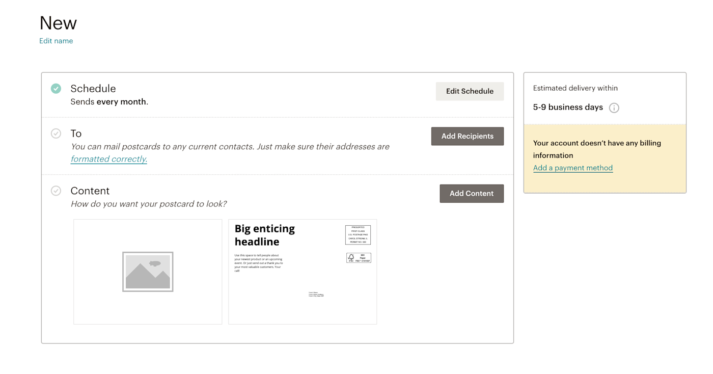
If you’ve ever gotten a 10% off postcard from a brand you’d been browsing, now you know how it happened.
5. Mailchimp is an all-in-one marketing tool—without losing its simplicity
Mailchimp may be a leader in the world of email marketing, but as you can already tell, that’s not all it has to offer. In addition to email marketing, Mailchimp offers all sorts of other marketing tools for social media, eCommerce, lead forms, landing pages, and websites. I’ll show you a couple, just to give you an idea.
-
Social media. Mailchimp gives you ready-made templates to choose from, stock photos, and the ability to post directly to multiple social media platforms when you’re done. You can even use the tool to create social media ads. Mailchimp automatically adjusts each graphic to fit each respective social platform—pretty good for what’s known as an email marketing tool. It reminds me of Canva but with fewer customization options.
-
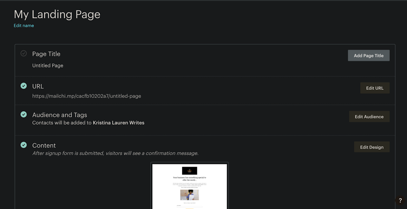
Landing pages. If you’re doing a one-time event or you’re a small business that wants to give people a quick way to stay in touch, whipping up a professional-looking landing page is simple on Mailchimp. You can choose from a variety of templates, similar to the email creation tool, and use the drag-and-drop editor to customize. When you’re done, you get your own link, which is customizable with a paid plan.
-
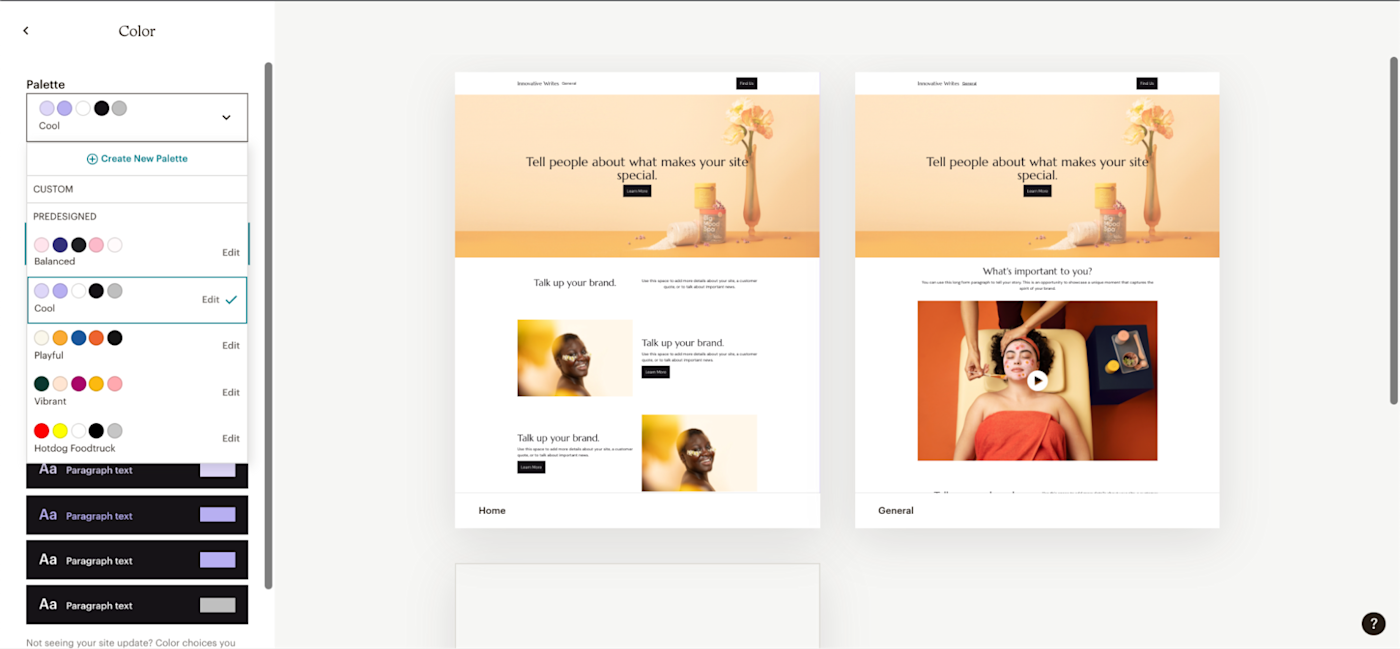
Websites. You can even build entire websites for free, using templates for an About page or Contact page, or by creating your own page from scratch. (Hotdog Foodtruck color theme included). When you’re done, you’ll get a Mailchimp-branded link—but if you have a domain name, you can use that instead to make your website even more official.
There are plenty of worthy Mailchimp alternatives, but none of them have that magic combination of approachability, feature breadth, and cost-effectiveness that makes everyone—marketers and non-marketers alike—know and love Mailchimp.
[adsanity_group align=’alignnone’ num_ads=1 num_columns=1 group_ids=’15192′]
Need Any Technology Assistance? Call Pursho @ 0731-6725516

