Using a call to action—like the cliched “buy now” or “click here”—may seem contrived and sometimes even sleazy, but if you do it right, it can seriously move the needle on conversions.
As a marketing copywriter for almost 15 years, I’ve seen what CTAs can do, and I’ve learned how to make them more effective. For DIY businesses and early-career copywriters, I created this CTA guide, which explains how to write a call to action for whatever you need and includes some examples of CTAs done right.
But first, let’s talk a little about why calls to action are a practical necessity.
Why calls to action work
As a user of the beloved internet, you’ve absolutely seen calls to action that were pushy or patronizing, begging the question: “do I really need someone to tell me where to click?” But just like the difference between an aggressive sales rep and a sales rep that actually listens, a CTA that’s written with care can get you a conversion without the negative connotations.
Grow your business with marketing automation
Why? Because having a strong CTA in your online sales pitch fits the psychology of your visitors.
For starters, having a clickable link or button coincides with the Action > Reward system our brains love so much. It’s the extension of the childlike joy in pressing an elevator button: humans crave interaction, and our curiosity alone is often enough for us to push and click things.
But more than that, a call to action—like any good sales closer—acts as a climax to the pitch. It serves the same function as a joke’s punchline, and without a CTA, the visitor is left in a sort of directionless limbo.
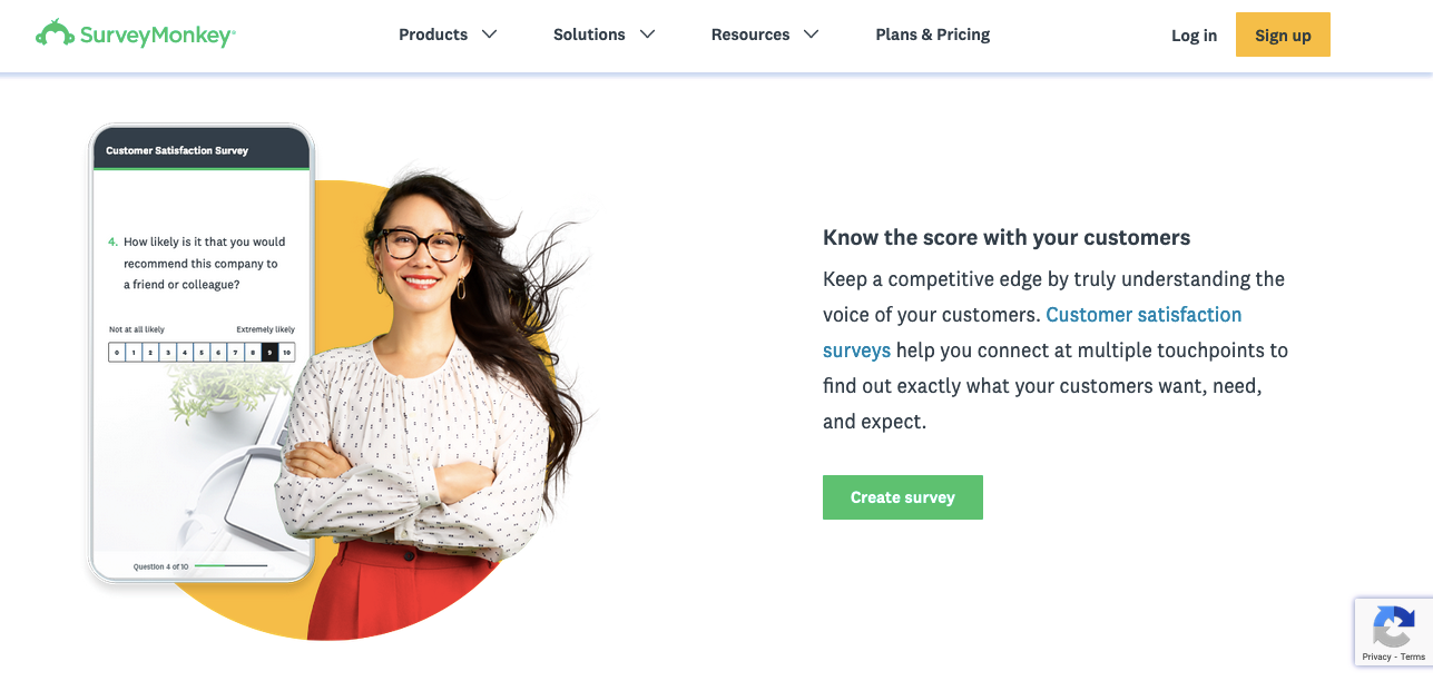
A good CTA not only signals that the pitch is over; it also recommends the next course of action. One core tenet of digital design is Steve Krug’s rule: don’t make the user think. By providing a suggestive call to action, the user doesn’t have to wonder what to do next. They see the next step in front of them, and all they have to do is take it.
All in all, the call to action is the best online equivalent we can get to a personalized, face-to-face sales closer. We may not be able to tailor our final pitch to a particular customer, but we can use the same techniques and strategies on a broader, more inclusive scale. And therein lies the art of writing a CTA.
How to write a call to action
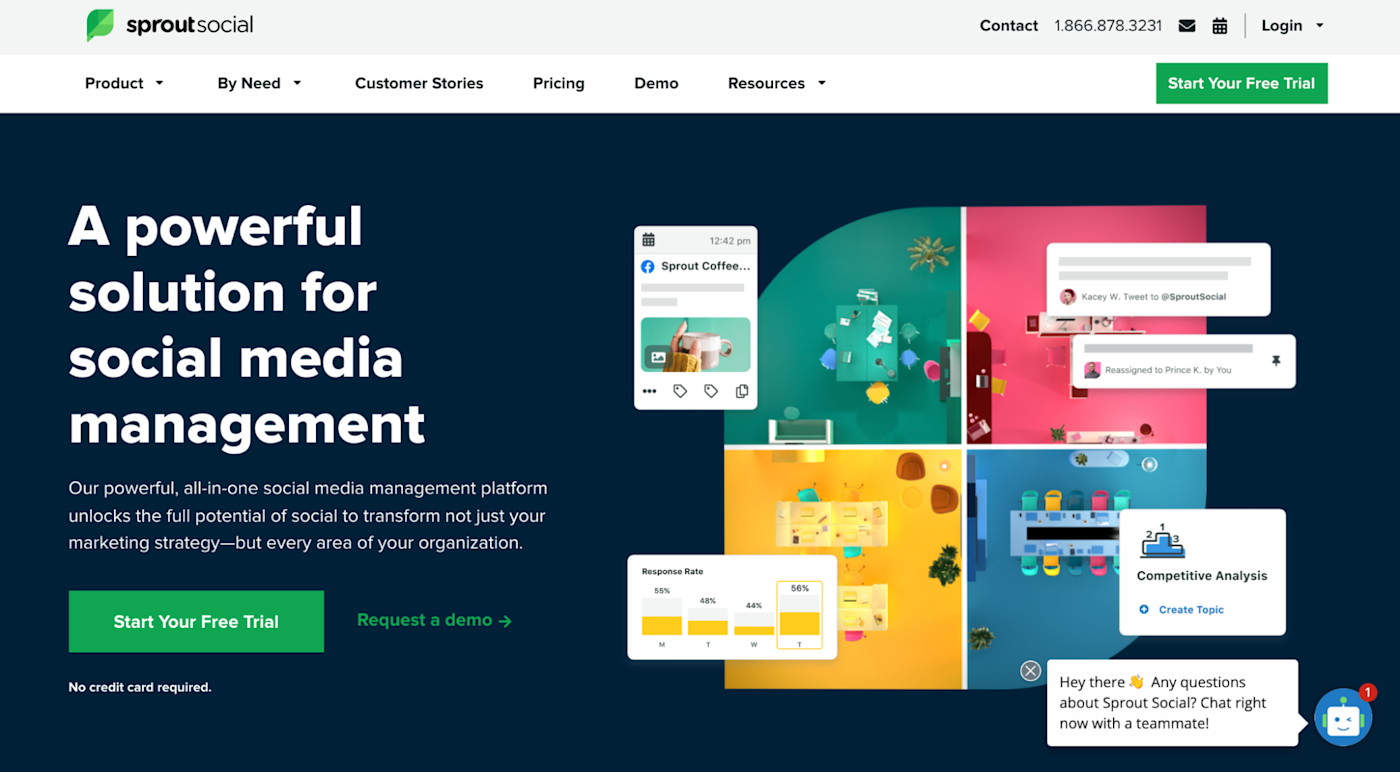
Of course, your calls to action should be unique, specific to your particular audience and targets, not to mention where it’s featured (landing page, home page, social media, ad, etc). That said, the best CTAs still share some characteristics that you can apply wherever they may be.
In my experience—which encompasses the advice of the writers who taught me—a call to action should address these six areas:
-
Incentive
-
Transparency
-
Command
-
Wording
-
Visibility
-
Validation (testing)
1. Incentive
If you’re looking for one secret to effective CTAs, here it is: give them a reason to click, share, or hand over their email address. More important than the wording, placement, or color of your CTA is the underlying incentive a person has to follow it. How will answering your call to action help them?
A good call to action restates its benefit bluntly and succinctly.
-
If you’re offering a discount, remind them what percentage.
-
If they’re getting a free PDF, mention the words “free” and “PDF.”
Here’s where you can borrow from traditional sales techniques, such as adding urgency with a time limit or bringing up the pain point they’re trying to avoid. Just remember the CTA shouldn’t be too wordy, so stick to the highlights and keep it brief.
If you’re using a standard link, typically you write the incentive in your CTA’s anchor text (the clickable text). In the case of social media posts and ads, you should reserve the last line in your message for your call to action, so mention any benefits there.
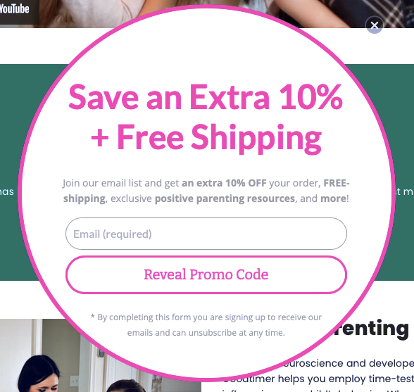
If you’re using a button CTA, you have to limit the number of characters you use, so it’s better to add secondary text. While the button can say something basic like “buy now,” nearby you should include a line or two to remind visitors about the advantages to clicking.
2. Transparency
One of the biggest reasons CTAs fail is because people don’t trust them. Most web users have a healthy suspicion when clicking links online, especially on new or unfamiliar sites. You can mitigate this fear, and increase conversions, by being open and honest.
For starters, say exactly what will happen when you click. Remove all mystery with specifics. For example, saying “start your download automatically” is more descriptive than “click here to download.” (For button CTAs, with limited space, you can include secondary text nearby.)
You want to acknowledge any user doubts and assuage their fears. If visitors are worried about security, they’re not going to click, so reassure them that you understand their concerns. One of the big fears, in the case of email signups, is spam. You might want to gently remind visitors that you won’t share their information and that you’ll only email them once a week, twice a month, or whatever the case is, to keep their imagination in check.
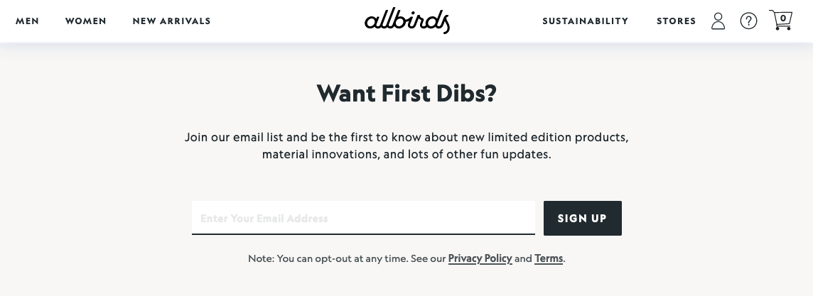
You can build trust just by being upfront about everything from the beginning. You’ll find people are more receptive to your CTA pitches when they know precisely what to expect.
3. Command
Don’t be shy about calls to action! Some people soften their language to avoid being pushy, but CTAs should be strong and unapologetic. After all, if you followed rule #1 (incentive), then what you’re offering is beneficial to the visitor.
That’s not to say you should be rude or demanding (please don’t); there’s a perfect balance somewhere in there between a strong suggestion and a forceful command. Above all, the reader must always feel they have a choice; your call to action is there to convince them of the choice you think they should make.
In practical terms, calls to action should be imperative sentences, which is the grammatical term for commands. A best practice is to start CTAs with an actionable verb:
-
Share this post
-
Join our newsletter
-
Subscribe for more deals
This makes the statement sound stronger, and at the same time, clearly communicates what the user should do.
Likewise, avoid wording that weakens your call to action, including “please” (no matter what Grammarly tells you) and modifiers like “could” and “would.” There’s a time and place for gentle language, but calls to action are not one of them.

4. Wording
Word choice is important to CTAs, not only for making a persuasive argument, but also for fitting the space allotted.
So which words should you choose? The consensus among professional copywriters is that certain words work better than others for sales and persuasive writing. And while there’s no official collection, the words below generally end up on most copywriters’ lists:
-
free
-
you
-
now
-
guarantee
-
because
-
instantly
-
new
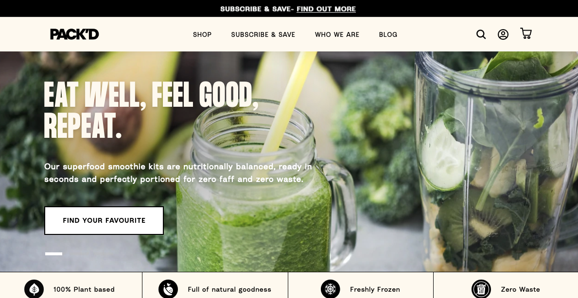
They’re not foolproof, but in my experience, these words tend to improve CTA performance and the effectiveness of most sales copy. And because most of them are short, you should have no problem fitting them into your CTA space.
5. Visibility
Now that we’ve covered the writing, let’s talk about how your CTA should look. The design, layout, and typography of your call to action all play major roles in its success.
If you’re placing your call to action on a web page or other content you design yourself, you want to place it at the top of your visual hierarchy. Your CTA should be the most noticeable element on the page.
To achieve this, you want to pull out all your design tricks. For one, you can use a vibrant color for your CTA, especially against a dull or contrasting background. Making the button and text larger than the surrounding elements also works well, as long as you don’t overdo it.
Another best practice is to surround your call to action with plenty of negative space, a photography term that just means empty space. Setting your CTA apart from the other elements makes it more noticeable and gives it more importance in the eyes of your visitors.
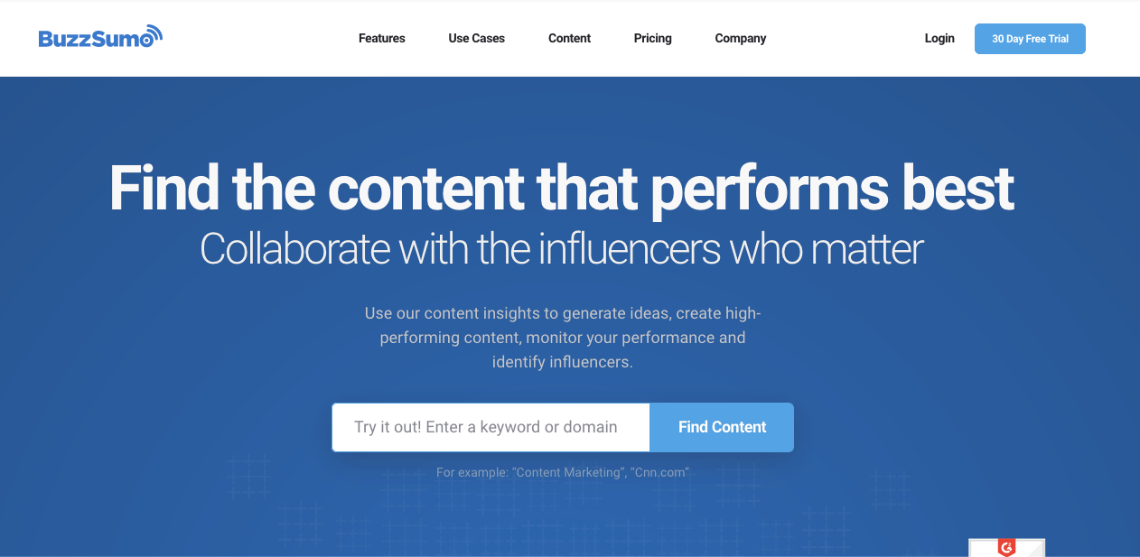
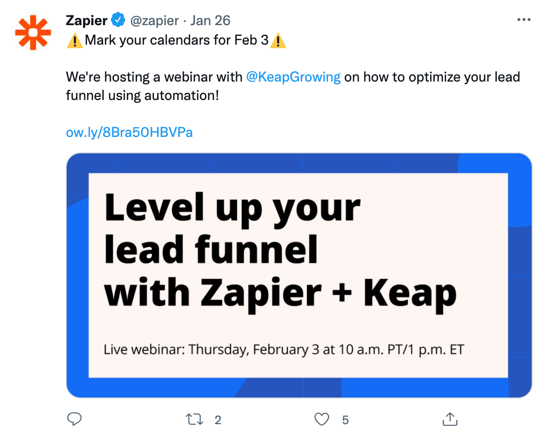
In the text itself, you can play with typography to emphasize key words. Commonly, operative words like “free” are set in a different color or sometimes even a different font to attract more attention (though I wouldn’t recommend this tactic for a button CTA). If all else fails, you can always use CAPS or italics to highlight certain words, especially in social media posts where you don’t have many design options. Some brands find success with emojis, but if you choose that approach, remember a little goes a long way.
6. Validation (testing)
Last but not least, you should evaluate how successful your final call to action is and identify room for improvement. Creating your CTA may feel like a lot of guesswork and shooting in the dark—because it is. Testing it is much more clear cut.
To get a basic idea of your CTA’s performance, take a look at your analytics. Compare the page traffic to the number of conversions and see what percentage of your total visitors clicked.
Don’t be alarmed if your conversion rate percentage feels low. Although there’s no universal figure that applies to everyone in every industry, a reliable general metric is around 4%. If your conversion rate is higher than 4% but you’re still not hitting your goals, try focusing on improving traffic to the site or page rather than tweaking the call to action.
If your conversion rate is significantly lower, it’s worth doing a split-test on your design and copy. Try two different versions of your call to action, experimenting with different phrasing, colors, or fonts, and see which one performs better with your target audience. It’s the most efficient way to reveal what works and what doesn’t with concrete, empirical data.
Improve your CTAs now, free!
CTAs may be short, but that doesn’t mean they’re easy. Those handful of words are often the most important text on a page or post, and each individual word should be painstakingly chosen with care. Don’t be afraid to dedicate the same amount of time you spend writing a full-length article on just the one or two sentences in your call to action.
[adsanity_group align=’alignnone’ num_ads=1 num_columns=1 group_ids=’15192′]
Need Any Technology Assistance? Call Pursho @ 0731-6725516

