If you’ve scheduled anything via email over the last few years, you’ve received or sent a Calendly link. In the face of dozens of back-and-forth emails, Calendly streamlined the scheduling process by creating a simple and professional way to share availability—without exposing your whole calendar to the world.
Focus on the meeting, not the scheduling
Recent debate on the power dynamics of the Calendly link aside, it’s a supremely popular and valuable meeting scheduler app. But one thing it hasn’t nailed just yet is scheduling meetings with more than one person. That’s where Doodle comes in: as a strong Calendly alternative for group scheduling.
I’ve used both Doodle and Calendly before, but in order to do an in-depth analysis, I spent time testing each app, trying out their comparable features and figuring out where each one shines—and doesn’t. Here’s the breakdown:
Doodle vs. Calendly: comparison table
If you’re looking for the quick version, use this comparison table or skip ahead for our summary of who should use each app. Otherwise, you can keep reading below for a more detailed look at both tools and my experience testing each one.
| Feature | Calendly | Doodle |
|---|---|---|
| Business features and customization |      Built for business with a slick, professional design and extensive controls Built for business with a slick, professional design and extensive controls |
  Pivoting toward a business market, but lacks the professional interface of Calendly Pivoting toward a business market, but lacks the professional interface of Calendly |
| Group scheduling |    In development and shows a lot of potential In development and shows a lot of potential |
     Core feature with clear visualizations Core feature with clear visualizations |
| Integrations |      18+ native connections plus Zapier integration 18+ native connections plus Zapier integration |
     A few native connections plus Zapier A few native connections plus Zapier |
| Pricing |     Free tier available for 1:1 scheduling; paid plans start at $8/mo Free tier available for 1:1 scheduling; paid plans start at $8/mo |
    Free tier for group scheduling; paid plans start at $6.95/mo Free tier for group scheduling; paid plans start at $6.95/mo |
Calendly is built for business
Many of the major features across Calendly and Doodle are the same. They make it easy to schedule meetings and appointments with other people by quickly sharing your availability and automatically creating new calendar events. They send out notifications and reminders to keep invitees in the loop and minimize no-shows.
The biggest difference comes down to this: Calendly is built for business.
While Doodle seems to be pivoting toward the business space, the app was initially developed with the education and consumer audience in mind. That’s led to some less tangible differences—like Calendly’s slicker, more professional-looking interface. But it’s not just about design: Calendly also offers a number of features and controls you need for business scheduling that Doodle just doesn’t.
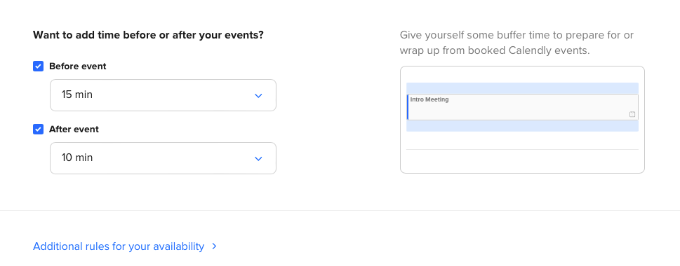
Calendly gives you serious control over who can book meetings with you and when, including the option to set any of the following:
-
Maximum number of bookings per day
-
Time padding before and after meetings
-
Minimum amount of notice before scheduled events
-
Booking links that expire after one use
-
Universal “working hours” that serve as your default availability
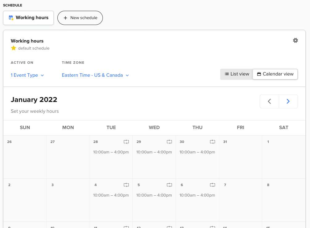
You have more options for sharing your availability, too. You can share the link to your booking page(s), embed the booking flow onto a web page, or even paste specific times into an email. With Doodle, you’re limited to sharing via link or email.
Plus, Calendly offers round robin booking—a powerful feature for business teams (like sales and support) to randomly assign new bookings among a pool of hosts. And once someone books a meeting, Calendly offers full customization over the notifications and reminders you send. Doodle only allows you to control whether or not to send notifications at all.
You can even set up Calendly to accept payments along with bookings. The list of features just continues to grow.
Doodle offers the best group scheduling—but Calendly is catching up
If you’ve ever encountered Doodle before, chances are it’s because of the group scheduling features—that’s the core, OG feature.
With the app’s Group Poll, you can choose a number of specific time slots to offer and send them out to a group of people. Each person in the group then marks each time slot as “yes,” “cannot attend,” or “if need be.” Once everyone in the group has responded, the visual chart makes it easy to see which times work for everyone. If the column is all green checks, you’re good to go.
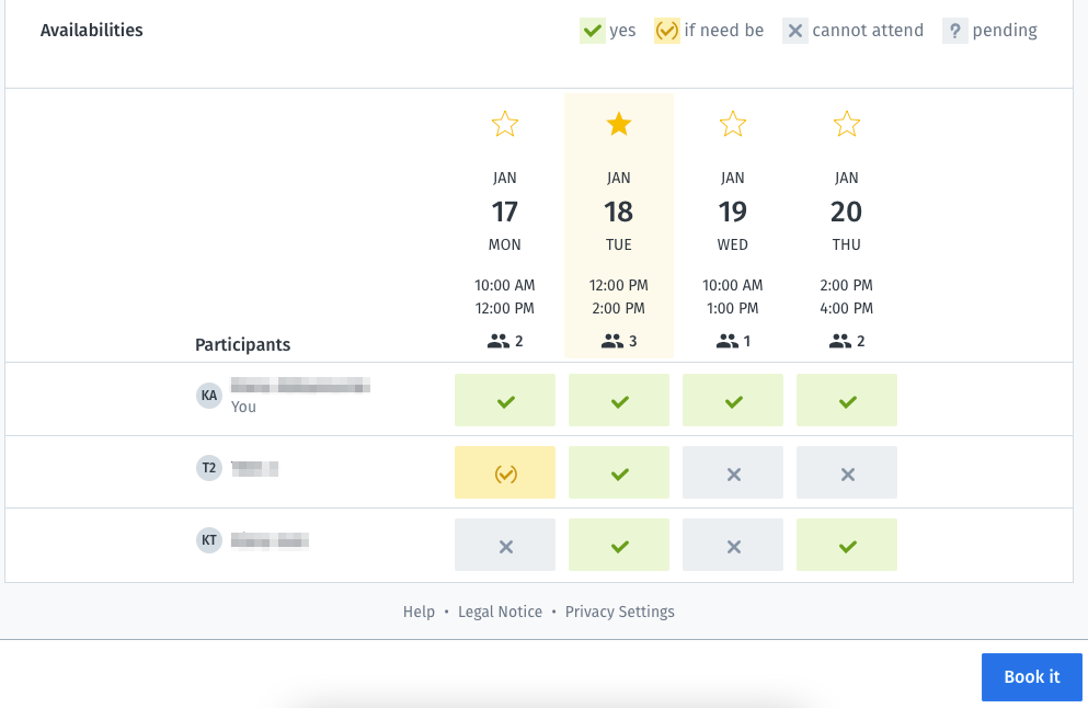
From there, it takes one click on the Book it button to schedule the event and send a confirmation to everyone.
Calendly, on the flip side, was originally designed for 1-to-1 meetings. The team is currently beta testing a new Meeting Poll feature to facilitate group scheduling and compete more directly with Doodle. The workflow to create a poll is even simpler and more intuitive than in Doodle, as is the interface for respondents. But there are two big drawbacks in Calendly’s group scheduling:
-
Respondents can only designate a time slot as yes or no—there’s no maybe option like Doodle’s “if need be.”
-
The results in Calendly aren’t as digestible as they are with Doodle. The app highlights top times, but it doesn’t have the same visual impact as Doodle’s colored chart.
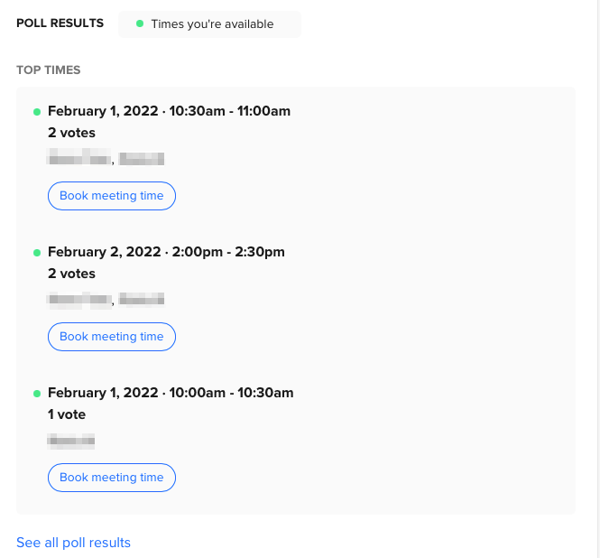
Again, Calendly is still beta testing this new feature, so we’ll have to wait and see how it develops and improves.
Each app’s free plan reflects its core features
At first glance, the free plans that Doodle and Calendly offer are pretty similar. Both limit free users to one booking page or event type and one calendar connection per user. The main difference reflects the core feature differences I’ve already covered:
-
Doodle’s free plan is geared toward the Group Poll feature and doesn’t include 1-to-1 scheduling (a feature not without its own issues with a clunky UI).
-
Calendly’s free plan includes access to most features, but doesn’t include the new group scheduling tool (whether this will change once the feature exits beta remains to be seen).
Other differences are small. For example, Calendly’s free plan technically allows you to create as many event types as you want, but you can only have one active at any given time (so you can toggle between which type is active as needed).
Both apps integrate with Zapier; Calendly has more native integrations
When it comes to syncing your calendar, both Calendly and Doodle connect with the big three: Gmail, Outlook, and iCloud. These integrations are available on both free and paid plans.
Both tools also offer some native integrations. Doodle includes only a handful, while Calendly offers more than a dozen business-focused integrations (with tools like Slack, Salesforce, HubSpot, and payment processors), plus an API.
That said, both Doodle and Calendly integrate with Zapier. The integration isn’t available on either app’s free plan, but paid users can use Zapier to connect with thousands of other apps. Currently, Doodle has 10 triggers set up with Zapier, enabling you to automate actions like posting new Doodle events in Slack, for example, or trigger a workflow in another app when a new Doodle event gets booked.
Calendly has two triggers and all sorts of popular workflows you can use to automatically create Asana tasks from new Calendly events, for example, or create HubSpot CRM contacts from Calendly invitees.
Zapier lets you automatically send information from one app to another, helping you reduce manual tasks. Learn more about how Zapier works.
Doodle vs. Calendly: Which should you use?
If you need a Doodle alternative, Calendly is a good bet—same goes the other way around. But if you haven’t tried either app, here’s the general rule for which to choose:
If you’re just booking time between two people, you really can’t go wrong with sharing a Calendly link—and the generous free plan makes Calendly a budget-friendly choice too. It’s also going to make a way better impression on prospects and clients. But if your main use case is scheduling with a group, Doodle is your best bet—at least for now.
[adsanity_group align=’alignnone’ num_ads=1 num_columns=1 group_ids=’15192′]
Need Any Technology Assistance? Call Pursho @ 0731-6725516

