Is an accessible web application the enemy of a slick, aesthetically pleasing one? It doesn’t have to be, if we’re smart. And we are.
At Zapier, we have a working group dedicated to accessibility. We’ve created accessibility trainings and have consolidated best practices into an accessibility playbook. One question that comes up a lot is about how to balance accessibility and aesthetics. The answer: universal design.
What is universal design?
Ronald Mace contracted polio in 1950, when he was nine years old. Due to the lasting effects of polio, he used a wheelchair for the rest of his life. When he went to college (he studied architecture at North Carolina State University’s School of Design), he found he couldn’t access a lot of the campus facilities. He was carried up and down stairs to his classes and wasn’t able to fit in the bathroom.
He went on to graduate and work as an architect, and after a few years, became heavily involved in the promotion of accessible architecture and related advocacy work. He coined the term “universal design,” based on the idea that good design should work for everyone.

The principles of universal design
Understanding the concept of universal design is the first step, but we also need to be sure we’re executing on it effectively. So below, I’ve copied the principles of universal design (pulled directly from the NC State University College of Design’s guide to universal design), and under each one, I’ve included some tips on how web designers can work on adhering to them.
These tips aren’t exhaustive, but I hope they get you off to a good start and get you thinking about how you might create a more accessible design for your users.
-
Equitable use
-
Flexibility in use
-
Simple and intuitive use
-
Perceptible information
-
Tolerance for error
-
Low physical effort
-
Size and space for approach and use
“Equitable use: the design is useful and marketable to people with diverse abilities.”
“Flexibility in use: the design accommodates a wide range of individual preferences and abilities.”
-
Ensure that users can zoom in on text, invert colors, or turn off animations—and still have a functional application with all meaningful information visible.
“Simple and intuitive use: use of the design is easy to understand, regardless of the user’s experience, knowledge, language skills, or current concentration level.”
-
Use established, familiar user interface (UI) patterns and wording, both from within your own systems and from around the web.
“Perceptible information: the design communicates necessary information effectively to the user, regardless of ambient conditions or the user’s sensory abilities.”
-
Organize data well.
-
Provide a mix of visual (with alt text, of course!) and text representations for data, to help convey information to people in a digestible way.
“Tolerance for error: the design minimizes hazards and the adverse consequences of accidental or unintended actions.”
-
Include clear instructions for users.
-
Offer helpful and perceivable error messaging.
-
Always confirm before irreversible actions are taken.
“Low physical effort: the design can be used efficiently and comfortably, and with a minimum of fatigue.”
-
Eliminate overly long forms.
-
Be sure users don’t have to go back and forth between interfaces to complete common tasks.
-
Make sure users can get to what they’re looking for without having to manually sort through a lot of data.
“Size and space for approach and use: the design provides appropriate size and space for approach, reach, manipulation, and use, regardless of the user’s body size, posture, or mobility.”
-
Make sure the target size for clickable items adheres to the WCAG standard of 44x44px.
-
Provide an alternative to drag-and-drop or swiping interactions.
-
Comfortably group and space content to not overwhelm users.
Accessible doesn’t have to mean strictly utilitarian
Of course, accessibility isn’t just for web apps. There are lots of examples of aesthetically-pleasing products that work for everyone. These are just a few, but I’m sure you can think of others.
-
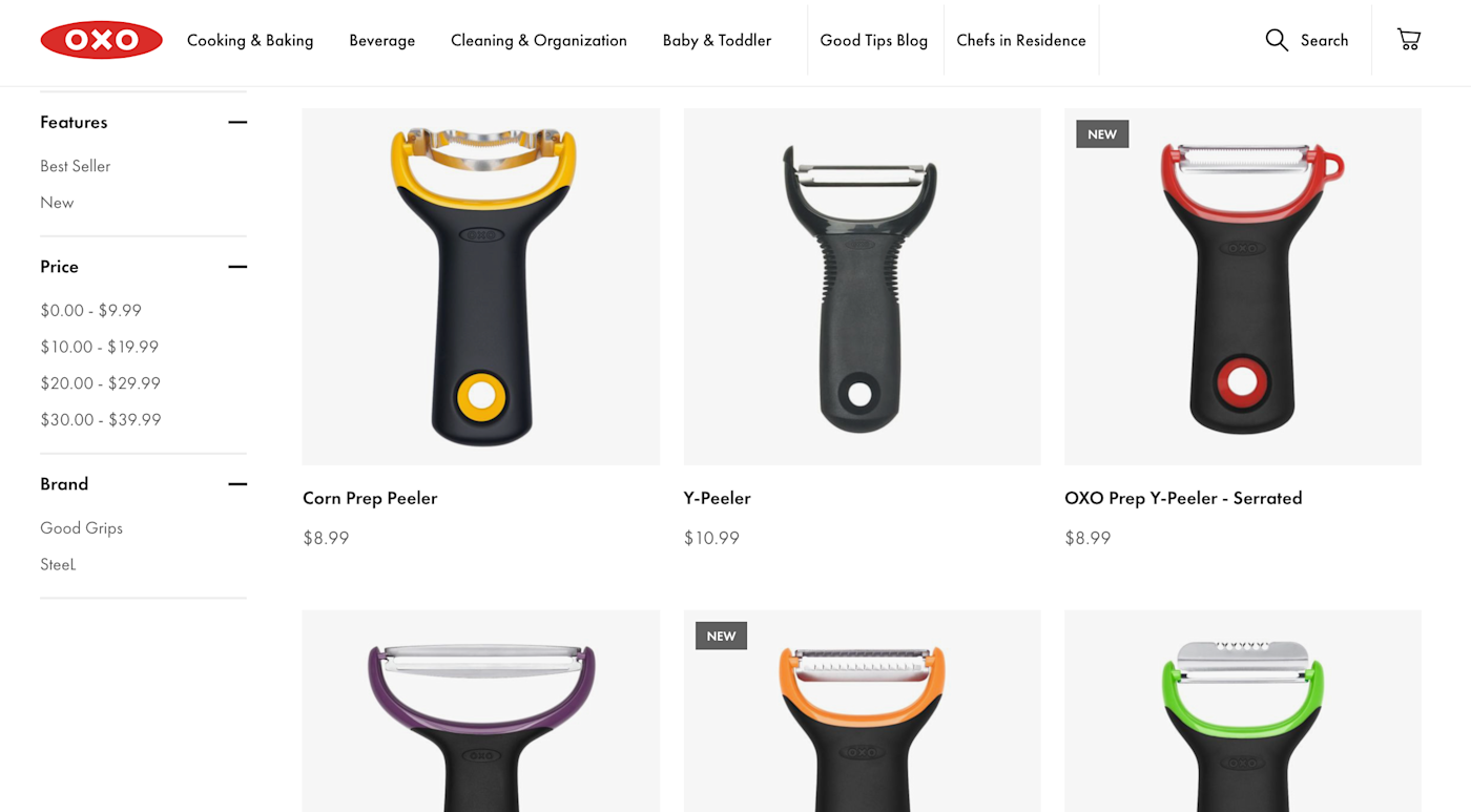
OXO was conceived of as a housewares company by Sam Farber, inspired by his wife who suffered from arthritis. He wanted to make tools that could be easily used by anyone. If you’ve ever used an OXO tool, you know they’re designed to be both ergonomic and stylish.

-
Automatic doors are wonderful for people who use mobility aids like walkers or wheelchairs, but they’re also great for parents with strollers, or shoppers with carts full of groceries. If you’ve ever walked into a modern office building, you know they can be pretty sleek.

-
Harper’s Playground helps fund and design playgrounds that are “accessible, natural, and radically inclusive” by including innovative, modern play structures and landscaping. For instance, wide swings that allow people with different abilities or preferences to sit or lie down, or for two people to use it at the same time, side-by-side. Accessible playgrounds are becoming more and more common, and they’re often way more aesthetically pleasing than their older, less accessible counterparts.
If we want something to be beautiful and accessible, we have to plan for both
We need to build tools that work for as many people as possible, but that doesn’t mean we’re barred from using UI enhancements like animations, videos, or audio content—it just means we have to do it in a smart way. This means things like accessible controls for media, captions for videos, transcripts for podcasts, and respecting users’ motion preferences via media queries.
It also means that these considerations should be surfaced way before the implementation, in the early conceptual design stages. This gives us the time to use this opportunity as a way to enhance the user experience with accessible features, instead of struggling to make our aesthetically-pleasing application accessible after it’s been designed and built.
Further reading:
[adsanity_group align=’alignnone’ num_ads=1 num_columns=1 group_ids=’15192′]
Need Any Technology Assistance? Call Pursho @ 0731-6725516


