If you run PPC ads, you know the strategies and best practices, and you’ve seen loads of examples from businesses who’ve done it successfully. But what about hearing from the people clicking on the ads?
I’m a PPC copywriter and content marketer, and I’ve spent almost seven years working with brands to create Google, Facebook, and other paid social ads that convert. But here, I’m going to share five real ads that I actually converted on—as a customer—when they showed up in my feeds, and talk about what drove me to purchase.
1. Google search ad with a discount offer included
I’m extremely particular about food. This made the beginning of the pandemic difficult because any meat was difficult to find, let alone wild-caught or organic options. I searched for “wild caught seafood” online because it wasn’t available anywhere near me in early 2020. This was the ad that popped up.

Here’s what got me to click:
-
I know that ordering meat or seafood online often comes with exorbitant shipping costs (sometimes upwards of $50), so seeing free shipping on the first order was immediately appealing. Discounts are powerful.
-
At the time, I trusted people who were spending money to get eyes on their products because it meant they had them in stock; this was a good bet. Many organic results were out of the items I was looking for because of the market’s scarcity. If you have something other people don’t, this is good to keep in mind.
When I clicked on the Fish & Seafood sitelink extension, I was taken to a landing page similar to this (it’s changed a bit since then).
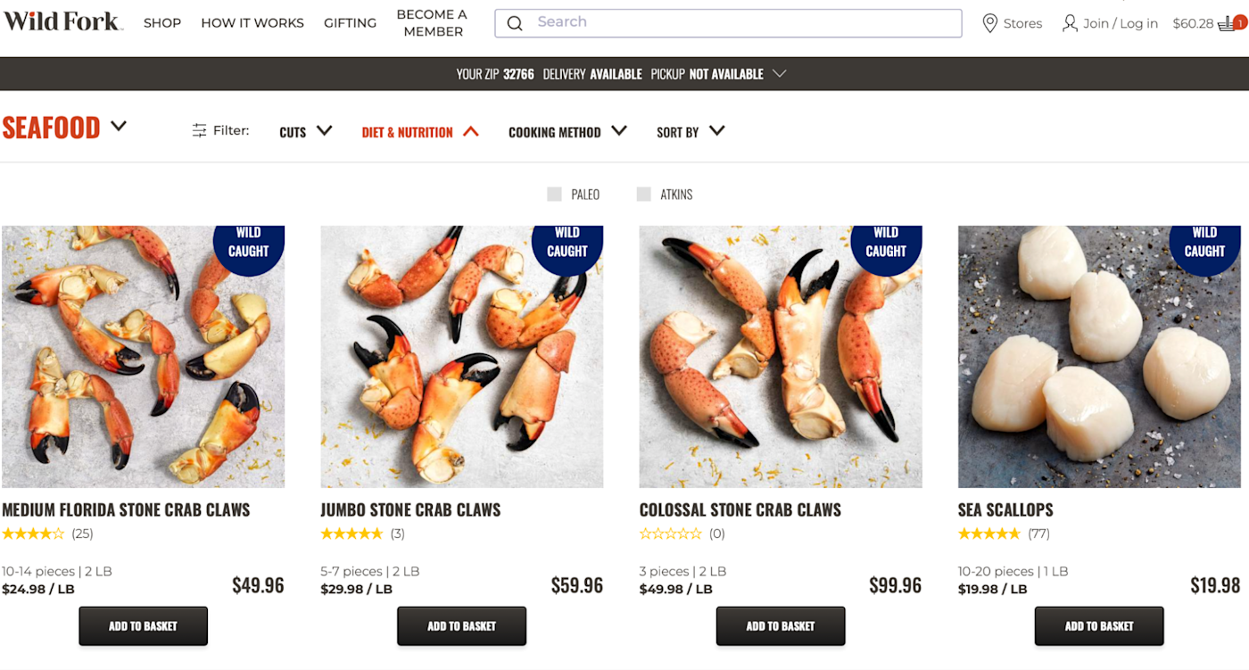
There was a large selection of wild-caught seafood front and center—exactly what I’d clicked for—and the rest of the site was easy to browse, so they were able to upsell me. I placed an order within thirty minutes of clicking the ad.
2. Google result that dominated search and shopping ads
Last year, I was looking to upgrade the small Christmas tree I’d purchased when I first bought my home. When I searched “artificial Christmas tree,” Balsam Hill dominated every ad section—including the shopping ads. It was like a megaphone of “we’re the authority on this subject, thank you very much.”
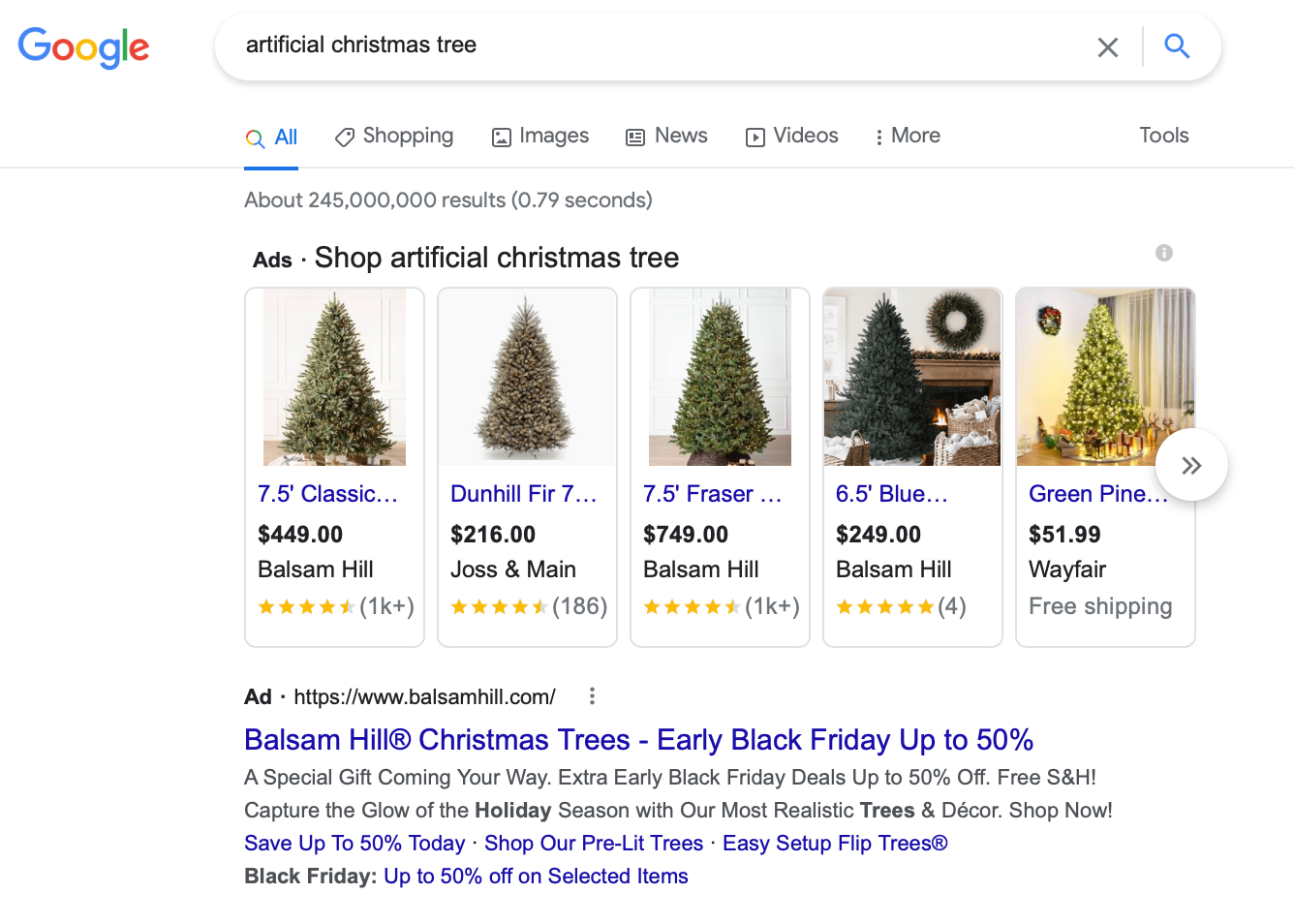
While it might feel a little in-your-face, that kind of ad domination made me confident that this was the place to go for this product. Here’s what pushed me over the edge.
-
I saw several different highly-rated trees in the Shopping ads section—that quantity made me feel like I’d be able to find at least one I liked.
-
The search ad below the shopping ads was the icing on the cake: one more reminder that Balsam Hill was the place to go. (Not to mention the discount offers and free shipping).
When I clicked on the search ad, I saw a landing page like this.
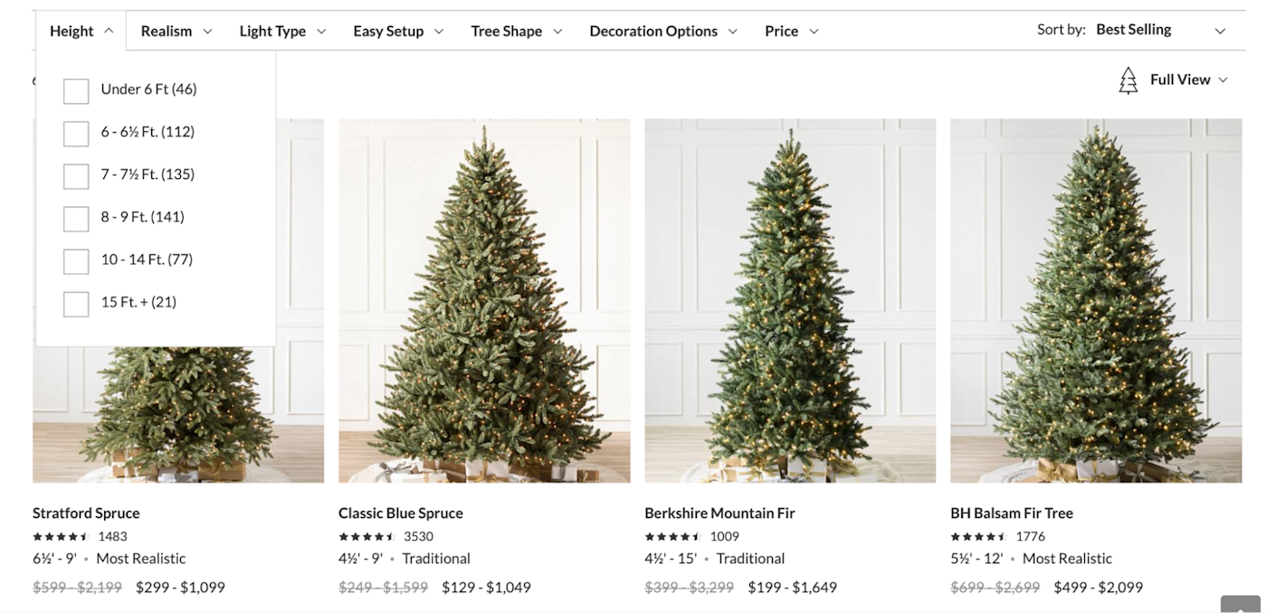
Once again, landing right on the product browsing page made my purchasing journey easy—instead of going from ad to landing page to targeted page, it was just one click. The filters were an added bonus: I didn’t have to poke around for what I wanted; I found it almost instantly.
After thinking through my preferences with my husband, I purchased two or three days after first seeing the ad, with a 20% off deal.
3. Facebook ad with a video
This year, my husband and I have been going down the sustainability rabbit hole. I’ve unsurprisingly seen an enormous number of ads promoting sustainable products—but only a few actually got my attention.
This one from Grove showed up not long after I’d clicked on a direct competitor’s ad and hadn’t converted due to mixed reviews.
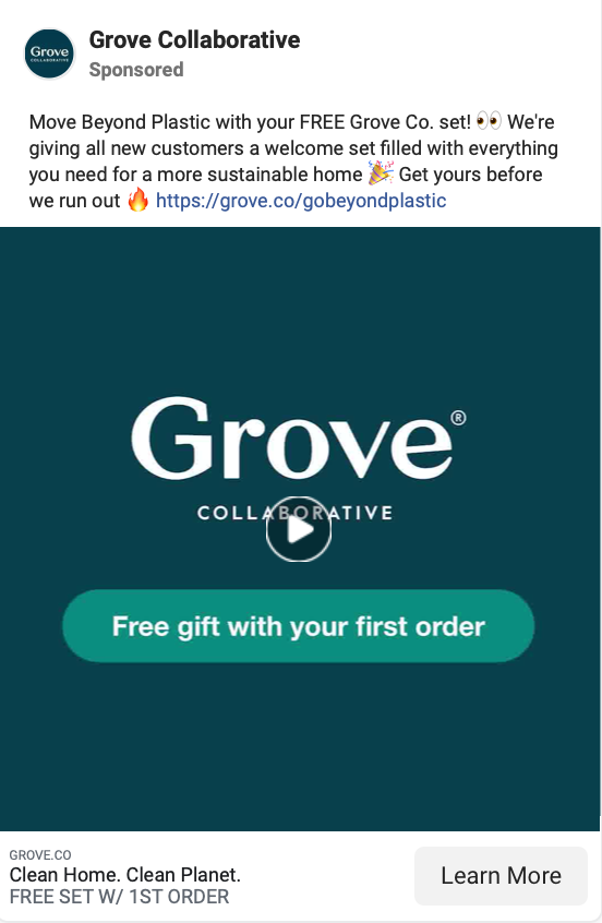
Here’s what caught my eye about this ad and encouraged me to click.
-
I’d been actively researching plastic-free and waste-free cleaning items online at the time, and this one started with “Move Beyond Plastic.” Great targeting.
-
There was an offer included for a free gift with my first order, which meant I’d get more bang for my buck.
-
The video showed the products in use (and they looked great). I knew I wasn’t going to be wasting time clicking an ad for a low-quality product.
Once I clicked, I added a few green items to the cart—the landing page automatically suggested items like compostable wipes and a washable duster—and purchased within 15 minutes of seeing and clicking on the first ad.
The combination of right-place-right-time, targeted messaging, and a too-good-to-refuse offer made this the fastest I’ve ever converted on an ad.
4. Facebook ad with persistent retargeting
Every ad I’ve mentioned so far has been an outstanding example of capturing user demand and intent with a well-timed ad: I was looking for a solution, and I found one.
When I saw the ad below from Thursday Boot Company, I wasn’t really in the market for new boots. They did pop up at a convenient time: I saw the ad over and over again for a month before I was taking a trip to Acadia National Park, and the boots were advertised with outdoor pictures. But I already had a pair of tried-and-true hiking boots that had gotten me through Alaska.
And yet I still ended up eventually purchasing.
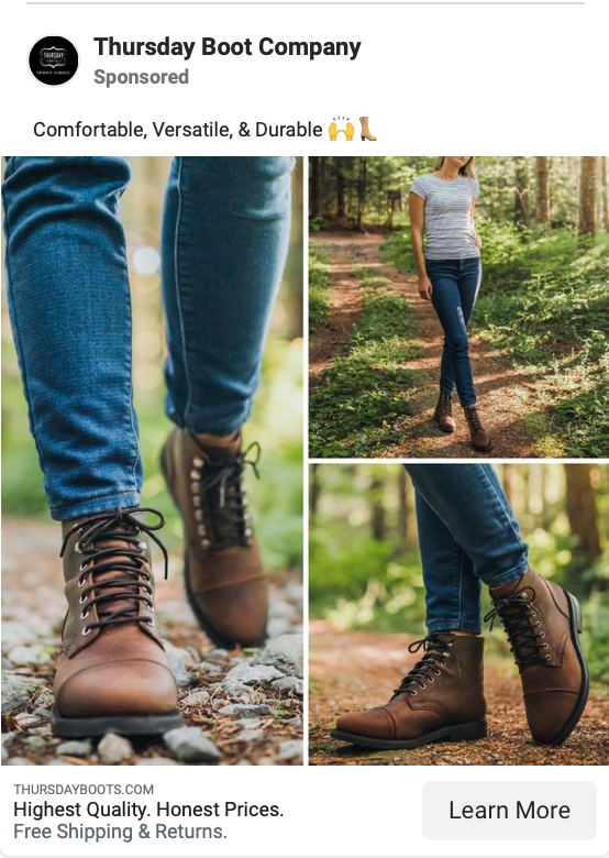
The high-quality, close-up pictures were the first thing that caught my eye. The copy, though, sealed the deal: it’s consistently simple across multiple ads, talking about comfort, versatility, durability, quality, and fair prices. There were also comments on multiple ads from people saying they loved their boots.
I scrolled past the ad the first time I saw it, resisting temptation. The second time, I clicked but thought I couldn’t justify $200 when I already had a pair I liked. Over time, as I was retargeted, I saw the brand responding actively to customers on the ads—I liked that a lot. It felt human.
So here’s what made me purchase:
-
The images were exceptional (and happened to align with my upcoming vacation where we’d be outdoors for eight days).
-
They continually retargeted me after I viewed a specific product on their page, showing me the exact version of the boots I was most drawn to.
-
They responded quickly to users who commented on their ads, which built my trust.
-
I figured since there were free returns, what was the harm? (Spoiler alert: they did not get returned.)
The sixth time I saw the ad—about three weeks after the first time I saw it, and two weeks before I went to Maine—I converted. This is probably a fairly average customer journey for someone who discovered a new brand they weren’t actively seeking out.
5. Facebook ad with strong visuals and targeting
This is another “demand creation” ad that I converted on several years ago from Stasher.
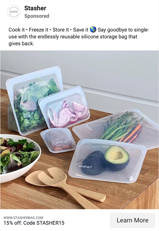
I’d never heard of the brand before, but it was a well-targeted ad that touched on every pain point I have as a consumer: versatile, sustainable, and easy to store and keep organized. I saw a few variations of these ads: some had the Stashers all lined up in an organized pantry; others showed an organized fridge. The ad above is the one I finally converted on.
Here’s what did it for me:
-
It was hyper-targeted at me (I know some people might find that icky; I love it).
-
It had tons of visuals, showing all the different ways the Stasher could be used.
I saw three or four ads before I finally converted about a month later. And I didn’t just purchase once. I’ve purchased over $250 worth of Stasher bags and got three of my friends to use them, too. They probably paid less than $10 to acquire me as a customer with exceptional payoff. This is a perfect example of why brands should keep marketing to the same users over time.
Common themes from excellent ads
Every consumer is different, so what worked for me might not work for someone else. That’s why it’s so important to split-test copy, images, videos, and entire strategies. That being said, there are a few themes that stood out to me.
-
Targeted. Most of the ads that I converted on were super-targeted. Sometimes to me specifically (or a very small segment); other times to a broader audience that I fit well into. But in every case, they highlighted my pain points.
-
Authoritative and trustworthy. Whether by dominating the ads section, showcasing great reviews, or being responsive to their customers, most of these brands showed me I could trust them.
-
Not giving up. Retargeting works. The end.
-
Visuals and videos. If you’re able to include visuals and videos in your ad, high quality matters.
-
Relevant landing pages. If you get someone to click, you need to be sure your landing page converts. Those clicks aren’t cheap.
-
Discounts and other offers. Whether it’s a percent off, free shipping, or anything else, it can be really helpful to give customers an extra incentive to click.
Keep these principles in mind—and start testing.
[adsanity_group align=’alignnone’ num_ads=1 num_columns=1 group_ids=’15192′]
Need Any Technology Assistance? Call Pursho @ 0731-6725516

