In mid-October of 2021, people all over Twitter went in on the “red flag” meme. You might remember lots of tweets with messages like “likes pineapple on pizza” followed by countless red flag emoji.
Seems harmless enough.
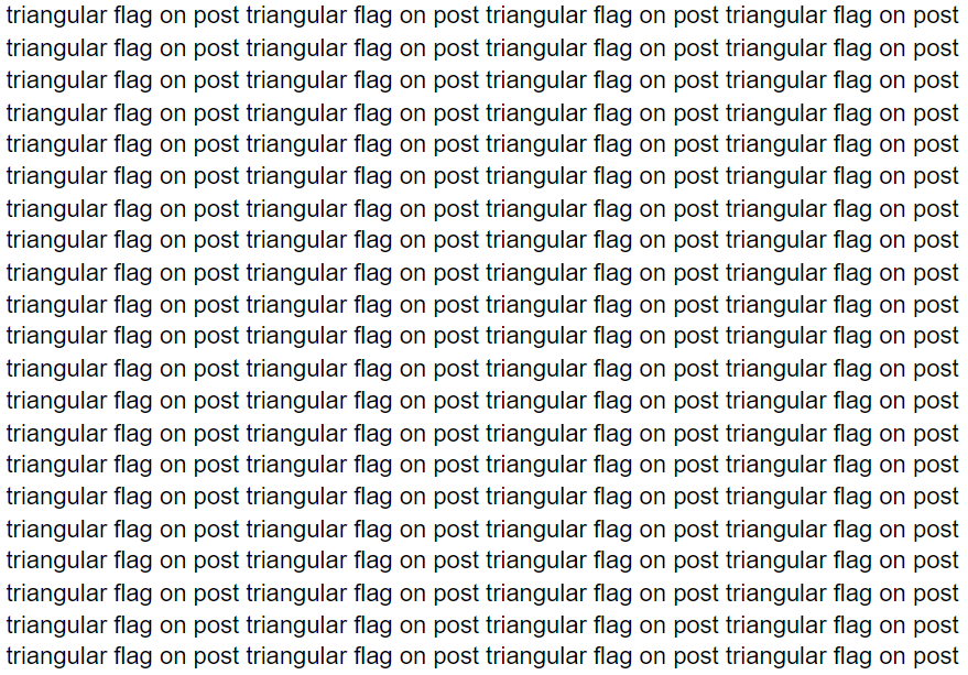
But, as advocate Sara Fisch points out, if you use a screen reader, instead of seeing “likes pineapple on pizza” and a bunch of emoji, you would hear “likes pineapple on pizza” and:
And it’s not just the red flags. Many popular Twitter meme formats can fall flat for screen reader users. If you want to make your web content accessible, you’ll need to tweak your memes. Here are a few tips.
Single image without text
Yes, the most popular meme format: a single image without any text in the tweet itself. Since most memes have text on them, many folks don’t bother to add text to the tweet. But if you post them as is, people with screen readers won’t have anything to hear from you.
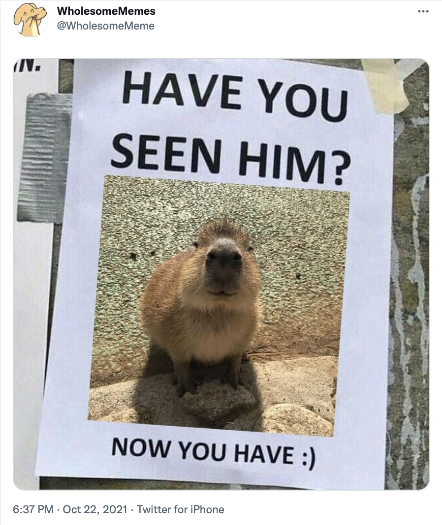
Here’s a meme from Wholesome Memes that doesn’t get its point across on screen readers:
What does this tweet sound like on a screen reader? Nothing. Literally… nothing. The image doesn’t have alt text, so screen readers have no information to share.
It’s fine to post an image on Twitter without text in the tweet, but when it doesn’t have alt text, screen reader users miss out on your content. You can help everyone enjoy your cute capybara memes by adding descriptive alt text to every image you post. And Twitter makes it easy to add alt text to images—you just have to know where to look.
How to add alt text on Twitter
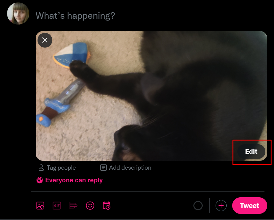
After you add the image to your tweet, click the Edit button on your image:
Then, click the ALT tab in the window that pops up. Write your alt text in the text box at the bottom of the window that reads Description.
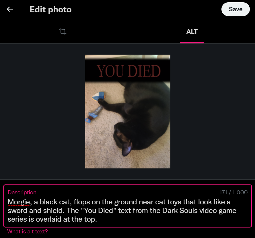
Click Save, and you’re good to go!
When you write alt text, make it as descriptive as possible. You don’t have to write a novel, but try to capture the most important details. ACES: The Society for Editing has plenty of good tips for writing effective alt text.
GIPHY and Tenor GIFs
Twitter has a nifty GIF search feature that lets you add a GIPHY or Tenor GIF to your tweets. Folks tend to use these GIFs to reply to other people or express their always insightful thoughts on a topic.
GIFs automatically populate Twitter’s alt text with their original platform’s description. In theory, that’s helpful, but there are a couple issues.
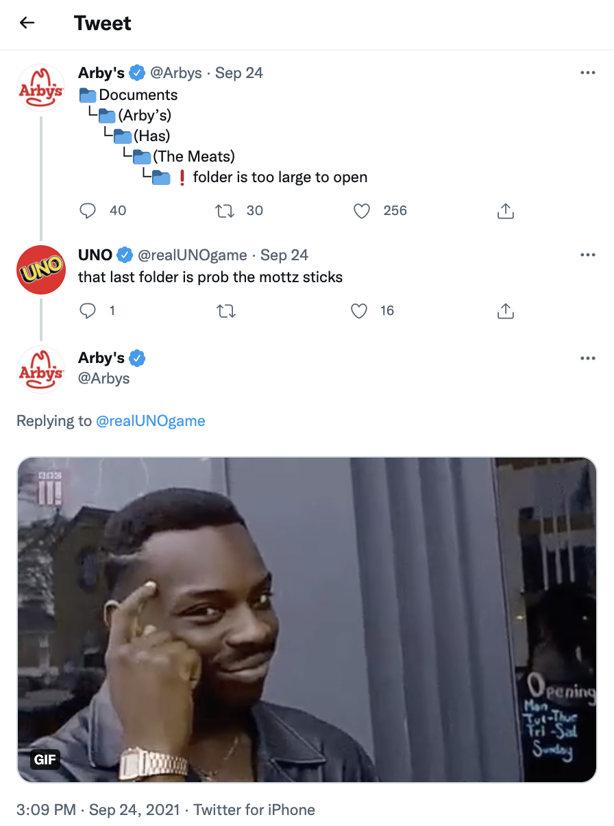
1. The original alt text isn’t always very descriptive. For example, Arby’s posted this GIF in response to UNO:
According to a Chrome extension that reads alt text, the picture reads as “Smart Thinking GIF.”
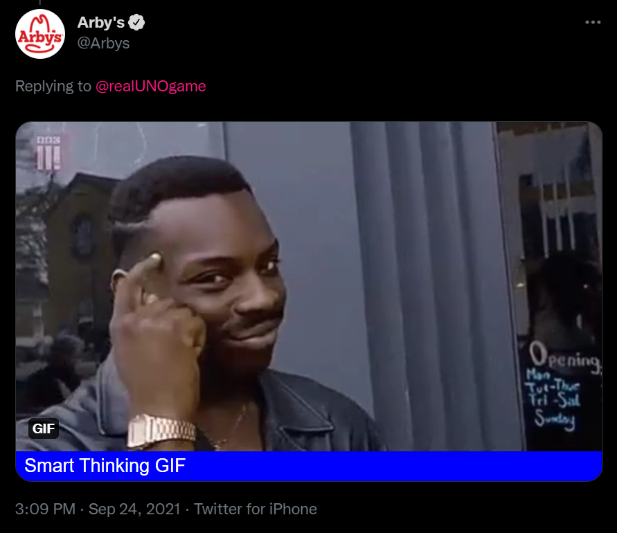
Ok, it gets the point across, but a person who uses a screen reader doesn’t really have the same experience. For all they know, the picture could be a tap dancing brain with the phrase “Smart Thinking!” in Comic Sans. (I sincerely hope that exists.)
Better alt text would be something like “A man taps a finger to his head to show that he has a good idea.” Or, if you’re a meme pedantic like me, you’d make sure to add a reference to the Roll Safe meme.
4 workflows to better market your brand on social media
2. In the worst-case scenario, a GIF search GIF can have flat-out harmful text. Twitter user T.C. Aurelius pointed out that some of them prepopulate with discriminatory and dangerous conspiracy theories.
You can avoid both of these situations by adding your own alt text to your GIF search GIFs. The GIF alt text feature appears in a different place from the regular image alt text option. You’ll find an Add description link directly under your GIF after you add it to your tweet.
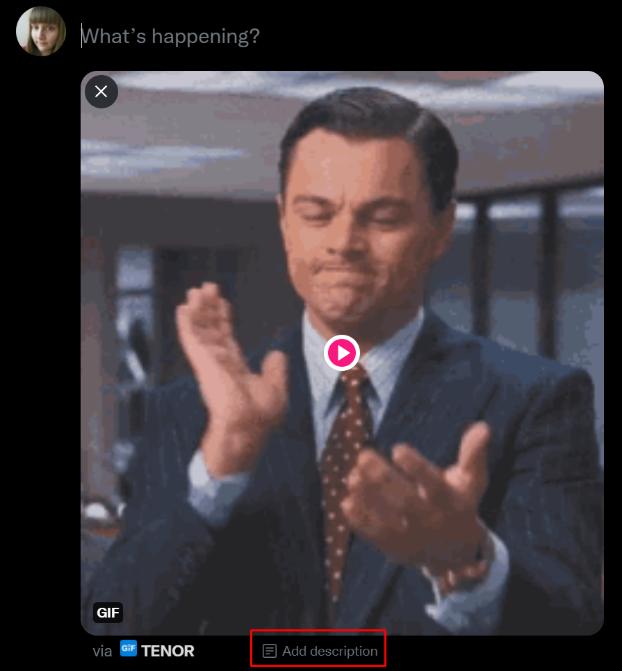
When you click that link, you’ll get a prompt to write your alt text.

Red flags (and other emoji spam)
Back to the meme that inspired this blog post: the red flag meme. If you missed it, check out this example from Chipotle:
On screen readers that read emoji, this tweet sounds like “No guac for me,” then “triangular flag on post” repeated fifteen times. Not super pleasant.
Oh, and the emoji name doesn’t even have the flag color in it, so it also eliminates the entire point of the meme for people with screen readers. It’ll become tempting to pass on the guac and the flags if a company’s tweet sounds that obnoxious.
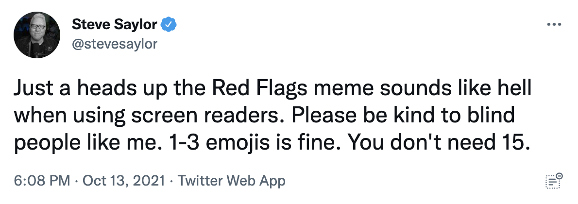
Accessibility advocate Steve Saylor, who uses a screen reader himself, has a simple solution for this meme: stick to one to three emoji.
You’ll find more ideas for alternatives in the replies to Saylor’s tweet. One reply suggested creating an image of multiple red flags. Another uses a GIF of someone waving a red flag. Both images have alt text, of course.
The red flag emoji meme seems to have calmed down. But more emoji memes will likely pop up in the future, so keep these tips in mind.
The handshake (and other aligned text memes)
Twitter’s handshake meme first appeared a few years ago, but you’ll still see it make the rounds now and then. The meme lists two concepts with a handshake emoji between them and something they have in common. Think of it as two ideas shaking hands over their common ground.
In many cases, this meme works fine on screen readers. But some of them have longer descriptions that don’t fit on one line, and in those cases, the tweet author will space out their lines so each concept appears on the left and right, like in this tweet:
It’s supposed to read:
“Post-World War I writers & artists (handshake) me in fourth grade
thinking all of your problems would go away if you lived in paris”
On a screen reader, though, it reads as:
“Post-World War I me in fourth writers & artists grade (handshake) thinking all your problems would go away if you lived in paris”
Now it sounds like a 100-year-old Twitter user talking about art school at best—and word soup at worst.
Screen readers read left to right, so they relay the words in the order they were actually written. The meme might look fine to people who don’t use screen readers, but it sounds like nonsense to those who do.
Due to Twitter’s formatting, it can be tricky to find a middle ground for this meme. If you want to make it screen reader-friendly, try a format like:
“Concept 1 (handshake) Concept 2
Commonality”
Or:
“Concept 1 (handshake)
Concept 2
Commonality”
You might need to play around with your line breaks to find a clean layout. Whatever you decide, make sure it reads correctly from right to left. Or, if the formatting bothers you, dare I suggest you skip this meme format entirely?
Similar rules count for other memes that try to align text left and right, like those that compare two images side-by-side. Always think about how your formatting will sound when you run it through a screen reader.
Special Unicode text
Have you ever seen someone use bold, italic, or script text on Twitter? That’s not Twitter formatting—it’s Unicode characters not used in typical text. In other words, they count as entirely different letters from the ones you type with your keyboard.
Since your computer thinks of these letters as special characters, they don’t read as text on screen readers. In fact, they don’t show up at all.
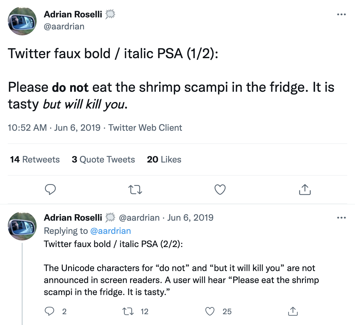
Accessibility advocate Adrian Roselli demonstrates this issue in a tweet:
People who don’t use screen readers read “Please do not eat the shrimp scampi in the fridge. It is tasty but will kill you.” But “do not” and “but will kill you” are written in special Unicode characters. That means that screen reader users hear “Please eat the shrimp scampi in the fridge. It is tasty.”
You probably won’t have to tweet anything that could food-poison someone, but it’s still important to avoid special Unicode characters so screen readers can read your content. Keep them out of your Twitter handle, too.
If you truly feel that fancy text will give your tweet some oomph, try screenshotting it and adding alt text. Everyone wins.
A few final tips
Your followers who use screen readers will appreciate you!
[adsanity_group align=’alignnone’ num_ads=1 num_columns=1 group_ids=’15192′]
Need Any Technology Assistance? Call Pursho @ 0731-6725516

