Introduction
One of the many breakthroughs of the last decade has been the migration of nonprofits to the internet. Today, nonprofits big and small have fully embraced the importance of being online and some now solely operate through the medium of the internet. As the technology around nonprofits continues to grow, they are finding new ways to attract donor attention and improve their online experience.
Out of all the features that can be used by nonprofits, nothing is quite as effective as the donate button. It is a simple thing that anyone can create, yet its placement and utility are far better than some of the most sophisticated tools online. In this guide, we shall take a look at how this button is created and why your nonprofit must use it.

Optimizing the use of your donate button
While these buttons that have the word ‘donate’ or ‘fundraise’ written on them are nothing new, they are nonetheless important. Listed below are some ways you can optimize the usage of the donate button.
Use a fundraiser button
While the donate now button takes center stage, you should incorporate a secondary button that can increase clicks. Have a ‘start fundraiser’ button that enables supporters to start a fundraiser on your behalf. You might think this is a redundant practice, we assure you it is not. There are almost always many supporters of a cause who cannot contribute towards it. The fundraiser button helps them show support by starting a campaign on your behalf. By displaying this button, you are including a whole new array of supporters who can raise funds through their network.
The button should follow your theme
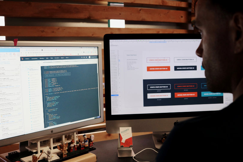
What is worse than a button that does not fit the theme of your website? Quite literally nothing. A button that does not incorporate your theme will stick out like a sore thumb. The placement of your button speaks volumes about the authority of your website. If you have a donate button that does not look like it belongs on your website, alarm bells will be raised.
Take special care when designing the donate button. It should have the same font, theme, and color as your website. This sort of consistency will help supporters approach you.

It should be on every page
That may sound almost overbearing, however, we have our reasons. Often nonprofits fail to maximize the utility of the donate now button simply because they only place it on the home page. This is because visitors tend to migrate to various pages to learn more about your nonprofit. Places such as the “about us” page are great areas to display the donate now button.
While we do not mean you should cram the button on every page, you should look at your website from an objective viewpoint. Find places where visitors are most likely to navigate and place your button accordingly.
The button placement is crucial
In the previous section, we have stressed placing the button on as many pages as you can. While the button must be on important pages, the placement of the button on the page itself is also crucial. It should be easy to spot and on-brand.
The reason we stress its page placement is that there are a shocking number of websites that do bury the button and they do this unknowingly! If a supporter is unable to find the button quickly they will simply move onto a better website. You should actively look through the website as if you are a first-time visitor and ensure that the buttons are visible.
Use compelling language on the button
Language conveys emotion and motive. Your button must use language that can move your supporters to click it. Terms such as “donate now”, “contribute today”, “educate a child” and “feed a family” are some examples. These terms use language that is compelling to visitors.
Using this best practice turns the motion from transactional to emotive. Visitors now feel that they are actively making a difference.
When you use compelling language, your supporters are reminded of the long-term implications of their contributions. You can use further texts in the button’s surrounding area to explain where the money is going and how it will help.

Double your clicks
We hope that the aforementioned points have clarified the purpose of the button and that you have understood the utility it can have for your nonprofit. By using donate buttons you are effectively creating value for your supporters and more importantly for your nonprofit. The application of the button will yield results almost instantaneously, all you need to do is place them throughout your website.


