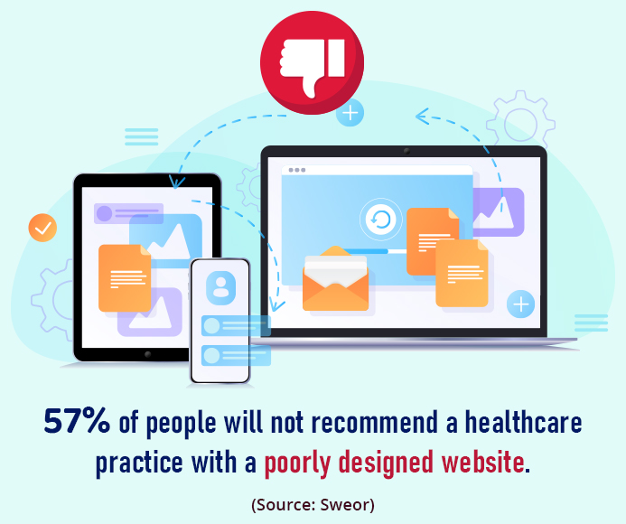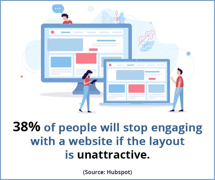
When it comes to healthcare website design, there are so many different styles and directions to consider: classy to minimalistic, vibrant, or sleek and modern.
While your final look-and-feel should exude your style, specialty, and brand identity, there are a few best practices, which, if followed, will help you build a website of your dreams.
Excellent web design feeds into your user experience and functionality while being easy to understand at first glance. Below we’ve gathered three simple healthcare website design tips to help make your site effective and compelling:

Web design tips for an outstanding healthcare website
Here are the top five healthcare website design tips you need to know about. Whether you are hiring a website design agency or DIY-ing, these tips will help you build a powerful website that will drive traffic and convert leads.
Related Read: How to Build a Lead-generating Website?
1. Keep your homepage free of clutter
Your healthcare website’s homepage should communicate your essential message instantly. After all, not many patients will read every word on your website. Instead, most patients will quickly scan the page and pick out keywords and images. With these known visitor behaviors in mind, it’s better to appeal to emotions rather than the length of paragraphs.

The less content your website visitors have to read, click on, or remember, the better they will process the information. Make sure your website is designed for decreasing attention spans so that visitors can do what you intend them to do.
When learning how to design a healthcare website, these simple healthcare website design tips will help you arrange your content aesthetically and make for an appealing homepage:


- Keep critical content above the fold. Your website visitors should understand what your healthcare website is all about without having to click or scroll.
- Never make your web page look cluttered. Make sure to include whitespace in between the two paragraphs. By leaving areas blank between content and graphics, you will give your web page a more spacious and well-balanced feel.
- Add high-quality graphics, photographs, video clips, and vector art to communicate your point.
- Include a powerful, well-placed call-to-action (CTA). From scheduling an appointment to sharing reviews, encourage your website visitors to perform the action you planned by placing a CTA on your homepage.
Related Read: 5 Must-Have Calls-to-Action on Your Medical Website
2. Keep visual hierarchy in mind
Hierarchy is a critical design principle that helps display your content clearly and effectively. The correct usage of hierarchy will allow you to lead your website visitors’ attention to specific page elements that are more significant than the others.
Some of the critical components of visual hierarchy are:

- Highlight your critical assets, such as your healthcare practice name and logo, by making them visually prominent. The majority of website visitors gravitate towards large and bold titles and then move on to smaller paragraphs.
- Use the proper healthcare website layout to steer your visitors’ eyes in the right direction. For instance, you can place an essential CTA at the center of the screen or position your brand name or logo at the header.
- The best part about establishing a hierarchy is that once it’s successfully done, your website visitors will follow the breadcrumbs. This is when you can include color, graphics, and contrast to accentuate your brand message further.
- Some of the more powerful healthcare website design elements to help you achieve a strong visual hierarchy are grid or strips layouts.

Related Read: 5 Medical Website Design Tips that Increase Patient Experience
3. Make sure the content is easy to read
The “readability” score of your content measures how easy it is for visitors to understand words and sentences. When your healthcare website’s readability is high, visitors will be able to scan through the content effortlessly.
Achieving healthcare website readability is relatively easy – keep these tips in mind:
- Ensure sufficient contrast between your text color and the background color. This will help improve readability as well as accessibility. While your healthcare website color scheme is likely to represent your brand colors, make sure there’s sufficient contrast between the different elements.
- Some people might struggle to see smaller fonts. A rule of thumb for healthcare website design is to keep body text at least 16pt. While this is an excellent place to start, this number depends on the fonts you choose.
- There are hundreds and thousands of fonts to choose from. Sans serif fonts are usually a good choice for lengthy texts. You can also consider creating exciting font pairings by mixing different types of fonts.
- Many fonts are just for decoration, such as the ones that look handwritten. If you are choosing one of those, make sure not to overuse them. Try not to use more than three different typefaces on your website.
- To establish a clear visual design hierarchy, make sure your content is varied in size and weight – from a big headline to more small subheadings to the even smaller body text. This handy healthcare tip will ensure that there’s always something drawing visitors’ attention.
Conclusion
Even if you’re not too tech-savvy, creating a user-friendly and professional-looking website is not beyond your grasp. These above-mentioned design tips will help you create a fantastic website to represent your healthcare practice. However, if you are unsure or not feeling confident in applying these essential design tips, don’t worry! Practice Builders offers affordable web design and development services to take your healthcare practice to the next level. We have decades of experience designing websites that attract patients, maximize conversions, and reduce bounce rates.
Contact us to schedule a free consultation to understand how we can create a functional and attractive website for your healthcare practice that makes visitors want to stick around and keeps them coming back for more.
Looking For Healthcare Marketing Agency For Hospitals , Clinics, Doctors?
Call Pursho @ 0731-6725516


