Ecommerce conversion rate optimization and user experience are complementary, but the former works best when businesses focus on shopper expectations, competitive innovation, and the industry segment.
It may help to define terms.
Conversion rate optimization (CRO) describes a methodical approach to increasing the percentage of website visitors that convert. In the ecommerce context, a conversion is a purchase. CRO typically includes A/B testing, heat-map analysis, and similar to understand the actions of on-site shoppers. A business will change all or part of its website based on the CRO findings.
Improving the user experience (UX) is systematic and iterative. It focuses not only on conversions but also on the shopper’s entire interactions with the company. UX seeks to make consumers’ interactions with a website or app relevant and meaningful, to meet or exceed their expectations.
A positive user experience is closely related to optimizing for conversions. If she loves a company, a shopper is more likely to buy.
CRO Foundations
Olivia Chen is UX director at Guidance, a commerce-focused agency in California. She states that ecommerce companies have “foundational CRO practices,” including:
- Automatically filling form fields to reduce the amount of time it takes to finish an ecommerce checkout process.
- Making the shopping cart “sticky” (i.e., always visible) and persistent to reduce abandonments.
- Providing a fixed, visible header with navigation to encourage shoppers to continue browsing.
- Providing several payment options, including PayPal and buy now, pay later services such as Klarna and Affirm.
- Streamlining checkout phases to reduce distractions. This includes removing from the checkout chat, pop-ups, and most promotions.
These are among the things that just about any ecommerce operation should be doing. The next step is meeting or exceeding customer expectations.
Customer Expectations
UX and CRO practices vary among companies, explained Chen. It is not enough to work through a checklist and be done. Rather each company’s industry segment, competition, and customers will define the path toward ever-improving conversion rates and UX.
What’s more, those factors also define shoppers’ expectations. Consider what an ecommerce business can learn about UX from its competitors.
“There can be obvious differences between your business and a competitor, or there can be very nuanced ones,” said Chen.
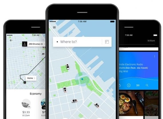
“Take, for example, Lyft and Uber. Their business model was virtually the same at the get-go. Uber had an interface that delighted its users. You could track the driver as a little car on the interface and see in real-time exactly where the driver was,” Chen continued. “In the beginning, Lyft did not have as robust an interface, and it made a significant difference in who pulled ahead.”

Uber’s user experience gave it an initial advantage in conversions. It created a new consumer expectation, which the entire industry had to meet.
The Uber feature Chen described is now common for rideshare and delivery apps. Uber set a consumer expectation, and its competitors had to meet it if they wanted to survive.
Merchants can identify users’ expectations by simply asking them, perhaps in focus groups. Insights from those interviews apply to existing expectations and not necessarily the next Uber-like innovation.
“One of the things that I try to do with useability testing is to get to the heart of what users care about now. We don’t expect them to innovate for us,” Chen said.
Art and Science
It is a cliche to say that something is an art and a science. Nonetheless, it applies to CRO and UX.
Both require an understanding of numbers, reports, and data. User interviews and A/B tests produce info, much like scientific research.
How those results are interpreted is the art, where human imagination and creative skill produce a compelling customer experience.


