What happens when consumers parachute from organic search results and land on the page Google thinks is the most personally relevant?
They skip as much as 95 percent of your prepared journey.
The page the searcher lands on may need to perform every step in the purchase cycle — awareness, intent, desire, action — depending on his goal and familiarity with your brand.
Purchase Journey
The steps in the purchase journey follow the page templates that make up your site. Each page typically performs a single function:
- Home pages generate awareness and excitement around your brand and products;
- Informational pages such as articles and shopping guides introduce the brand;
- Major category pages and smaller subcategories pique interest and desire;
- Product pages move shoppers to purchase.
Visitors are supposed to start at the home page or informational pages, where they pick up enough awareness and interest to move to the next page in the funnel. Some shoppers arrive just wanting information. They leave the site retaining brand impressions. Others, we hope, stay on the site, continuing the journey.
The product parade begins in earnest on category pages. Shoppers see lines of products, brands, and individual items. Some top-level categories might contain instructions on choosing a product or offering navigation by persona or usage types. But all share the goal of moving the shopper to the next stage for a smaller subset of goods.
The purpose of a product page is to prompt an add-to-cart action.
This, in sum, is the journey shoppers are supposed to take.
Searchers
However, every indexed page on your site is a potential landing page in the search engines’ eyes — even obscure or unrelated pages — so long as the pages send appropriate relevance and authority signals.
To integrate them into your funnel, meet those searching shoppers where they are in their journey, and direct them to the next step.
Thus every page has multiple purposes:
Wayfinding. Unless they can instantly identify where they are, searchers are likely to bounce back to the search results, taking a potentially negative brand impression with them. Inserting prominent, descriptive heading and navigation options into your page templates fulfills this purpose. However, it’s surprising how many ecommerce sites miss this one, especially on category pages of browsable product grids.
Awareness. Every page should prominently show your logo, company name, tagline, and other identifying elements. Unfortunately, search engines also index oddball pages, such as downloadable PDF files and administrative pages and documents.
Regularly review your organic search landing pages to identify those oddball URLs. Then modify the pages with proper brand elements, or replace the pages entirely.
Interest. Engagement is another word for interest. Engaging shoppers according to their intent — regardless of the page that they land on — is much more difficult. For instance, a shopper searching Google for “engagement rings” may want to browse images and compare prices before purchasing. A category or collection page featuring a grid of compelling engagement-ring photos would best serve that intent.
However, if he’s starting his journey, the shopper could be overwhelmed with a massive grid of rings. Instead, he likely needs to know the types of available rings and how to choose.
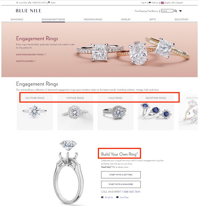
Blue Nile navigates this disparity in purposes well with its Engagement Rings page, shown below. This high-ranking page incorporates the needs of serious shoppers, custom ring builders, dreamers, skeptics, and information seekers. The zones near the top (highlighted in red by me) take care of shoppers who know what they want, including custom builders. Further down the page (not shown) are links to the most popular engagement rings, tips on shopping and sizing, reviews, and an offer to help.

Blue Nile’s top-level landing pages meet the needs of multiple searcher personas.


