Despite the chatter around its dwindling reach, Facebook remains hugely popular. It has twice the number of users than Instagram, for example, according to Sprout Social.
But gaining users’ attention on Facebook via advertising can be difficult. In this post, I’ll offer tips to optimize Facebook ads with better images and copy.
Images
Even the best copywriters will say that images are more important than copy when it comes to ads that convert. Spend the bulk of your advertising brain power on producing show-stopping, scroll-busting images or videos that your audience can’t ignore.
Here are a few ideas.
Text overlay on the image. Placing text on images can help emphasize benefits and features. The New Yorker’s ad, pictured below, does this with an easy-to-read offer: “Get 12 weeks for $6, plus a free tote.” Remember that Facebook has a 20-percent rule: the text overlay cannot occupy more than 20 percent of the photo.
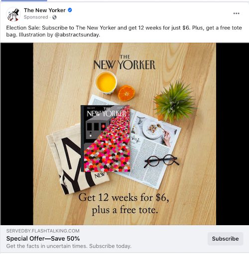
Placing text on images can help emphasize benefits and features. This ad from The New Yorker includes an easy-to-read offer: “Get 12 weeks for $6, plus a free tote.”
Photos of faces. Photos of everyday humans appear native to the platform — they look like a post from a friend! So people are more likely to stop scrolling and read.
Otherwise, a stock photo of a friendly, smiling face can’t hurt.
Photos of the product. Ecommerce merchants can always put their products front and center. Note the example below from the jeweler PD Paola. The earring photo is attractive, crisp, and clear. This strategy may be better suited for an interested audience that’s searching for products like yours.
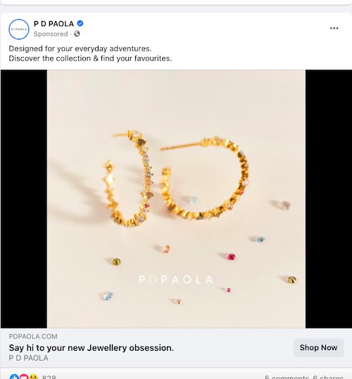
Ecommerce merchants can display their products front and center, such as this example from jeweler PD Paola, which uses an earring photo that is attractive, crisp, and clear.
Headlines
Headlines make or break an ad. They need to be painfully obvious and captivating. The average headline of Facebook is just five to eight words.
Consider these pointers:
- Benefit. What’s in it for the reader? Save money? Get fit? Look good?
- Who’s it for? Everyone? Marketers? Entrepreneurs? Don’t be afraid to call them out directly.
- Who’s in it? Can you include a celebrity or brand name for authority?
- What is it? If a dominant feature is important to your audience, say so specifically.
Many headline factors depend on where your audience is in the purchase journey. For example, a warm lead — such as someone who has visited your website or abandoned a cart — would likely respond to a discount offer. The headline example below from Your Super superfood blends offers an enticing discount: “Pre-order today & Save €10.”
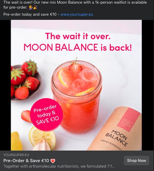
This headline from Your Super superfood blends offers an enticing discount: “Pre-order today & Save €10.”
Older audiences may require more explanations in the headline. I wrote the example below for a yoga course. The benefit is clear (“Improve Your Posture & Flexibility”), as is the how (“in Under 15 Minutes”).
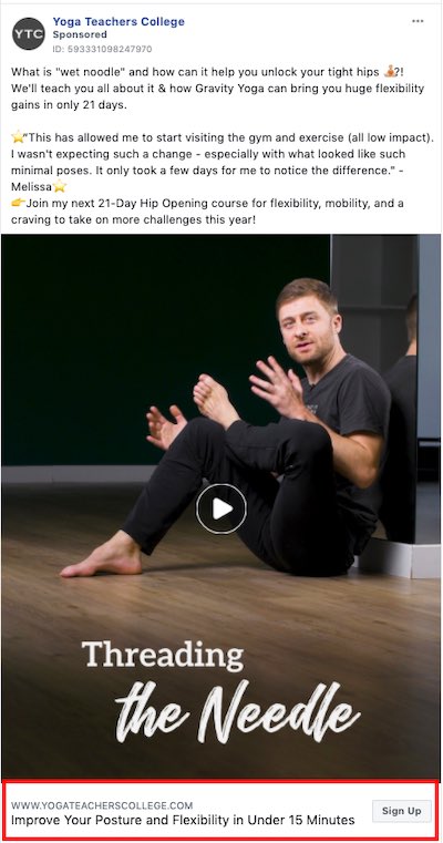
The headline for this yoga-course ad includes a clear benefit: “Improve Your Posture & Flexibility.”
Body Copy
If the image and headline prompt them to stop scrolling, users will likely read your body copy — or body text, as Facebook calls it.
Start by asking something that has an obvious answer, such as “Looking for breakfast that keeps you full all morning?”
Or try something out-of-the-ordinary, such as the example below from the same yoga ad. The quirky term “wet noodle” grabs attention. Then I tease readers with the question: “What is ‘wet noodle’ and how can it help you unlock your tight hips?”
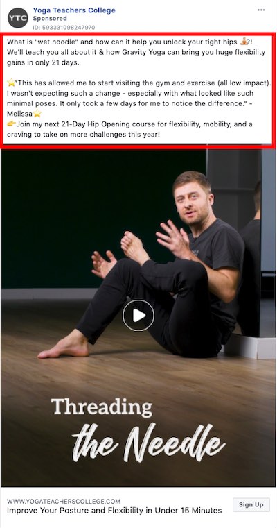
Out-of-the-ordinary body copy, such as “wet noodle,” can grab attention.
Instagram ads tend to be short and choppy. But Facebook ads are often longer. They offer a good opportunity to experiment with extended copy, as users otherwise encounter lengthy posts from friends and Facebook groups. Breaking up long text with punctuation and emojis can make it easier to read.
The example below from Love & Light School of Crystal Therapy uses emojis to separate the text. The emojis are crystals, which accurately represent the company and could grab readers’ attention.

This ad from Love & Light School of Crystal Therapy uses emojis to break up the text. The call to action, “Click to get started NOW,” precedes the link directly after it.
Remember a key element of copywriting: The goal of the first sentence is to entice the reader to move to the second. The second sentence promotes the third. And so on.
Calls-to-action
You’ve got the hook and the line. Now here’s the sinker: the call-to-action. The whole point of running an ad, after all, is to get someone to take action. Go for the ask.
The CTA in the image above is “Click to get started NOW.” These should always begin with a verb that suggests a command, such as “join,” “get,” “grab,” “sign up,” or “buy.’” Including the link directly after the CTA makes it extremely simple to understand what to do next and why.

