30-second summary:
- The popularity of dark mode web design and its adoption by leading tech giants.
- How coders and web developers became influencers for this change.
- The impact of dark mode web design on users and their eyes.
- How dark mode web design leads to less battery consumption.
- Various guidelines available online to adopt this new theme.
- Search engines do not mind the change and thus it doesn’t affect your SEO adversely.
- User preferences, mood changer, and why adding space matters.
In recent times dark viewing mode for websites has gained a lot of popularity from users worldwide. The followership is so strong that Google right now offers you the ‘Night Eye’ feature where you can apply dark mode on any website as long as you’re using Google Chrome as your browser.
However, the popularity is further augmented with many applications and web designs exclusively adopting this new design feature to make users enjoy the experience that is different from conventional web designs.
According to a recent report by Built With, around 1,028 websites have used Dark Theme to attract customers, out of which 340 are live websites while 688 sites have used Dark Theme historically. Furthermore, Get Polarized conducted recent surveys on various social media platforms to comprehend users’ preferences when it comes to the dark mode or dark theme user interfaces.
It turns out that the majority of users gave an overwhelming response agreeing that the shift was appreciable.
In light of this information, let us take a quick look at some of the prominent reasons as to why dark mode web designs are gaining popularity.
1. Adopted by tech giants
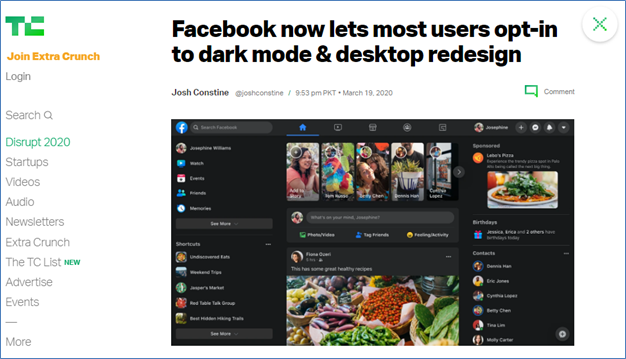
Source: TechCrunch
To consider Google as the progenitor of dark mode would be too biased. In fact, many early home computers that used monochrome CRT monitors used to display greenish text on black screens, in recent times however it was Windows Phone 7 in 2010 that reintroduced dark-colored themes and backgrounds.
Right now, we have major tech giants and popular domains that have actively adopted the so-called ‘Night Mode’ and are offering customers and their users with the ability to shift their viewing preferences as per their choice.
These include big names like Facebook, Reddit, Twitter, YouTube, WhatsApp, Samsung’s One UI, Apple’s iPad and iOS 13, and Android 10 shadow mode, to name a few who are offering dark mode for users.
Together these online platforms and companies cater to the majority of the urban-tech population of the planet. Hence there is no doubt that night mode became a popular option for internet and smartphone users.
2. Influenced by developers and coders
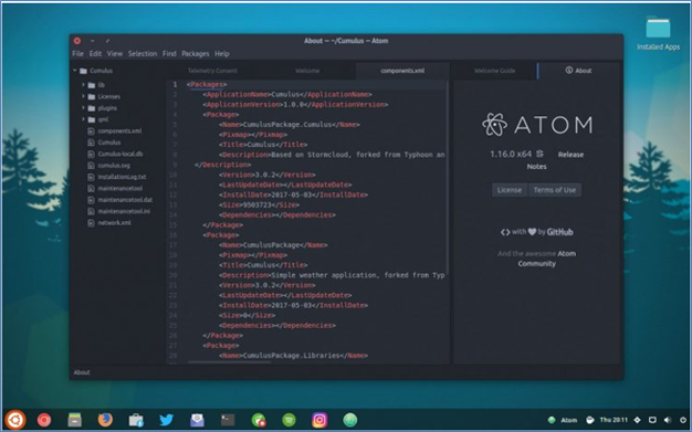
Source: Omg! Ubuntu!
While the dark mode is gaining popularity by users in recent times, seldom do people realize that for program developers and coders who design UI apart from other things, have been working on this theme for a very long time.
In fact, this dark mode theme has been the default look from most coding text editors out there. In fact, some of the most popular coding text editors, including Atom, Sublime Text, Brackets, and Visual Studio Code, all use dark themes.
Hence, it becomes quite easy to understand why coders and developers might influence this transformation when you look at this perspective. Furthermore, according to a recent study published by Medium.com, over 70% of software engineers use Dark Theme IDEs, and dark theme downloads are almost always within the top 10 themes as per popular demand.
3. Friendly to users’ eyes

Source: PhoneArena
It seems like biology is involved when dark theme preferences are further studied according to their impact on users and their eyes. The mechanics are simple. Seeing light text on a dark screen allows the iris in our eyes to be more burdened. It has to widen much more than it does in case of a white screen.
Hence, in dark viewing mode, our eyes’ pupil grows in size, thus requiring more effort to focus on things.
This is further backed by statistics regarding astigmatism, a condition that affects almost 33% of the US population. However, at the same time, dark mode is preferable when the reader on any device has low-light conditions and doesn’t prefer to read long chunks of text.
4. The boldness of text or just mood
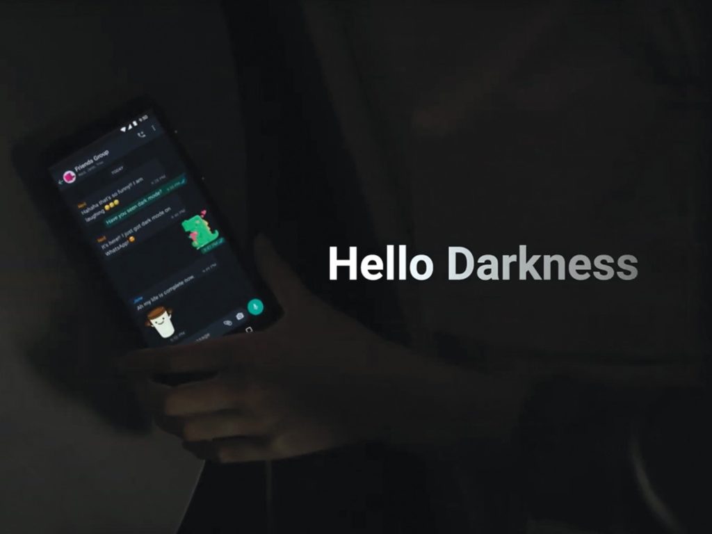
Source: Facebook
While the argument for using dark text on light backgrounds is fairly strong, however, the argument that it makes the experience aggravating for some also holds true. This is because the majority of users spend their days staring at bright white screens that can result in digital eye strain.
Digital eye strain is defined as a group of vision-related problems that result from prolonged use of cell phone, computer, e-reader, or tablet, to name a few. Many users thus consider the change as much more acceptable and agreeable. This allows them to sink into the darkness and cocoon themselves from bright white light that makes people feel as if they are staring directly into the sun.
While the dark theme does not make the text bold, it happens to create the opposite reaction where letters bleed, dark mode is more of a mood rather than just a feature. According to the recent survey findings on Medium, around 82.7% of participants stated that they prefer to use dark mode on their devices.
5. Less battery consumption
Source: TechSpot
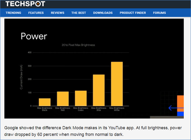
At the 2018 Android Dev Summit, one of Google’s solutions to developers to reduce battery consumption was the introduction of dark UI. Researchers at Google proclaimed that night mode could save battery life.
This finding is shared through a story published by XDA Developers, where it is stated that a dark theme can reduce battery usage up to 63% on AMOLED displays even with max brightness. Furthermore, one also has to consider the fact that white pixels are indeed more power-hungry and that brightness affects both power usage and battery life in a linear fashion.
6. Plenty of guides online
With dark mode becoming a prevalent theme across users, no wonder today, you can find various online guides to make any application and software on your smartphone or browser change the interface. This also adds as well as goes to show just how fanatic people can be at times when a trend hits them.
7. Search engines don’t mind it
Source: 9to5Google
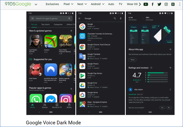
To understand the impact of the dark theme on SEO, we have to consider the user experience. This is due to the fact that users and the usability of your website play a huge role these days when it comes to search engine rankings. Hence if you are planning to go dark mode, then it has to be done right.
The short answer to the question of whether dark mode affects your SEO or not? The answer is NO, but that doesn’t mean that we can neglect users and not provide them with a user-friendly experience.
Hence using a dark theme doesn’t mean that search engines like Google will penalize you for it. It does, however, matter if you are adversely affecting the user experience in some way.
8. User preferences
Source: Reddit
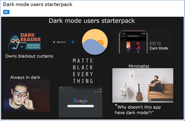
We all are pretty aware of the fact that the majority of the audiences seldom read texts online as the most viewed and popular forms of media are visuals that can be either categorized into videos or images. Hence user preferences do come into play when it comes to the popularity of dark-themed websites.
According to a recent study by Smart Insights®, 92% of marketers are using videos as an important part of their marketing strategy. Furthermore, it is estimated that on average people will spend as much as 100 minutes every day watching online videos in 2021.
This is also supported by the findings of Statista.com, where online video consumption is considered as one of the most popular forms of internet activities worldwide. Hence when taking these studies into perspective, it is definite that dark theme works well with online video streaming sites.
No wonder YouTube and Netflix have become dominant in the usage of these dark tones for the most part.
9. Adding space matters
Lastly, I would like to add that reading or viewing media closely hinged together in a night mode theme website can be more difficult than with a more traditional white background website. Hence a strong word of advice, consider using more space between visual elements and texts when designing a dark themed website.
Conclusion
While laws of science and medicine state; otherwise, the dark mode has become instantly popular amongst the masses. I preferably define dark mode as more of a mood inkling rather than something more profound.
I hope this post was able to offer you some delightful insights regarding why dark mode web designs have gained popularity amongst users. For more questions regarding the topic, please feel free to share your feedback in the comment section below.
Amanda Jerelyn currently works as a Marketing Manager at Dissertation Assistance, a perfect place for students to buy academic writing services from expert dissertation writers UK. During her free time, she likes to practice mindful yoga to keep herself fit and healthy.

