30-second summary:
- Reducing bad user experience of 404 errors by branding and customizing them.
- Including links to 404s allow users to navigate the website even when they come across a potential dead end.
- Boost SEO by placing your sitemap, homepage tab, and search bar.
- Usage of conversational language along with attractive visuals reduces user’s contempt and frustration.
- Mention of blog on your customized 404 error page promotes your intellectual prowess for possible users who might be interested in your content.
- Amanda Jerelyn shares some amazing methods to improve the SEO of your site even through 404 pages.
- Lastly, some tips to help you avoid 404 errors wherever possible.
Bad user experience can lead to your website’s demise and can also adversely affect your website rankings. This is why 404 errors are considered deplorable when taking into their perspective regarding both user experience and the search engine rankings of your website.
However, there are ways through which you can use 404s to boost your SEO, as in some situations, it is not a broken link but an error by the user that can cause them.
A 404 can be generated when a user types in a faulty address, and this may result in an error being generated on their browser that may look bad, but you can definitely address the situation.
According to a recent study conducted by Gomez, a commercial platform that runs tests for web performance, 88% of online consumers are less likely to return to a website after a bad experience.
In the light of this information, let us take a quick look at some of the ways you can use 404s to negate such inferences and strengthen your SEO.
1. Add links to them
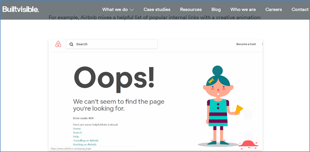
Perhaps one of the best ways to make use of 404s is to design them so that it can link random internal pages from your website. This will allow you to get more website pages indexed through your 404 error pages. This can be achieved by running an algorithm that can help you to link out to a random number of internal pages.
Hence whenever a 404 page is generated, the links also change each time. According to Neil Patel’s own practice, he was able to boost TechCrunch search engine traffic by 9% in just a matter of 30 days. As far as search engines go, Google itself encourages developers to create custom 404 pages.
Since it is a standard HTML page, developers can customize it the way they want to, hence adding links to 404 pages shouldn’t be a big hassle.
2. Brand and customize them
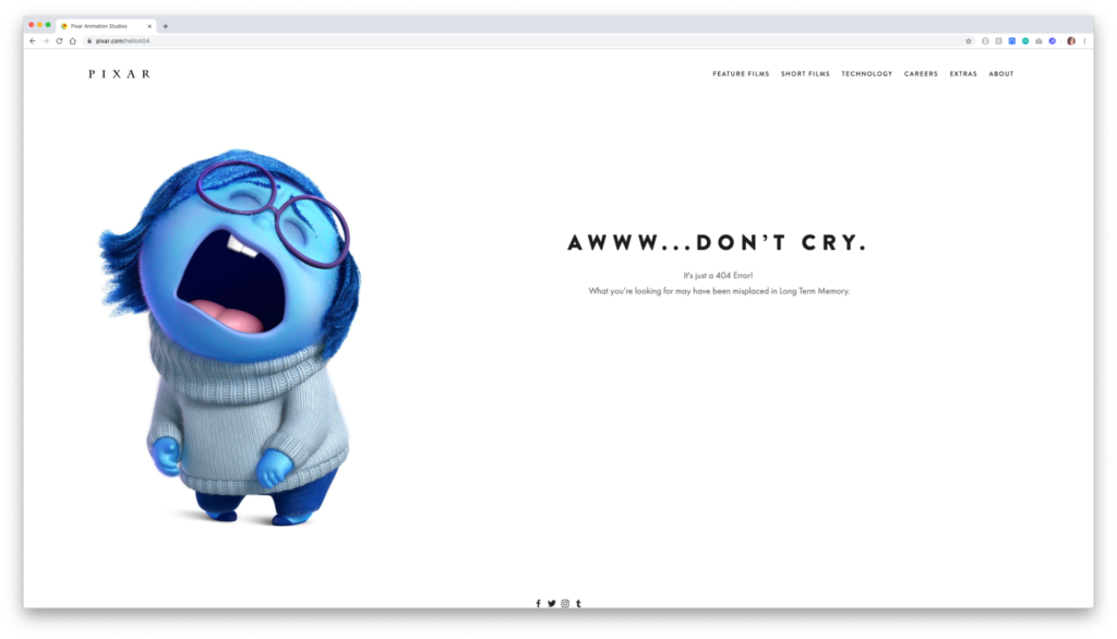
The inconvenience user experiences when they run into a 404 can be quite infuriating; however, this is also a moment where you can use creativity to capture their attention. By branding and customizing your 404 pages, one can actually boost their website revenues and increase their conversions.
However, this might involve additional effort where a 404 page has to be properly designed and optimized in order to turn lost visitors into loyal customers. A standard 404 page doesn’t look good at all. In fact, it seems like coming for an era that was far less progressive. We understand that visuals play a huge role in attracting customers.
Several social media and marketing statistics proclaim the power of visuals, such as the fact that 96% of online shoppers watch a video about a product or a service before making a decision and that 88% of marketers prefer visuals in their published content.
So why refrain from using visuals and not branding your 404s? The answer is that you should definitely not only brand them but also customize them to make them even more appealing for your users.
3. Put in a search bar
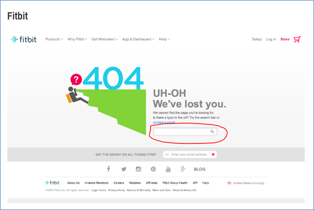
Another great tactic to follow with your 404 pages is to add in a search bar. This is further reflected by the study published by the Search Engine Journal, where 81% of users think less of a brand if it’s outdated, and that 40% of users consider search box as the most important feature.
Therefore this should be plenty of reasons for you to make this change happen. A search bar added to your 404 is like sweet candy to a small kid who just dropped their ice-cream.
Surely it is not what they were expecting, but with the power of search in their hands, they can begin their adventure anew. Plus, a nice consolidating message to go along with it would also work wonders.
It is all about compensating for the error they just ran into. Hence you are covering damages and making it easier for your users to recover from them.
4. Include mentions of popular landing pages

Remember that your main goal is to create attention for your online users and direct them to your most profitable and viable landing pages. Hence even when your customers accidentally land themselves on a 404 error page, you can continue your efforts to divert their attention from the error and towards your most popular products and services. It is like a never-back down approach.
Sure, you would be offering them some comforting words to soften the impact created by the error. However, marketing is all about never quitting. Hence your 404 actually becomes like a landing page. It is true no one would actually land on a 404 with intention.
However, when they do, you will be prepared for them to divert the traffic to the most popular pages on your website. This can downright act out as a recommendation for your users. According to a recent report by McKinsey and Company, 35% of Amazon’s and 75% of Netflix’s revenues are generated by their recommendation engines, respectively.
5. Place your sitemap
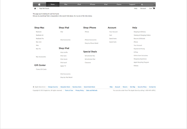
If you are from the SEO side of things and adept in the knowledge that encircles the mastery of search engine rankings, then you know for sure that sitemaps can be extremely good for your websites. Since they are listed in search control, there is no doubt that Google does pay attention to them. Hence it would be great for your 404s to include a sitemap on them.
This will allow users to easily navigate through your website without leaving your website or going back to the SERPs (search engine result pages) to start their journey all over again. Hence you would be effectively reducing pogo-sticking. This will thus enhance your users’ dwell-time.
6. Use conversational language
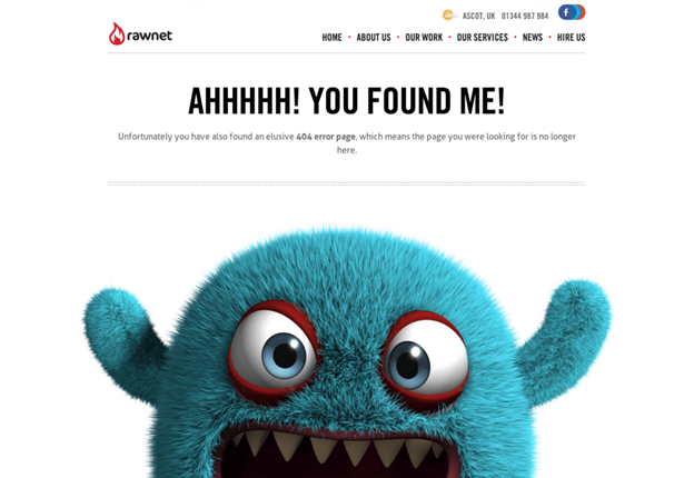
It must be pretty obvious by now that a remedy for a 404 lies in offering users a human touch that softens their impact, and this can be further augmented with the use of conversational language.
You want your customers and website visitors to feel less infuriated, and in order to do that, you need to spread out some comfort for them so that they do not feel agitated.
This can be reflected by a recent study by Business 2 Community, where they emphasize the use of conversational marketing. According to the study, 79% of consumers are willing to use messaging apps for customer service, 82% consider immediate response as extremely important, and 36% of companies are actively using live chat for marketing and sales.
Hence the idea over here is to make your users feel as if you are directly speaking to them, and this can help break the ice and reduce the tension created.
7. Get to homepage tab

Probably one of the easiest get around for your 404 pages is to link back to the homepage. What you are doing is here is giving your customers the easiest route to start their search all over again without letting them go and trying to keep them on your domain.
8. Mention your blog
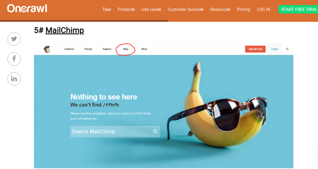
Blogs are considered a good choice for your audiences as well. While they may not be good for directly influencing their behavior, they can certainly create awareness that your domain does publish interesting content that users might find interesting to read.
It’s just a small nudge in the right direction. Obviously, customers who are looking to buy products or hire services would like to be directed to their requested pages, but mentioning your blog on a 404 is like saying, “hey there, we have more in store for you!”
Many students nowadays also go through blogs while they buy research papers online to increase their pool of knowledge relating to their field of study.
9. Avoiding the 404 Error
Lastly, I would like to share some guidelines with you to help you avoid 404s where you can possibly manage to reduce them. This will only make your user experience skyrocket and help negate dissonance from users. Here are some quick tips:
- Log into your Google Search Console account.
- Check the Coverage report to see how many URLs are returning error codes.
- Use the URL Inspection Tool to find more details about each error.
- A 301 redirect is considered a good option for rectifying a 404 status.
Why are we doing this after all of the discussion above? This is because having too many 404s can prove to be detrimental to your user’s experience. Hence if you are notified about their existence, you should resolve them.
Conclusion
The 404 error codes undoubtedly leave a negative impact on your users and visitors. However, there are various ways you can make them add value for your customers.
I hope this post was able to offer you some meaningful ways through which you can use 404s in an interactive manner to boost your website’s SEO. For more questions regarding the topic, please feel free to post your queries in the comment section below.
Amanda Jerelyn currently works as a Marketing Manager at Dissertation Assistance, a perfect place for students to buy academic writing services from expert dissertation writers UK. During her free time, she likes to practice mindful yoga to keep herself fit and healthy.

