Ecommerce content is more than sales pitches and technical info. Shoppers who cannot understand your communication will not convert. To grab their attention, write at a fifth-grade reading level.
Reading comprehension plays a crucial role in ecommerce. Shoppers need to understand how a product or service works. A good example is the Harry Potter books. The storyline is complex, but the writing is easy to understand. Thus it continues to appeal to both adults and younger readers.
Help Shoppers
Reading at a lower grade level is less work for shoppers. It’s not dumbing down the content.
Consumers who quickly understand a product are more apt to purchase it.
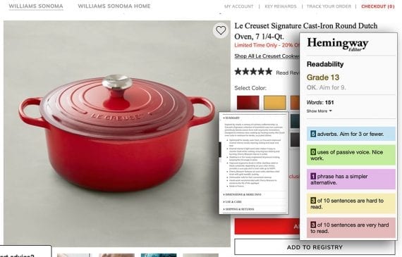
Williams-Sonoma might be an example of what not to do. The “readability” of the company’s product pages is for grade 13, according to the Hemingway Editor. Shoppers are likely rereading (or not understanding) the explanations — and leaving the page.

The readability of the William-Sonoma’s product pages is for grade 13, according to the Hemingway Editor.
Williams-Sonoma isn’t alone. Many online stores use fancy jargon to describe even simple products. There are better ways to convey the benefits of a brand or product. Here are a few examples, using the Dutch oven description, above.
- Original: Enamel interior’s light sand color makes it easy to monitor food while cooking, ensuring less sticking and burning; Cherry Blossom interior is white.
- Revised: A light-colored interior makes it easy to check on food to prevent sticking and burning.
- Original: Stabilizers in the newly engineered lid prevent rocking, keeping the lid snugly in place.
- Revised: Stabilizers keep the lid from rocking, so it stays snugly in place.
- Original: Improved ergonomic knob in either stainless-steel or black-composite, depending on your color choice, provides a sure grip and is oven-safe up to 500°F.
- Revised: Improved ergonomic knob in stainless-steel or black-composite provides a sure grip and is oven-safe to 500°F.
Beyond Products
Clear writing goes beyond the product page. The home page, customer service pages, landing pages, and navigation should all be easy to understand.
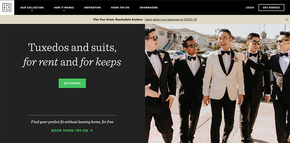
For example, the home page for The Black Tux has one goal, and it’s not the immediate purchase or rental of a tuxedo. Rather, the goal is to entice visitors to click the “Get Started” button. That would prompt them to enter their email address as well as the event date and the number of tuxedos needed. While visitors could instead use the top navigation, the simple explanation (“Tuxedos and suits, for rent and for keeps”) and clear call-to-action (“Get Started”) expedites the process.

The Black Tux’s home page features clear text and instruction.
Readability
Many tools can estimate the readability of your site’s content. Some are free and might be sufficient. However, you’ll likely want to dig deeper, especially for manufacturers’ descriptions, which are often formal and too long.
Microsoft Word provides a simple, built-in tool. From the Tools tab in the Microsoft 365 version, click Spelling & Grammar > Options > Show readability statistics. The stats appear after running the check.

Microsoft Word provides basic readability metrics at Tools > Spelling & Grammar > Options > Show readability statistics.
The Flesch Reading Ease score is a long-time method of measuring readability. The higher the score (out of 100), the easier to understand. The Flesch-Kincaid Grade Level estimates the minimum requirement. In the screenshot above, this is 4.4, indicating the average reader requires a grade 4.4 level to understand.
The free Hemingway Editor is a style checker that focuses on readability. It points out sentences and phrases that are hard to read and suggests alternatives.
Grammarly’s free version highlights critical grammar and spelling mistakes. The paid version provides tips on vocabulary and punctuation.
Write for Humans
Automated tools, while helpful, can recommend less-than-ideal changes. Never accept a suggestion without careful thought.
Writing for lower grade levels is cumbersome at times. Stick with it, though. Shoppers who understand your company and products are more likely to drive conversions.


