As banks seek to serve more customers online, how good are they at content design on the fly?
Every sector has challenges right now. Banks are operating with fewer branches open, and those that are open have reduced their opening hours.
This inevitably means more customers want to contact banks over the phone, exacerbated by the parlous financial state many people find themselves in, and yet call centres are not fully staffed.
American Banker reports that mobile banking logins at BBVA have hit record highs in the US, 16% up in the first three weeks of April, compared to the same period in March.
So, how are banks dealing with this when it comes to humble content design? I decided to check out the coronavirus help pages on the websites of the big five banks in the UK – Barclays, HSBC, Lloyds, RBS, Santander.
I’d be very interested to hear the thoughts of any content designers or UX specialists in the comments below.
First impressions – where’s the humanity?
Though I groan at the average banking advert on TV – the couple buying a house, painting a nursery etc – the need for humanity at the moment is pretty obvious. So, I was a little surprised by how these coronavirus help pages were mostly devoid of human life.
Top marks to RBS for including a picture of a human being at the top of the page – I don’t know why it helps, but it does. Incidentally, I am aware of studies that investigate the effect of photos of humans on website users (see a summary here) and in short, the effect is to engender trust. This could well be important when speaking to new visitors, or indeed current customers who feel vulnerable.
Here are some screenshots, roughly above the fold on my laptop, just to get a feel of these pages…
HSBC
Pretty good. Four big blocks/calls to action above the fold, with some nice icons, and we can forgive the long line of text at the top of the page that runs full-width.
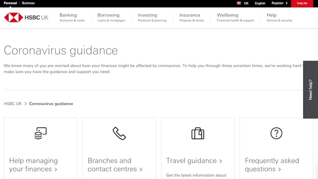
HSBC coronavirus guidance page. Image: HSBC website
Santander
Configured almost like a long blog post – it’s a collection of ‘tips’ (11 in total!), which is admirable, but it ends up very text heavy and assumes the user has at least five minutes spare to peruse their options.
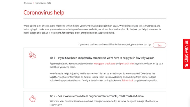
Santander coronavirus help page (I scrolled down a little bit). Image: Santander website.
Barclays
Seems a little empty above the fold, it has hard-to-follow full-width text about contacting the bank and signposting could perhaps be clearer.
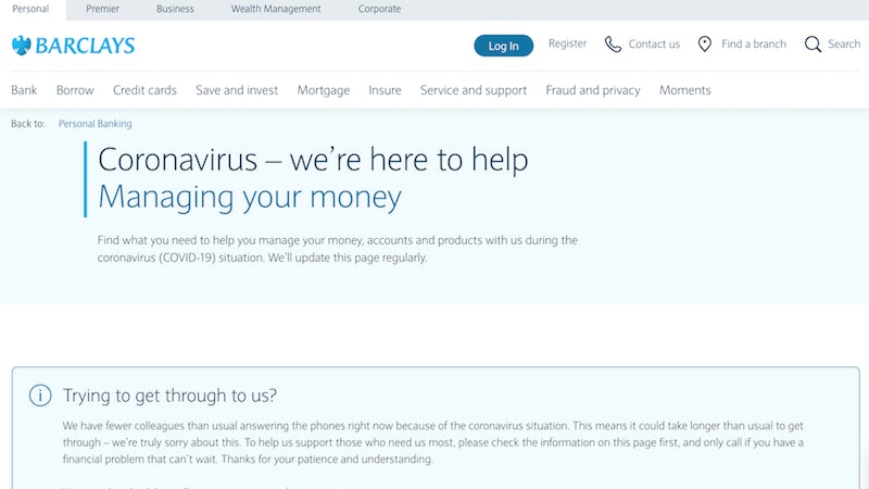
Barclays coronavirus help page. Image: Barclays website.
Lloyds Bank
I really like the focus on personal banking, it’s a big priority at the moment and this page sells the benefits above the fold, but again it seems a little too wordy.
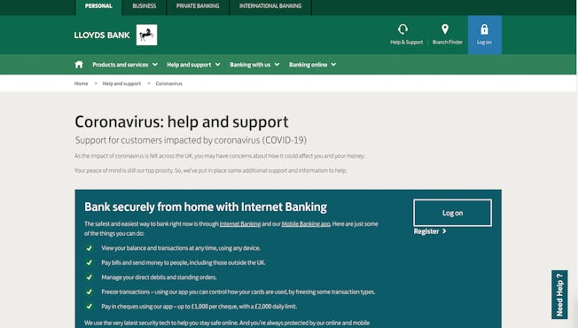
Lloyds coronavirus help and support page. Image: Lloyds website.
RBS
A nice family photo and some very clear onward navigation options. Truly, this page did not make me think, and that’s a good thing.
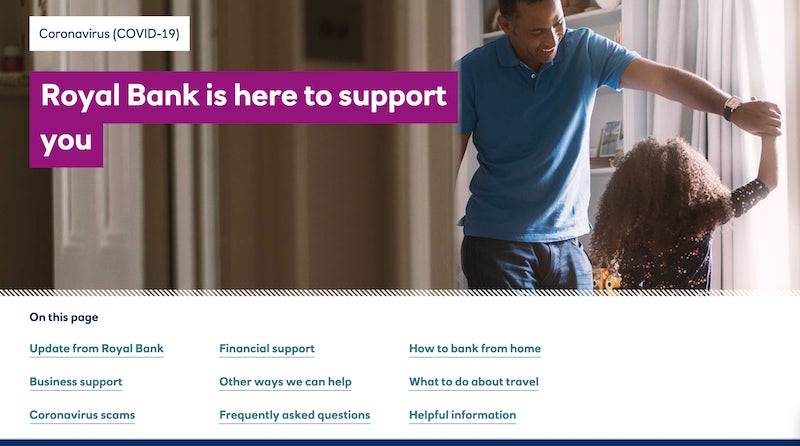
RBS coronavirus support page (I scrolled down a little bit). Screenshots via RBS website
Regarding imagery, I should add that HSBC, RBS and Barclays all had pictures of families over on their homepages when I visited, but it still stood out to me that RBS had taken extra care with the aesthetic of their coronavirus help page above the fold. It was immediately the most reassuring.
Barclays actually includes more images of people than RBS does, but they appear further down the coronavirus help page, and serve to highlight how strangely vacant it is above the fold. HSBC includes one family picture further down their coronavirus help page.
Though I’m aware that much imagery of human interaction can seem inappropriate in a pandemic (see the 24th March survey by Pattern89 which found that across Facebook and Instagram there were 27% less images and video ads of models displaying human interaction), I think it’s still important that brands convey some level of empathy, something which can be far easier to achieve with pictures than words.
Reducing cognitive load
I have already alluded to Steve Krug’s book Don’t Make Me Think (a common sense approach to web usability). The theory is simple: let users accomplish their goals easily and directly.
Krug may be particularly relevant during a pandemic. When asked about how he was responding to the crisis, Grégoire Baret, Senior Director, Omnichannel Experience at ALDO Group said, in an interview with Econsultancy, “First, we adjusted and simplified the overall ecommerce flow and set of services. Less cognitive load to focus on clearer, faster and leaner services. We tweaked and optimized key steps from the product detail pages to the checkout…”
Now scroll back up this article and look at those screenshots of bank coronavirus pages again. Which of them really evokes a sense of calm, takes your hand and leads you through? To be honest, I find Santander, Barclays and Lloyds a little bewildering at first glance.
Just look at Santander on mobile. Beyond big design changes, it feels like some HTML TLC could improve it to start with…
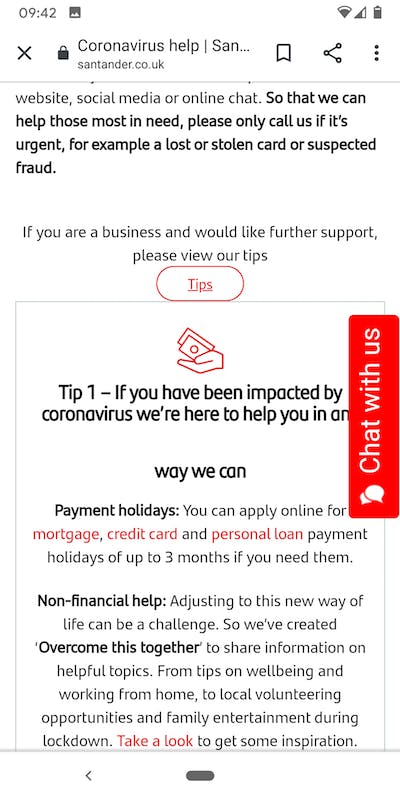
Santander coronavirus help page. Image: Santander.co.uk
In case you think I sound disingenuous, I’m aware that these pages are designed to impart quite a lot of information, and that customers are seeking updates that may not always be short and snappy. Still, success is in allowing the user to find what they need.
Compare the navigation options, for example, on the RBS and Barclays coronavirus pages. They both appear just below the fold on their respective pages.
Here’s Barclays…
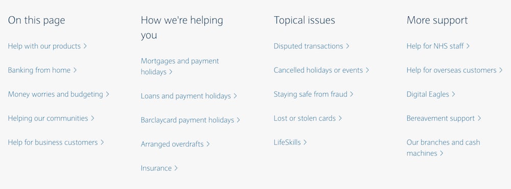
Menu below fold on Barclays coronavirus help page. Image: Barclays.co.uk
And here’s RBS…

Menu below fold on RBS coronavirus support page. Image: personal.rbs.com
The main thing, of course, is that the Barclays menu is more extensive and therefore could perhaps benefit from clearer buckets/headings (‘topical issues’, ‘more support’, possibly a little vague?). Beyond mere size, Barclays is also more difficult to read with its light blue font colour and lack of weight.
You could argue that for a specific task, the RBS menu might not provide the user with what they need. But, for example, if I had lost my card, clicking on ‘helpful information’ takes me toward the bottom of the page and after a small scroll I see a search panel saying ‘something else we can help you with’, which duly serves up relevant query (see below).
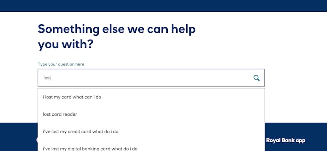
RBS search panel at the bottom of its coronavirus support page. Image: personal.rbs.co.uk
On the topic of menus or navigation options, look at GOV.UK’s coronavirus page, just below the fold (see below), and you start to understand the benefit of bigger, bolder font and one column of information that follows the ‘inverted pyramid’ method (why concern users with anything other than the most important stuff to begin with). Yes, GOV.UK is not a bank, but I’m using the website to illustrate something akin to best practice when lots of information and services are on offer (and yes, I understand that best practice is a tricky idea).
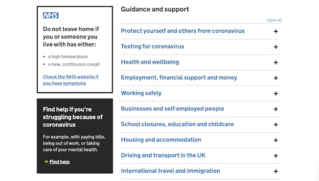
GOV.UK coronavirus page. Image: gov.uk
Another tip of the hat to HSBC here, which gets fairly close to a GOV.UK feel on pages such as its coronavirus travel guidance. See below how the bank seeks to meet user needs with first-person scenarios, these then link further down the page to the appropriate information. The text is a little on the small side, but is used sparingly and doesn’t run full-width.
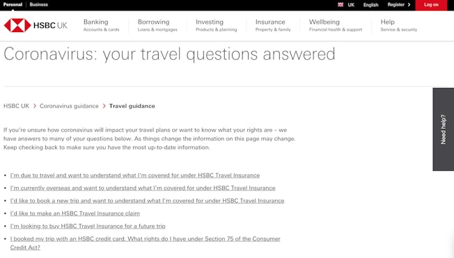
HSBC coronavirus travel guidance page. Image: hsbc.co.uk
Tiny text torture
Looking at all these pages on desktop, it’s arguably only RBS and HSBC that actually escape criticism for small text that runs the full width of the window.
Below is a screenshot of the Lloyds coronavirus support page taken below the fold on my laptop. Pretty intimidating stuff in my opinion, even where the page uses two columns, and especially if you are a user that has difficulty with reading.
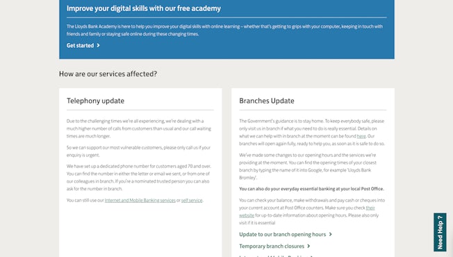
Lloyds coronavirus help page, below the fold. Image: lloydsbank.com
There is a neat accordion-style feature about halfway down the Lloyds coronavirus help page, a clever way of reducing cognitive load and also keeping plenty of content on one page. But pop open one of the options and you’ll find more full-width plain-looking text. It’s all perfectly usable for me, but if I had poor eyesight, I think I would appreciate something bigger.
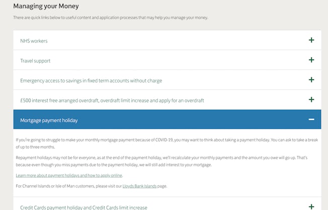
‘Accordion’ style quicklinks on the Lloyds coronavirus help page. Image: lloydsbank.com
This tiny-text criticism is one I could level at Lloyds, Barclays and Santander. A lot of the guidance for writing for the web could be better adhered to with more readable text, split into more readable sections or headers.
Of course, on mobile, the screen size makes this text more readable as line length is limited. Here is an example from Barclays that is arguably more readable than the desktop version I included at the top of this article…
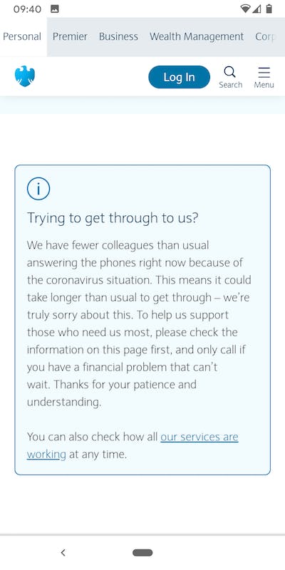
Barclays coronavirus help page on mobile. Image: Barclays.com
RBS, however, as we’ve seen already and the following GIF shows, keeps it relatively chunky on desktop, and uses subheaders and foldouts in a way that feels more sophisticated that the other four websites.
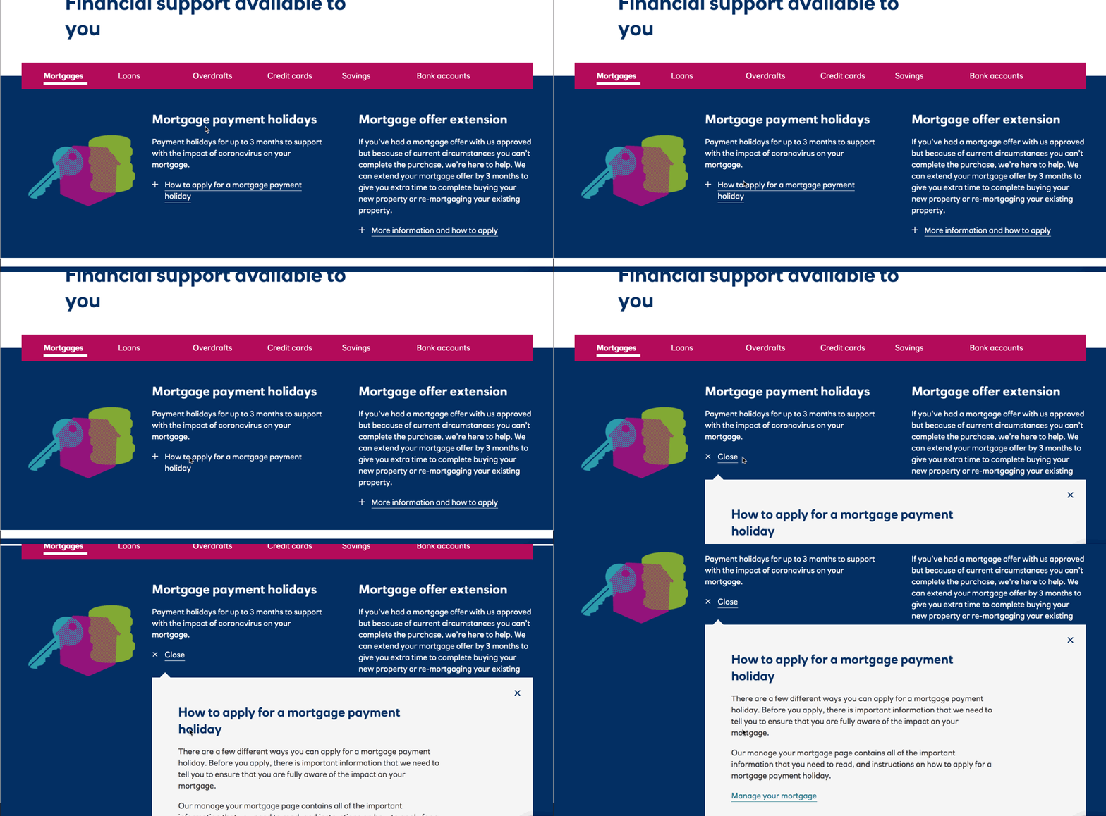
RBS coronavirus page, financial support. Image: personal.rbs.co.uk
HSBC, too, has better sized text and is good on headings, making the right information easy to find. Icons are a big help, too, in my quest not to exert my brain too much.
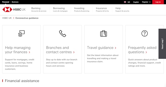
HSBC coronavirus guidance page. Image: HSBC.co.uk
Getting text links right, or even buttons!
Can the humble button reveal a lot about digital transformation? Well, it’s certainly true that digital experiences can be complex, and are often the sum of their parts. In that sense, when pages are rushed out, they can feel exactly that.
You don’t always need fancy buttons if you have good in-text links, but they need to be done right.
Take Lloyds again, this time on mobile. Look at the text links used in the screenshot below to help users find the right information. Apart from being hard to notice, the anchor text doesn’t help the user understand where the links will lead. Though I understand that linking from the word ‘here’ will help users know they can click on it, it might be even clearer if it said ‘find out about services currently available in our branches’. Similarly, when referring to the Post Office, ‘their website’ is used as anchor text, when perhaps ‘visit the Post Office website’ may have been more noticeable.
Also, as my colleague Rebecca Sentance points out, someone who is using their screenreader to listen to a list of on-page links will just hear “here” with no other information.
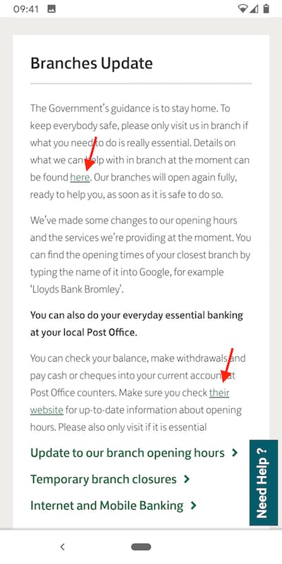
Lloyds coronavirus help and support page on mobile, below the fold. Image: lloydsbank.com
Compare the Lloyds page to one I took from GOV.UK again below, which has much less information on page and uses descriptive text links very effectively to direct users to the right information or service.
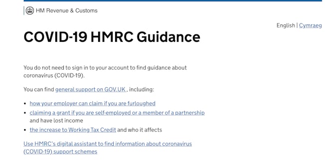
Government gateway, Covid-19 HMRC Guidance. Image: GOV.UK
So, buttons aren’t necessary as GOV.UK shows, but boy do they stand out in the RBS example below. Very tappable. Though I haven’t included a GIF here, on desktop these buttons have some pretty snazzy rollover effects, with some hatching shimmering across the bottom edge of the button when the mouse is overhead.
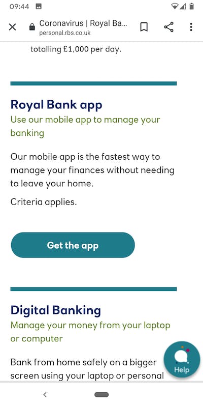
Example of buttons on the RBS coronavirus support page. Image: personal.rbs.co.uk
And here’s one equivalent call to action from Lloyds (notice I had to highlight it with an arrow)…
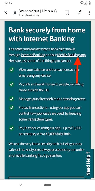
Banking app link on the Lloyds coronavirus help page. Image: Lloydsbank.com
I should add that there is a big button to ‘log on’ to Lloyds internet banking just at the bottom of this box, and if you tap that, you visit a page which has a clearer advert for the mobile app.
Writing for the web
Writing for the web is something most big companies have got to grips with now, to some degree or another, and the big five banks are all pretty good at using simple language that the customer will understand.
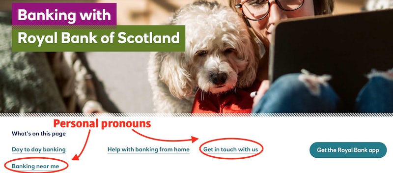
Head to the RBS personal banking page, and you’ll see clickable links saying ‘banking near me’ and ‘get in touch with us’. It’s simple stuff but works pretty well.
Go back to Government Digital Service’s 2016 guidelines for writing for GOV.UK if you want something as close to what you might call best practice. Here’s just a selection of points that jump out at me:
- Meet the user need.
- Meeting that need means being: specific; informative; clear and to the point.
- Good online content is easy to read and understand.
- It uses: short sentences; sub-headed sections; simple vocabulary.
- …users only read about 20 to 28% of a web page.
- Keep your body copy as focused as possible.
- Use the ‘inverted pyramid’ approach with the most important information at the top tapering down to lesser detail.
- Break up text with descriptive subheadings.
With these guidelines fresh in the mind, here’s a couple of examples where the writing from Barclays and Santander could perhaps be improved…
Barclays and Santander copy – is it specific enough?
The Santander coronavirus page is split into 11 tips. The first tip is pictured below. Being pernickety, I’d say that ‘we’re here to help’ isn’t exactly a tip.
I would add that the full heading of this tip – ‘If you have been impacted by coronavirus we’re here to help you in any way we can’ – isn’t very short or specific. Would two boxes – ‘financial help’ and ‘wellbeing’ – do the job better?

Tip 1 on Santander’s coronavirus help page. Image: santander.com
Tip 2 at least reads like a tip – ‘See if we’ve removed fees on your current accounts, credit cards and more’ – but I’d argue that subheaders could be made more impactful here by using breaks and some differential in the font size rather than just bolding. A small thing, perhaps!
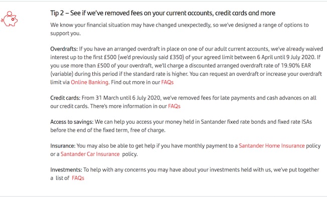
Tip 1 on Santander’s coronavirus help page. Image: santander.com
It’s a familiar story in the mortgage help summary on the Barclays coronavirus page – an uninspiring three lines of text. Could it be broken up more?

Mortgage information dropdown on the Barclays coronavirus help page. Image: Barclays.co.uk
‘There could be a number of ways we can help you’ – do these opening words really add anything? Could payment holidays and extensions be made to stand out more as subheadings? Maybe I’m being harsh here, there’s a nice clear button after all – ‘mortgage help’ – and on mobile the text reads a little easier.
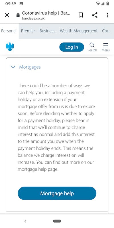
Mortgage information dropdown on the Barclays coronavirus help page on mobile. Image: Barclays.co.uk
Lloyds shows improvement over time
The ‘branches update’ box on the Lloyds Bank coronavirus page leaves a little to be desired (it would perhaps benefit from better subheaders)…
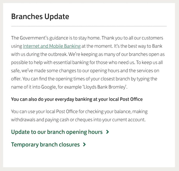
Branches update box on the Lloyds coronavirus help and support page. Image: Lloydsbank.com
However, when you click through from the above box to read the full update about branch opening hours, you get a page that has been vastly improved by the Lloyds team.
Here it is in April when I first visited…
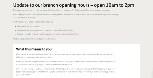
Lloyds branch update page in April. Image: Lloydsbank.com
And here it is in May around time of writing…
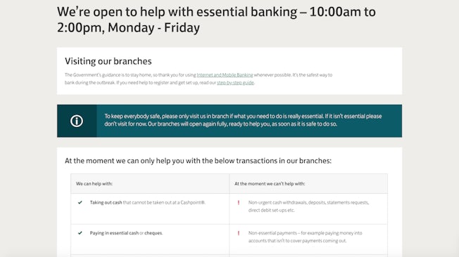
Lloyds branch update page in May. Image: Lloydsbank.com
The headline has been much improved, uses everyday language and clearer timings. There are clearer messages about staying at home (albeit repeated slightly), and the addition of a nice table showing what ‘we can help with’ and what ‘at the moment we can’t help with’.
You can see in microcosm how small changes make a big difference all told by moving further down this Lloyds branch update page – there’s a box that was really uninspired in April, titled ‘what this means to you’. It’s still not amazing now, but it does the job, and it’s much better than it was, mostly achieved by adding some subheaders. Take a look…
April
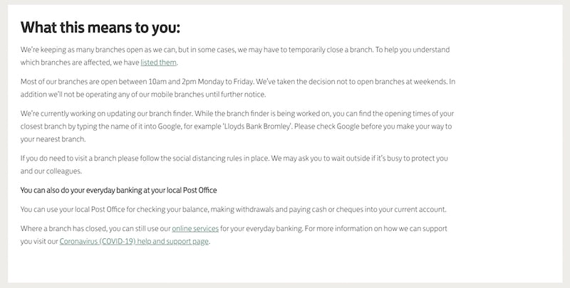
Lloyds ‘what this means to you’ information box below the fold on the branch update page. Image: Lloydsbank.com
May
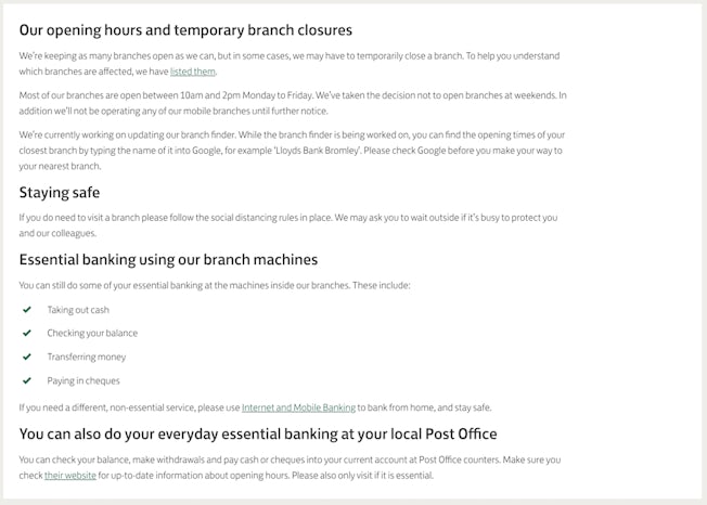
Updated Lloyds ‘opening hours’ information box below the fold on the branch update page. Image: Lloydsbank.com
It doesn’t really need pointing out that what was hard to read/understand earlier is easier to understand now.
A conclusion full of caveats
A few caveats:
1. My investigation isn’t extensive. I’ve essentially been looking at one simple page, albeit one that each of these banks highlights very prominently on their respective homepages. I haven’t gone deep into any sort of user journey or even really thought about needs or personas. I haven’t looked at apps, branches, advertising, or called any phonelines.
2. Search is an important part of meeting user need that I did not cover. I could search for ‘payment holiday’ on the homepages of Santander, RBS and Barclays (HSBC and Lloyds do not offer a search bar on the homepage). In each of these three examples, I was led quickly and easily to the right information. But Barclays was the most impressive, with suggested results appearing dynamically in the form of FAQ links (see below).
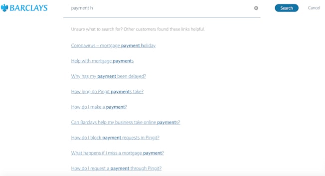
Search on the Barclays website. Image: Barclays.co.uk
3. Each of these websites has a prominent help/chat function with a digital assistant that can guide users to the information they need.
4. I haven’t touched on so many points important to usability – speed, mobile (only in a few places), and accessibility, to name three.
5. I don’t want to suggest that each of these banks should necessarily be aiming for the same tone of voice.
6. Regulation may dictate what information has to be included on some of these pages e.g. when offering information about borrowing. Sometimes reams of text are hard to avoid.
7. If you want to hear from real experts, I already mentioned the GOV.UK writing guidelines, but you can also check out Econsultancy’s User Experience and Interaction Design for Mobile and Web – Best Practice Guide.
With all these caveats and more taken into account, I think it’s fair to say that content design is still a science that perhaps is underinvested in. Or perhaps, though I noticed iteration from Lloyds, it’s easy to see how a combination of teams working remotely and having to work with speed (even haste) is not the ideal scenario in which to get content design right first time.
And while each of these banks’ content management systems will certainly have their quirks and limitations, digital transformation is as much about how well teams can adapt to working iteratively as it is the tech they have to play with.
All in all, the five banks have done a good job surfacing all the information customers need. In the real world, necessity compels digital experiences that aren’t always as slick as we would like.
