Do you remember the last time when you were on a medical practice website to schedule an appointment, but you just didn’t know how to do it? Sure, there was an email id, a phone number, and a contact form, but somehow the process was more complicated than it should have been.
Maybe because there was no clear call to action (CTA)!
Importance of CTA
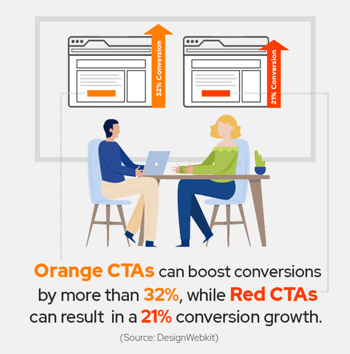
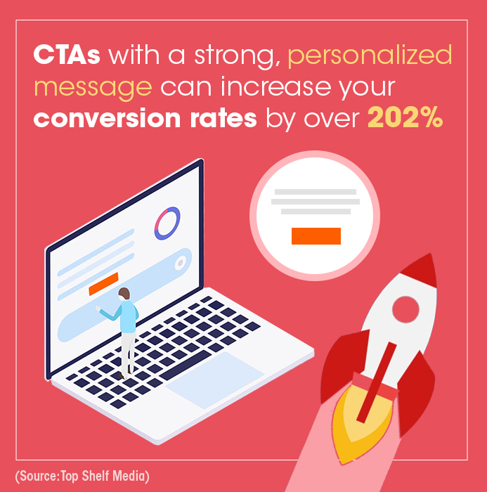
If you are wondering what a CTA is, it is a text hyperlink, an image, or a button on your website designed to encourage visitors to take the desired action. CTAs are the most effective way to drive conversions. But not all CTAs are effective. You can’t just slap the words “Call Now ” on an orange button, put it everywhere on your website, and then expect to rake in leads and patients.


Creating and placing an active call to action in healthcare is a more complex job than you think. You’ve got several groups of audiences looking at your website — visitors, patients, referrals – and you want to get each group to take different actions. You want visitors to become leads, leads to become loyal patients, and patients to become brand ambassadors — but you can’t serve the same CTAs to achieve different goals.
Solution? You need to create different types of CTAs to serve different audiences so that you can motivate them to take the next step.

Different types of CTAs
Here are the five must-have CTAs on your medical practice website:
1. “We Can Solve Your Problem.”
Offering helpful resources, such as a downloadable eBook about a health problem and its prevention, in exchange for a visitor’s contact info, will engage the visitor while helping you grow your lead pipeline at the same time. Just make sure that the contact form is short and doesn’t ask for unnecessary information. The visitor’s name and email address or phone number are the only details you need to start a conversation with a prospect. Asking for too much information will deter leads from filling out your form.
2. “Learn More About Our Practice.”
Visitors can land on your medical website from different sources. They might type in keywords related to your specialty on a search engine and land on your website or they might click a link they saw on one of the social networks and enter your website through your blog page. Keep content on your homepage, services page, and your blog page short and crisp. Instead of going in-depth into a service, include “Read More” CTA that takes visitors to a related page on your website where you can dive into the nitty-gritty details. This will help the visitor quickly scan the page he or she lands on and navigate to the content that is relevant to them.

3. “Like or Share.”
In addition to lead generation, your website can help promote your brand and reach out to your target audience. A simple yet often overlooked CTA is using social sharing buttons. When a visitor shares information with others via social networks, he or she brings that third-party cred factor to your brand. Their network of family and friends is exposed to your practice through a trusted source, and your potential patient pool becomes bigger. Also, the trust you will build with the target audience through social networks is beyond brand awareness. A strong social presence plays an essential role in the prospects’ buying decision. So, if you aren’t encouraging social shares on your medical website, considered it a missed opportunity.

4. “Check Out Our Services.”
Once a visitor starts checking out your website, make it easy for him or her to take the next step, and engage with your brand. Using a prominent services CTA button on your homepage and throughout your website will give your potential patients a clear way to find out how your services meet their specific needs. A short video on the services page that lists benefits and features is a great way to give prospects an overview of how your services can help them. There are several ways to showcase your unique service, depending on your specialty industry and target audience. For some medical practices, an interactive video leading to an appointment with the specialist is the best fit. For others, patient testimonials might do the trick.

5. “Schedule Appointment.”
Once your website visitors have had the chance to engage with your services and patient testimonial videos, don’t miss the opportunity to suggest booking an appointment. This means using a specific CTA to make it easy for your visitors to schedule their appointment. This CTA should focus on converting the lead into a paying patient.
The Call-to-Action Checklist for Medical Website
When adding buttons to your medical website, follow this checklist. There are several elements that go into creating effective CTAs, but if you have answered “yes” to these questions, then your CTA is probably good to go!

1. Does my CTA have less than five words?
2. Does my CTA begin with a strong action verb?
3. Does my CTA communicate the value the visitor will get from clicking the button?
4. Is my CTA displayed prominently on the website above the fold?
5. Is my CTA standing out and not blending with the web page?
Conclusion
CTAs don’t seem like a big deal until you start collecting data. Then, you realize how important they are. Poorly designed and placed CTAs hurt your lead generation efforts as well as your reputation. That’s the last thing any medical practice owner wants. Paying attention to your data and testing new CTAs can increase conversion rates and make your website a lead magnet.

Looking For Healthcare Marketing Agency For Hospitals , Clinics, Doctors?
Call Pursho @ 0731-6725516


