In the early years, search-engine optimizers typically equated accessibility with rankings. We focused on algorithms. A website that’s accessible to users with disabilities would also be accessible to Google. Or so we thought.
We used alt attributes heavily. We knew Googlebot couldn’t detect words in images. So, we leveraged alt attributes, knowing Google was reliant on them. Sometimes we even over-optimized. But rarely did we think about the user.
Things are different today. Google takes accessibility seriously. Google has an educational portal full of info on how to build accessible pages, products, and apps.
Google strives to include the best websites in organic search results. In 2020, the best sites are accessible. Almost certainly accessibility is a ranking signal. Search-engine optimizers in 2020 must therefore understand and incorporate accessibility.
Google Lighthouse
My firm conducts a lot of technical audits. Accessibility almost always is lacking.
For example, take the pinch-to-zoom feature in smartphones. The feature is there for a reason (i.e., to view the content). I recently visited 100 popular ecommerce websites; 17 did not have pinch-to-zoom. Consumers who find an ecommerce site are a hair-trigger away from returning to search result pages. If a smartphone user can’t zoom-in, you’re likely losing sales.
But Google makes it much easier to learn via Lighthouse, which is built into Chrome.
To access Lighthouse, visit the web page you want to audit in Chrome. Right-click and choose “Inspect.” This panel might look overwhelming, but it’s full of details for improving SEO. For this article, I’ll focus on “Audits.” The top menu lists “Elements,” “Console,” “Sources,” “Network,” “Performance,” and a double arrow (>>). Click that arrow for more options, including “Audits.” This is Lighthouse. Choose a category, such as “Accessibility,” and then click the “Generate Report” button. Your audit results will appear in a few moments.
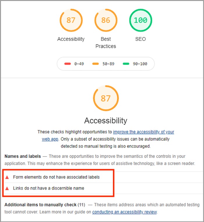
The screenshot below is from Lighthouse. The two red arrows (in the red rectangle, which I’ve inserted) expand, with details on the failing elements. But this is scratching the surface.

The two red arrows in this Lighthouse report expand with details on the failing elements.
Additional accessibility items in Lighthouse include:
- Form elements. The code for a form must include a

- Links with text. A link should include meaningful text to help users know the destination. For example, use “Click here for our buyer’s guide” instead of just “Click here.” Again, use an aria-label in the absence of meaningful link text.
- Proper color contrast. Similar colors are difficult to distinguish for many users. An example is light gray on a white background. Use a sharper contrast, such as black on white. Contrast-ratio.com is one of many sites that can help. Google requires a 4.5:1 text contrast ratio. Remember that ratio during a design phase.
- Proper language attributes. This code informs screen readers of the language.
- Keyboard access. A keyboard can activate all interactions on the site — from forms to links. A form that doesn’t respond to the “tab” key is not accessible, for example.
Beyond Rankings
The value of an accessible site goes beyond search rankings. It helps humans — visually impaired consumers that want to use and enjoy the internet. It also complies with the law. U.S. courts have increasingly applied the Americans with Disabilities Act to websites. Ask Dominos, Target, and other commerce sites about the penalties.


