There is a page on your ecommerce site that likely needs attention. Perhaps you don’t have it, but a frequently-asked-questions page is essential to any online store. Done right, FAQs can close sales.

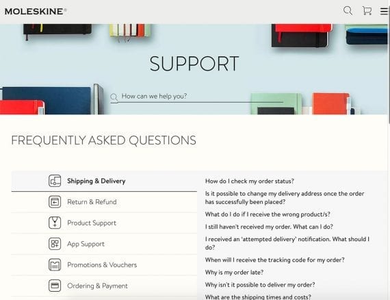
An FAQ section can help boost conversions by providing key information about the brand and the products it sells. Source: Moleskine.
Why FAQs?
FAQs, also called help pages, are necessary for many reasons.
- Saves time for both shoppers and customer-service staff. You can cut down the number of requests and let shoppers help themselves by providing answers to common questions. LEGO’s FAQ section, for example, is easy to navigate. It uses simple words. The topics are definitive. For example, if you click for more info on the LEGO VIP Program, you’ll see how to register, earn and redeem points, replace your VIP card, and more.

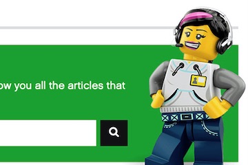
Make the help section easy to use, such as this example from LEGO. No shopper should need support to find support.
- Validates a shopper’s query. A shopper who can’t find answers feels like he’s the only one who is confused. Likely many shoppers have the same question.
- Builds relationships. Answering questions with transparency generates trust. Use your brand’s voice to further the cause.
- Decreases the number of negative comments and reviews. Your company will earn more respect by eliminating surprises and being honest — even when there’s a problem. Referring to FAQs pre- and post-ordering gives a clear picture of what you sell, how you manage orders, and return and exchange policies.
- Improves time on site. Good FAQs promote longer visits and, thus, more sales.
FAQ Components
Creating or improving an FAQ section is straightforward, though it can be time-consuming. Key components of an FAQ page are as follows.
- Consistent layout. The FAQ section should function and appear like the overall site, with the same design elements, fonts, and colors.
- Logical categories. Shoppers need all sorts of information, including how to use features, track orders, return or exchange items, understand product descriptions, and handle membership and account issues. They want to know how items are packed and shipped, and how to troubleshoot glitches on your website. By segmenting FAQ types, shoppers can quickly find answers.

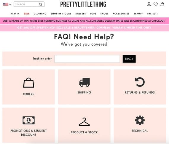
The FAQ section is part of the website. It should carry the same design elements. Source: PrettyLittleThing.
- Order lookup tool. Many customers visit the help section for the status of their orders. Including the lookup function here saves a step.
- Tips on finding the best product. For a clothing store, this could be information on how different items are sized. For sporting goods, it may be an explanation of fishing lures.
- Authentic voice. FAQs should not be stuffy. They should carry the same tone as the site, not like a tech manual. Dubbed as a card game for horrible people, Cards Against Humanity’s FAQ follows the format of the site and the product.

To some, it may seem offensive, but Cards Against Humanity’s FAQ section speaks directly to its target audience.
- Relevant and important details. This is where you address concerns that are defined by your audience. For example, if you sell sustainable goods, explain how products are sourced and manufactured.
- How custom products are made, with lead times. If you sell handcrafted goods, explain the process. Provide a chart on turnaround times to diffuse expectations of immediate shipping.
- What you stand for. Does your company give back? List the causes and how you donate. Showcase the efforts of employees that volunteer time to community projects. Refrain from political stances unless your target audience requires them.
- Privacy, customer information. Summarize your security and privacy policies, and then link to those pages.
- How to contact. List all the ways you can be reached, including a link to live chat, social messaging, and a phone number.
Ongoing FAQs
Once the core is complete, populate the section with additional questions and answers as concerns and trends evolve. Use the following sources for ideas.
- Pre-checkout calls and chats. Note anything — from finding products to completing checkout.
- Feedback forms and email. Logging shopper feedback will help recognize repeat concerns.
- Return and exchange forms. Include an optional field for comments. These will often provide more insight than a menu selection or checkbox.
- Product support requests can help identify user errors, confusion, or misuse.
- Social media. Monitor posts and comments about your brand and the products you sell.
Not every question or concern is legitimate. But don’t be quick to write off people’s opinions. For every person who complains, likely many more have the same issue but say nothing.


