Back in 2017, a study by Kalibri Labs found that hotels were seeing a faster rate of growth in hotel site bookings compared to online travel agencies (OTAs).
This was also the case in terms of both revenue and room nights when compared to year before, and prior to direct booking campaigns being launched.
Kalibri released a follow-up study in 2019, this time discovering that the direct-booking campaigns not only drove short-term results, but also generated repeat business and loyalty in customers.
So, what makes consumers want to book direct rather than a third party? Here are some examples of hotel websites I think are getting it right.
SchlossHotel
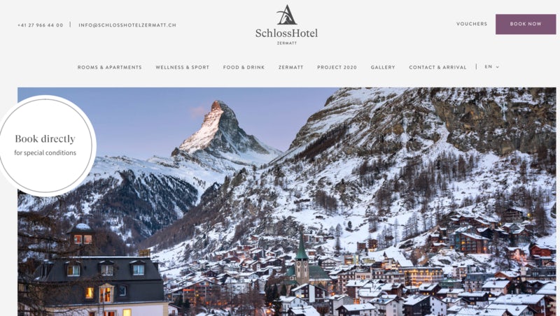
The SchlossHotel in Zermatt emphasises the benefits of booking direct throughout its website, first and most notably via a large sticker on its homepage saying ‘book directly for special conditions’, designed to catch the eye of anyone who lands on the page.
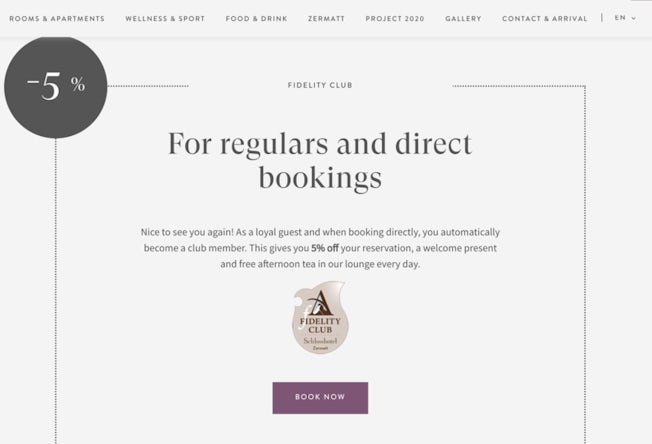
Scrolling down, there’s further information about the hotel’s loyalty club, which customers are automatically enrolled in if they book direct on the website. Pleasingly, this comes with perks such as a 5% discount, and free afternoon tea every day – yet more incentive to book direct.
The hotels also ensures that customers are reminded of this deal throughout the booking journey, preventing them from abandoning their journey or looking elsewhere at the last minute.
Premier Inn
In 2019, Premier Inn was named the best rated UK hotel chain by Which? The reasons were a combination of good value, convenience, and emotionally-driven marketing – features which are all emphasised on its website.
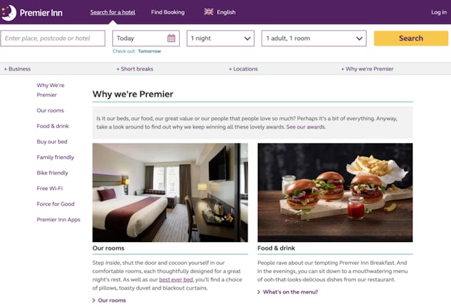
The website promotes family-friendly stays and comfy beds, but of course, this would all prove irrelevant without a fast and intuitive UX – which it also happens to deliver.
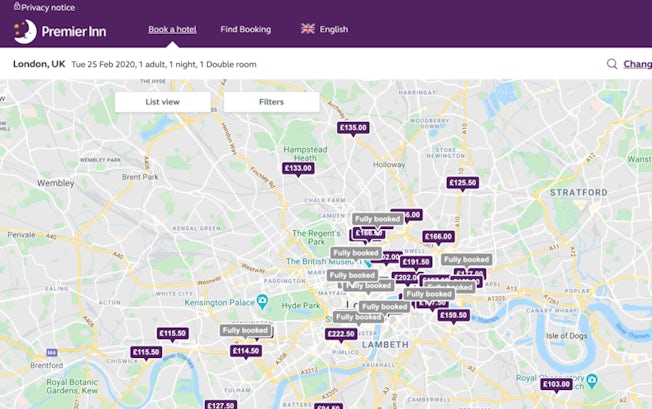
As a nationwide chain, location-based features are important, and its responsive search bar and map makes it easy for users to find a hotel in the right place. Labelling hotels as ‘fully booked’ also saves users extra time and hassle. Similarly, the hotel search results show users flexible rates as well other useful nuggets of information like whether a hotel has new rooms or is a special ‘hub’ hotel, which are centrally located in select cities.
Hilton
According to Hilton data, adults aged between 18 to 34 have shown 10% greater interest in staying at Hilton hotels since the chain launched its first celebrity campaign last September (featuring actress Anna Kendrick). There has also been an increase in direct bookings. The campaign promotes the Hilton Honors loyalty program and its perks, like discounts when booking direct on the website or through the Hilton mobile app.
In order to continue this connection with consumers, Hilton’s marketing campaign is also featured on its homepage, where it encourages people to ‘save even more when you book ahead’.
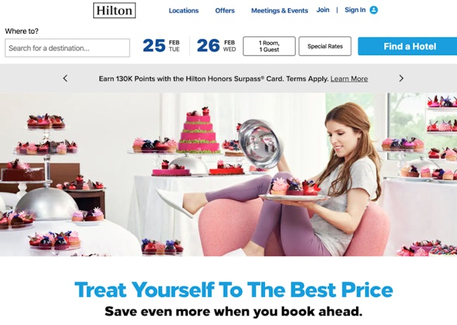
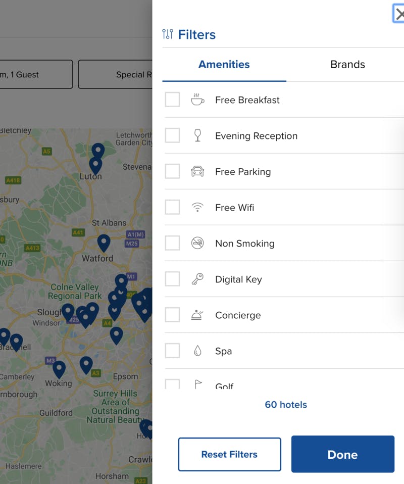
This focus on loyalty continues through to Hilton’s search and booking platform, which allows the user to view hotel prices either by currency or loyalty points. The helpful filter function – which includes factors like ‘pets allowed’ and ‘spa’ – also contributes to an easy browsing experience.
BelleClaire
A report by Navis suggests that alignment of offline and online channels is particularly important for the hospitality industry. Navis’ VP of Sales, Mark Bartlett comments: “I am surprised when I run across a property that does not include a phone number throughout their website, especially on the bookings page.” The report goes on to highlight the importance of telephone bookings, suggesting that just 1.7 out of every 10 website visitors will convert to a booking, while ‘a reservations agent is 20 times more likely to turn a prospect into a booking.’
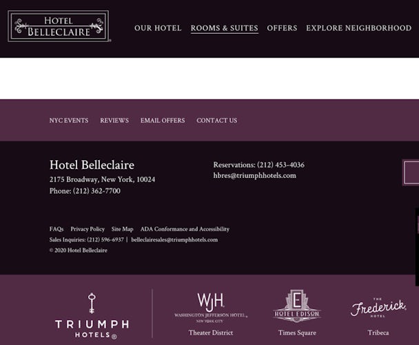
The New York boutique hotel, Hotel BelleClaire, helps to drive telephone enquiries by making its number highly visible on both the top and bottom of the homepage as well as throughout its website. It includes a click-to-call button, too, making it easy for visitors to make a call on any device.
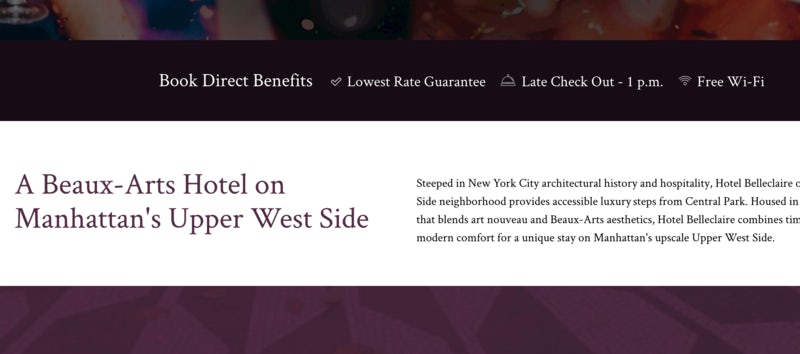
Another effective element of the website design is the USP bar, which nicely summarises the reasons why customers should choose BelleClaire.
The Ritz
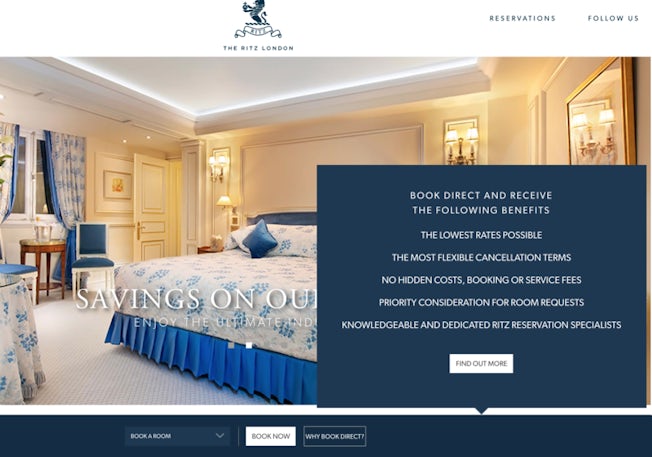
As one of the most well-known hotels in London, the Ritz largely relies on its prestigious reputation to drive bookings. This means that people might be more inclined to visit its website as a first port of call anyway (as opposed to a third party site). However, the Ritz still encourages direct bookings as often as possible, immediately capturing the user’s attention with a list of benefits (including lowest rates and flexible cancellation terms).
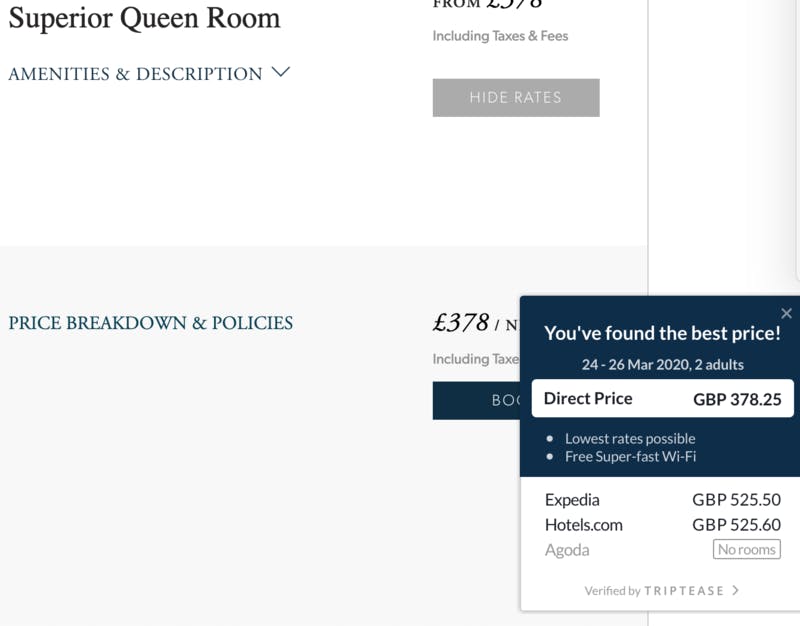
The search and booking process itself is quick and easy. It also includes both reassurance and urgency, informing customers that they’re getting the best deal by booking direct, and comparing the price against Expedia and other online travel agencies.
The Garland
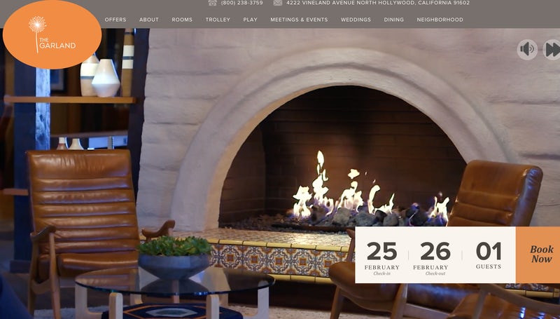
The Garland Hotel in Los Angeles creates an immersive user experience throughout its website, aiming to draw users in so they do not leave without making a booking. It immediately does this by using site-wide video on the homepage, and a prominent booking tool overlaid on top. The large buttons (and suggested dates) are eye-catching, and designed to immediately compel the user to check hotel availability.
Scroll down and the site continues to draw users in with social proof (from integrated TripAdvisor reviews) and useful imagery (of the hotel’s various rooms and facilities).
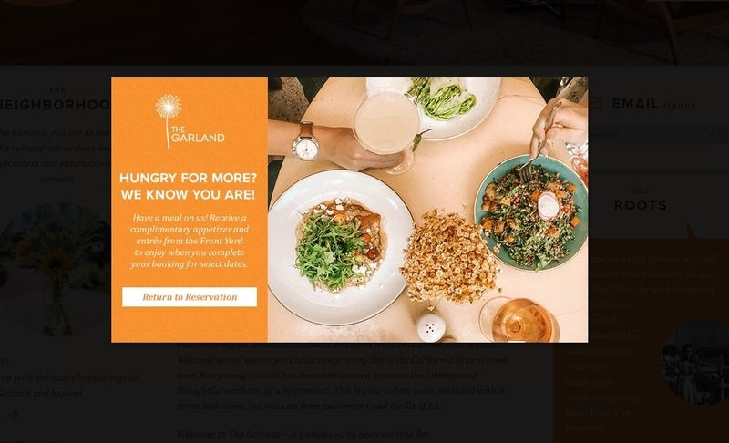
Finally, the site aims to prevent people from abandoning a booking, using a pop-up window that offers a free meal if the customer returns and completes their booking.
Key takeaways
So, what can these examples tell us? Here is a summary of some key characteristics that consumers might favour over an online travel agency.
- Promote direct bookings. The Ritz and Premier Inn make it clear why users should book directly, and this is likely to increase confidence in both new and loyal customers. Signposting the benefits alongside reviews and rating on the booking page might also be effective for driving conversions.
- Upsell hotel extras. Online travel agencies don’t have the opportunity to include as much content about hotel extras, such as spas or food and drink facilities. This is one area hotel sites can make the most of, particularly when it comes to upselling on hotel packages like afternoon tea.
- Drive loyalty programs. If there’s one reason to use a hotel website rather than an OTA, it’s being able to make use of special hotel offers and discounts. Hilton is a good example of how to promote this, using its ‘Honors’ scheme to drive bookings.
- Copy OTA tactics. Personalisation is a key reason online travel agencies tend to be so popular. Through data, these sites are able to guide users towards relevant results, with a focus on value and choice. However, hotel sites can steal some tactics also used by OTA’s, such as creating a sense of urgency and social proof.
- Make it convenient. Factors like location can help determine whether or not someone books a hotel, so increasing focus on this (like Premier Inn) can also be effective. With area guides or locational maps, for instance.


