Restaurateurs put great passion into their food, their concept, and their decor. But, a restaurant’s brand identity – and visual brand design – is equally important and not to be forgotten.
A restaurant’s brand identity is the cumulative effect of what your guests see, taste, smell, feel and hear at your restaurant, online, and in the world at large.
In this Q&A, Ross Kimbarovsky, founder and CEO at crowdspring, addresses the things restaurants need to know when creating their brand identity.

Noobpreneur (Q): What do entrepreneurs need to keep in mind when thinking about designing a logo?
Ross Kimbarovsky (A): logo is the visual centerpiece of a company’s brand identity.
Smart entrepreneurs collaborate with designers to create a more perfectly brand-appropriate, memorable logos.
Inexperienced entrepreneurs use a ready-made design or an online logo generator to create a generic, uninspiring logo that looks like thousands of other brands.
A unique, memorable logo design will help boost awareness and can improve your marketing and bottom line. A poorly designed logo, or one that has outgrown your brand, can tarnish your brand.
At its most basic, a logo is a small, symbolic piece of artwork that represents a business. When you set aside all the design trends and fancy fonts, at its core, a logo must:
1. Embody your brand.
2. Be instantly recognizable.
3. Be versatile.
4. Be timeless.
Everything else is optional. Every design choice in your logo should exist only to serve and strengthen the four items listed above.
Q: Does having the right logo really make that much of a difference to buyers/consumers?
A: The right logo can make a big difference. In fact, for existing businesses, rebranding may be the key to getting your business back on track. That’s why most successful companies, from Fortune 500 to startups, rebrand.
The most important job of a logo is to help customers and customer prospects identify your company. That’s why the best logos are simple and memorable.
Just think about how many logos you are able to recognize in your everyday life! Those logos serve as a reminder that Nike was the brand that made your shoes, or that Apple is the reason why you’re reading this on your Macbook or iPhone.
Another important job of a logo is to draw attention to your company and its products and/or services. Logos don’t only identify what your company does or stands for, but they also catch people’s eyes. People remember great logos! Again, it’s all about association. If people associate a specific symbol or font with your brand, then they will instantly recognize it wherever they are.
That’s why generic logos or online logo generators will often hurt your business. When your logo looks like thousands of other logos, people will not remember your company.
Finally, a good logo helps to differentiate your company from its competitors.
One of the best attributes of a logo, assuming you’re not using generic templates, is that it can only be associated with your business. It doesn’t matter if a different company is similar to yours, what matters is that your logos are different. As a result, you have an opportunity to make a unique first impression.
Often, a logo is one of the first defense barriers against competition. Besides your company’s name, it’s the first difference customers and prospects will notice. That’s why it’s important to avoid generic and cliche logos.
Q: What are some 2020 logo trends you expect to see?
A: As logo design and branding experts, at crowdspring, we keep our fingers on the pulse. And, we love to share what each new year will bring.
Here are 3 logo design trends and styles that will be popular in 2020.
To see a full list of logo design trends for 2020, read Logo Design Trends 2020: Your Definitive Guide to Navigate The Biggest and Hottest Trends.
1. Playful minimalism
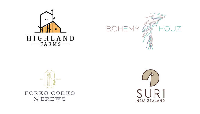
Ultra-chic minimalist logos have enjoyed a surge of popularity over the past few years.
All minimalism reduces its subject to just the visual essence. This makes minimalist logos very adaptable to a wide variety of backgrounds and mediums – making them very functional.
This trend is fun, but if your brand isn’t playful, creative, warm, or quaint (these attributes aren’t appropriate for every brand)… then it’s not the right trend for you.
2. Strong typography
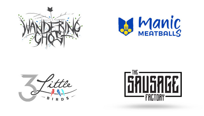
In logo design, font choices are just as important as the icons you use in the logo.
In fact, some logos (known as logotypes) are made up entirely of letters with no icon at all.
And recently, designers have grown bolder. Note the wide variety of in-your-face font choices that appear in the logos above.
But not any font will do. You can’t just plop your business name under your logo mark in a serif or sans serif font like Helvetica or Times New Roman and call it a day. Often, you must get creative with the type treatments to personalize the design.
The beauty of this trend is its flexibility. There are so many strong fonts available to choose from – there’s bound to be a striking option that suits your unique brand.
3. Line art
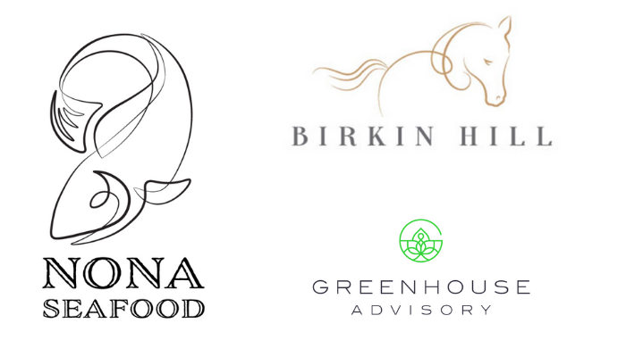
Line art is a remarkably versatile, timeless form. These traits automatically make line art a strong option for a logo.
From repurposing retro pin-striping technique to create a memorable fish, to clean geometric line drawings, to suggestive gesture logos (like the horse above), we’ve seen designers ramping up their creativity and reinterpreting what a line art logo can be.
This trend is refreshing, elegant, and flexible. It’s also beautiful.
Line art logos can be rendered on virtually any background. And, with the nearly endless array of styles in which they can be executed, you’re sure to find one to match your brand’s tone.
Request lighter and heavier line weight versions of your logo in your final files. The heavier line weight version will be easier to see on busier backgrounds.
Q: What are the biggest mistakes entrepreneurs make when it comes to logo design?
A: Stay on the straight and narrow, and keep yourself and your business safe from these seven deadly sins of logo design.
1. Lust: Avoid fads and trends
You should resist the magnetic pull of trends. Unlike dresses or hairstyles, logos are meant to endure, and those that reflect what was trendy at the time do not age gracefully. You need not look further than startup logos from the so-called “web 2.0”-era to see how poorly many of these have aged.
Instead of trying to appear current, aim for timelessness. Logos like Nike, FedEx, Penguin Books, and the WWF look just as relevant now as when they were first introduced, mainly because they are simple, memorable, and avoid logo cliches.
That said, the best logos still evolve and adapt to the times, but usually in subtle ways that reinforce a timelessness without slavishly incorporating fads. A company like Starbucks or Coca-Cola have consistent, reliable brands that have still seen small changes over time to stay fresh.
2. Gluttony: Do not gorge yourself on complexity
The average person is exposed to anywhere from 3,000 to a staggering 20,000 messages and brands a day. More than ever, simplicity and clarity are critical elements of the best logo designs.
As we emphasized in our guide on how to start a business,
A strong brand identity is the most effective way your new business can gain a competitive edge in an increasingly crowded marketplace.
You want your logo to leave a lasting impression, and with so many demands made on people’s attention, a simpler approach is usually the most effective.
3. Greed: Only use what you need and nothing more
With so many different fonts, color combinations, and styles to choose from, the temptation to drink deep from the well of creative elements may be strong, but for the sake of your logo’s success, resist.
Greed and gluttony are two sides of the same coin, and indulging in either one can cause your logo to suffer from the equivalent of visual gout. Designing with less means it’s much easier to move your brand across platforms and mediums. Flat, simple designs mean your logo will load faster and look clear on smaller screens, which studies show helps boost recognition and memorability.
Redesigning your logo to strip away complexity and clutter is a great way to update your brand without having to start over.
You want your logo to resonate with your customers, and the less embellishment and visual clutter your brand has, the clearer your message will be.
4. Sloth: avoid stock art and online logo generators
It seems so easy: you’re a simple google search away from a veritable galaxy of stock art or an online logo generator. Some of it is even free.
If you’re looking for generic designs used by thousands of other businesses, you can pick pretty much any automated logo maker, and that’s what you’ll get.
Generic design is a good way for your brand and business to hide from customers.
Online logo stores and logo makers may be cheap (sometimes) but they offer marginal value.
And don’t get confused by claims that some of these logo makers use Artificial Intelligence (AI) to create their designs.
It’s nonsense. If you look at the examples on their sites, they’re using generic elements – thousands of generic glyphs, images, and other things that ensure your logo will look like thousands of other logos.
There are many reasons why you should avoid using stock imagery in your logo:
- Anyone can download the same stock art and you have no control over how it’s used
- A competitor can easily replicate or rip off your logo
- Your logo may look generic or cheap
- There may be unforeseen copyright, trademark, or usage issues
Your business has its own unique personality, and your brand should reflect that succinctly and clearly. As it was created outside of the context of your own business and its specific needs, stock imagery can devalue your brand’s character.
5. Wrath: Prepare for the backlash
For every one person that creates something new, there are five thousand others yelling, “FAIL!”
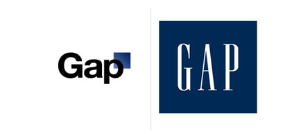
The reality is that many branding efforts are often met with scorn and ridicule. Famous branding disasters like Gap’s infamous “blue square” or Pepsi’s ridiculous logo redesign document are stark reminders that the feedback loop can actually be a painful whip.
Even the best-planned logo designs are not free from criticism, but what’s more important is how you process the feedback you receive.
Handled well, even the most bloodthirsty mob can be soothed.
6. Envy: Be distinctive, not derivative
Your business has a unique value proposition, and your logo should be equally distinctive. You want your logo to embody the spirit of your business, and the best way to achieve that is to create an original, distinct brand.
7. Pride: Be humble and listen
Powerful brands elicit an emotional response. One of the key steps to create an impactful brand design is to research, know, and understand the people that will interact with it. Your customer’s response determines if a logo works or not. For example, every design project on crowdspring gives you the opportunity to launch free public and private focus groups to share design concepts with friends, colleagues, and even your customers. It’s a great way to get quick, free feedback and to involve your customers in your branding process.


