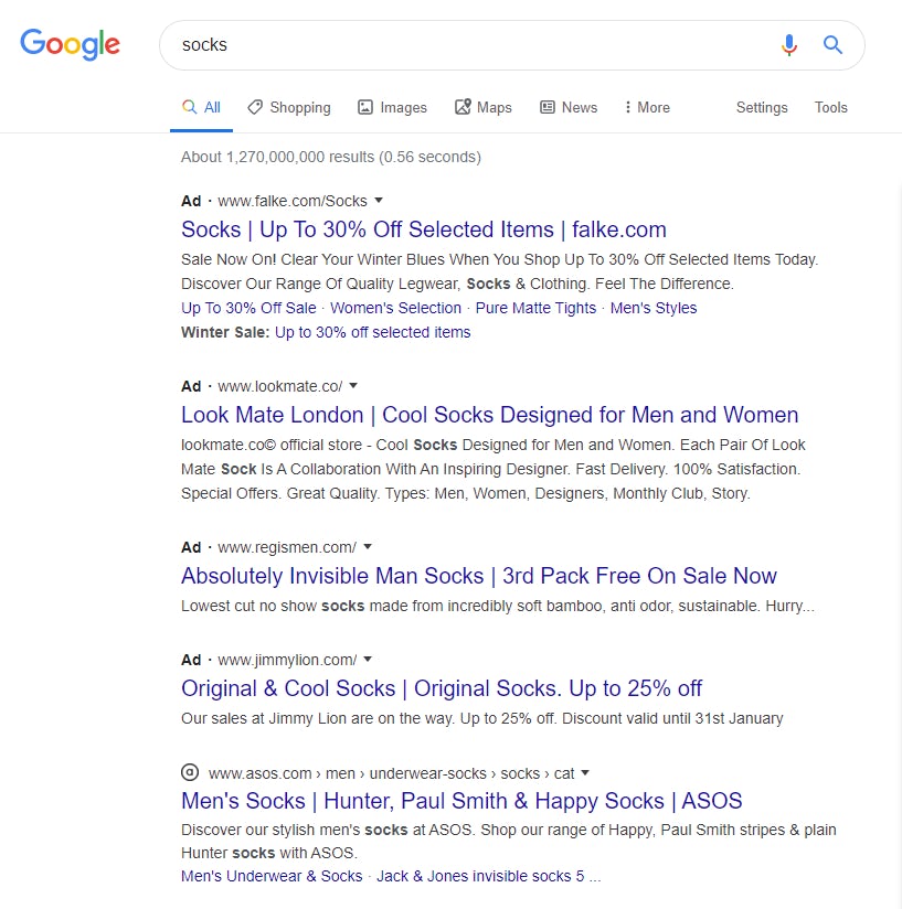
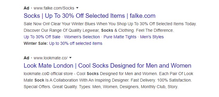
In 2019, Google updated the look of its mobile search results pages (SERPs), displaying a website’s favicon and moving the name of the website to the the top of the results card. It also changed the appearance of ads in the SERPs, featuring a black bolded “Ad” label at the top of the card along with the website URL.
Last week, the search giant announced that it was rolling out an update in which the design of its desktop SERPs will be more like the the design of its mobile SERPs.
“The format puts a site’s brand front & center, helping searchers better understand where information is coming from, more easily scan results & decide what to explore,” Google stated on Twitter.
But is the primary goal of Google’s design really to help searchers? Around the web, discussion and debate about the design has been significant, with many pointing out that the design makes it very difficult to distinguish organic listings from paid listings.

Google’s new-look SERP on desktop
In a Twitter thread, one observer, Johnny Makes, argued that Google’s design goes so far as to represent a dark pattern.
“Where once only adverts had an icon to differentiate them, now there are favicons in the same slot on all other results,” he wrote. “By putting something visually similar in every slot which previously signalled an ad, it becomes impossible for a user to tell them apart without taking care and effort. Google can still say they label adverts, but that info is now buried under more visual noise.”
This, he believes, is a dark pattern because it subverts users’ ability to quickly identify paid ads in search results — ads which many users have trained themselves to avoid based on the principle that as ads, they are likely to be less relevant.
Humans are self-training machines, and in the context of the internet, we’ve trained ourselves to ignore the intrusive adverts which increasingly clutter our screens.
If something looks vaguely like an advert, we don’t even look at it – a behaviour known as ‘banner blindness’.
— johnny makes
(@johnny_makes) January 18, 2020
The impact on marketers
Google has been increasing the number of ads it serves in the SERPs for years and this has led to a significant increase in the number of searches that result in clicks on ads. For example, according to clickstream data firm Jumpshot, in June 2019 4.42% of desktop searches produced ad clicks, up from just over 2% in Q1 2016. On mobile, the trend is even more pronounced, with 11% of searches resulting in ad clicks, up from less than 4% three years ago.
With the distinction between ads and organic results becoming even less apparent, it stands to reason that Google could generate more and more clicks on paid ads if it increases ad density in SERPs even further.
While companies should take advantage of the opportunity to specify a favicon for inclusion in Google’s SERPs, the numbers make it abundantly clear: paid ads, along with Google-owned and controlled results, are pushing out organic results. As a result, companies may find they have no choice but to allocate more to paid search than SEO if they want to reach consumers through Google.
But the waning distinction between ads and organic results could have an impact on paid campaigns. If Google’s SERP design boosts paid ad clicks as it appears designed to do, marketers will want to pay close attention to campaign performance as they might see increased clicks from users who previously wouldn’t have clicked on their ads.
While this isn’t inherently a bad development, marketers will want to take steps to ensure that their ads are as relevant as possible to the keywords and phrases they target so that any increase in clicks doesn’t go to waste.


