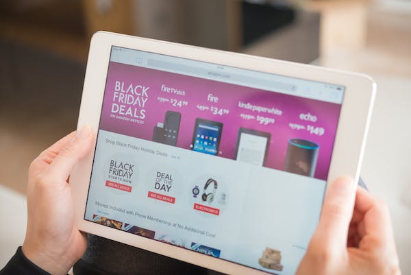
Black Friday came and went before you could say ‘peak capitalism’.
There’s no doubt that there is plenty of money to be made on the last Friday of November, as consumers hunt for Christmas bargains and brands try to boost sales during the crucial ‘golden quarter’.
John Lewis reported that its total sales were up by a record 9.5% in 10 days surrounding Black Friday this year, with a particularly impressive 43% uplift in purchases via the brand’s app. Meanwhile brick-and-mortar high street stores more generally across the UK welcomed a 3.1% hike in footfall after consistently disappointing figures over the last couple of years.
Of course, the 29th November fell on payday for many shoppers in 2019, which may have contributed to the unusually buoyant results numerous retailers have released; results that are especially positive when it comes to ecommerce.
Excellent online user experience is imperative during times of heavy traffic like Black Friday, as customers (often frantically) try to navigate a website hoping to relocate products they’ve had their eye on for a while.
It’s important to remember that the majority of visitors already have intent to purchase on days like these. Therefore, opportunity for conversion is very high – indeed a lot higher than the average day in retail – but is also easily lost if ill thought-out UX slows them down or directs them to the wrong place.
With this in mind, let’s take a look at a short list of UX examples from this year’s Black Friday event, and explore why some were more successful than others.
Curry’s PC World – humour, clarity and bundles
Tech store Curry’s PC World produced a humorous, yet genuinely useful, Survival Guide which displayed on its Black Friday landing page both prior to and during the day itself. The guide provided some handy tips for customers looking to survive the shopping experience in their physical retail stores and online, including eating a big breakfast, bringing water with you and how to cope with queuing.
Alternatively, the brand encouraged customers to download its app, and take a look at the website’s peak traffic patterns, giving them the inside scoop on when to grab the best deals before they sell out.
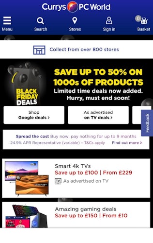
The Curry’s PC World Black Friday homepage included a number of categories across the top of the mobile screen, such as ‘Shop Google Deals’, which were accessible with a swipe, as well as a list of the best deals underneath.
A well-placed CTA towards the top of the homepage offered to help spread the cost of a customer’s purchase before they’ve even started browsing any products, thereby perhaps convincing some to increase their spending limits. After all, the latest technology often comes with a hefty price tag, even when discounted.
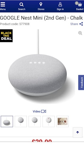
Clicking through to the product pages, a small sticker appeared at the top left hand corner informing customers that the item they are viewing was part of the brand’s Black Friday promotions (‘Black Tag Deal’). This can be particularly useful if shoppers have arrived at the product through search, rather than the dedicated Black Friday landing page.
Scrolling down some product pages, Curry’s PC World focused quite specifically on upselling by offering bundles of complementary products based on past shopper purchase habits. The retailer was careful to present total savings within the bundles and when bought separately to ensure deals were transparent and clear to its customers. While upselling is really in the interest of the brand, I found the suggestions useful as I had not considered these additional products which could make useful gifts or alternatives.

Though not a huge number of alterations were made to the usual Curry’s PC World website for Black Friday, extra features such as the navigable homepage, survival guide and black tag stickers made the shopping experience even more slick and transparent.
Argos – a mixed bag
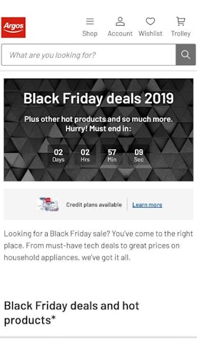
Argos’ homepage this year was decorated with a countdown timer signalling the length of time left before its Black Friday deals were due to expire. As with Boohoo’s version, this was a fantastic way of increasing urgency but also transparency, enabling customers to be easily aware of the time they had to decide on their purchase.
I noticed, however, that the ‘Black Friday deals and hot products’ were listed below the fold on mobile, increasing their chances of being overlooked by visitors who may go straight to the search bar.
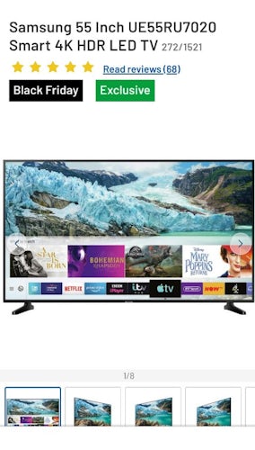
Customers were greeted with plenty of crisp, detailed images on the product pages themselves. The useful colour-coded tags below the title identified the item as included in the Black Friday sale, but could perhaps have been more prominent in order to encourage urgency and excitement.
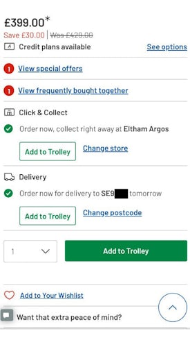
When it came to the displayed price, the total savings were clearly shown in red, although font size could probably have been raised a notch. The most off-putting part of this section, however, was the asterisk placed after the new price. This would make most customers suspicious of – and cause them to go looking for – a catch, rather than immediately adding the item to their basket. Pain points like this, particularly under the time-pressure of Black Friday, are unnecessary and could cause shoppers to reconsider their purchase.
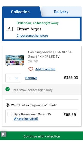
While the price was still true to the Black Friday discount applied to it, there was no indication, like a before/after price or percentage saving in red, that it had been discounted at all when added to the basket. There was also absolutely no mention of the fact that this product was included in Argos’ Black Friday deals. This was slightly disconcerting and I wouldn’t have blamed some shoppers who might have gone back to the product page to check that savings had indeed been applied.
All in all, it was a bit of a mixed bag for Argos. Though there were some really useful features when it came to delivery and collection, and transparency regarding when the deals were to expire, very little focus was put on Black Friday once customers had traversed to any product pages. As a result, checkout became confusing as savings weren’t consistently reiterated, which could have caused some customers to track back in their journey or lose confidence in their purchase decisions altogether.
Boohoo – simple and effective homepage takeover
Boohoo has seen a rapid increase in revenue in the last few years, despite sales generally declining in the fast fashion sector since 2015.
A huge countdown emblazoned on its Black Friday landing page prior to the day itself, alongside an email capture form promising launch notifications, is bound to have boosted anticipation amongst the brand’s most loyal customers. This sense of urgency likely prompted many to add items to their wishlists in preparation for the onslaught of discounts that awaited.
When its Black Friday deals were launched, the retailer’s homepage stated that there was ‘up to 75% off everything’, with a ‘shop now’ CTA directly underneath it. Scrolling down, a number of full-screen images followed, indicating the various categories covered by the sale.
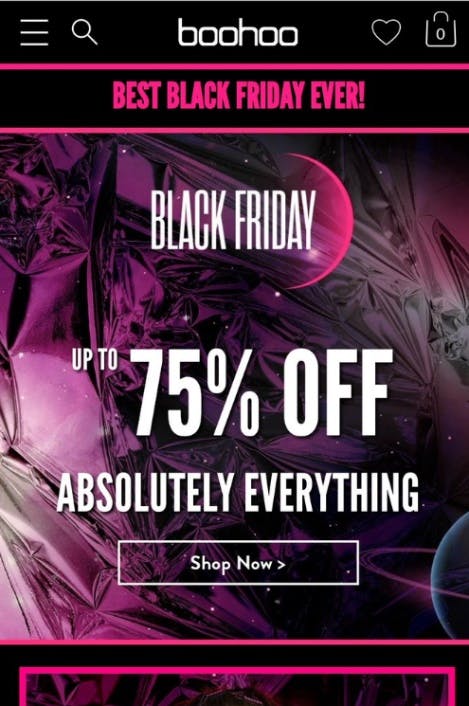
Now this is pretty standard practice in ecommerce, but the creative presentation of each category was really quite striking, encouraging me to click through and browse. Simple but effective.
Boohoo: 12 clever ecommerce features and strategies that drive sales
Asos – accusations from shoppers
In 2018, Asos experienced ‘disappointing’ Black Friday results which were followed by profit warnings and a 38% slump in shares later that year. It’s unclear if results have improved this year – at the time of writing they have not yet been released.
It was promising that the hashtag #asosblackfriday was in the top 10 trending topics on Twitter on 29th November, but a closer look revealed that it may have been for all the wrong reasons.
I know all retailers do it but the second picture was the price a week ago.. they’ve put the price up £12, shameful!! pic.twitter.com/ONABt67rtK
— Kerry Pickett (@_Kerrrrrrry) November 28, 2019
Amongst the top tweets under #asosblackfriday were shoppers posting some suspicious screenshots of their website suggesting that the brand had raised the full price of their items to make resulting discounts look larger and therefore more appealing. Whether this is indeed true or false, the Asos account didn’t appear to respond to their concerned customers.
Away from Twitter, and over on its website, there was a big colourful banner proclaiming there was up to 70% off everything in its ‘biggest deal ever’.

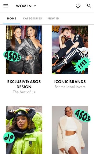
Scrolling a little further down, the brand had conveniently divided up its sale into some of its best-selling categories – perfect for those looking to browse their favourite brands without needing to use the search bar. The images were adorned with retro-style graphics which tied in with the main banner, although they didn’t seem quite as slick or considered as those on Boohoo’s website (more like hastily edited onto pre-existing photos).
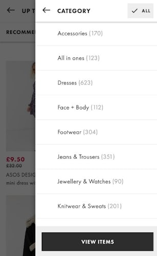
As usual it was very easy to view certain types of products with their filtering tool, where customers could browse by product category all the way down to colour and size. For shoppers looking for a specific item or particular look, the filters would make it very simple for them to find exactly what they were looking for.
Equally, customers looking to browse at their leisure were able to do so via the (almost) infinite scrolling interface allowing them to view every item in the Black Friday sale all in one place.
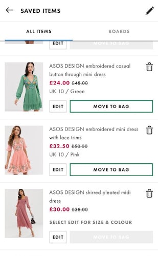
It was just as easy to view Black Friday discounts in my saved items. It was immediately clear which products were on sale, by how much, and whether a certain size was in stock. Moving a saved product straight to the shopping bag is great for loyal Asos shoppers who wishlist their items in advance of a sale and also ensures the absolute minimum number of steps in the checkout process.
Overall, Asos continued to offer up the excellent UX we’ve all come to expect from the brand, but without that many changes specifically tailored to Black Friday. However, the online accusations from some customers on Twitter, while unverified, could be damaging to their reputation and sales. It will be interesting to see if the brand has fared any better with this year’s event when the results are released.
British Airways
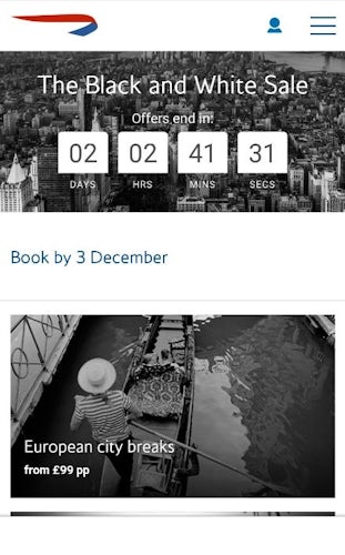
Flights and holidays were also heavily discounted on Black Friday, and BA tried to get in on the action with its ‘Black and White Sale’.
Like Argos, the brand opted for a countdown on its homepage which informed customers when the deals were due to expire. This was followed by a series of clickable images divided up into breaks in various parts of the world. The use of black and white photography was really effective here, as it was not only consistent with the messaging of the ‘black and white’ sale, but also related to BA’s longstanding position within the travel market.
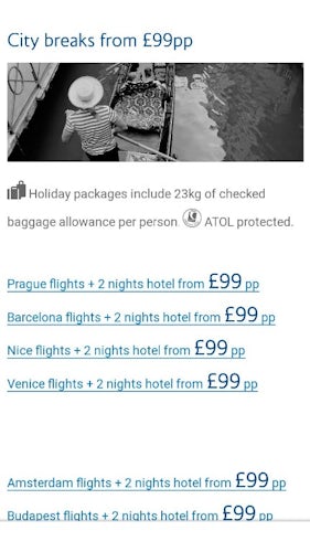
Things go a little downhill after clicking on one of these images. While the information presented on these pages was clear – that packages include checked baggage, flights and 2 nights at a hotel – the list appeared as nothing more than a series of plain hyperlinks. This is not something you’d come to expect from such a well-established brand, and it was hardly exciting to look at. It almost seemed to have been hurriedly added to the page as an afterthought.
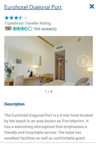
Clicking through, customers were then asked to choose a hotel for the destination they had selected. A standard affair with images of the location, a detailed description and UGC features such as Trip Advisor ratings, everything was where you would expect it to be. However, there was no mention of the black and white sale at all by this stage of the customer journey.
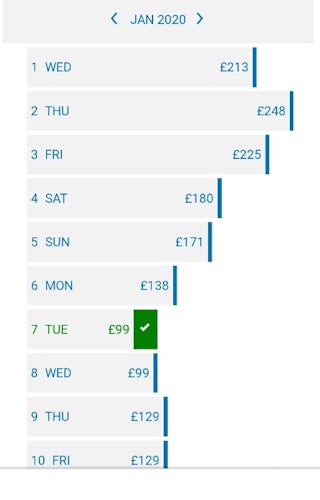
Once a hotel was picked, the cheapest price was selected for you by default, but there was no mention that these prices had been discounted from a higher original price as part of their Black Friday deals. Perhaps this was to encourage customers to choose more suitable dates, despite the higher cost, in order to bypass the sale altogether and increase average order value. Either way, it didn’t feel like an entirely transparent process.
A final price was displayed after flights were selected, but again there was still no indication that the customer had saved any money, or that there was even a sale at all. This could be confusing for shoppers who have reached this point, increasing the likelihood of abandonment. However, the price remained true to those originally advertised, with no hidden fees or added extras included at the customers expense.
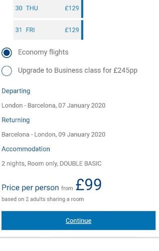
Only when customers began the checkout process will they have discovered the total discount, and even then it was not immediately obvious. It seemed a bit late to finally divulge this information so close to making payment, and in such a nonchalant way.
However, kudos should be given for the simple summary of what’s included, and the option to view a price breakdown of your trip.

On the whole, there were more negatives than positives when it came to BA’s UX for Black Friday. Although holidays aren’t the first thing people will spring for on the major shopping event, there seems to have been no energy or prominence in its campaign. In fact, on many occasions throughout the customer journey, it was easy to forget that the brand was even promoting any deals at all.
The first rule of Black Friday is: You do not talk about Black Friday

