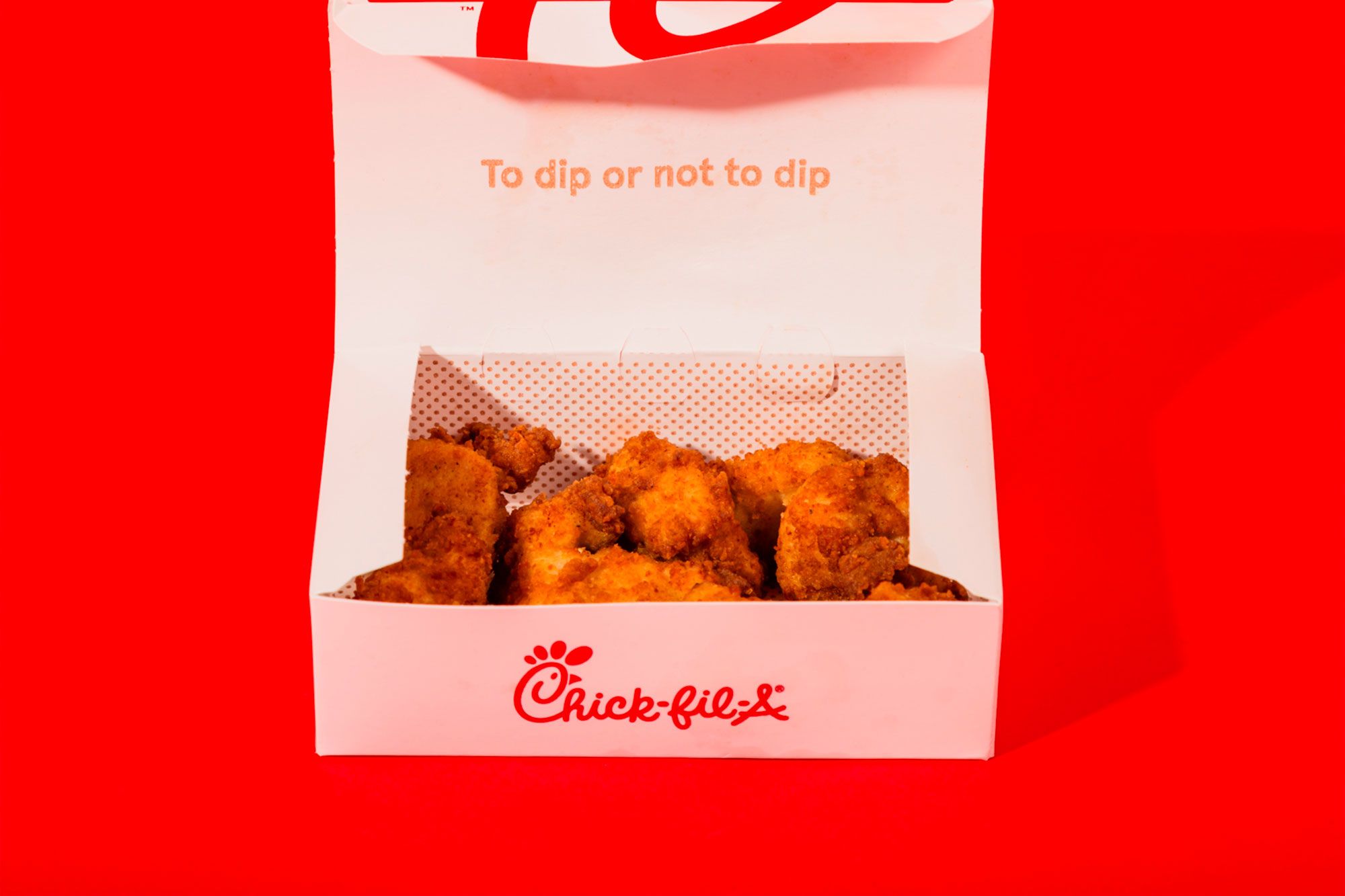
There’s a hidden message in Chick-fil-A’s logo.
1 min read
This story originally appeared on Business Insider
There’s a hidden message in Chick-fil-A’s logo.
When Truett Cathy was coming up with the name for his iconic chicken sandwich in the early 1960s, he decided to play on the phrase “chicken fillet.”
“I began to reflect on the product, which was the best part of the chicken — a boneless breast,” Cathy writes in his book, Eat Mor Chikin: Inspire More People.
He continued: “It occurred to me that the best cut of beef is a fillet; why not call ours a chicken fillet? Or chick fillet? Or Chick-fil-A?”
The decision to capitalize the “A” was a conscious choice on Cathy’s part, an attempt to represent “top quality.”
Cathy registered the “Chick-fil-A” name in 1963.
While Chick-fil-A has evolved over the years, the capitalized “A” has remained consistent. The chicken chain grew sales by 16.7% in 2018, reaching about $10.5 billion and becoming the third-largest restaurant chain in the U.S.


